Wedding paper runs from a free digital save the date to die-cut martini glasses, and the pieces that cost the most are the ones that add a hand step to every copy: ribbon, wax seals, calligraphy.
Your guest count decides which of those you can afford in time and money, since a bow or a seal that takes minutes on 20 households takes evenings on 120.
Spend on the first pieces guests see, like the invitations and save the dates, and keep the rest plain; the ordering timeline below shows when proofs and printing need to start.
1. Wedding Invitations
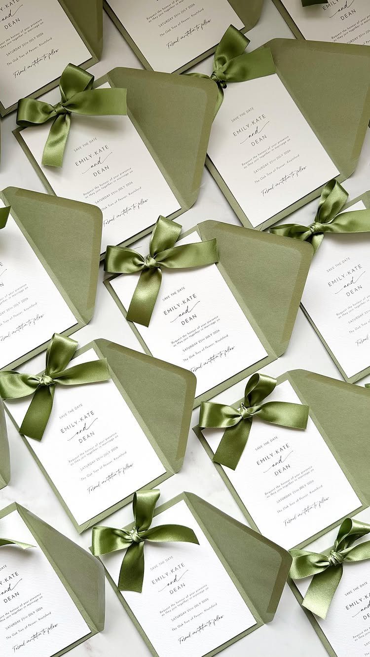
A colored envelope is the cheapest way to set a mood on a save the date, so I would spend the effort there and keep the card inside simple white.
Ribbon adds assembly time. Tying every bow by hand is slow on a long guest list, so count your households first and decide whether the ribbon is worth the evenings it takes.
2. Thank You Cards
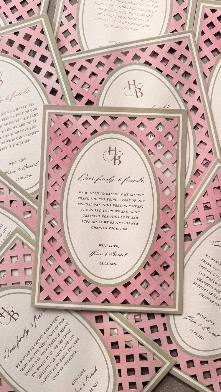
Thank you cards are the one piece of stationery guests read after the party is over, so a short, specific note beats a pretty one.
A pink lattice border with a plain oval center leaves room to write a few lines by hand.
Printed wording such as "Dear family & friends" works for a group message. For individual gifts, I would add one handwritten line naming the gift and how you will use it.
Print the date on the card if you like, but do not let the design slow the mailing.
3. Save the Dates
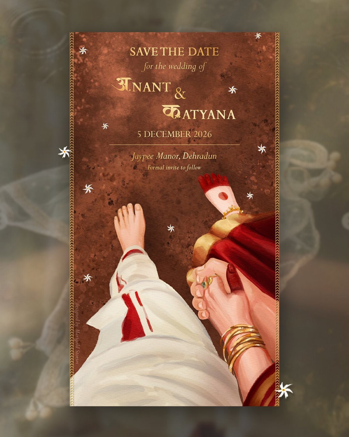
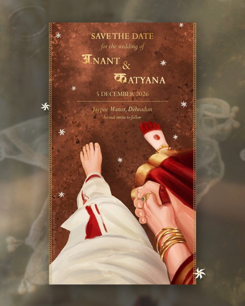
A digital save the date costs next to nothing to send, and an illustrated card like this one, with hands and feet drawn in traditional Indian attire, can say as much about the celebration as the wording does.
Email or text delivery fits a tight budget and a tight timeline. Put the names and the date up front, and I would add a line saying a formal invitation will follow.
Keep a mailing address list as you go, since you will need it again.
4. Wedding Menus
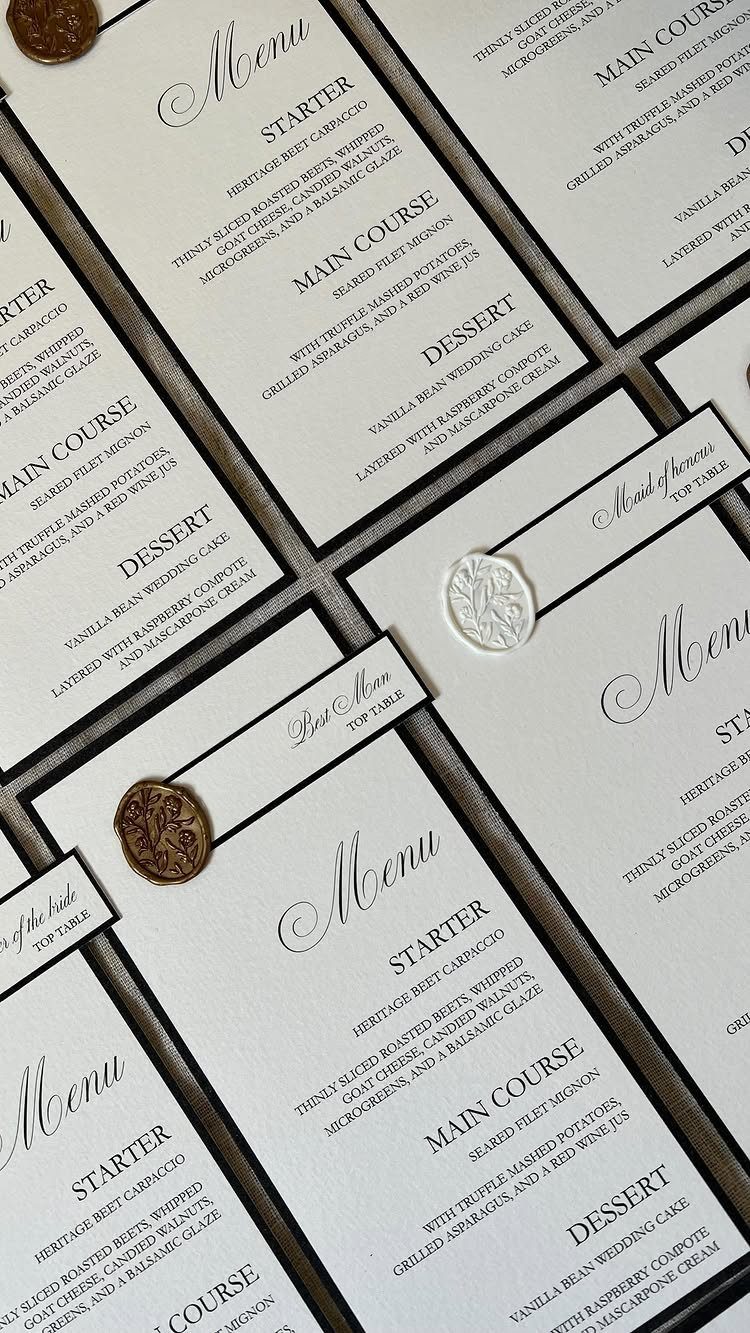
White cardstock with black text is the most legible menu you can print, and it photographs cleanly.
Wax seals are a nice touch but add a hand step to every menu. I would seal only a few, say for the head table, and leave the rest plain to save time and money.
A menu can also carry a short line of thanks to the people in your wedding party.
5. Place Cards
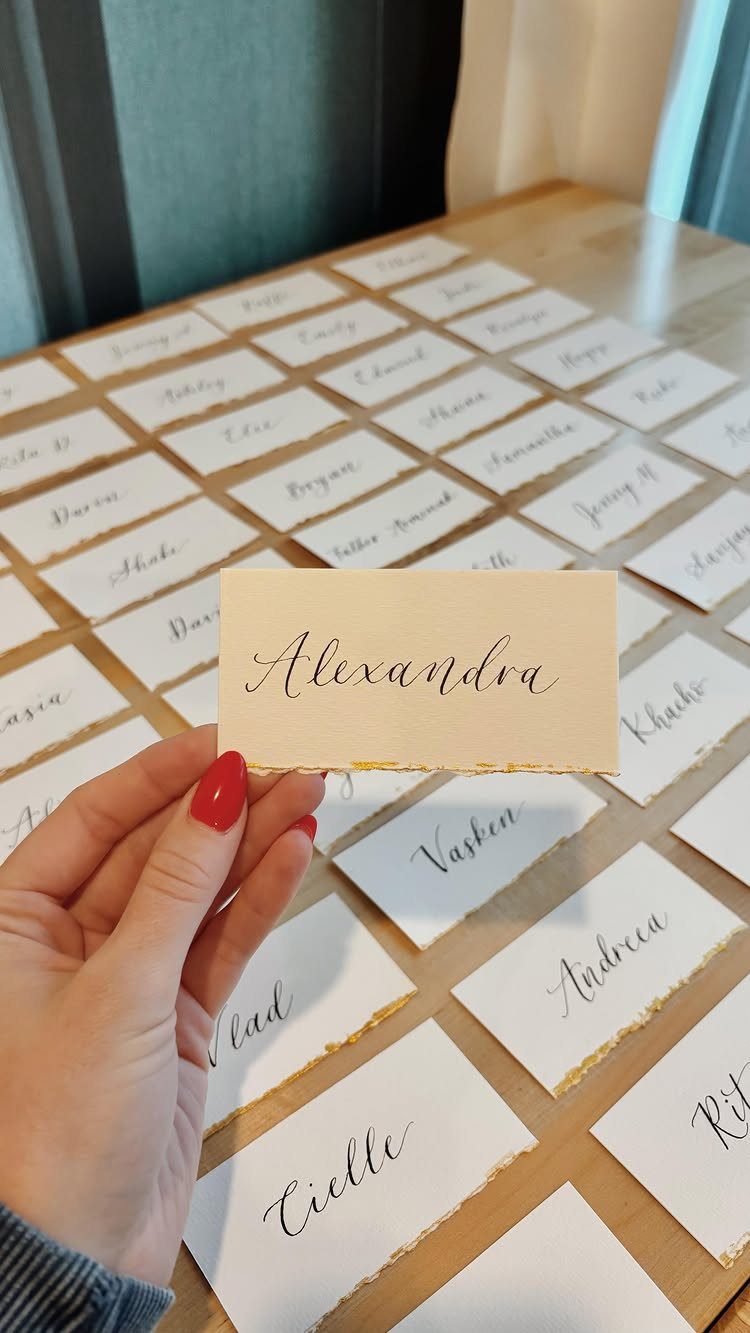
Handwritten place cards with a deckle edge feel personal in a way printed ones rarely do, and calligraphy in gold ink gives even a plain card some weight.
If your handwriting is neat, write them yourself; it costs only the cards and a good pen. Practice on scrap stock first, since a single smudge on the final card means starting over.
Write the names in one sitting so the letters look consistent. Spell each guest’s name the way they spell it.
6. Ceremony Programs
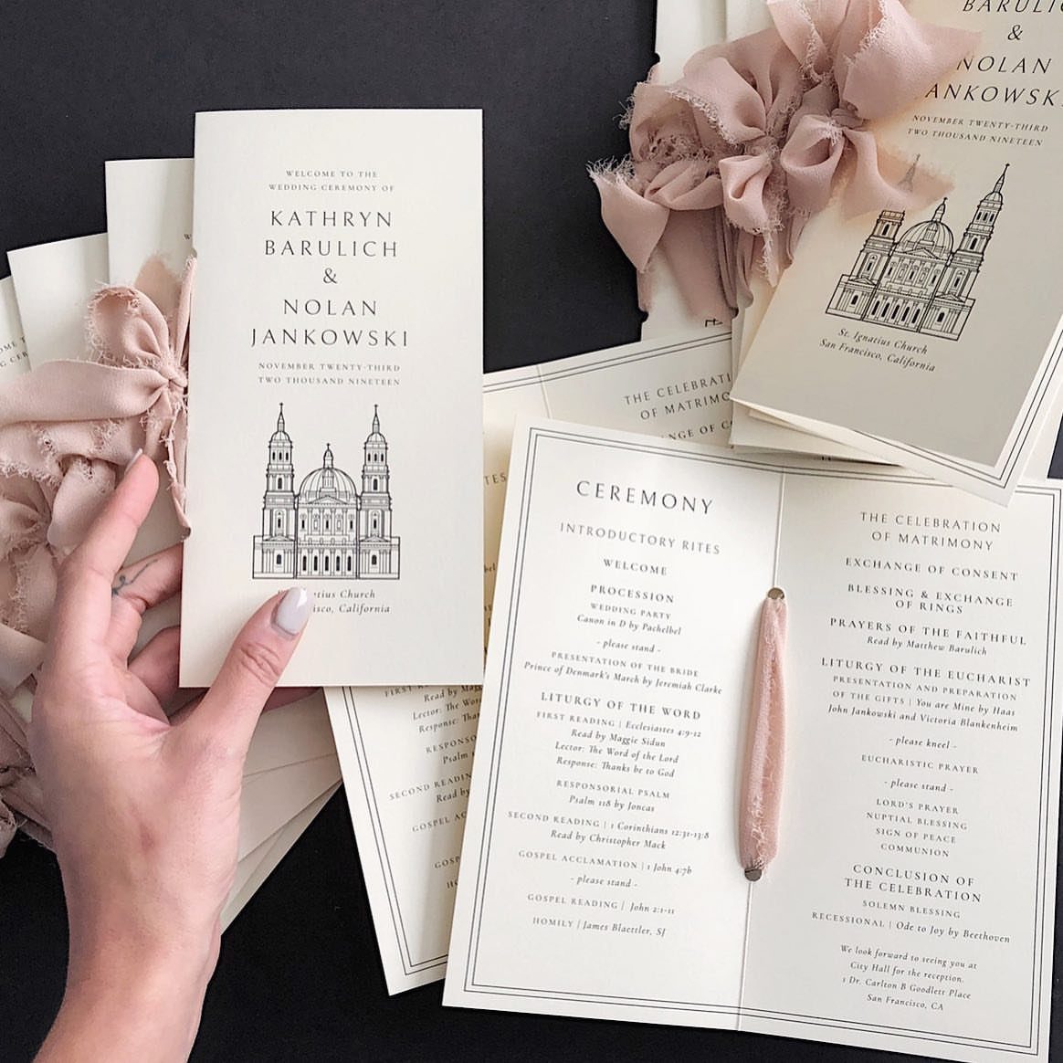
A ceremony program works best when it does one job: lay out the order of events so guests know what is coming.
An illustration of the venue, like the church on this one, gives the cover a personal anchor without extra text.
Names of the couple go on the front, the sequence of readings and music inside. I would keep it to a single folded sheet, which prints cheaply and is easy to match with your other paper.
A ribbon tie is optional, and it adds assembly time.
7. Welcome Signs
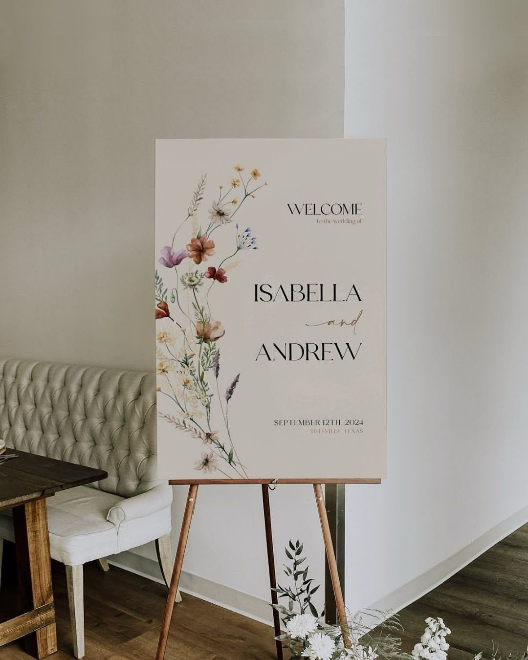
Florals painted or printed on a welcome sign set the tone before guests reach the first seat. Names, date and town are all this one needs, and I would keep the wording that lean.
An easel suits it well, since you can move the sign from the entrance to the reception afterward and get a second use out of the same piece.
Set it where guests slow down, near the door, and leave room for a few people to stop and read without blocking the line.
8. Itinerary Cards
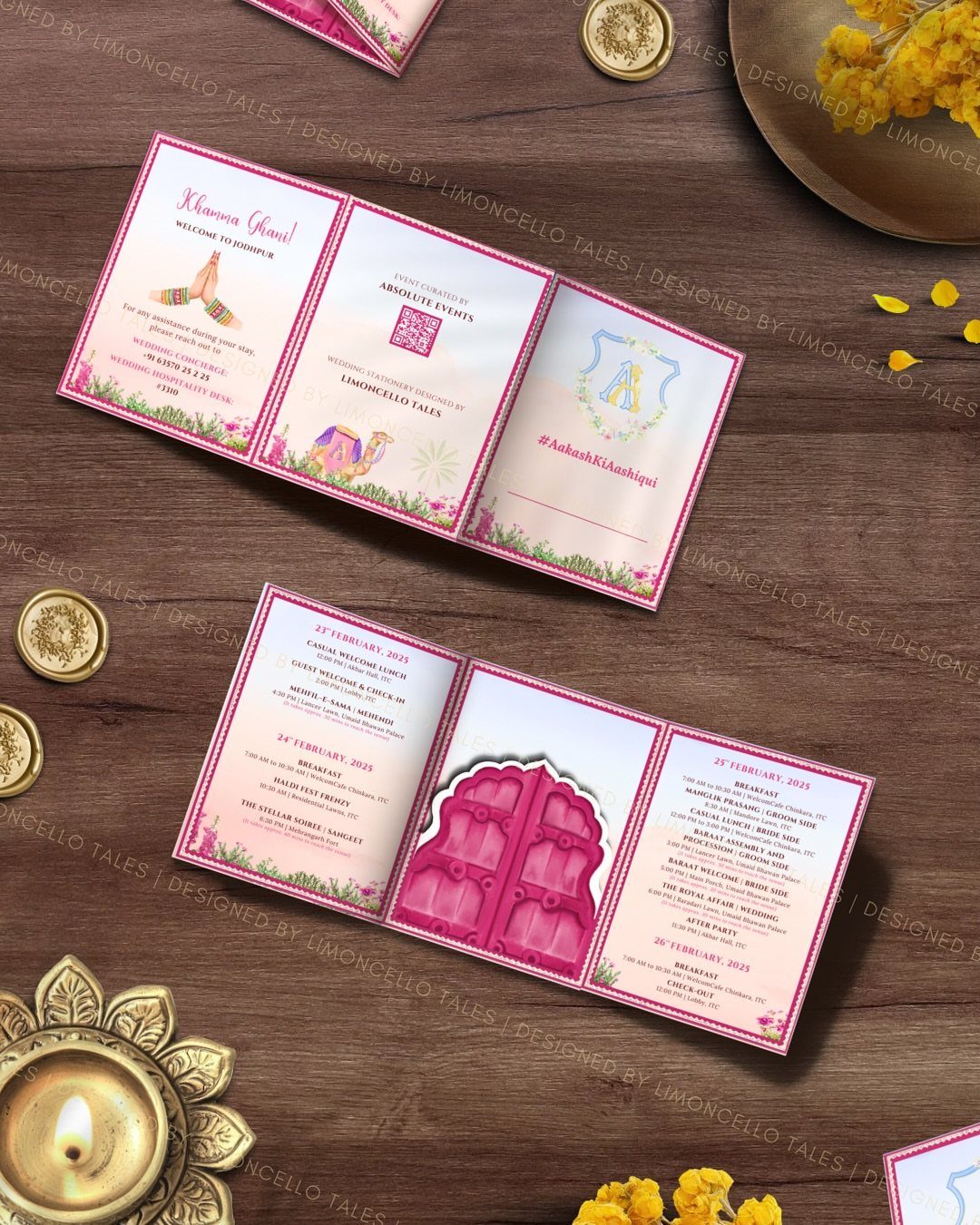
Itinerary cards work best when each line answers a question guests would otherwise text you about: what happens, and at what time.
Keep the date at the top of the card, written out in full as it would appear on the invitation, and list the events in order below it.
A short greeting in your family’s language, like "Khamma Ghani!" here, adds warmth at no cost in space.
Gold accents look rich but can crowd small type, so I would leave generous margins around the schedule and print a test card before ordering the full set.
9. Seating Charts
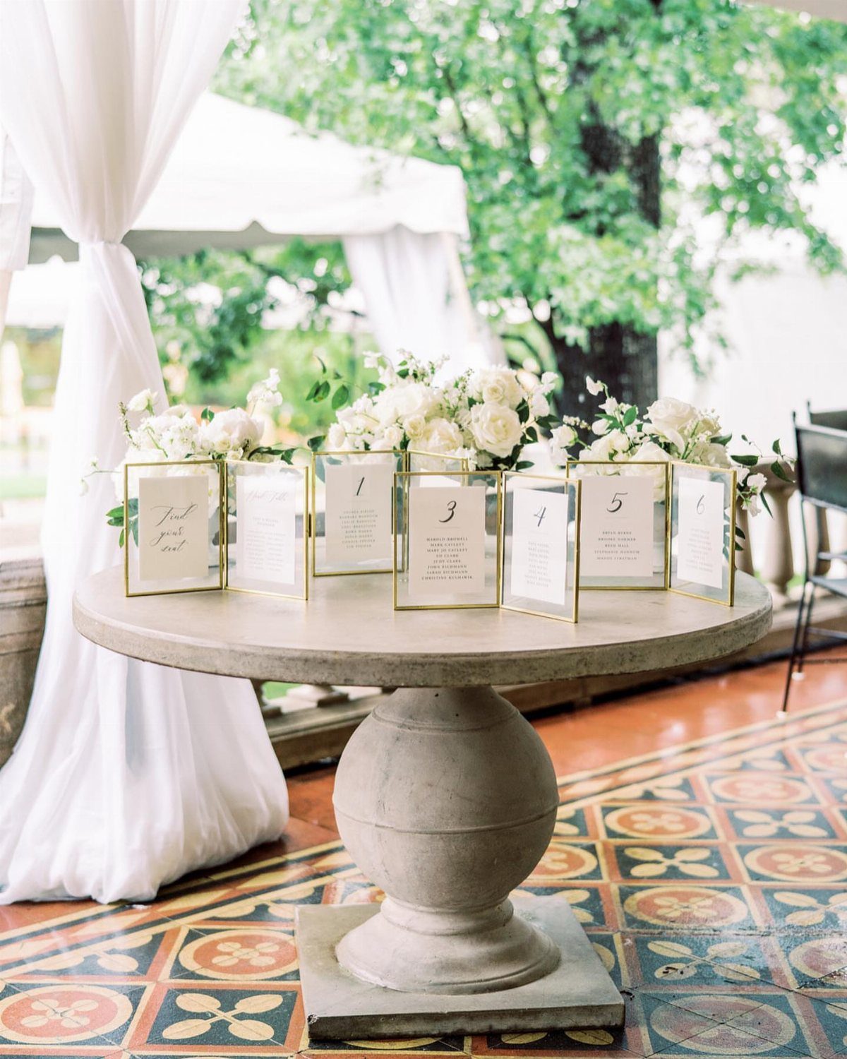
Gold frames turn a seating chart into a display piece, and a table number with names listed beneath it is easy to scan from a few feet away.
I like one frame per table, since guests can find their number quickly and the line never bunches up at a single board.
Alphabetize names within each frame, and double-check spellings against your RSVP list before printing.
Frames add cost with every table, so if the budget is tight, use one large board instead.
10. Wedding Stationery in Novelty Shapes
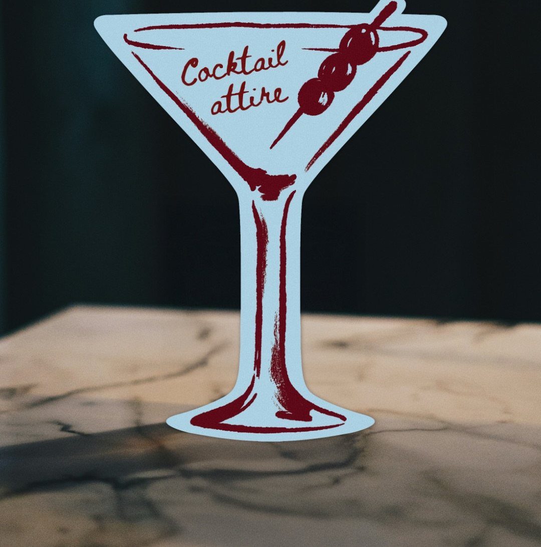
A die-cut card in the shape of a martini glass tells guests the dress code and the mood in one glance. Red outlines and olives keep it playful, and "Cocktail attire" fits neatly into a short line of text.
Custom shapes cost more than a standard rectangle, so I would use one for a single job, such as the dress code or a drinks menu, and keep the rest of your paper simple.
Pick a shape that matches something real at your party, so it reads as a cue and not a gimmick.
Customization Options
Most stationery can be changed in design, color and wording, so start with the palette and the wording you have already settled on and carry both through every piece.
Two colors and one typeface repeated across your paper will look planned, even if each item comes from a different place.
Before you pay for a custom tweak, check what the standard version already lets you edit. Text and color changes are often included, while new artwork usually costs extra.
Write out your final wording in one document first, with names, dates and venue spelled exactly as you want them. Pasting from one source avoids the small mismatches that creep in when you retype.
Ordering Timeline
Order day-of paper like programs, menus and signs about 4–8 weeks out, which leaves room for a reprint if something goes wrong. That window leaves room for a proof, production and shipping without a rush fee.
When proofing is part of your order, expect a digital proof in your inbox within 1–2 days.
After you sign off on the proof, printing typically takes 3–5 business days, and delivery adds more time depending on the shipping speed you choose. Choose the slower, cheaper method only if you have weeks to spare.
Place cards, table numbers, stickers and favor tags skip the proofing step, so a typo in the name or number is yours to catch before you hit order.
Read every name and number twice before you submit, and ask a second person to read them too.
Matching Stationery
Matching your ceremony and reception paper to your invitations is optional. You can order pieces from the same suite, or mix and match between different suites.
I would match the pieces guests see first, such as programs and menus, and mix freely on the small ones.
If you mix, repeat one element across suites: a color, a font or a border. That single link keeps a varied table from looking accidental.
Frequently Asked Questions
How far in advance should I order ceremony and reception stationery?
Programs, menus and signs can wait until about 4–8 weeks out, since that day-of paper is the last thing you need in hand.
That gives you time for a digital proof, which usually arrives within 1–2 days, then 3–5 business days of printing, plus shipping. A buffer like that gives you time to reprint if a proof comes back wrong or a box arrives damaged.
Should my ceremony and reception stationery match my invitations?
No, matching is optional.
Match whatever guests see first, usually programs and menus. If the rest comes from different suites, tie it together with one repeated color, font or border.
Do place cards and table numbers get a proof before printing?
No. Place cards, table numbers, stickers and favor tags skip the proofing step, so any typo in a name or number is yours to catch.
Read each one twice before ordering, then hand the list to someone else for a fresh pass.
How should I display wedding signs?
A welcome sign works best on an easel, because it can greet guests at the entrance and then move to the reception for a second turn.
Set it by the door, where people naturally slow down, and leave enough space that a small group can read it without stalling the line. Keep the wording lean: names, date and town.





