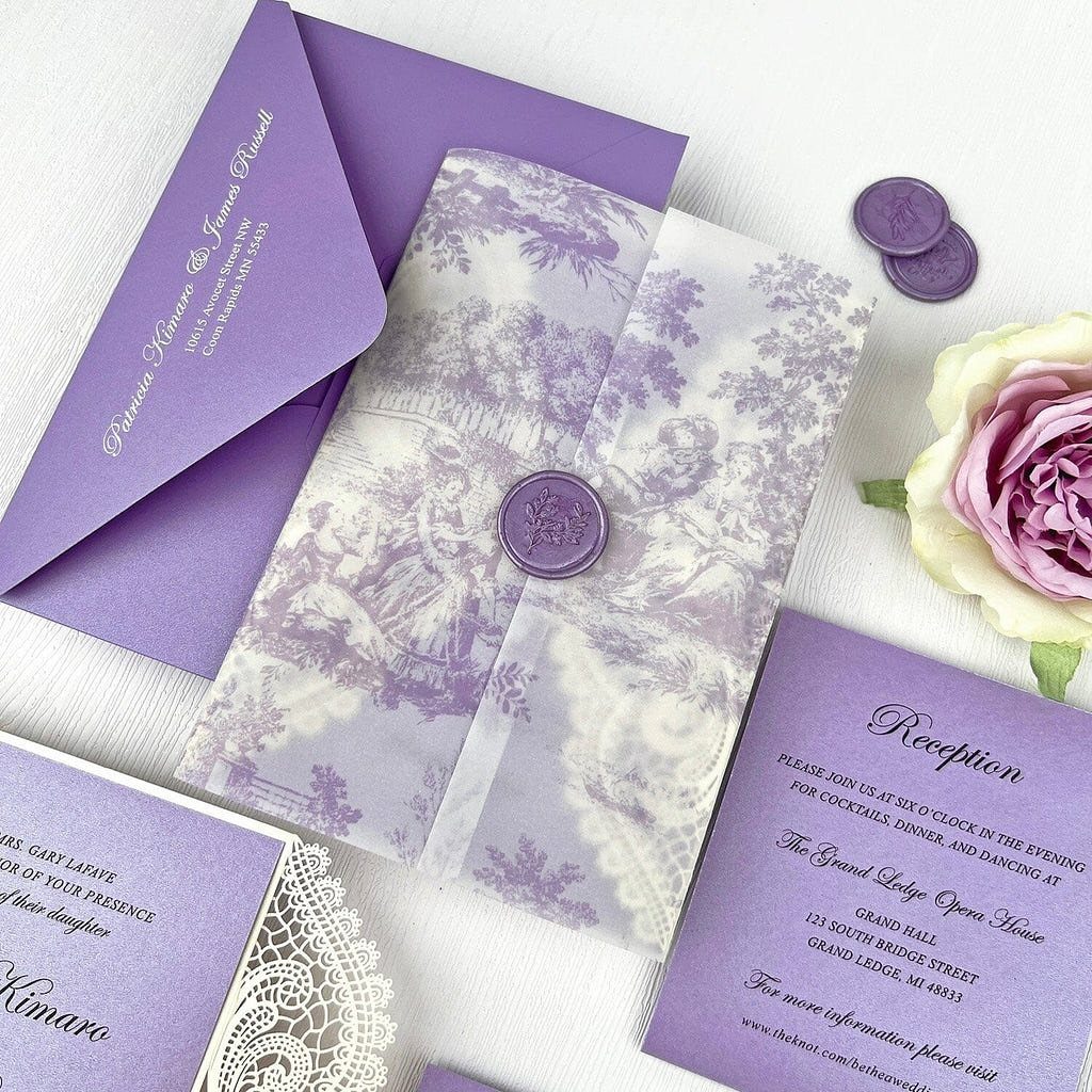
These ideas run from a printed floral card with a simple sealed closure to a fully laser-cut suite, with dried sprigs, vellum wraps and lavender envelopes in between.
Your budget decides which one is yours: laser-cut is the splurge, so on a small budget I would pick cardstock with a vellum overlay and spend the savings on a wax seal, the first thing a guest touches.
Elegant templates and printed florals get you most of the way for less, and a sage accent or a lavender envelope adds color without extra printing.
1. Lavender Floral Invitations
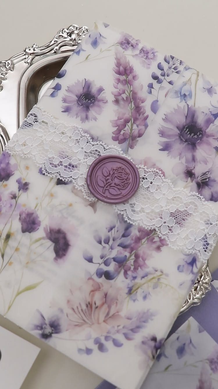
A floral lavender pattern does the decorating for you, so the rest of the suite can stay quiet.
Pair it with plain type and one extra layer, such as the lace band and wax seal here, rather than stacking three embellishments.
If you want the lace look on a budget, a printed floral card with a simple sealed closure gets you most of the way.
I would spend on the wax seal before anything else, since it is the first thing a guest touches.
2. Lavender and Sage Invitations
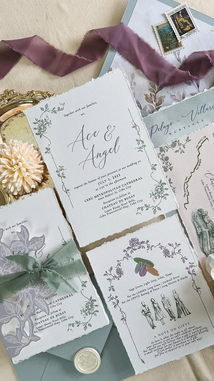
Sage is what keeps lavender from reading sweet. A purple floral card with a sage ribbon and sage envelope looks grown-up and a little garden-like, and it gives you a palette that carries easily into florals and table linens.
Keep one color dominant. I would let lavender lead on the card itself and use sage only for ribbon and envelope, so the pairing looks planned rather than split down the middle.
3. Laser-cut Invitations
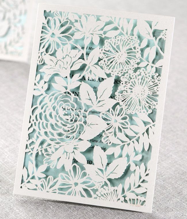
A laser-cut overlay lets the card underneath show through the pattern, so the color choice matters as much as the cutwork.
Lavender or pale blue stock behind a white floral cut gives you a soft, layered look without any extra printing.
Expect it to cost more than a flat card, and keep the text simple, because the cutouts already add plenty of detail.
Laser-cut is easiest to afford when you limit it to the invitation itself and print the rest of the suite flat.
4. Watercolor Lavender Invitations
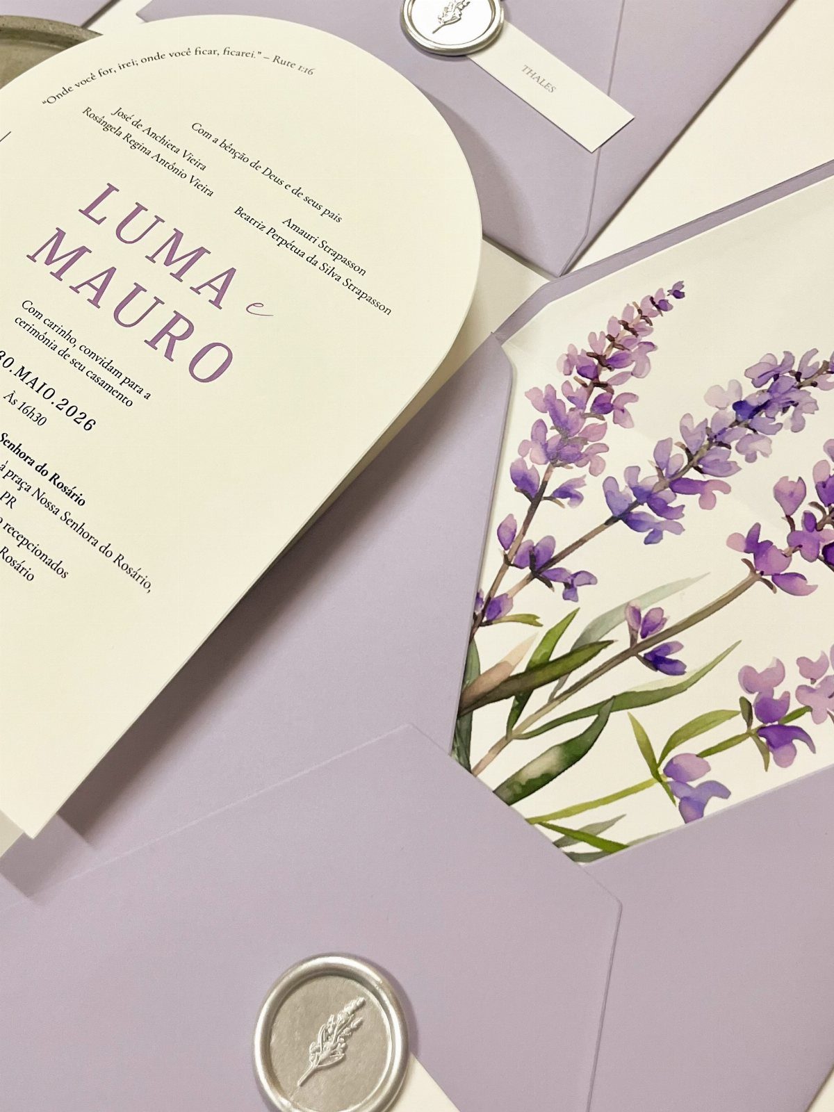
Watercolor lavender sprigs give a hand-painted softness that flat graphics rarely match.
Ask to see a printed sample before you order, because pale washes can look different on screen than on paper. Silver seals suit the cool tone of lavender better than gold, which is my preference here.
5. Lavender Envelopes
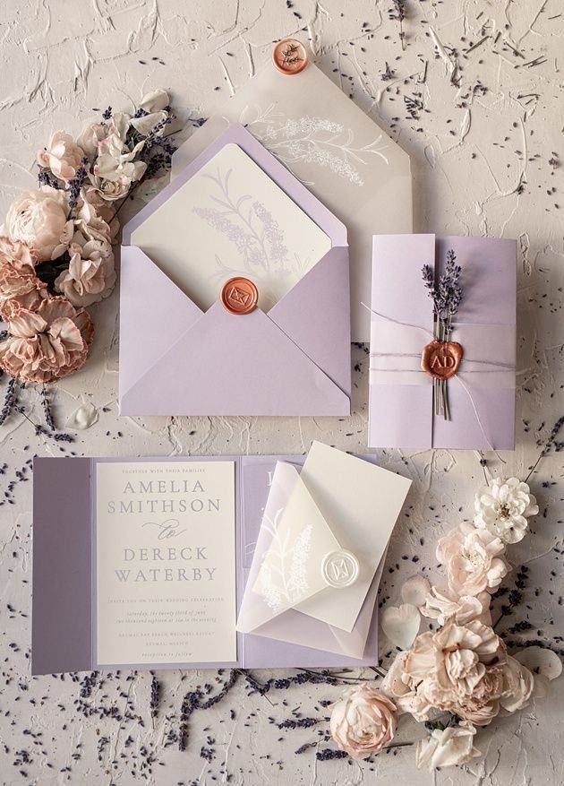
Color the envelope and the card inside can stay nearly plain. A lavender envelope is the first thing guests see, so it sets the mood before anyone reads a word.
White invitations inside lavender envelopes keep the text easy to read, and a wax seal adds a finishing touch.
Tuck in a dried sprig only if you are mailing nothing heavy, since a lump can catch in sorting machines. Handwritten or printed addresses both work on this shade, though dark ink reads best.
6. Vintage Lavender Invitations
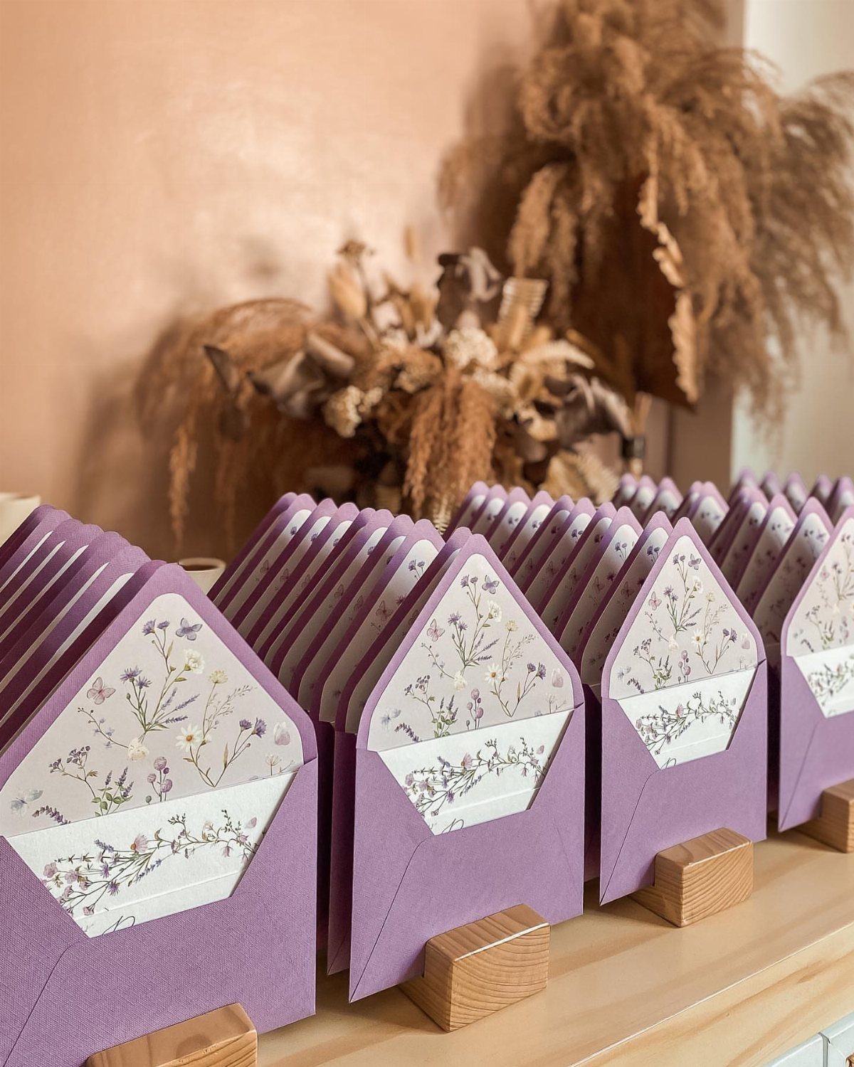
Vintage lavender is mostly an envelope story: a purple outer with a floral lining in a lavender print and a white liner behind it.
The lining is where the old-fashioned charm lives, and guests see it the second they open the flap.
Choose a small, repeating floral rather than a large bold one, which can look modern. A matching liner across the whole suite is an inexpensive way to make plain cards feel considered.
7. Rustic Lavender Invitations
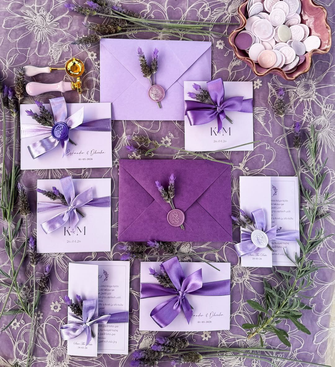
Dried lavender sprigs tied on with ribbon give rustic its look here, and the wax seal keeps it from feeling casual. The sprig does the work a printed flower would, so the card itself can stay simple.
Pick a ribbon in a tone close to the lavender, and let the purple card stock carry the color so the whole suite reads as one soft shade.
Lace layered underneath works well for a flat-lay or a mailer insert, though I would treat it as an extra rather than a requirement.
8. Elegant Lavender Wedding Invitation Templates
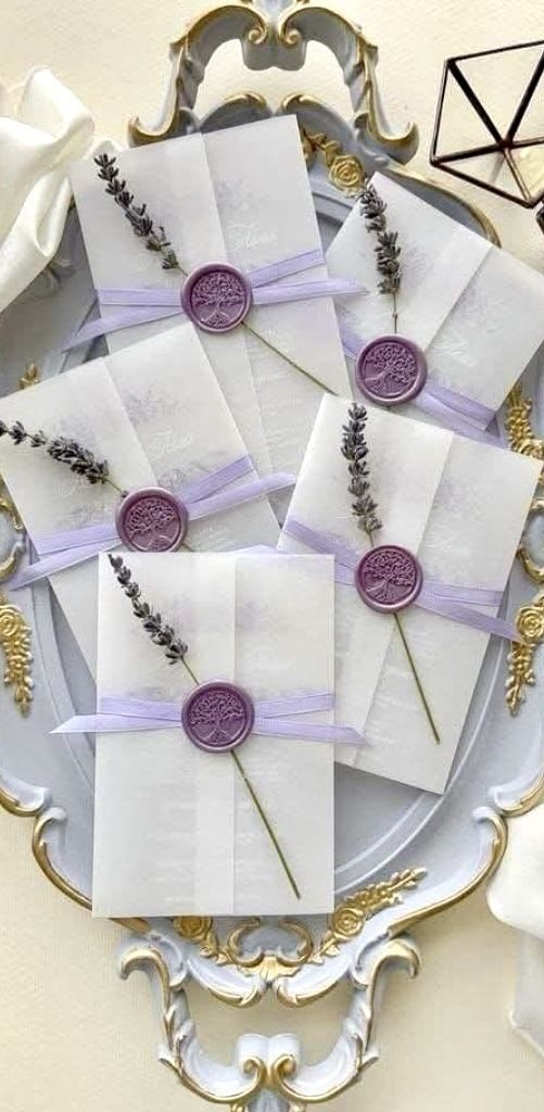
A template is the budget route to a look like this: you swap in your own details, and the card is done.
Choose one with plenty of white space, since the sealed envelope, ribbon and dried sprig already carry the decoration.
Add the wax seal and the lavender sprig yourself, and keep the ribbon purple to match.
Order a printed sample first and check that the lavender on the card agrees with your seals. Because a template costs less than custom design, the money saved can go toward real seals.
Materials for Invitations
Cardstock is the workhorse, and white is the safest base for purple artwork because it keeps the lavender looking clean. Printed florals along the borders or in the corners work well, and the same card can carry a matching RSVP.
A vellum wrap, sometimes sold as a belly band, is the cheapest way to add a second layer. It holds the suite together, and purple floral accents on the vellum tie it to the card without extra printing.
Laser-cut is the splurge. On a small budget, I would pick cardstock with a vellum overlay over a fully cut suite.
For type, a black serif paired with a script is easy to read against pale purple.
Choosing Colors for Invitations
Sage and navy are the pairings to start with. Dusty blue also sits well beside lavender, and it gives a softer, more romantic palette than navy does.
Using dark text, such as charcoal or deep plum, on a soft lavender background keeps the text readable and the color obvious.
Order the save-the-date and RSVP in the same lavender tone as the invitation. When pieces come from different shops, the purples can drift, so match them against a printed sample before you place the full order.
Personalization Options
Names and event details are the basics, and nearly any suite lets you change them. Proof every line twice, especially dates, times and spellings, because a reprint costs far more than a careful read.
A short personal message is worth the space. A single line from you both on the card or a small insert feels more personal than extra decoration.
Keep it brief, though. If the wording runs long, the design and the lavender color lose their room, so trim the message before you shrink the type.





