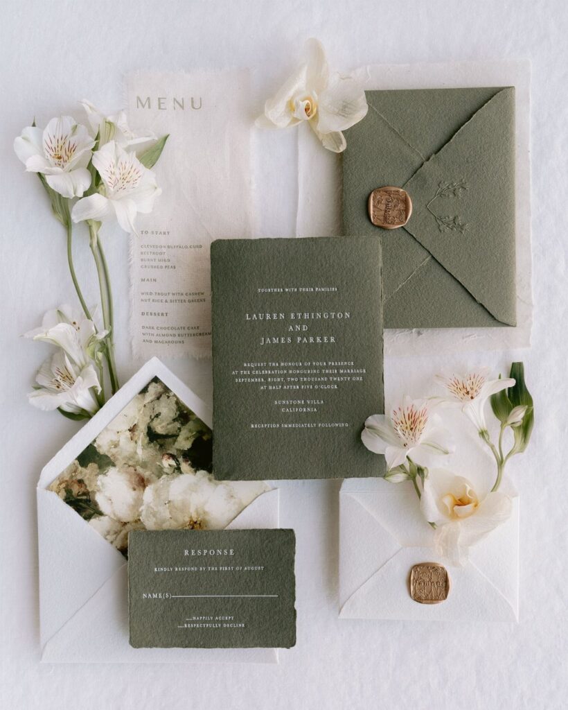
These ideas run from timeless invitations and complete suites to lace trim, satin ribbon, gold foil and transparent acrylic, and the price climbs with every material and embellishment you add.
Your budget decides where you land: a small one does best with simple paper and one splurge, such as acrylic for the invitation itself while the response card stays on plain stock.
Even a single metallic touch, like the gold foil on a sage green envelope, changes both the look and the cost of a suite.
1. Timeless Invitations
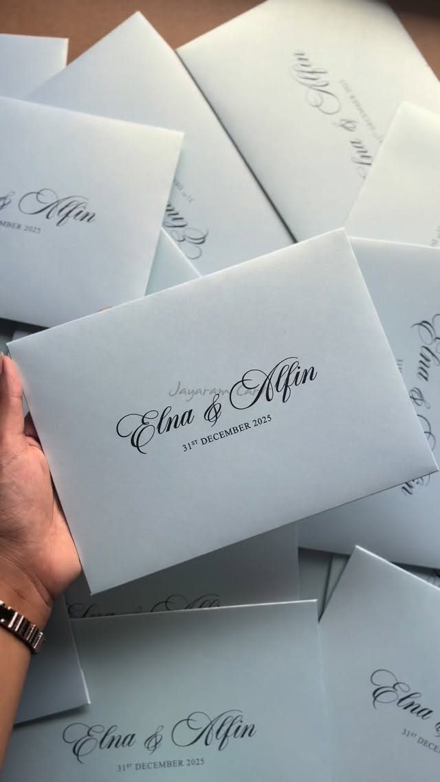
Black script on plain white card is the safest elegant choice, and it earns that reputation. With no color, texture or trim to carry the look, the lettering does all the work, so spend your attention there.
Pick a calligraphy-style font with clear contrast between thick and thin strokes, and keep names and date as the largest lines.
A date spelled out in full, with the day, month and year given in a formal order, reads more formal than a string of numerals like 12/31/25.
It also costs less than foil, lace or ribbon, which leaves room in a small budget for better paper.
2. Complete Suites
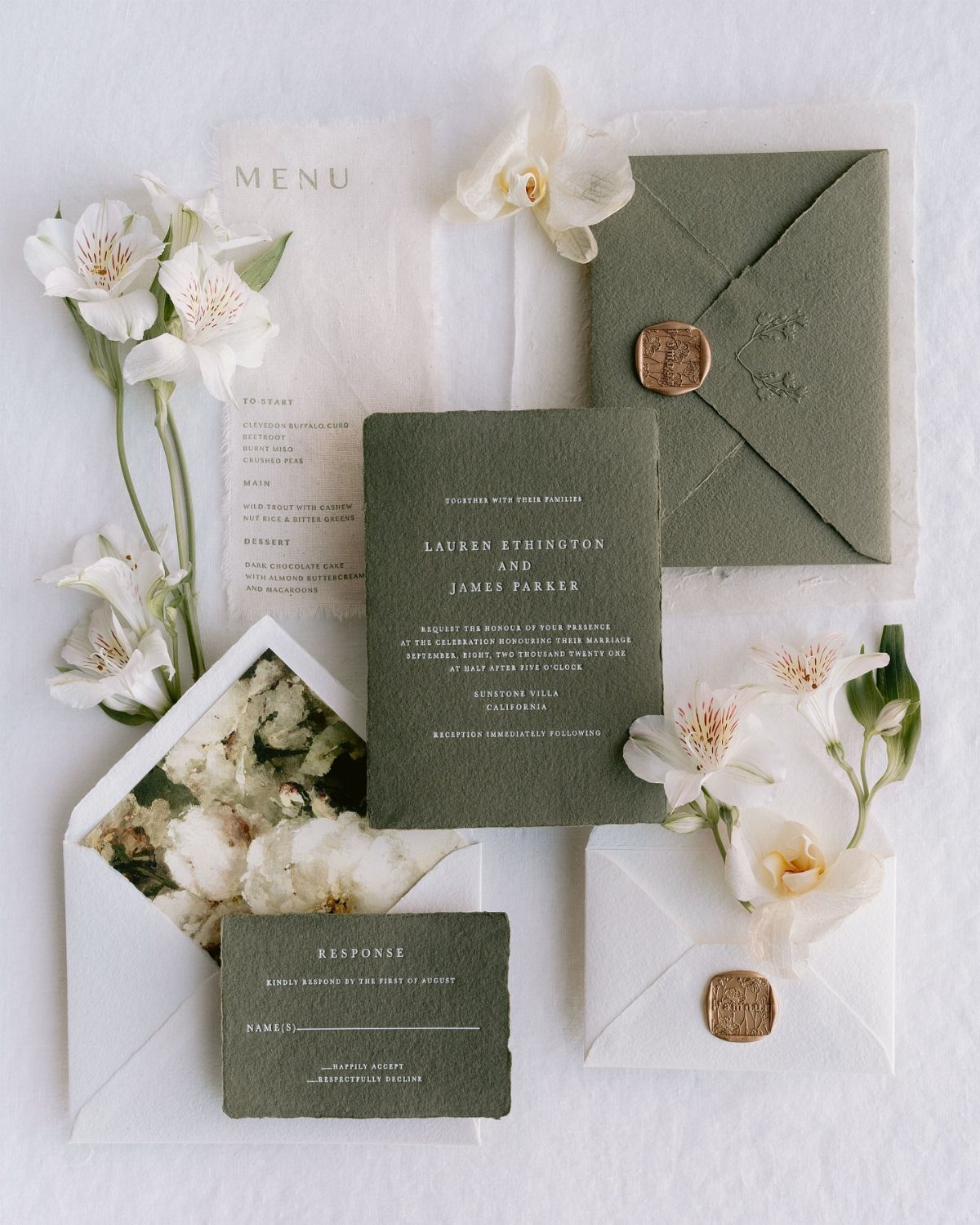
A suite means the invitation, response card and menu all share one color, one font and one decorative motif, so a guest sees a single design rather than loose pieces.
For a modest budget, I would limit the suite to what guests truly use: invitation, response card, and a menu at the table. Each extra piece adds printing and postage.
A narrow palette is what makes an olive green suite work: stick to olive, white florals and wax seals, and every piece will look like it belongs.
Choose 2 colors, repeat them on every piece, and the set looks planned even when the pieces are simple.
3. High-Quality Materials
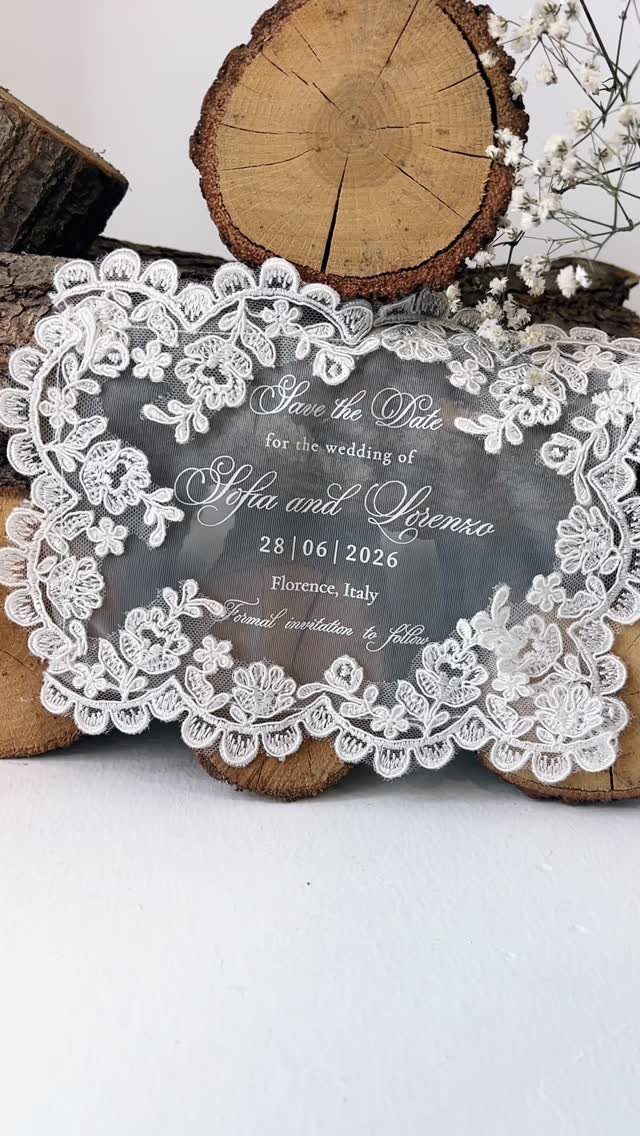
Material alone can make a small card feel special, and lace borders, acrylic and wood are 3 ways to do it. Acrylic is the unusual choice here, since most people expect paper.
I like the lace edge for softness against the hard, clear surface. Keep the text short, with names, date and city, because a see-through card with a crowded layout gets hard to read.
Premium materials do cost more than standard cardstock, so use them on one piece, such as the save the date, rather than the whole suite.
4. Elegant Embellishments
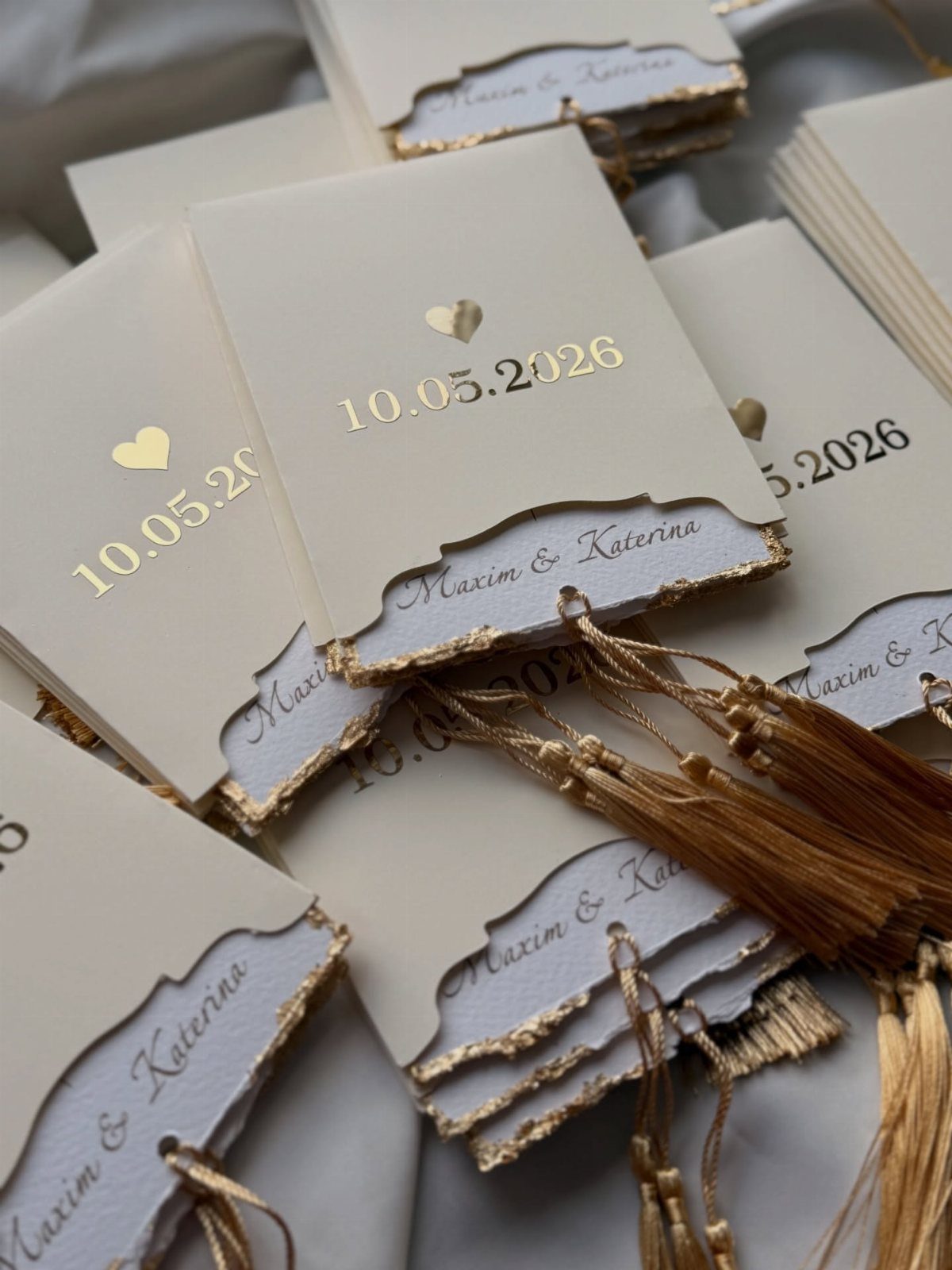
Gold foil, deckled edges and tassels each add a different kind of finish, and I would pick two of the three rather than stack them all. Foil on the lettering gives shine; a deckled edge gives a soft, handmade border.
Tassels are the most optional. They look lovely on cream paper, though they add handling time when you assemble the invitations yourself.
Keep the foil to the key text so the layout stays calm and readable.
5. Sage Green and Gold Foil Envelope
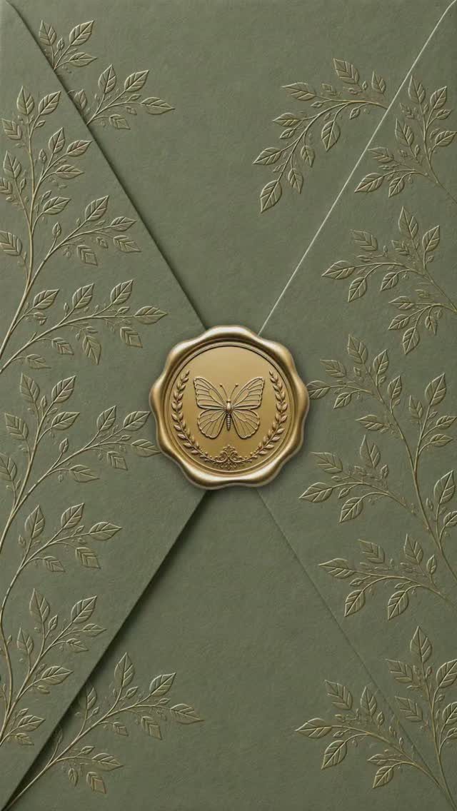
Sage green paired with gold is a quieter combination than white and gold, and an envelope is the place to use it.
Guests see the envelope before anything else, so a foil botanical pattern sets the tone before the card is opened.
A wax seal with a butterfly adds a second metallic touch. Keep the gold on just the pattern and the seal, and let the green stay plain everywhere else.
Foil stamping and wax seals both add cost and assembly time, so order extra envelopes for mistakes.
6. Lace Trim and Satin Ribbon
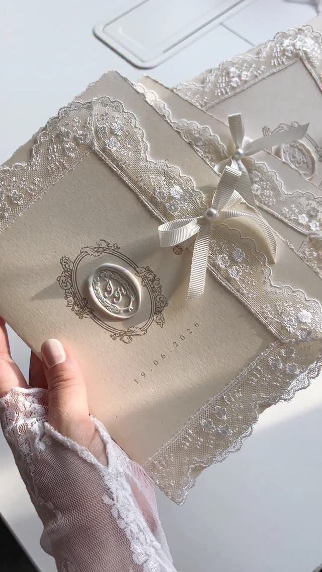
Lace trim, a satin bow and a monogram wax seal turn a cream invitation into something guests will want to hold. Soft, tactile details suit a traditional, romantic wedding.
If you make these yourself, attach the lace and tie the bow before pressing the seal, so the seal sits cleanly on top. Monogram initials work best when the design is simple.
Trim thickness can make the invitation bulky, so have the finished piece weighed at the post office before you buy stamps for all of them.
7. Transparent Acrylic with Gold Calligraphy
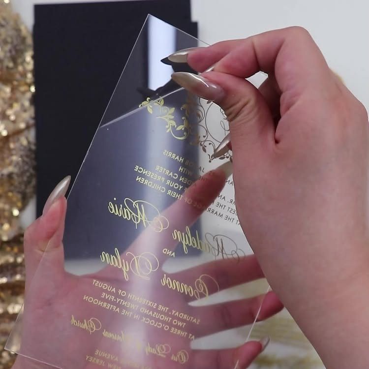
Gold cursive on clear acrylic gives a see-through card real presence, and the lettering is what guests will read, so it has to hold up against whatever sits behind it.
Gold is bright on a dark surface and fades on a pale one, so test a sample card over a white envelope or a black folder before placing the full run.
Choose one ornate script for names and date, and set the rest in a plain, small type. Ornate flourishes plus a crowded layout will blur together on a transparent surface.
Acrylic costs more than cardstock, as entry 3 says, so I would make it the invitation itself and keep the response card on simple paper.
Stress-Free Ordering
Proofs are where most invitation mistakes get caught, so treat the proof stage as the main reason to pick a service.
A professionally designed proof shows your layout, fonts and spacing before anything prints, and a designer you can reach by live chat, email or phone can fix a problem the same day.
Check every name, the date and the venue spelling on the proof, then have a second person read it. Once the run is printed, a typo costs you the whole order.
Ask whether inner and outer envelopes and guest addressing are included. Full addressing saves hours of handwriting, and it keeps the formal look consistent.
Compare that against software you operate yourself. Do-it-yourself tools cost less up front, but you carry all the layout decisions alone.
Expert Guidance
A designer is worth the most when you are unsure about etiquette.
Bring your guest list and your wording questions to the first conversation, such as how to address couples, whether to use inner envelopes, and how formal the phrasing should be.
Ask what is customizable before you commit. Wording, fonts, layout, foil color, paper type and matching RSVP cards, detail inserts and envelope liners are all common options, and each one changes the price.
Say your budget up front, in a number. A good designer will show you where to spend, such as on paper, and where to save.
Showcasing Love Stories
If you hope to have your wedding published on a blog or social account, the invitation is often the first image a stylist or editor sees.
Photograph the full suite flat, in natural daylight, on a plain surface, and include the envelope, liner and any inserts.
Do that before mailing, since you will not get the pieces back afterward. Order one or two extra complete sets for this purpose.
Submissions go better when the photographer’s images and your stationery share the same colors. Send both together, with the paper type and printing method noted.
Publication is never guaranteed, so do not pay for a luxury upgrade on that hope alone.
Frequently Asked Questions
What styles of wedding invitations are available?
Styles run from classic black script on white card to olive green suites, sage and gold foil, lace and satin ribbon, and clear acrylic with gold lettering.
The notes from other pages also mention vintage, modern, floral and rustic looks. For a small budget I would start with the plain black-on-white option, since the lettering carries the design and it costs less than foil, lace or ribbon.
How can I personalize my wedding invitations?
Wording, fonts, layout, foil color, paper type, matching RSVP cards, detail inserts and envelope liners can usually all be customized. A designer can adjust each of these, but every option changes the price.
Give your designer a firm budget figure at the start; a good one will point out which line deserves the money, usually paper, and which can be trimmed.





