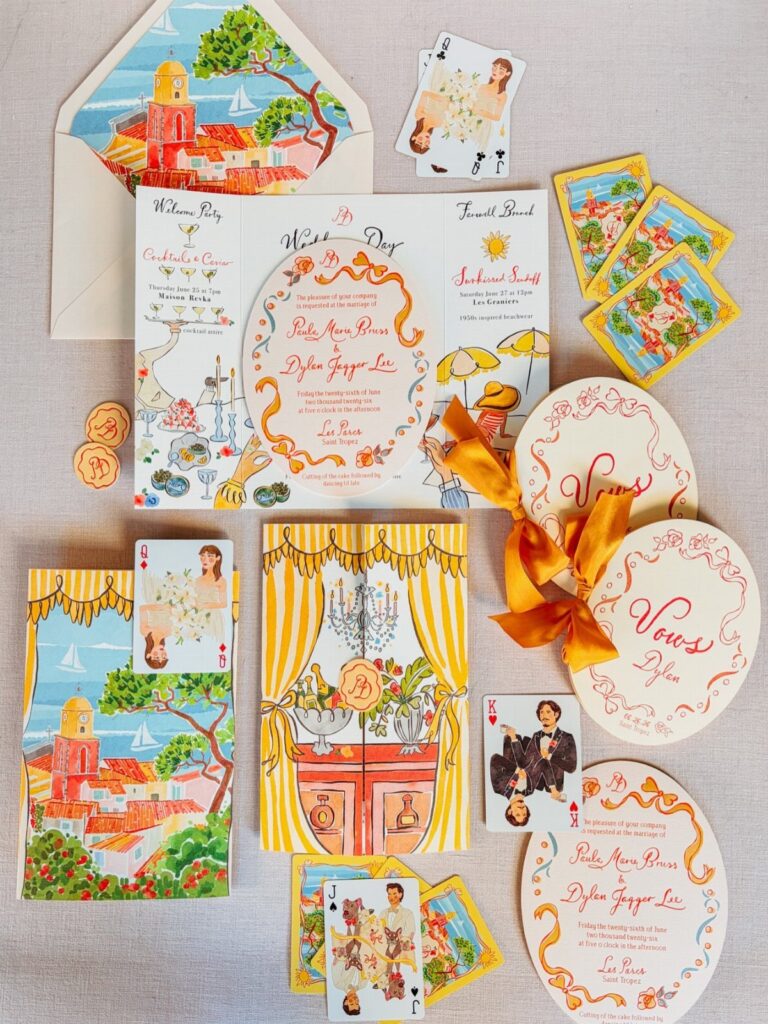
The ideas here run from Art Deco and Vintage Glam to Rustic and Modern Vintage, and the real difference between them is where the money goes: foil, a special trim or custom illustration.
Your budget decides which one is yours, so pick the single element worth paying for and keep every other piece in plain type.
Playing cards with illustrated portraits and a leaf-shaped cut-out both cost more than a flat rectangle, which is why I would price them before falling for the look.
1. Art Deco Wedding Invitations
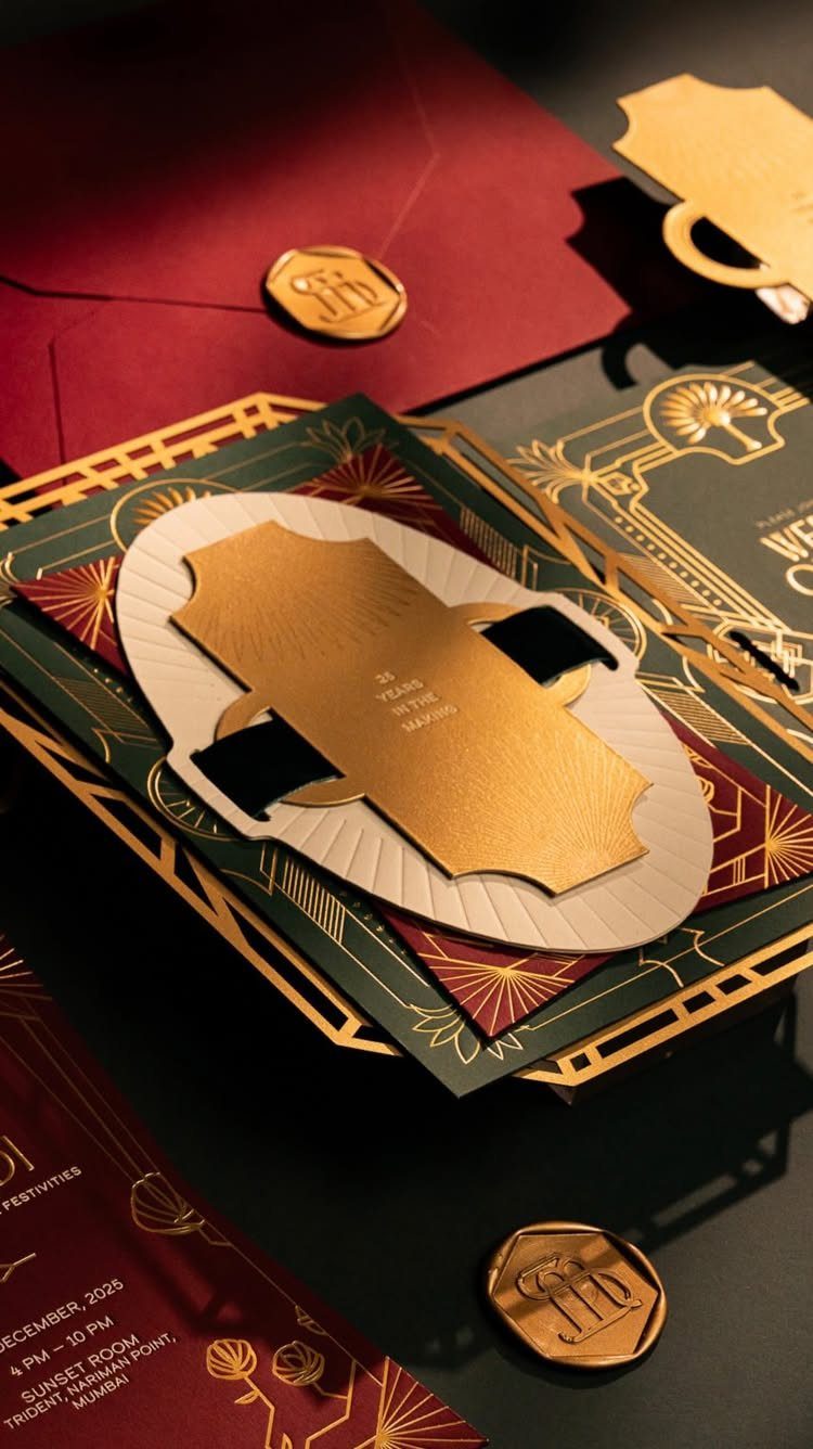
Gold geometric linework on deep green and burgundy is the whole Art Deco idea, and it works because the palette does the heavy lifting. Dark paper with metallic ink reads as formal before anyone reads a word.
Foil on every card adds up fast across an invitation, RSVP and details card.
A short, punchy line suits the style, something like a tagline that reads as a headline rather than a sentence. Keep the rest of the wording plain so the pattern gets room.
2. Matching Wedding Stationery Suite
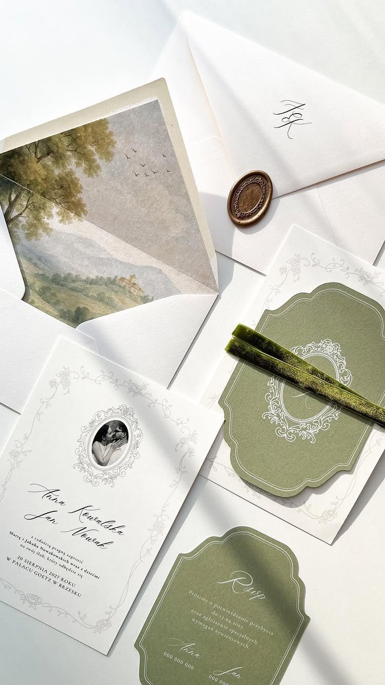
A matching suite means the invitation, RSVP card, envelope and liner all share one palette and one border, so the mailing arrives looking like a single object.
Decide the suite before you order, not piece by piece. Cards bought separately rarely match in paper tone, and that mismatch shows up next to each other.
If money is tight, I would spend on the envelope liner and the seal, then print the RSVP card on the same stock as the invitation. Those 2 touches make the set feel finished.
3. Nature-focused Vintage Invitations
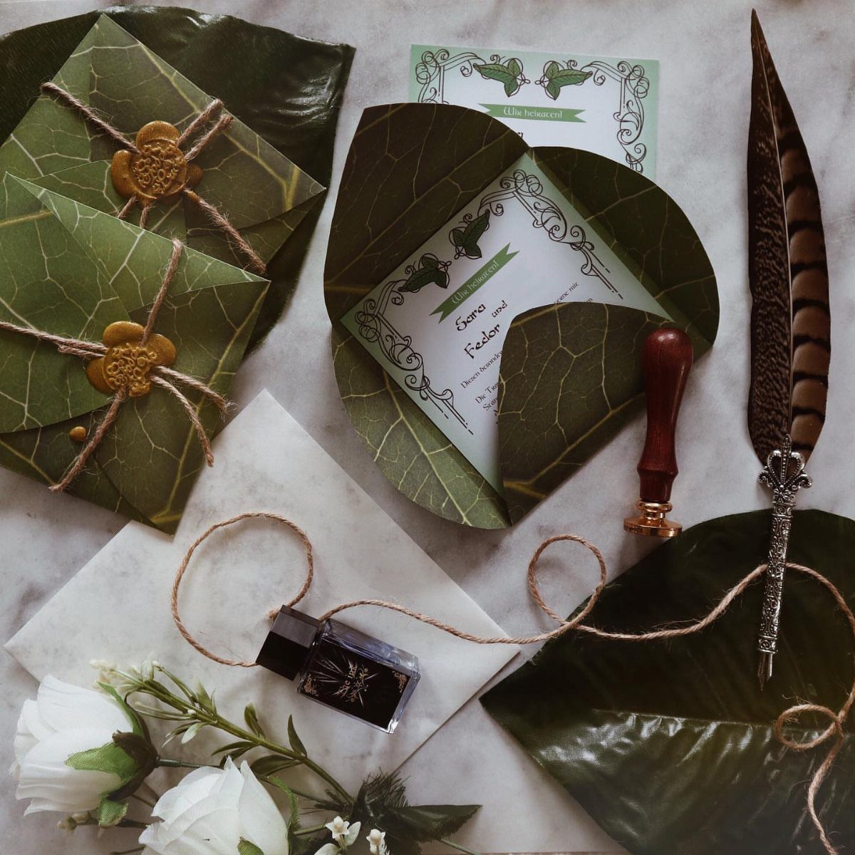
Leaf-shaped cards are the clearest way to bring nature into a vintage invitation, since the shape itself carries the theme instead of a printed sprig in the corner.
Pair them with a gold wax seal and keep the text brief, because a cut-out shape leaves less room for text than a rectangle.
Put the names and date on the leaf and move everything else to a separate details card.
A quill and ink bottle are lovely for a flat-lay, but they are props, not stationery. Use them for your photos if you like.
4. Vintage Glam Invitations
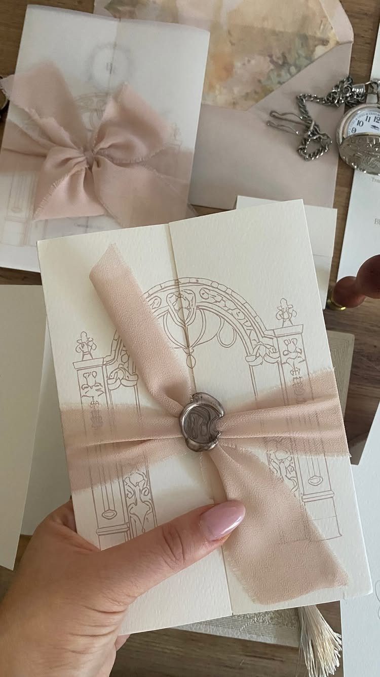
The shine comes from the seal, so the card itself can stay quiet.
I like this version because the ribbon and seal are small purchases that look expensive. Silver against blush feels softer than the usual gold.
Keep the line drawing to one illustration. Ornate art plus ornate lettering gets crowded fast, so choose a simple typeface for the wording.
5. Rustic Vintage Invitations
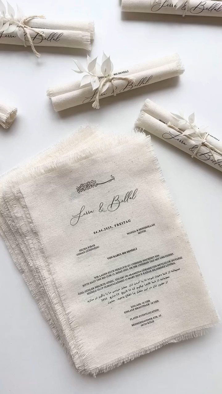
The raw edge is the design, so it costs nothing extra to leave it unfinished.
Rolling means the text has to be short: names, date and one line. Send location and schedule on a separate paper card tucked in or posted online.
Test one rolled invitation in its mailing envelope before you order the full batch.
6. Modern Vintage Invitations
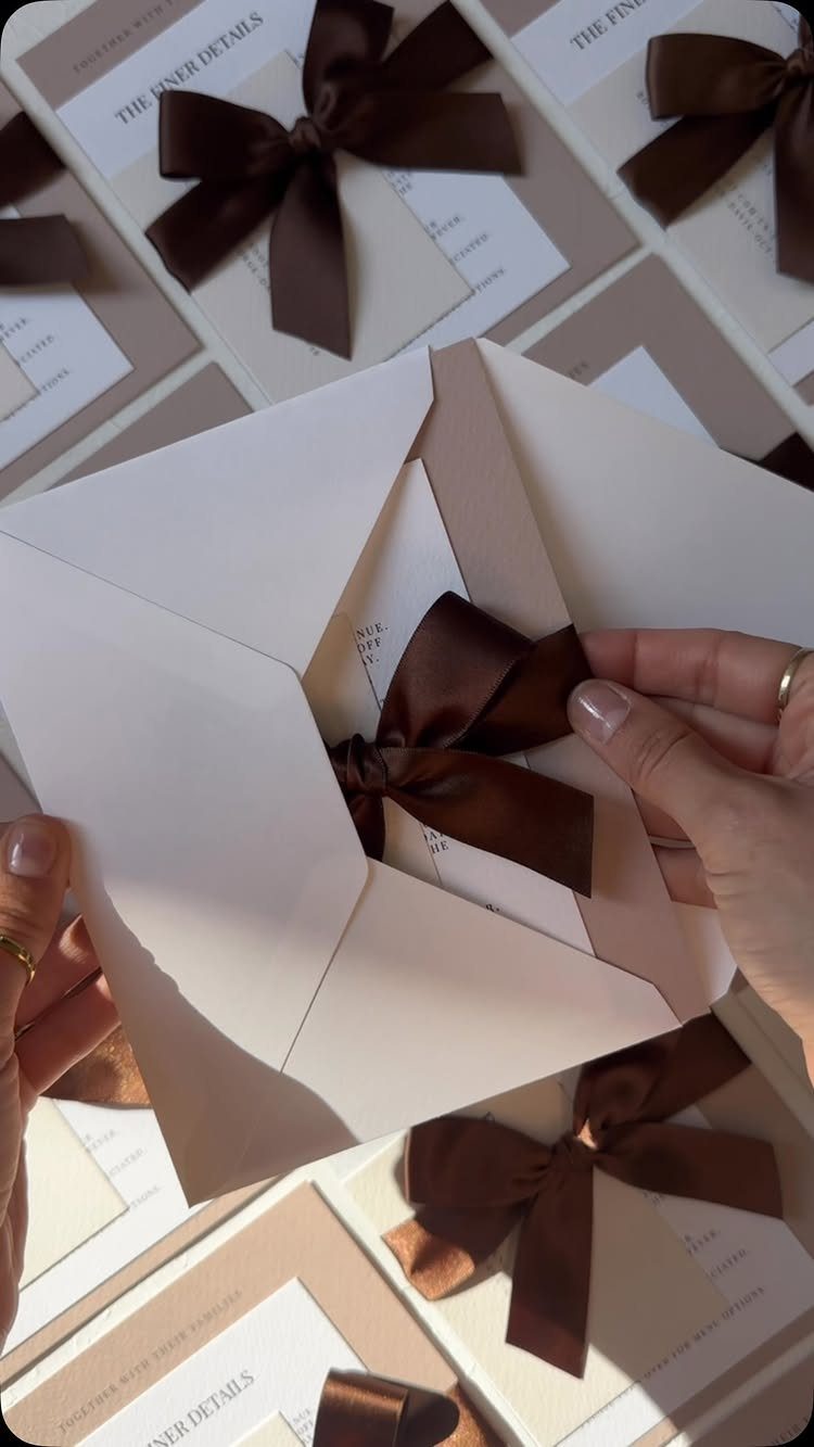
Cream card, a brown satin bow and restrained type: modern vintage keeps the old-fashioned materials and drops the ornament. Headings like "The Finer Details" give the extra cards a clean, editorial feel.
This suits couples who like vintage but worry it will look costumed. Ribbon does the nostalgic work, so the layout can stay simple and spacious.
I would pick one ribbon color and use it on every piece in the suite.
7. Playful Retro Cocktail Theme
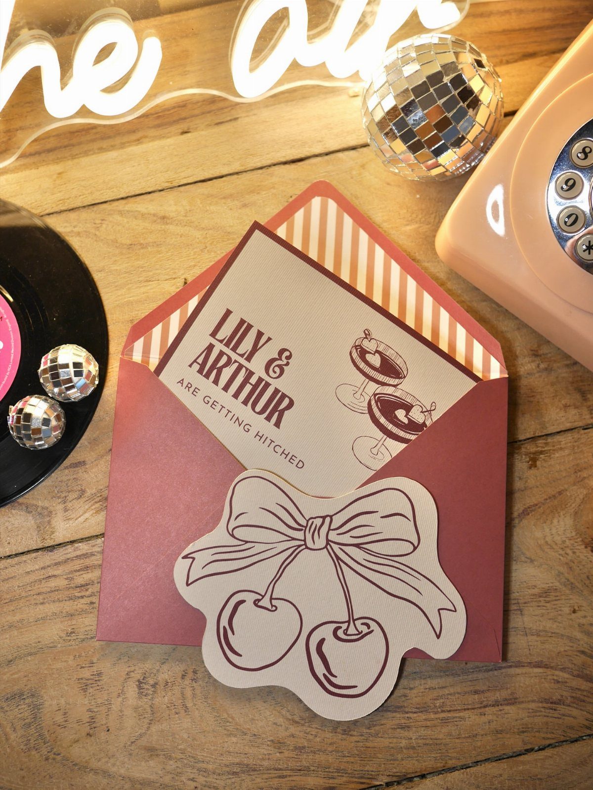
Cocktail glasses drawn in loose line work do the joking so the wording doesn’t have to. Cream stock keeps the drawings crisp, and maroon retro lettering gives the humor a vintage accent.
The striped envelope is where this suite earns its personality, and a cherry-shaped seal finishes it for little money. I would put the budget there and keep the card itself uncomplicated.
Stick to one illustration style across every piece. If the glasses are line-drawn on the invitation, a details card with a photo or a heavy script will fight them.
Friendly, short copy works best here, because the drawings already set the tone and long lines would crowd them.
8. Illustrated Playing Card Stationery
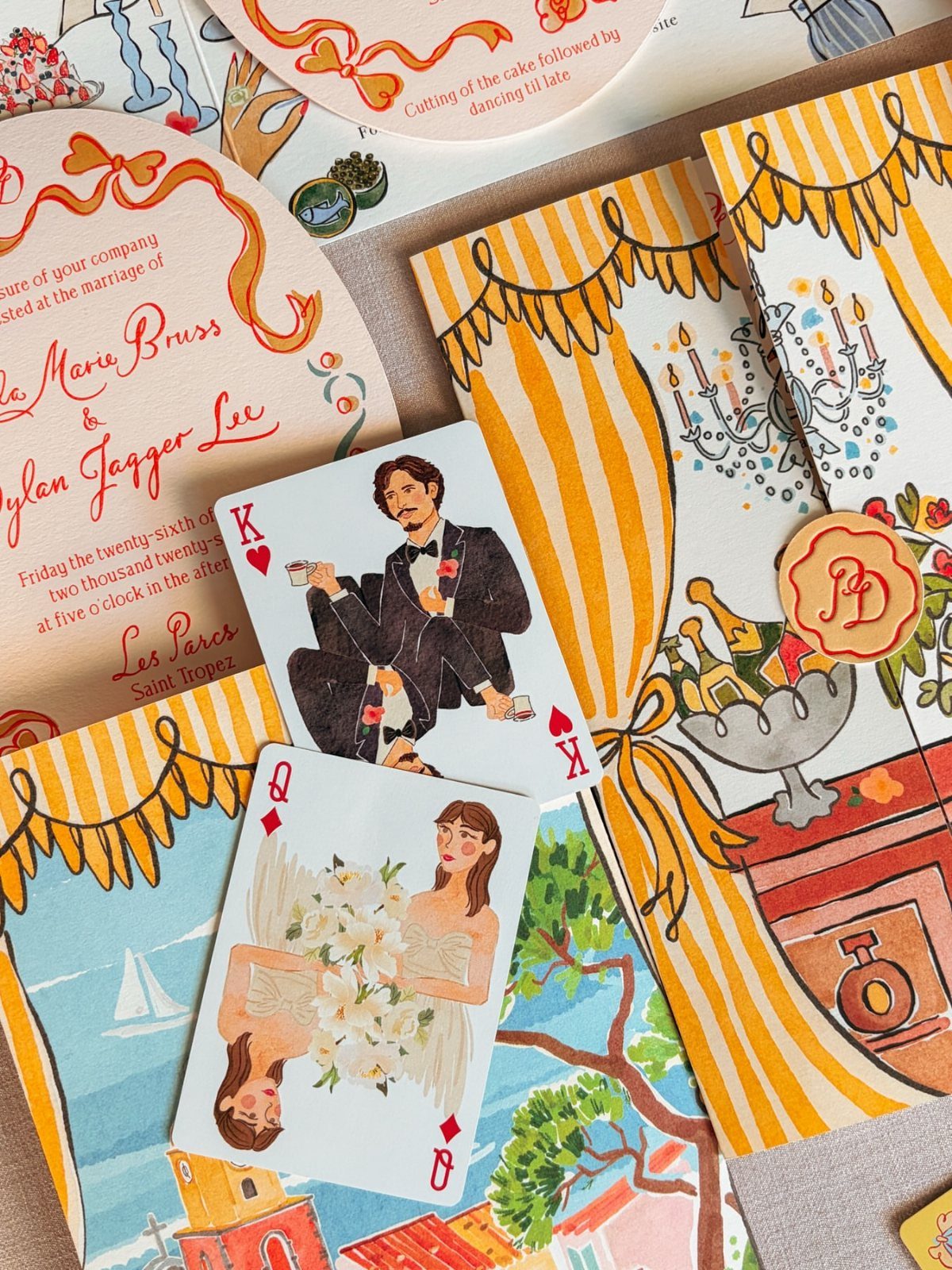
Playing cards turn the couple into the stationery: a custom deck with illustrated portraits of the two of you, in colorful vintage drawings, doubles as an invitation insert and a keepsake.
Pair the cards with curved invitations and one retro typeface, so the drawings carry the color and the lettering stays steady.
A destination name such as Saint Tropez fits neatly on a card, which makes the deck a good home for the location.
Custom cards and a curved cut both cost more than a flat rectangle, so I would ask for quotes on each before committing to the full set.
On a small budget, spend on the illustrated cards for the invitation alone and print everything else in plain type.
Customization Options
Fonts, colors and card trim are the three things most online printers let you change, so start with the one that shapes the look most.
Trim is the easiest to overlook: bracket, scallop and ticket edges can be swapped without touching the artwork.
Change fonts and colors before you add anything else. Then order a printed sample or proof, because a color on a screen can print softer or darker than you expect.
Editors with an online preview let you see the layout before it prints, which saves a designer’s fee. Use it, but check spelling and the date twice.
Characteristics of Vintage Invitations
4 ingredients make a card read as vintage: faded, muted colors, a typeface from a past era, ornaments borrowed from old printed pieces, and a print method you can feel under your thumb.
If you can only get two right, pick the palette and the typeface.
Ivory, sepia and faded gold read as old without any extra decoration. A flowing script looks best on a quiet background of cream, ivory or dusty taupe.
Foil stamping is the finish to price out first. Gold, rose gold and silver all give a shimmer that feels refined and nostalgic, and you can use it on one element, like the names, instead of the whole card.
Card shape is a quieter way to signal age. Bracket, scallop and ticket trims give an antique feel while the wording stays simple.
Budget Considerations
Settle the stationery number early, before you fall for a design. Invitations are rarely just the invitation, so set aside money for the extra cards, envelopes and postage in the same line.
Ask each vendor for the price of one complete set, then multiply it by the number of invitations you will actually mail, which is usually fewer than the number of people attending.
Count households, not individual guests, since one invitation covers a couple or a family.
Add extras to your order, since reprints cost more than a few spare sets. Decide where the splurge goes, such as foil or a special trim, and keep the rest plain.
Frequently Asked Questions
What makes a wedding invitation look vintage?
A vintage look comes down to 4 parts: washed-out color, a typeface from another decade, flourishes lifted from old printed ephemera, and a print process with texture you can feel.
Pick only two and make them the color palette and the lettering. Warm ivory, sepia brown and tarnished gold look aged on their own, with no added ornament.
Can I customize the fonts and colors on vintage wedding invitations?
Yes. Most online printers will adjust type, color and edge shape, and the edge is the one people forget: a scalloped, bracketed or ticket-style cut changes the whole feel while the artwork stays put.
Settle the type and colors first, then pay for a printed proof, because a screen tends to show colors lighter or deeper than the paper will.





