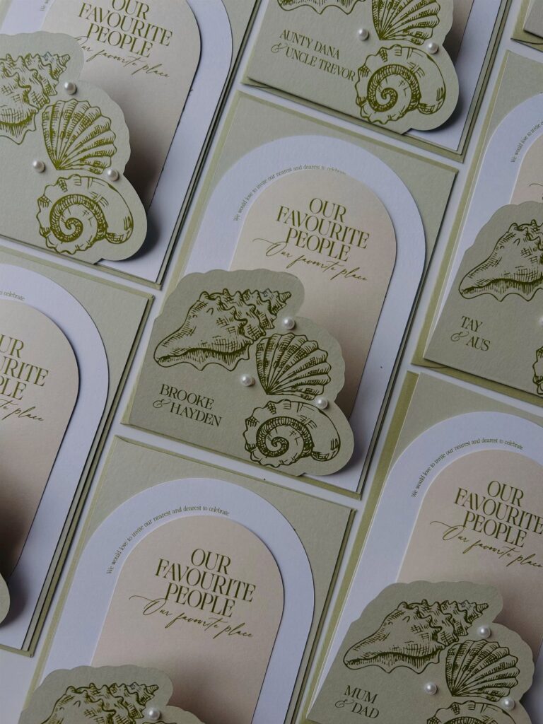
The 5 ideas run from a tropical bouquet printed flat on the card to a passport-style suite, and what separates them is how much handwork, specialty printing and extra postage your budget can absorb.
If the number is small, pick one motif or one photo and print it flat; if there is room, spend on a single piece, such as the cover or the ribbon on the invitation, and keep everything else plain.
1. Tropical Bouquet
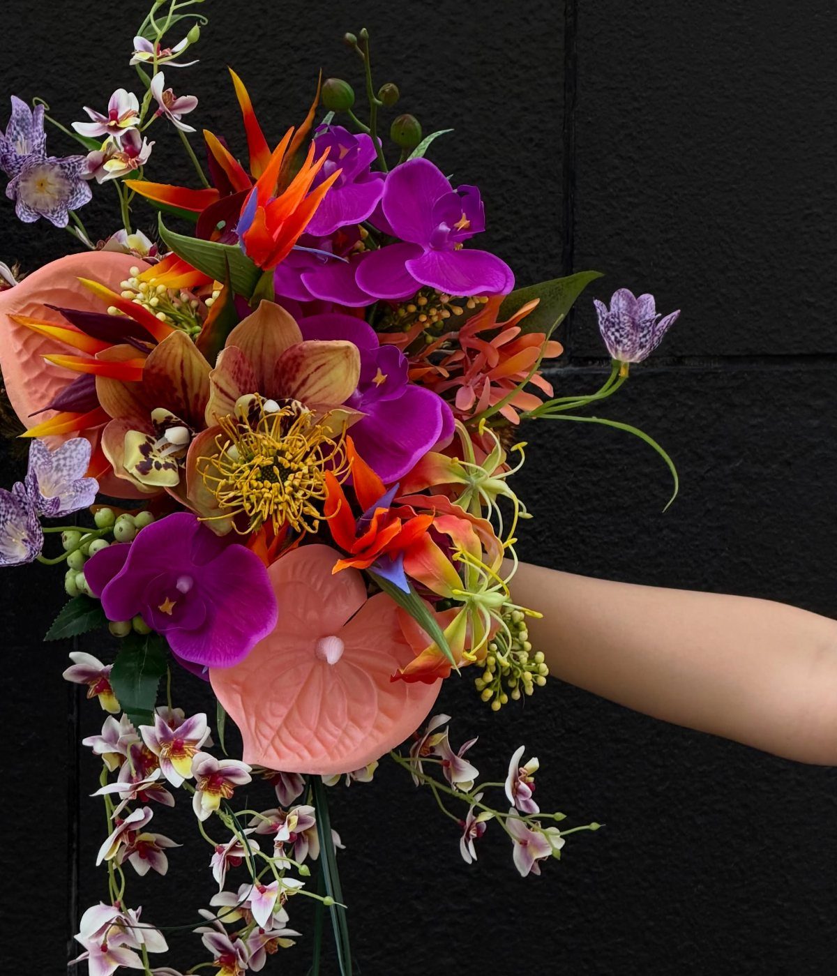
Purple orchids paired with orange bird of paradise make a strong color pair, and that contrast is worth borrowing for the paper itself.
Print a bouquet illustration or photo on the front, then pull the invitation’s text color from the deepest purple.
A bouquet reads as a clear signal of a tropical destination before anyone opens the envelope. I would keep the layout plain around it, with lots of white space, so the flowers do the work.
2. Beach Motifs Invitations
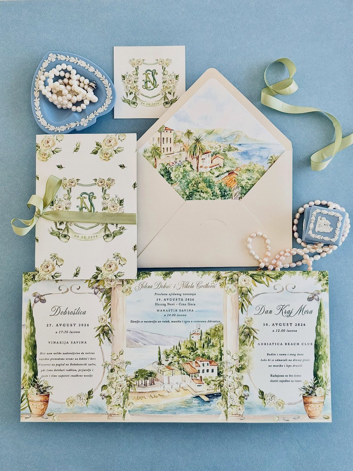
Coastal illustration can carry a whole invitation suite, and a painted village scene does it with more character than clip-art shells. Pick one motif and repeat it on the invitation, the envelope liner and the RSVP card.
Small accents such as a green ribbon or a string of pearls tie the pieces together, though they add handwork and cost. On a small budget, I would put the ribbon on the invitation only and print everything else flat.
3. Dress Code on the Invitation
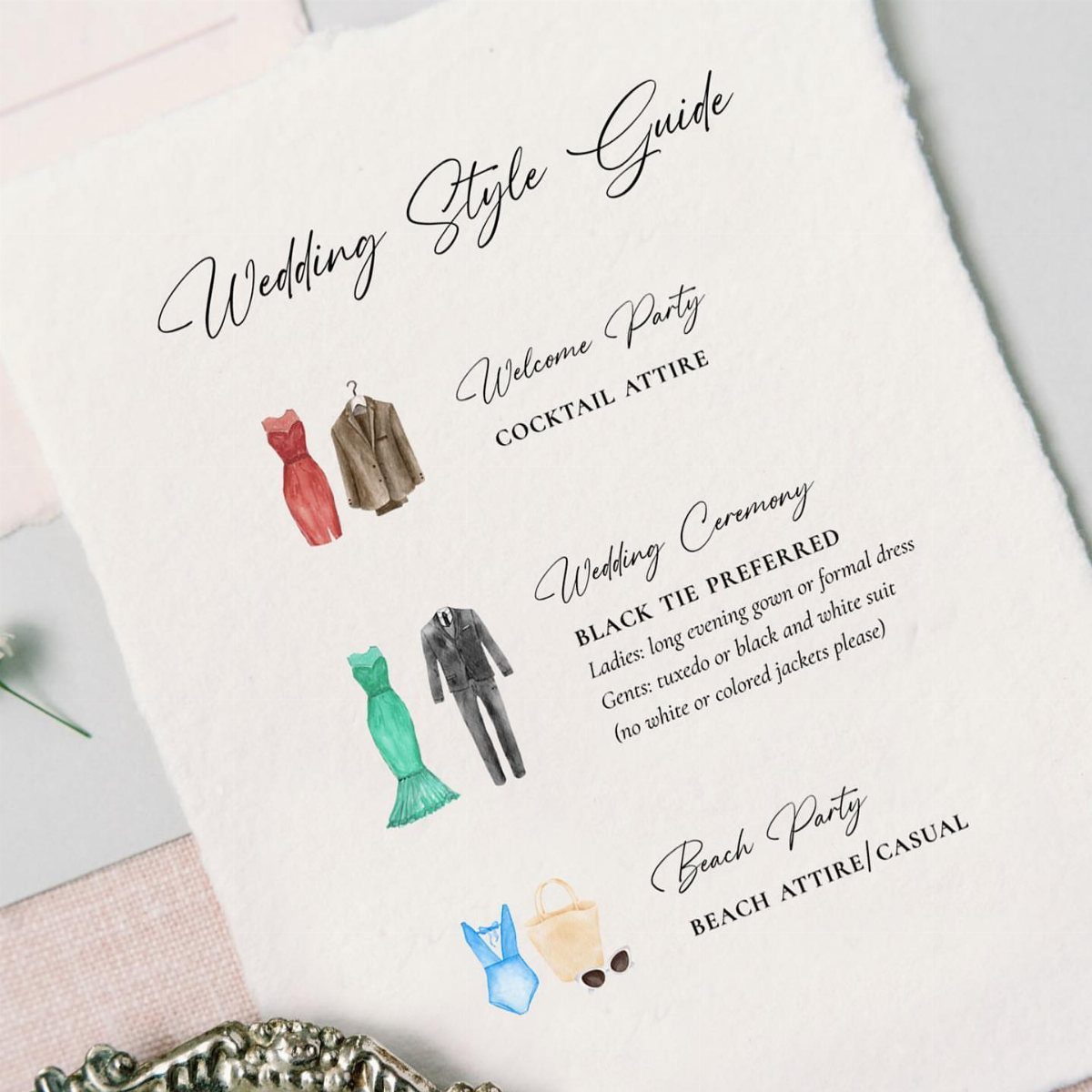
Beach weddings leave guests guessing about shoes, fabrics and what to wear after dark, so a separate style guide card answers it before the questions start.
List each event by name, as this one does for the welcome party, ceremony and beach party, and describe the outfit in a short phrase.
Illustrated outfits are a nice touch, but plain text works just as well if you want to save on design time. Tuck the card in with the invitation instead of squeezing attire onto the main card.
4. Beach Photo Invitations
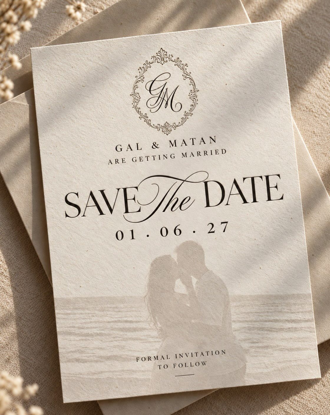
A faded beach photo behind the text gives a save the date a soft, nostalgic look, and the lowered contrast keeps the date and each guest’s name easy to read.
Choose a picture with open sky or sand, so the lettering has somewhere to sit.
Fade the image in your design software before adding text, then check a printed proof. Busy photos fight with type, so I would choose the calmest shot you own.
5. Passport Style Wedding Invitations
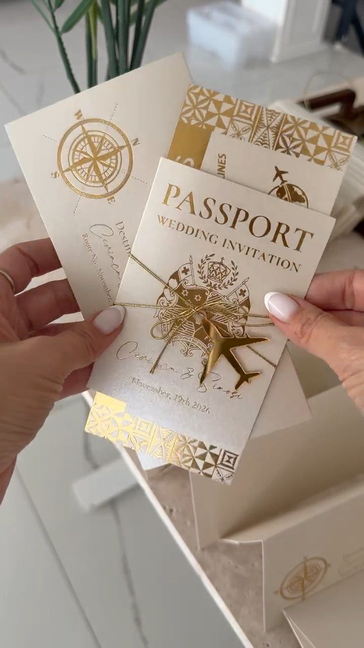
A passport-style invitation turns the mailing into a trip, which suits a destination wedding well. Gold foil on a compass and an airplane gives the cover a stamped, official look against a dark base.
Foil costs more than flat ink, so I would limit it to the cover and print the inside pages plainly. Put the date and location where a passport would list them, so guests can find the essentials fast.





