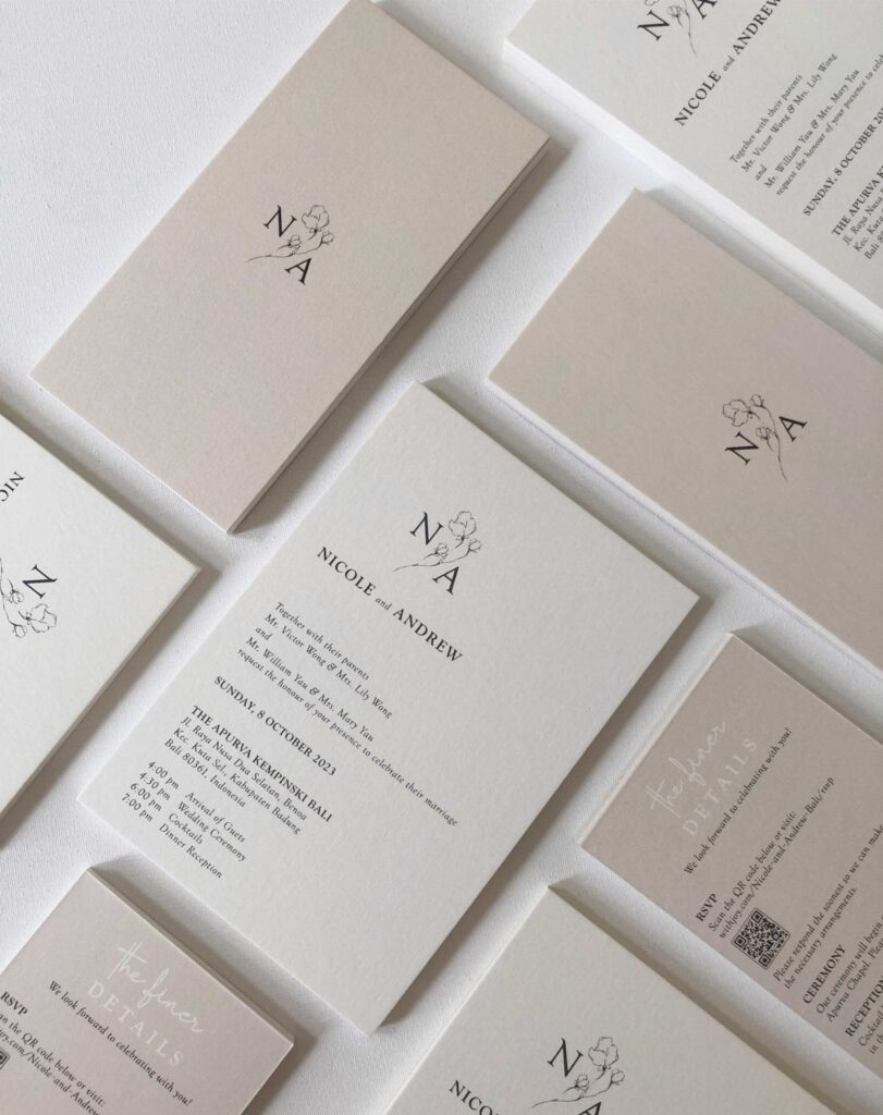
Minimalist wedding cards here run from understated calligraphy and vellum to letterpress, embossed all-white florals, black and gold foil, and a white card with a wax seal and dried florals.
Which one fits depends on how many cards your suite needs, because letterpress, embossing and foil are all priced as premium finishes and the cost climbs with every piece.
Spend it on the invitation alone, print the rest flat, and a sample of 1 card will show you the paper weight well ahead of the full run.
1. Minimalist Wedding Invitations with Understated Calligraphy
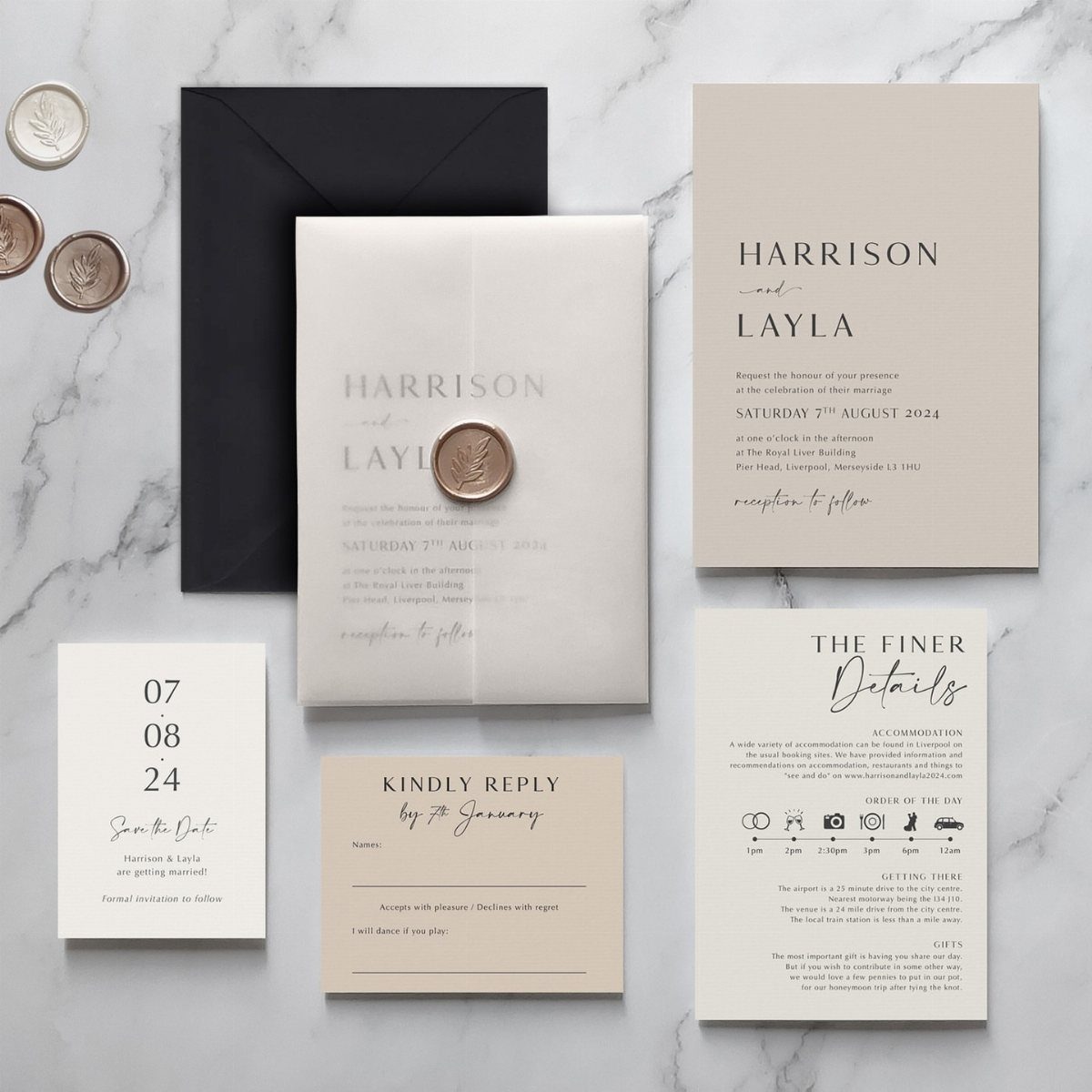
4 pieces carry this suite: the invitation, a save the date, a reply card and a details card with the timeline.
Keeping every card to one ink color and one script is what makes it read as minimal rather than sparse.
The vellum overlay and wax seal are the only extras, and both are optional.
A plain overlay costs far less than a full custom suite, so if money is short, I would drop the seal first and keep the details card, since guests actually use that one.
2. Vellum Invitation
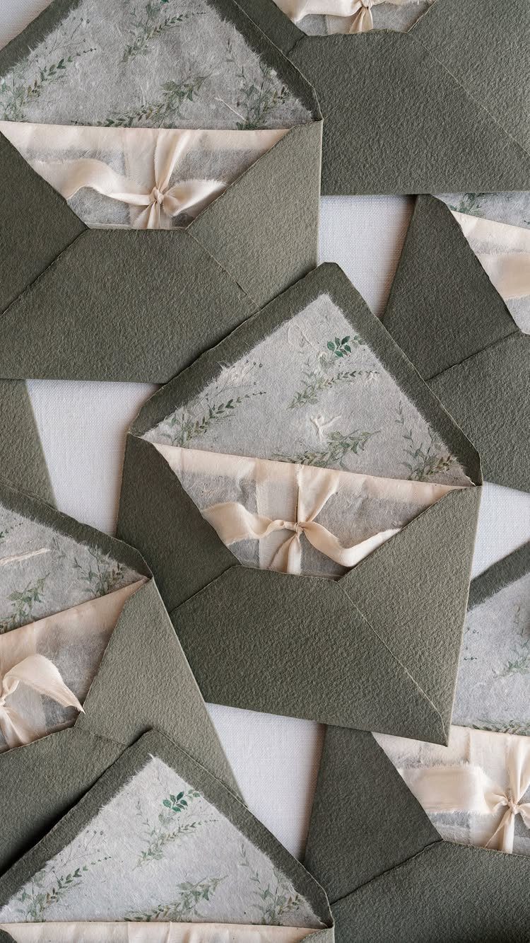
Vellum turns an envelope liner into the whole design. Botanical prints show through the translucent paper, so you get pattern without adding a single printed card.
Pairing one earthy envelope color with a single neutral ribbon keeps the palette to two quiet colors. Tie the ribbon loosely enough that the vellum can slide out without tearing.
Vellum shows every smudge, so print on it with a printer that suits the paper, or order it pre-printed. Test one sheet before committing to 100.
3. Arches Wedding Card
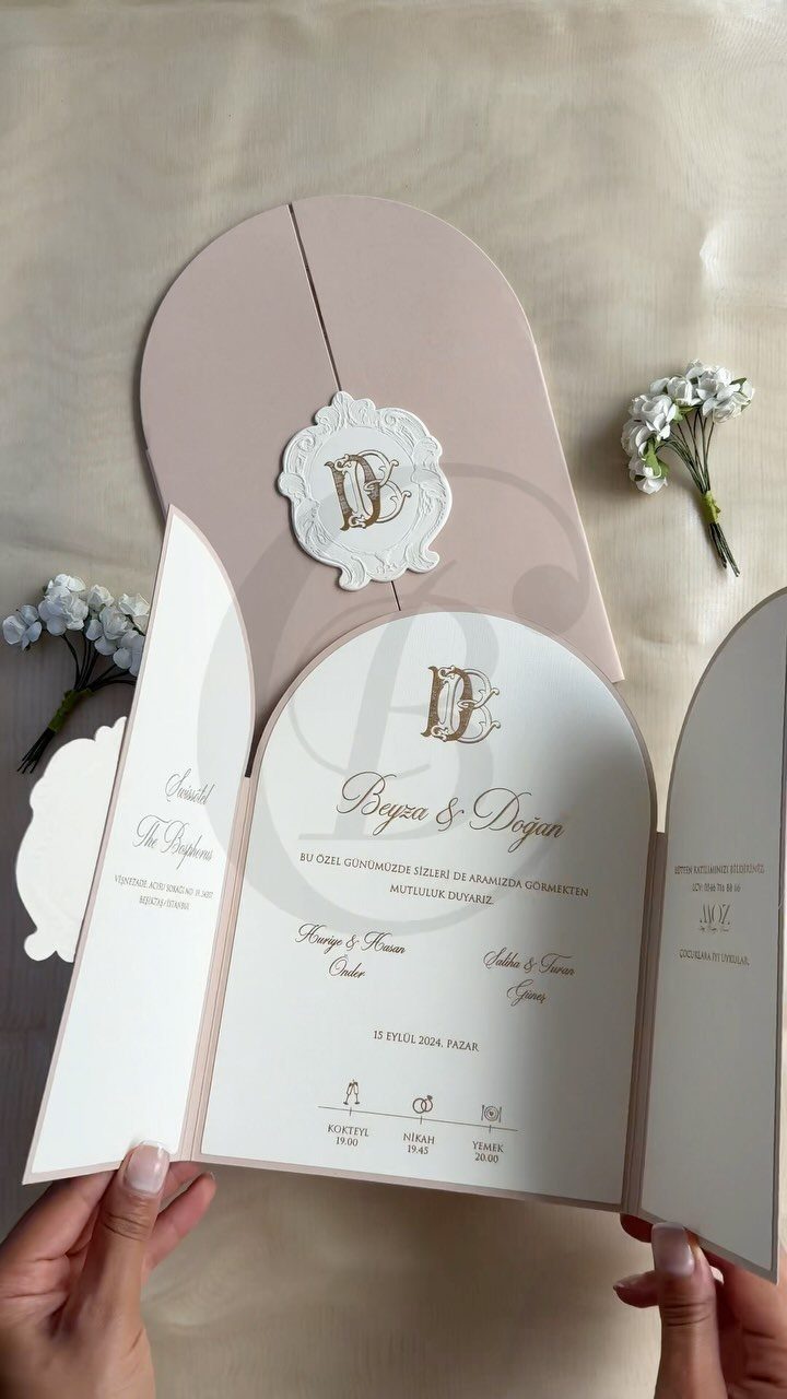
An arch-shaped card does the design work through its outline alone, which is why it suits a couple who want almost no decoration.
Custom die-cut shapes usually cost more than rectangles, so ask for a quote before falling for the look. If it stretches the budget, I would use the arch only on the invitation and keep the other cards standard.
4. Letterpress Minimalist Wedding Invitations
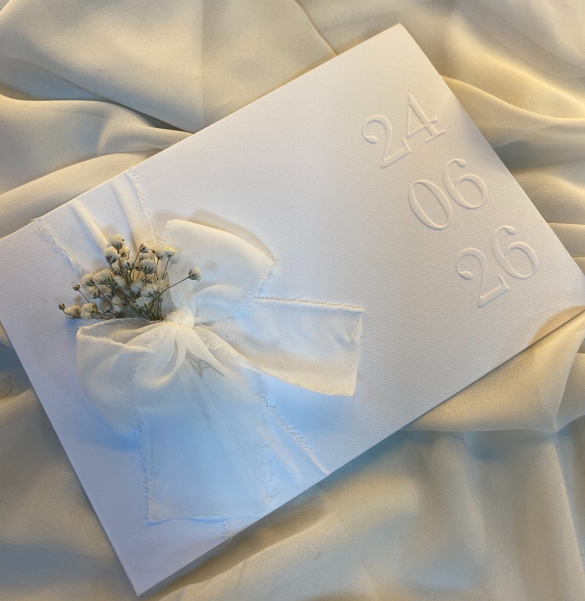
Pressed numbers alone can stand in for a full line of text. A date like 24 06 26, embossed on white card, says everything a guest needs to hold onto.
Letterpress and foil stamping both add texture you can feel, and that is the selling point: the card looks plain and feels expensive.
Both cost more than flat printing, so use them on one card, the invitation, and print the rest flat.
5. Black and White Greenery Drawings
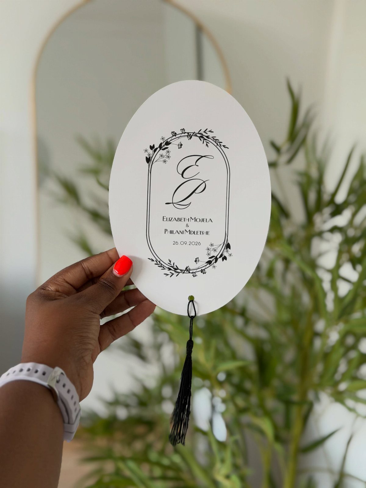
Hand-drawn black leaves on white card give a wedding a botanical feel without a drop of color. An oval card with a black tassel and calligraphy names makes the drawing the focal point.
Line drawings reproduce cleanly in one ink, which keeps printing simpler than a full-color illustration. I like pairing a single leaf motif with a monogram rather than filling the card with greenery; the white space is what keeps it minimal.
6. Black and White Minimalist Wedding Invitations
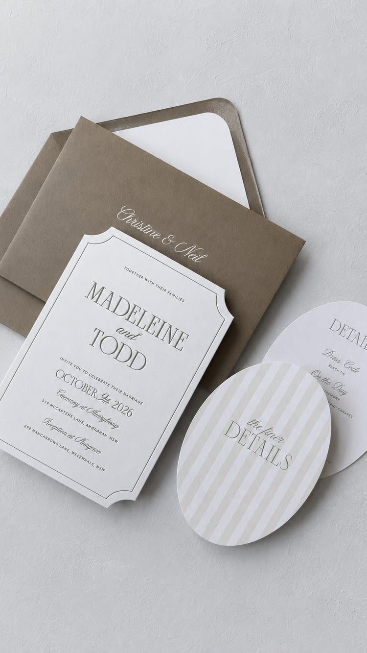
Black text on white card is the safest minimalist choice, and online printers make it easy to order. A scalloped edge on a white card, paired with a brown envelope for contrast, adds shape without adding clutter.
Because the palette is fixed, the shapes do the personalizing. Scalloped edges and ovals cost little in design terms but break up the plainness.
Pick a clear, readable font, since black on white leaves nothing to hide behind. Choose the envelope color last, and order a sample first.
When shopping for minimalist wedding invitations online, the design is the most important thing to look at. Chris Neubauer, the founder and owner of event branding firm Yonder Design, says to consider options such as monochromatic designs, sans-serif typography, and two-tone details.
7. Deep, Saturated Tones Bold Monogram
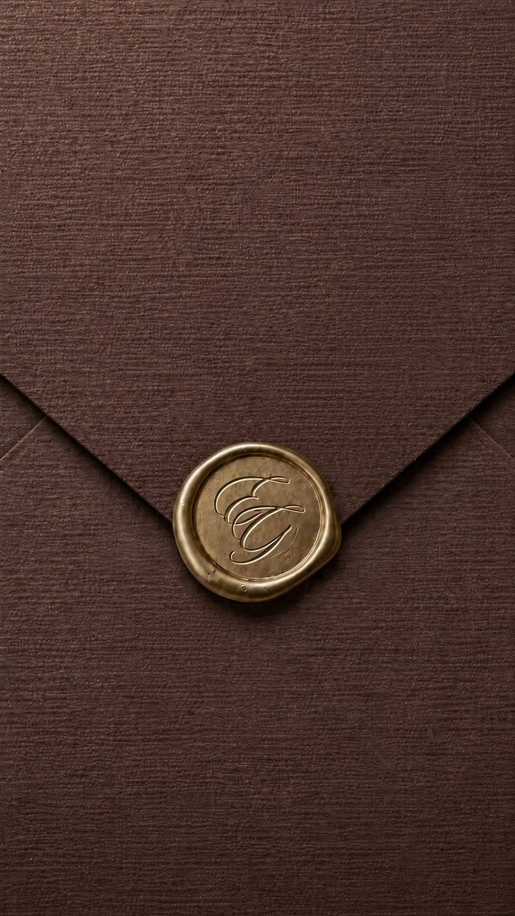
The envelope is the statement, so the card inside can stay plain.
Deep, saturated color suits a couple who want drama without adding any decoration. A single initial or pair of initials in the seal keeps it minimal.
Seals cost extra on every envelope, so I would seal only the invitation envelopes and leave reply envelopes plain.
8. Green Stationery with Gold
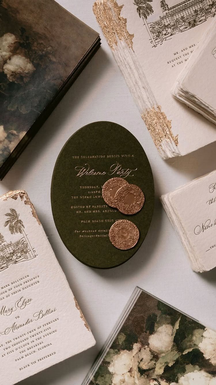
Olive green paper with gold italic names gives a wedding a color story using just 2 inks. The oval shape and matching gold wax seals carry the elegance, so nothing else needs printing on the front.
I like keeping the supporting cards white with black text. That leaves the green card as the one piece with color, and it holds the eye.
Gold on a dark green is easier to read when the italic is not too thin, so check a sample before ordering the full run.
9. White Card with Wax Seal and Dried Florals
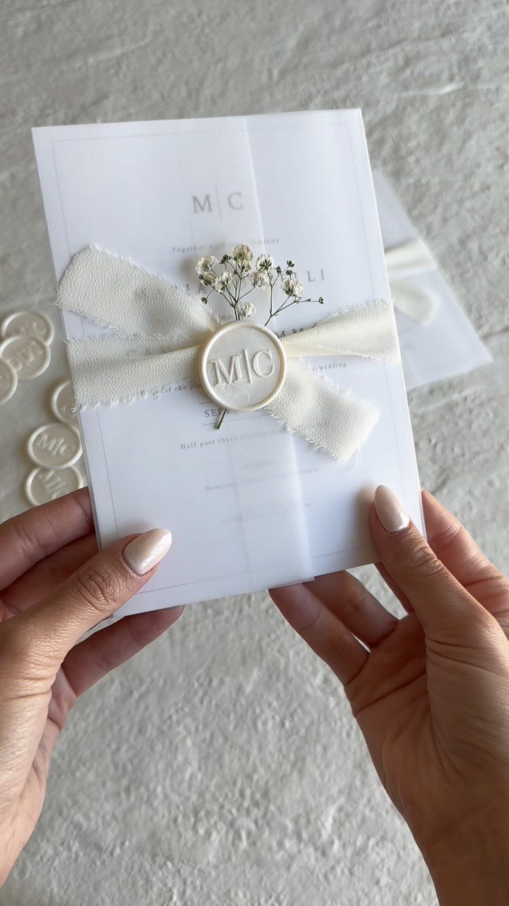
White on white, with a ribbon, a seal and one sprig of baby’s breath, is about as quiet as an invitation gets. Initials in the seal, like the "MC" here, make it personal without a single extra printed line.
The sprig is the cheapest touch in the whole suite, and it is dried-flower territory, so it can be tucked in days ahead. Keep it to one stem per invitation.
If postage or flat packing worries you, hand-deliver these or ship them in a padded envelope, since a sprig can snap in a standard mail run.
10. Embossed All-white Floral Stationery
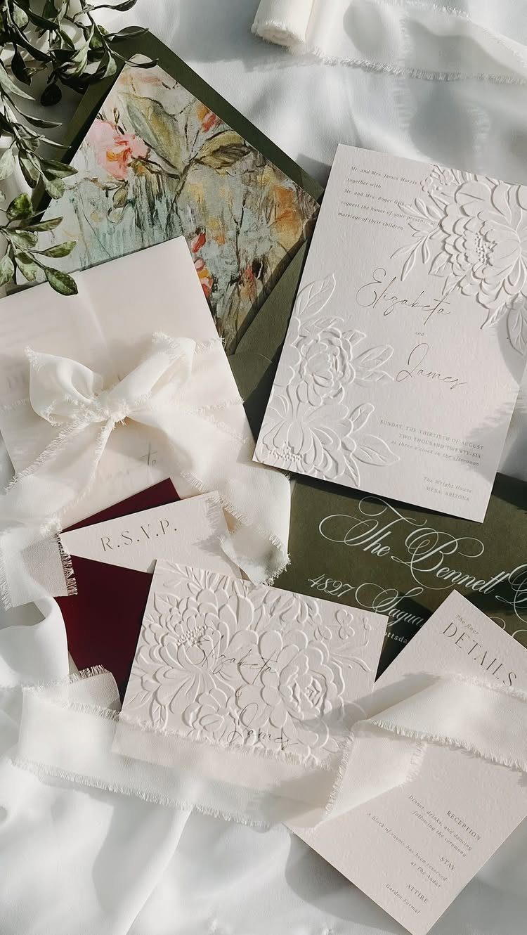
Embossing lets flowers appear without any ink, so a suite of all-white cards reads soft and still has pattern. Names, RSVP and details cards all follow one embossed motif, which ties the set together.
White fabric ribbon binds the pieces and adds a second texture. I would emboss the invitation and keep the smaller cards flat, since embossing is priced as a premium finish and the cost climbs with every card.
Pale-on-pale text is hard to read in dim light, so make the printed names and the RSVP line dark enough to see at a glance.
11. Black and Gold Foil Wedding Invitation
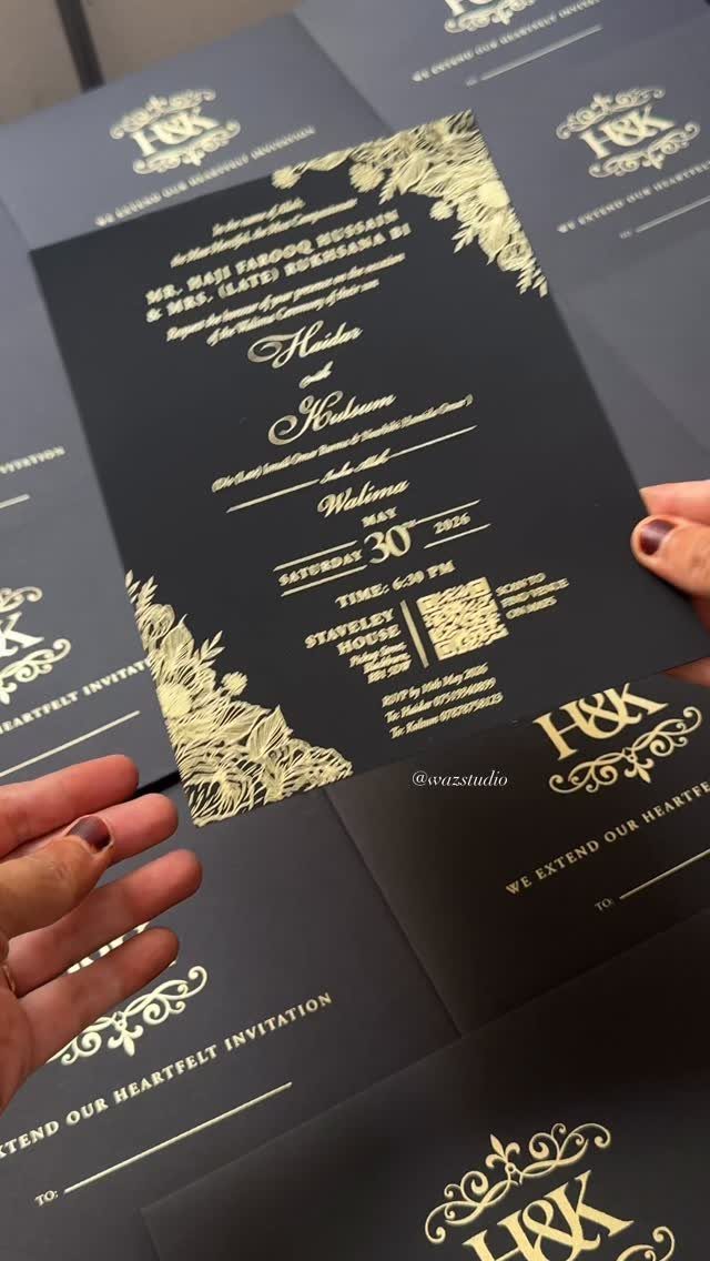
Black card with gold foil lettering is the formal end of minimal: 2 colors, a few lines, and small flourishes in the corners. Foil catches light, so the text does the decorating for you.
Keep the wording short, names and event only, so the gold stays crisp and legible. Foil costs more than flat printing, which is why I would foil the invitation and print the matching cards in plain gold or white ink.
Ask for a proof before you approve, because fine corner lines can lose detail on dark stock.
Practical Details for Invitations
Before you fall for a layout, check that it has room for 3 practical lines: RSVP instructions, accommodation details and a registry mention. Minimal designs tend to leave these out, and guests then email you to ask.
If the invitation itself is too spare to hold them, move them to a separate details card or a wedding website, and print a short URL on the card.
Test the space with your real text. Paste in your actual deadline, hotel name and web address, then see whether the layout still looks calm.
Tips for Buying Invitations Online
A screen flatters paper. Order a sample of your chosen design before you place the full order, because weight, texture and ink color only show up in your hands.
Then proofread the sample as if it were the final copy. Check names, dates, the venue address and the RSVP deadline, and read them twice more, ideally with someone who has not seen the draft.
A typo caught on a sample costs a few dollars. The same typo on a full run costs the whole order.
Cost Considerations
Invitations get expensive fast, even minimalist ones, because the card is only part of the bill. Add envelopes, RSVP cards and any details card to your stationery budget at the start so the total holds no surprises.
You can dress a flyer up with a colorful envelope or a vellum wrap bought elsewhere. It costs more effort than ordering a boxed suite, but it is the cheapest route to a look that feels custom.
Frequently Asked Questions
How much should 100 invitations cost?
For 100 invitations, a typical couple lands near $160, though that figure swings with the printing method and how many pieces go in the envelope. Design, paper quality, printing method, envelopes, RSVP cards and inserts all move that number up or down.
How many wedding invitations should I order?
Order 10–15% more than your guest count.
Remember that one invitation usually goes to each household or couple, so count households rather than people. The extras cover addressing mistakes, late additions and keepsakes.
How early should you send out your wedding invitations?
Aim to get them in the mail 6–8 weeks ahead of the date, and add a few extra weeks if many guests are traveling.
For a destination wedding or a guest list with lots of travelers, go eight to twelve weeks out. A save the date should reach guests several months ahead of that.
What should go on a minimalist wedding invitation?
Names, date and venue lead the card, and I would add 3 practical lines after them: how to RSVP, where to stay and a nod to the registry.
Spare layouts often cut those lines, and the result is a stream of guest emails asking what the card left out.
When the card has no room, a details card or a wedding website can hold them, with a short web address printed on the invitation.
How can I keep a minimalist wedding suite affordable?
Spend on one card and keep the rest simple. A wax seal is the first extra I would drop, and a colorful envelope or vellum wrap bought separately is the cheapest way to get a custom look.





