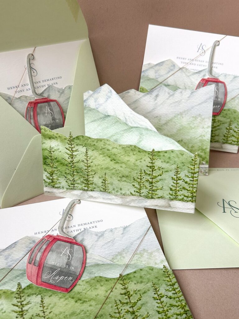
The ideas here run from watercolor pines and embossed mountain range textures to leather folder wraps and copper line art, so the price swings mostly on how many production steps each card needs.
Guest list length decides which one is right for you: anything with hand assembly, like gondola charms or wax seals, gets costly on a long list, while a printed design with mountain-shaped envelope flaps scales to any size.
Letterpress takes roughly 20 business days, so settle on the finish before you settle on the artwork.
1. Rustic Mountain Wedding Invitations
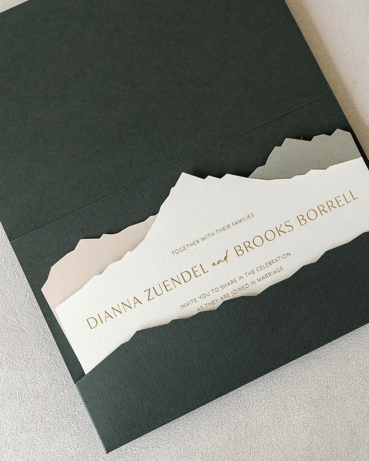
A mountain-shaped cutout in a folder front does the work of a printed illustration, and it costs nothing in ink. The white card underneath shows through the peak, so the names sit right in the opening.
Dark green paired with white keeps the look warm and quiet. I would match the envelope to the folder so the whole suite reads as one piece, and keep the wording short, since the cutout already makes the statement.
2. Woodsy Mountain Wedding Invitations
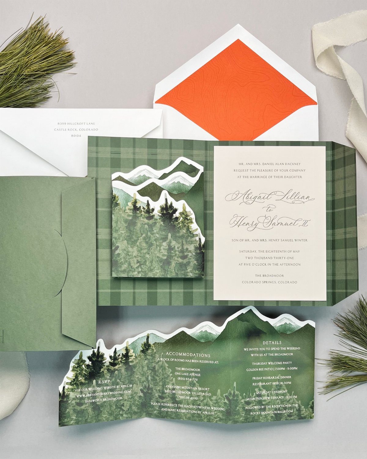
Keep the card mostly clean and let the artwork frame the text.
A bright orange envelope liner is the move I would copy: it adds a pop of color that guests only see when they open the envelope.
It stays hidden until the guest opens the flap, and it gives a green suite one warm surprise without crowding the card.
3. Winter Mountain Wedding Invitations
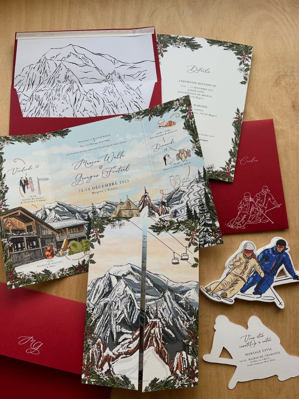
The red envelopes add the contrast that makes the white and blue artwork stand out.
Cutouts add production steps, so ask a printer about the extra cost before you fall for them.
If money is tight, I would keep the illustrated peaks and red envelopes and skip the cutouts. A wooden surface under your flat-lay photo is a nice touch, but it costs nothing to skip.
4. Save the Dates
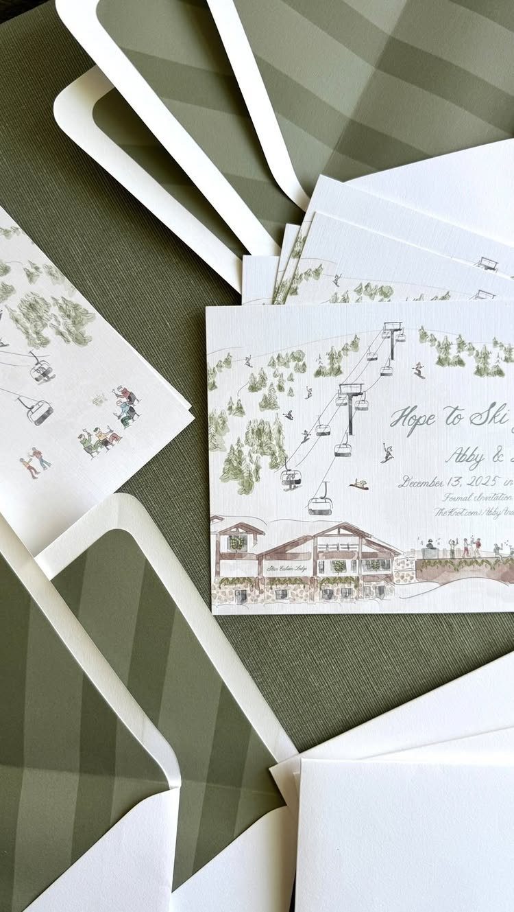
A ski resort illustration tells guests the setting before they read a word, and a playful line like "Hope to Ski" sets the tone for the whole weekend.
Olive green envelopes keep the set grounded and outdoorsy. Keep the card simple: names, date, and a promise that the formal invitation follows.
5. Mountain Silhouettes
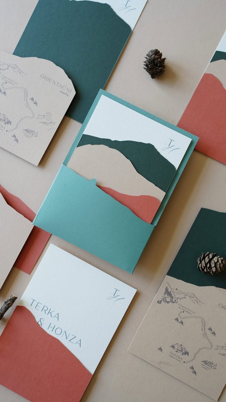
Layered ridgelines in teal, tan and terracotta make a mountain range feel abstract rather than literal. Stacking 3 colors gives depth without any shading or fine detail, which keeps printing simple.
I like this one for couples who want a modern look instead of a cabin one.
Pinecones are an easy styling prop for photographing the suite. If your wedding is abroad, a map-style card with the location, like the one here, is a smart extra piece.
6. Pine and Evergreen Trees
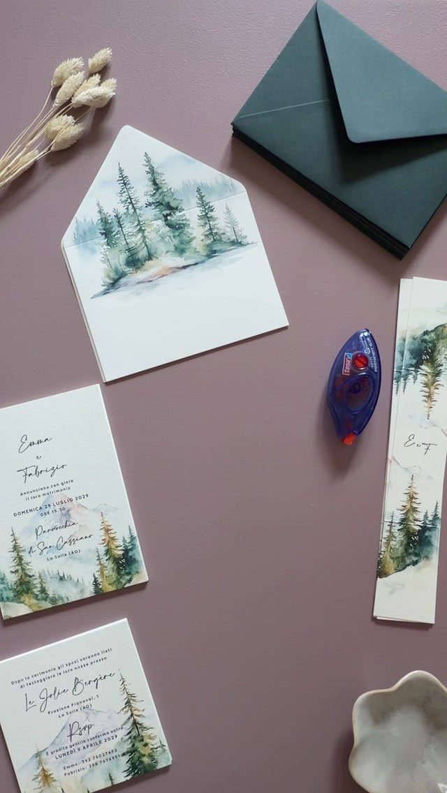
Watercolor pines are the easiest way to say "mountains" without drawing a single peak. A cluster of trees at the card’s edge, with dark green envelopes, reads as alpine at a glance.
Soft watercolor edges feel gentler than a crisp vector print, so I would choose them for a relaxed, romantic tone.
Print the date in a simple serif and leave white space around the trees. Busy backgrounds make small text hard to read.
7. Travel Insert Cards
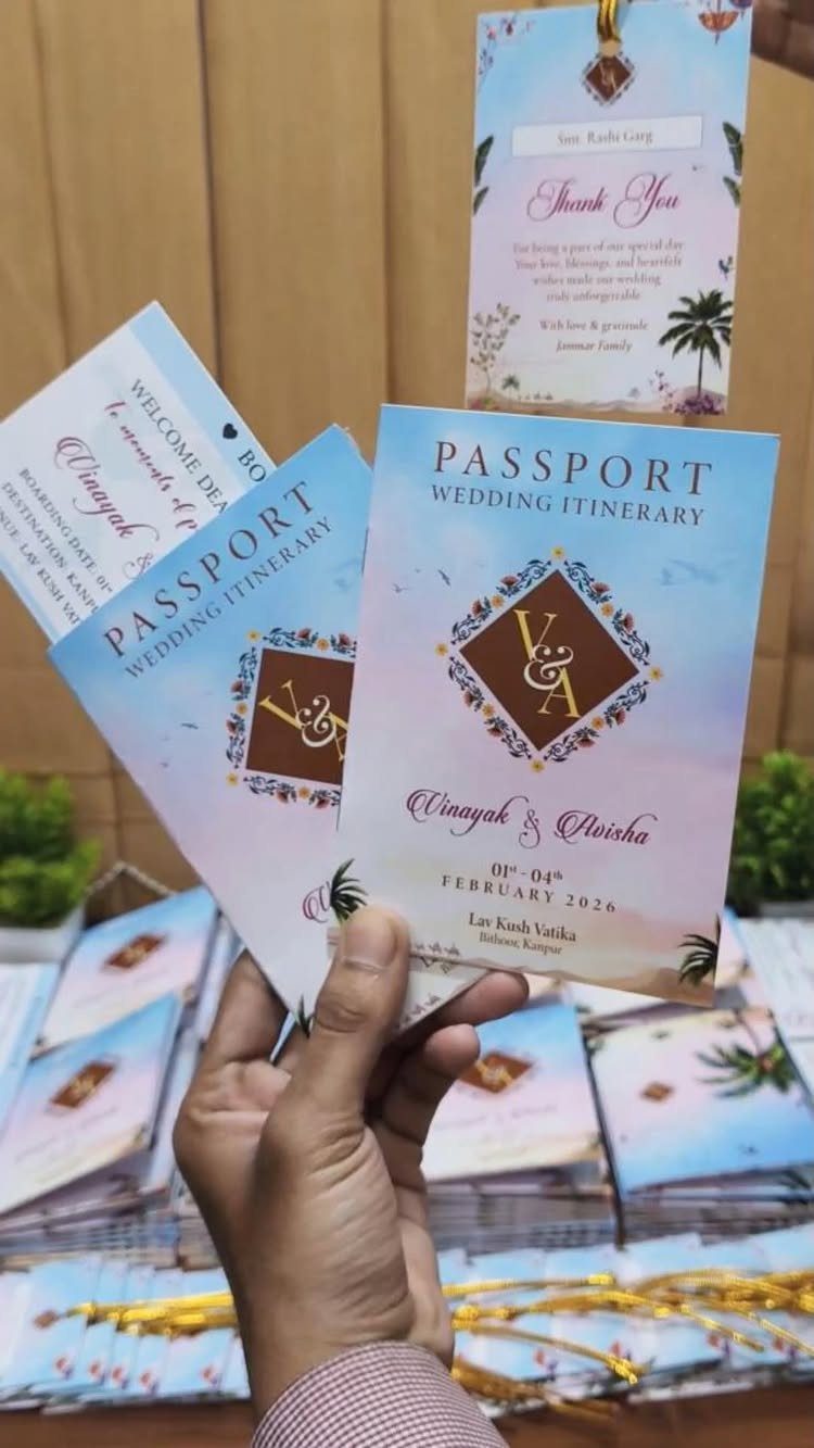
Passport-style itinerary cards give out-of-town guests one small booklet for the schedule, so they stop scrolling back through emails. The format has room for the date and venue on the cover, with the day’s events inside.
I would put the cover details guests need most up front, the wedding month and the venue, and save the hour-by-hour times for the inside pages. A floral pattern keeps the booklet pretty enough to tuck into a suitcase.
Tuck one into each invitation suite, and consider adding a hotel name or shuttle times on the last page.
8. Casual Wording Options
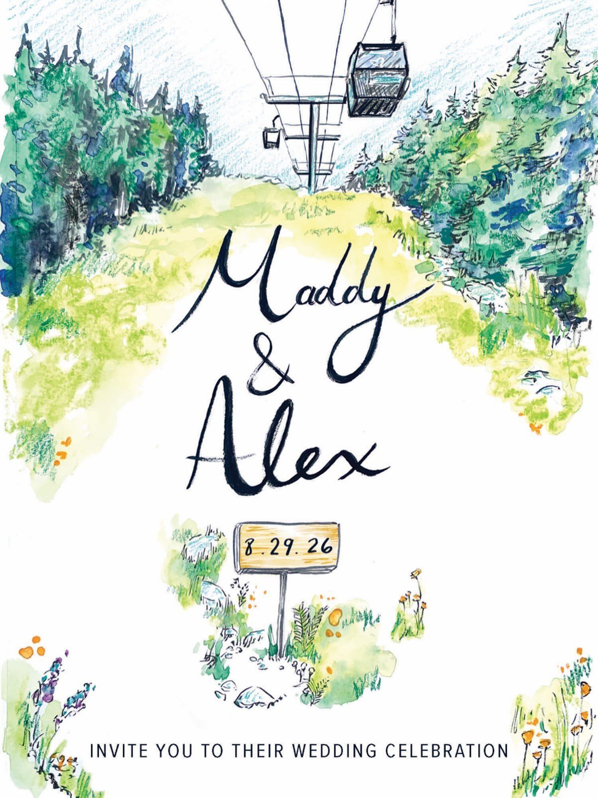
Phrasing like "invite you to their wedding celebration" sounds warmer than the formal "request the honor of your presence," and it fits an outdoor day.
Pair first names only with a numeric date, as in 8.29.26, and the card reads as friendly instead of stiff.
A watercolor gondola and trees set the mood before anyone reads a word, so the text can stay short.
I would keep the casual tone in every piece of the suite, including the RSVP card, so the voice stays consistent from envelope to reply.
9. Green Mountain Wedding Invitations
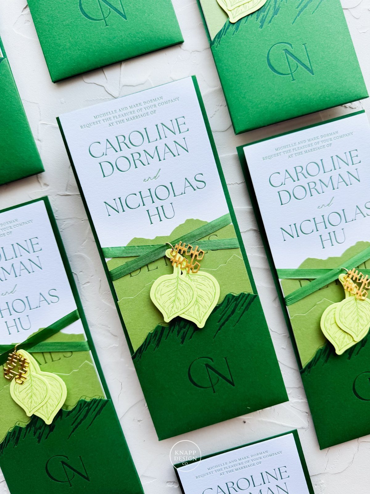
Green mountain shapes work well for spring or summer weddings, when the leaves outside match the card. Botanical leaf accents add a fresh note, and teal text against green and white keeps the palette cool.
Leaf-shaped charms on ribbons are a nice extra, though each one adds hand assembly and cost, so ask for a quote before ordering the full guest count.
Money running short? Then I would keep the printed leaves and skip the charms.
Keep the text color dark enough to read against the green.
10. Custom Wax Seals
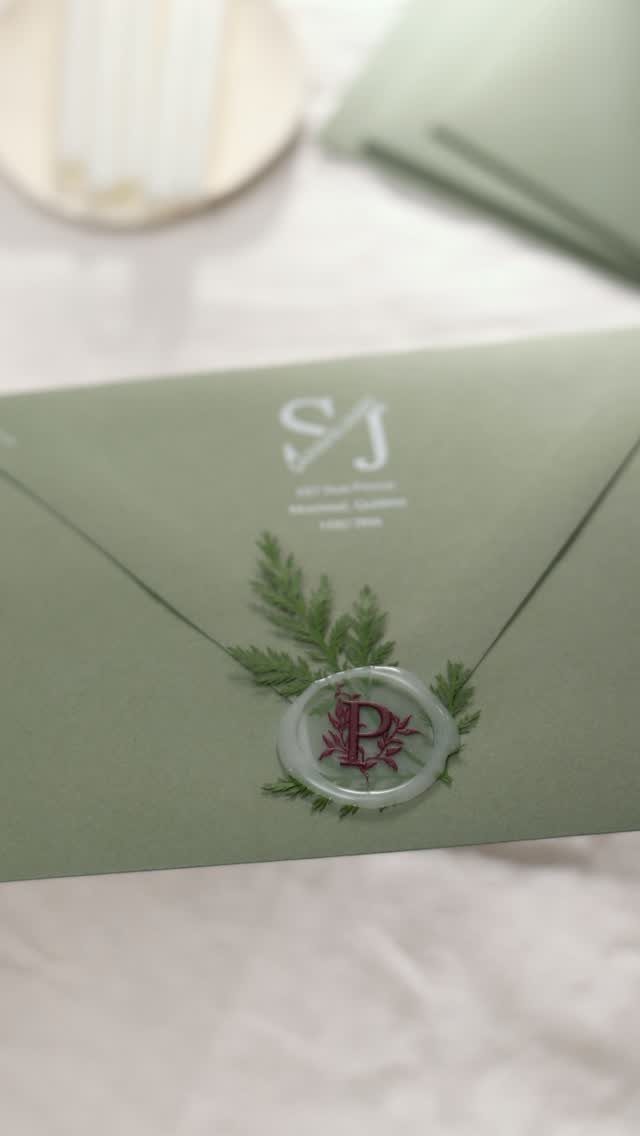
A wax seal on the envelope flap gives an invitation an old-world finish, though the hand assembly it takes adds up fast across a full guest list.
Use a monogram of your initials, like the SJ here, so the seal doubles as a signature.
Red wax stands out sharply on a sage green envelope, while white wax looks softer, so pick the one that matches how bold you want the contrast.
A small sprig of greenery tucked under the seal ties it to a mountain theme.
Sealing is done by hand, so allow extra time for a long guest list.
11. Vintage Postage Collection
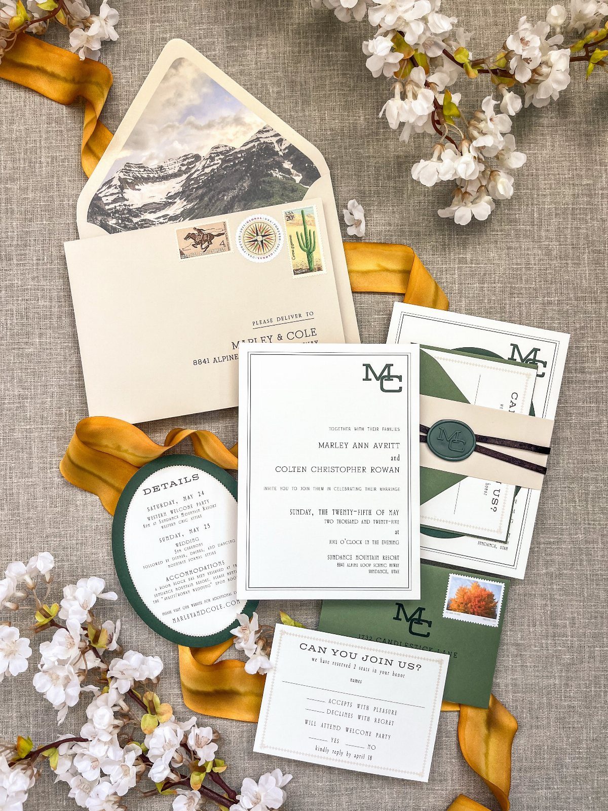
Vintage stamps turn the postage into a design element, and they suit a mountain suite because the envelope already carries the scenery. Choose stamps that echo your palette, such as green ones, and tie the stack together with gold ribbon.
I would ask the post office whether the stamps add up to the right postage for a heavy suite, since a thick envelope can need more than one stamp. Weigh a finished sample before you buy a full set.
Mixing a few stamps looks collected rather than matched, which is the charm.
12. Embossed Mountain Range Textures
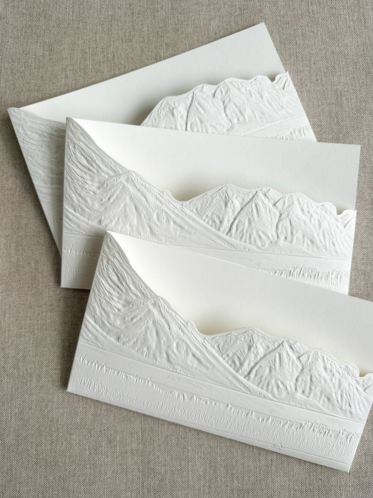
Embossing presses the mountain range into the paper, so you feel the peaks before you see them. Embossing gives a quiet, tactile result, and the shadows in the raised ridges do the drawing.
I like it for couples who want elegance without color. Because the design is raised, keep the printed wording minimal, and view a physical sample before ordering to check how crisp the ridgelines come out.
Embossing needs a die and extra production time, so expect it to cost more than flat printing. Linen or textured stock underneath keeps the photo-ready look.
13. Watercolor Mountain Landscapes
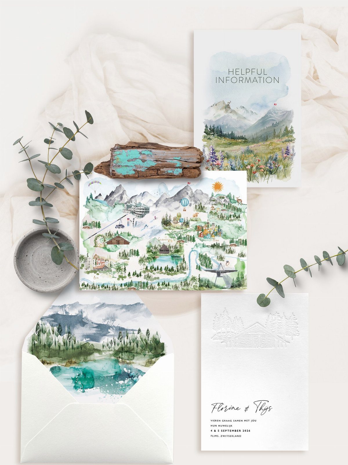
Soft watercolor washes let one illustration carry the whole suite: mountains on the invitation, a hand-painted map, and eucalyptus leaves repeating on the insert cards. A destination wedding like the one in Flims, Switzerland, gets real use from that map.
I would keep the same palette on every piece so the set reads as one painting cut into cards. Put the date and place on the information card, and leave the invitation mostly to the names and the artwork.
14. Gondola Charm Attachments
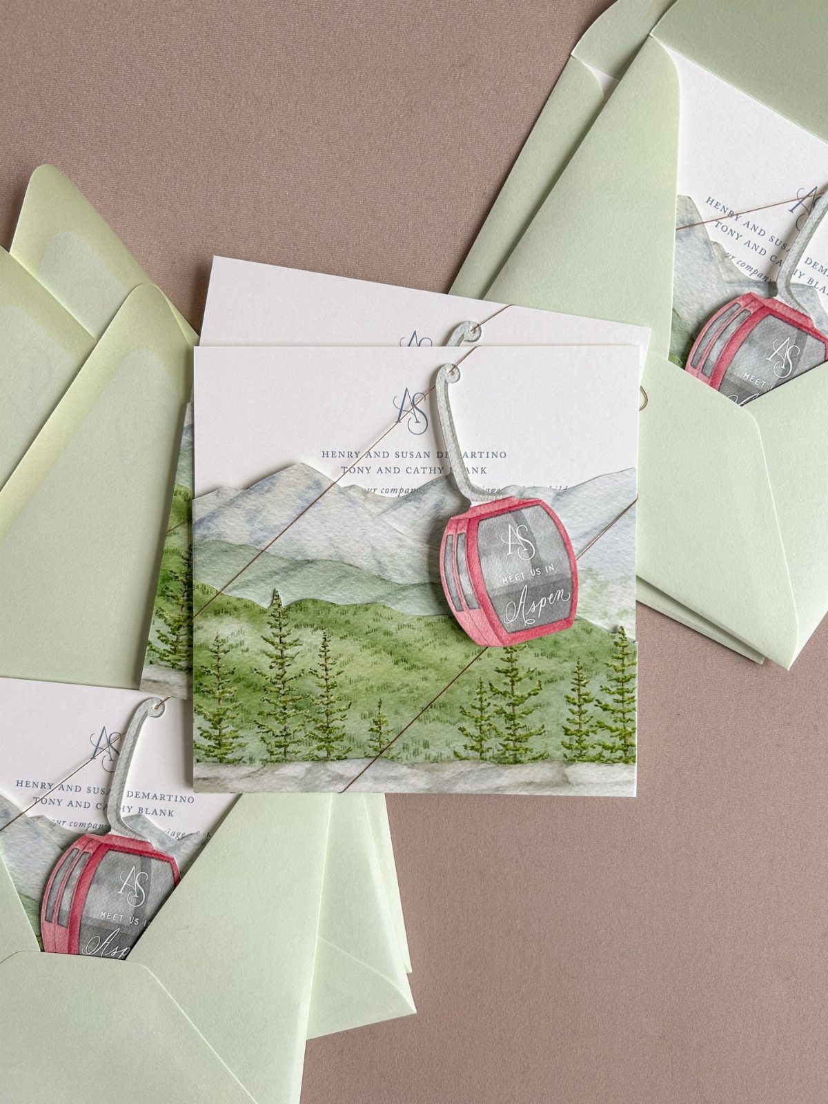
A miniature gondola hung over the landscape artwork turns a flat card into a small keepsake. Pink stands out against the watercolor mountains, so the charm reads from across the table.
Each charm is tied on by string, which means hand assembly for every invitation. Get a quote on the full guest count first, and if money runs short, I would put charms on close family and skip the rest.
15. Copper Mountain Line Art
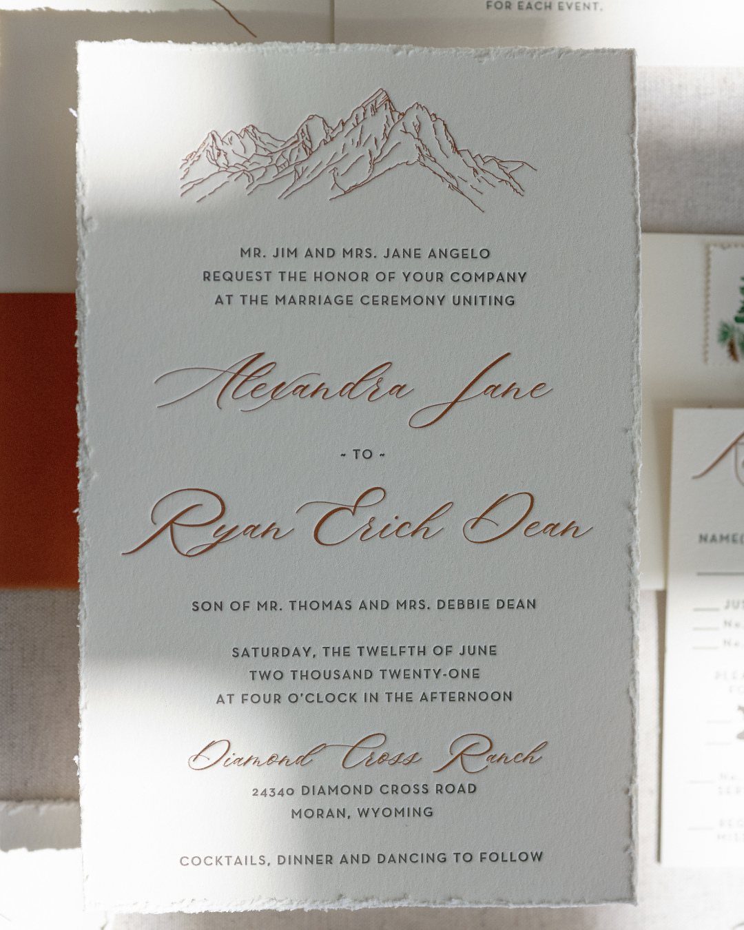
Copper foil line drawings keep a mountain invitation light: a few thin strokes say "peak" without filling the card. On deckle-edged white paper, the torn-looking edge adds texture while the design stays minimal.
Warm copper envelopes pick up the foil, so I would choose them over plain white.
Foil costs more than flat ink, so keep the artwork small and let the calligraphy do the rest. Ask to see a printed sample before ordering.
16. Mountain-shaped Envelope Flaps
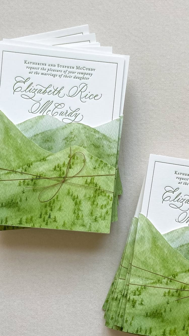
Cutting the envelope flap into a mountain peak puts the theme on the outside of the suite. Green watercolor on the flap, with a twine tie, makes the stack look like a bundle of little hills.
Peaked flaps need a custom die or hand trimming, so expect a higher price than standard envelopes. I would keep the card inside simple, with cursive wording and no extra art, since the envelope already carries the design.
17. Leather Folder Wraps
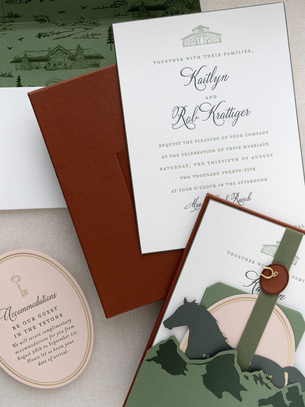
Brown leather folders give an invitation suite weight before anyone reads a word. They hold the invitation and an accommodations card together, so out-of-town guests get lodging details in the same hand-off.
Leather is a splurge, so I would use it for a small suite rather than a full guest list, or save it for the closest family.
Pair the folder with script type and one mountain illustration, and stop there. The material is already a lot.
18. Arched Photo Invitations
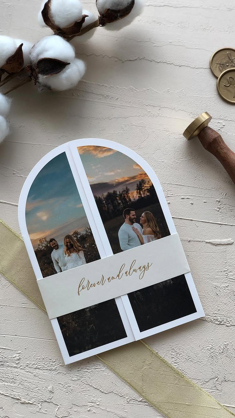
An arched card frames a pair of couple photos the way a window frames a view, which suits a mountain setting well. A paper belly band with "forever and always" in gold script holds the layers together.
Pick photos taken outdoors, with the peaks behind you, so the picture does the theme’s work.
Keep the band’s wording short, since it has to fit a narrow strip. Arched cuts usually cost more than rectangles, so request a quote first.
When to Send Invitations
Timing depends on how far guests have to travel.
For a mountain wedding with a flight and a cabin booking involved, mail the invitation 12 weeks ahead or more. A local crowd needs less, but 8–10 weeks is a safer window than the 6–8 often quoted, because mountain lodging can fill early.
The save the date does the heavy lifting.
Send it 6–8 months out, and up to a year out if you’re marrying in peak season, when cabins and flights go first. For a destination mountain wedding, 8–14 months is the range to aim for.
A pared-down version of your invitation design works well for this mailing, because it previews the look of the full suite before the real thing arrives.
Digital vs Printed Invitations
For most mountain weddings, I would send digital invitations to the full list.
They arrive instantly, cost less, and can be updated if a shuttle time or start time changes. After that, order a small print run of keepsake copies for your parents and your memory box.
If you print, the finish decides the price and the wait. Flat foil in gold or copper on kraft paper needs no custom die, so minimums start at 10 cards and production moves faster.
Letterpress on cotton stock (300gsm or 600gsm) feels the most tactile of any option, though it needs roughly 20 business days to produce.
Seed paper is embedded with wildflower seeds, so guests can plant the card in a garden or pot once the day is over.





