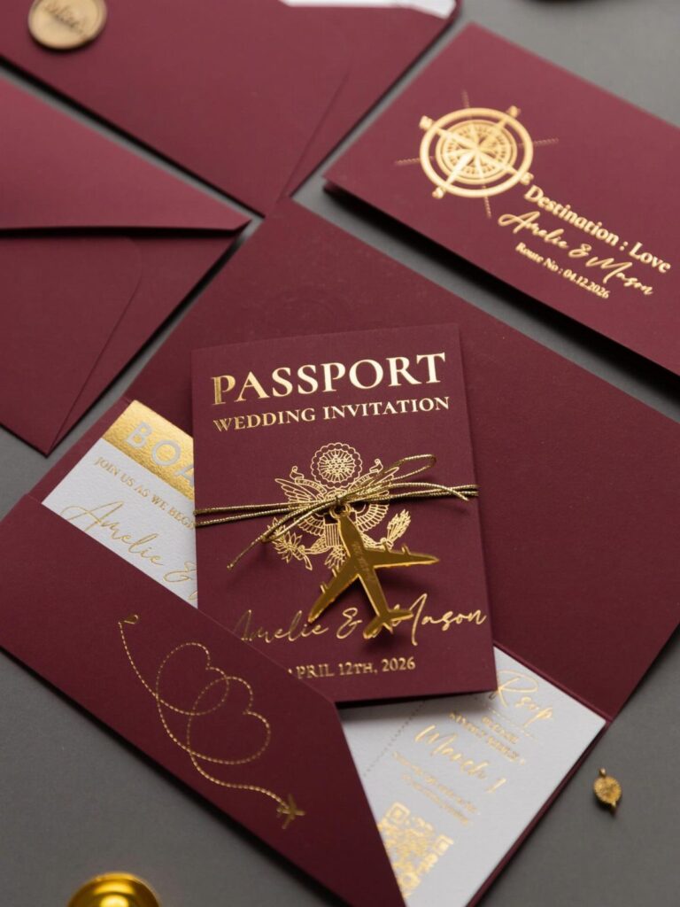
The templates in this post run from a minimalist card to layered suites, Ribbon and Pearl pieces and handmade paper with calligraphy, and the price gap comes mostly from printing method and extras, not from the template file itself.
Let the venue, season and time of day pick among the styles below, whether Floral, Destination, Vintage or Art Deco, instead of whatever looks popular this month.
1. Floral
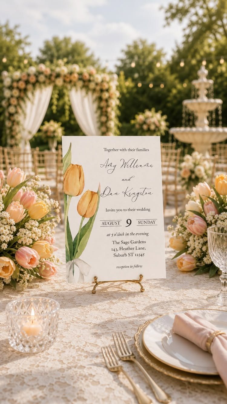
A floral template can run romantic, rustic or crisp and modern, so the flower choice matters more than the layout.
Yellow tulips, like the ones on this garden-table invitation, read fresh and springlike, while a darker bloom would push the same layout toward evening.
Pick a template where the flowers frame the text instead of sitting behind it. Both the couple’s info and the big day stay easy to read that way, and the blooms can be swapped to match your actual bouquet.
2. Destination
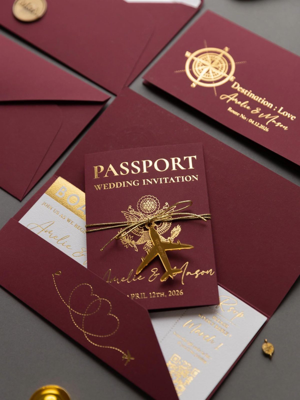
Venue-linked invitations are the quickest way to make a template feel like yours, and the passport card is a neat example.
Burgundy and gold foil lettering with a compass logo and a small airplane charm tells guests they are traveling before they open anything else.
In a template, change the names, date and location line first. Then ask whether the theme fits your venue; a passport suits a wedding far from home, and it would feel forced for a ballroom across town.
3. Vintage
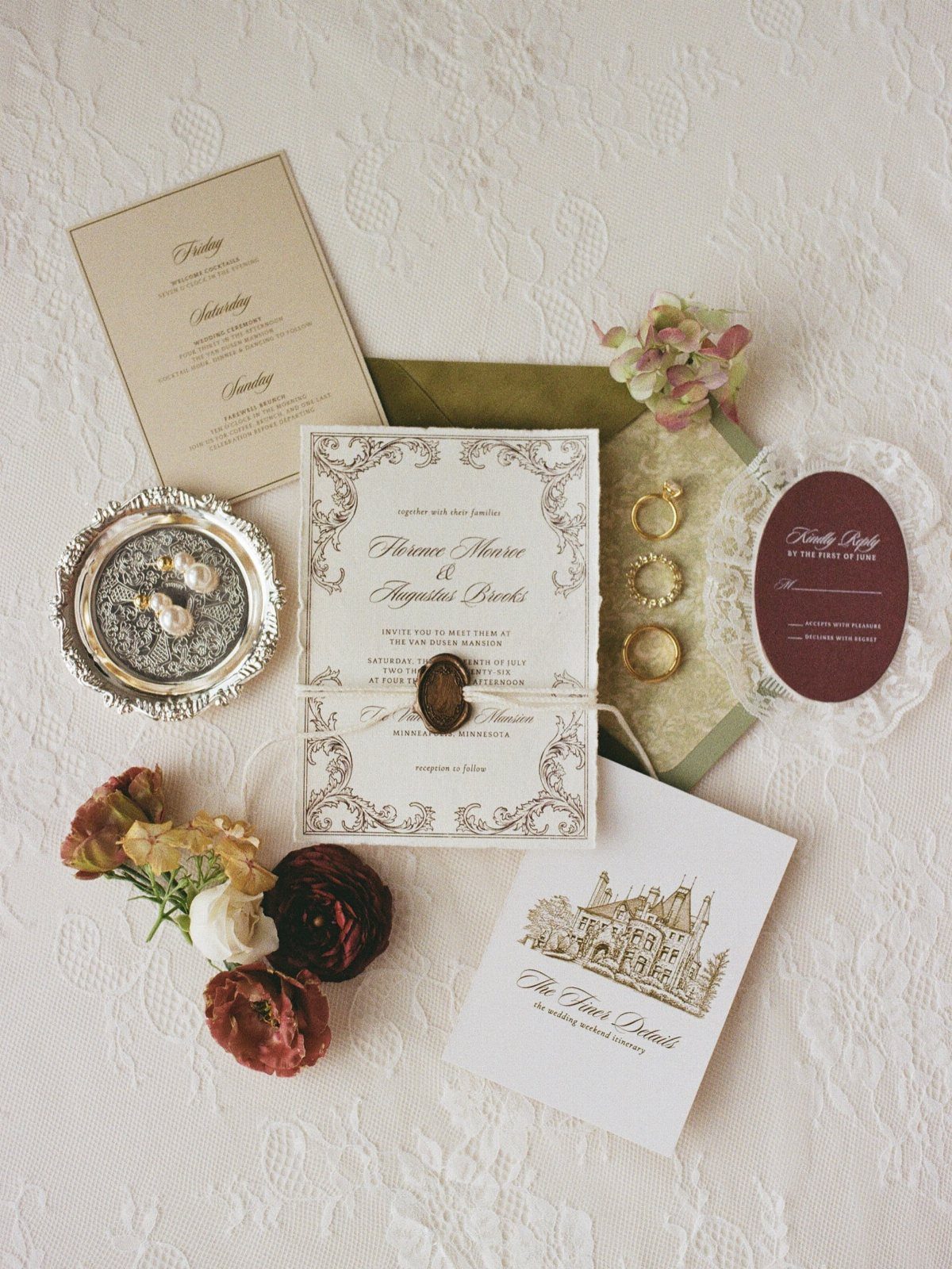
Vintage templates lean on illustration: a detailed building drawing, old-style lettering and a wax seal, as in this suite set on lace.
A drawing works best when it shows somewhere that means something to the two of you, like your venue.
Keep the type to one serif and one script. Too many flourishes on top of an illustrated card make the names hard to read, and the names are the whole job.
4. Matching Stationery and Wedding Invitation
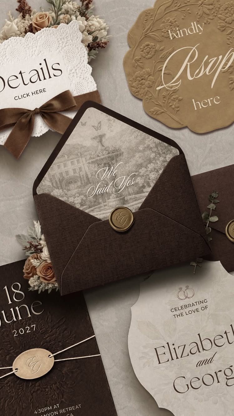
Buy the suite as one design, not piece by piece. Invitation, RSVP card, details card and envelope in the same brown and cream palette, sealed with wax, look planned even on a simple template.
Check that the template includes every piece you need before you pay. Adding a details card later in a different font undoes the matching.
Proof the date on every card, since one typo gets repeated across the set.
5. Layered Invitations
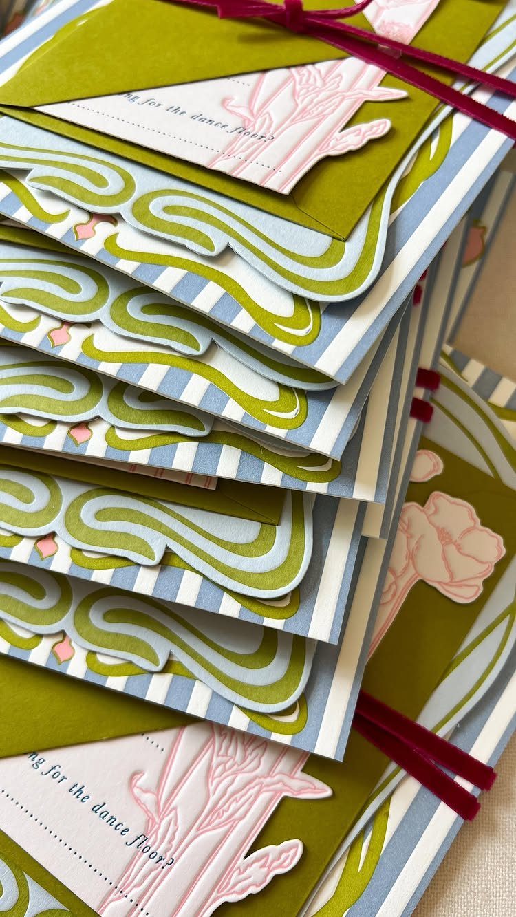
Layering turns a flat card into something guests turn over in their hands.
Layering works best when each sheet adds something different, such as a patterned base paper under an illustrated top layer, so the stack looks full without crowding the text.
Templates built for layers come with separate files for each sheet, which helps when you print at home or at a shop. Choose patterns that share one color, or the stack looks busy rather than deliberate.
Expect higher printing and postage costs than a single card.
6. Minimalist
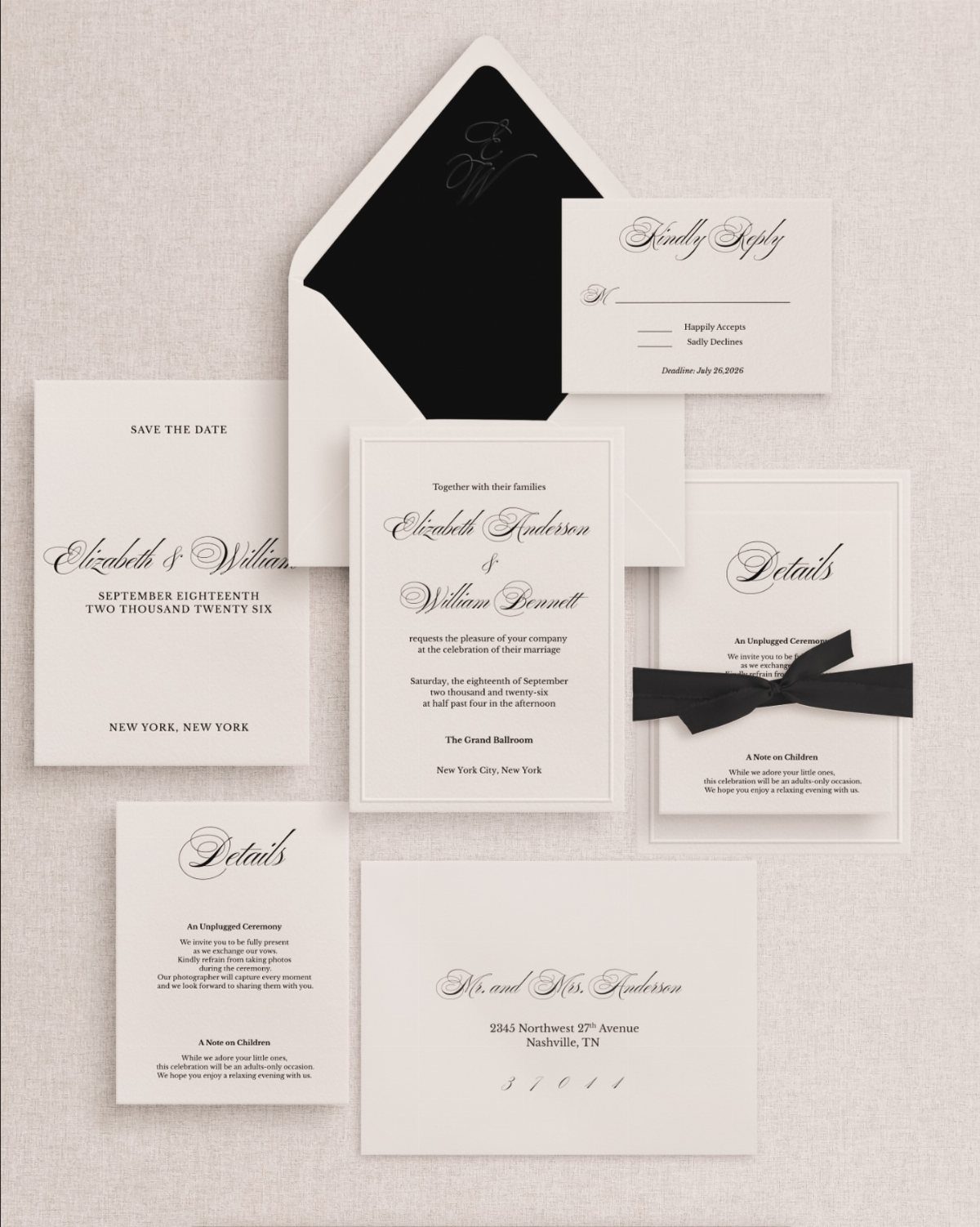
Strong type does the work here. White cards, black lettering and a black ribbon bow give a suite with nothing to hide behind, so spacing and font choice decide everything.
That makes minimalist templates forgiving for beginners: fewer elements means fewer ways to go wrong. Keep the margins generous, use one typeface family, and resist adding a border because the template looks too empty.
I would spend any extra budget on heavier paper, since plain design shows the stock.
7. Art Deco
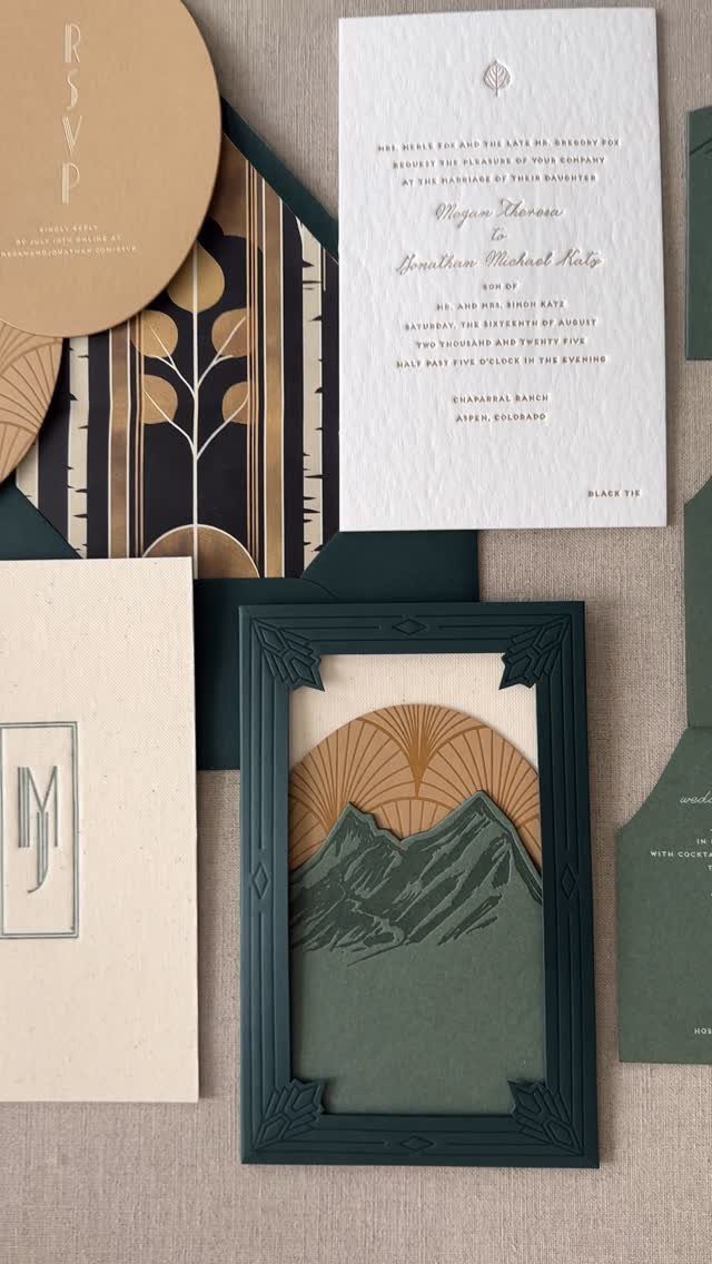
Dark forest green with gold linework gives Art Deco a formal, evening feel, and a geometric pattern like a mountain motif can carry the whole theme without extra decoration. Bold, symmetrical shapes do the work that flourishes do elsewhere.
Choose a template with a separate file for each piece, so the RSVP and the scenic card keep the same gold and green.
Gold ink or foil costs more at a print shop, so a template whose gold is only a printed color is the cheaper route.
Keep the names in the largest type on the main card.
8. Digital Wedding Invitation
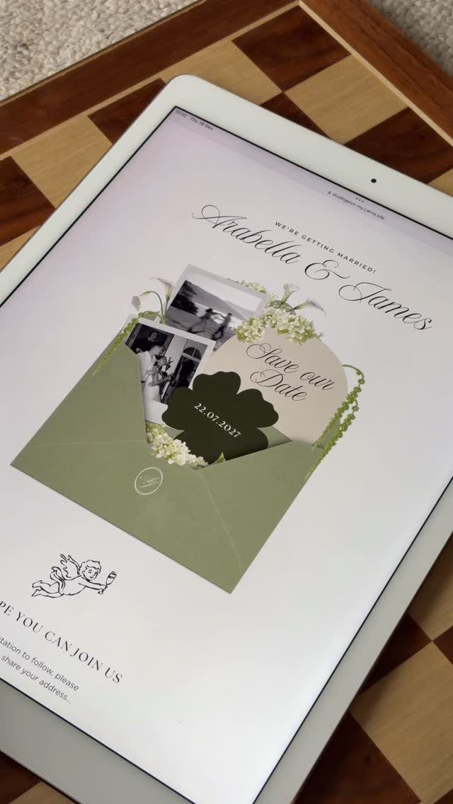
A digital invitation lives on a screen, so photos can do more than they would on paper. Sage green, florals and a few couple photos, as on this tablet design, make the template feel personal without any printing bill.
Check how the template looks on a phone before you send it, since most guests will open it there. Put the date near the top, and consider the dotted format, 22.07.2027, which reads cleanly on a phone screen.
Digital costs far less than paper, though some older relatives may still want a printed card.
9. Traditional Indian Wedding Invitation
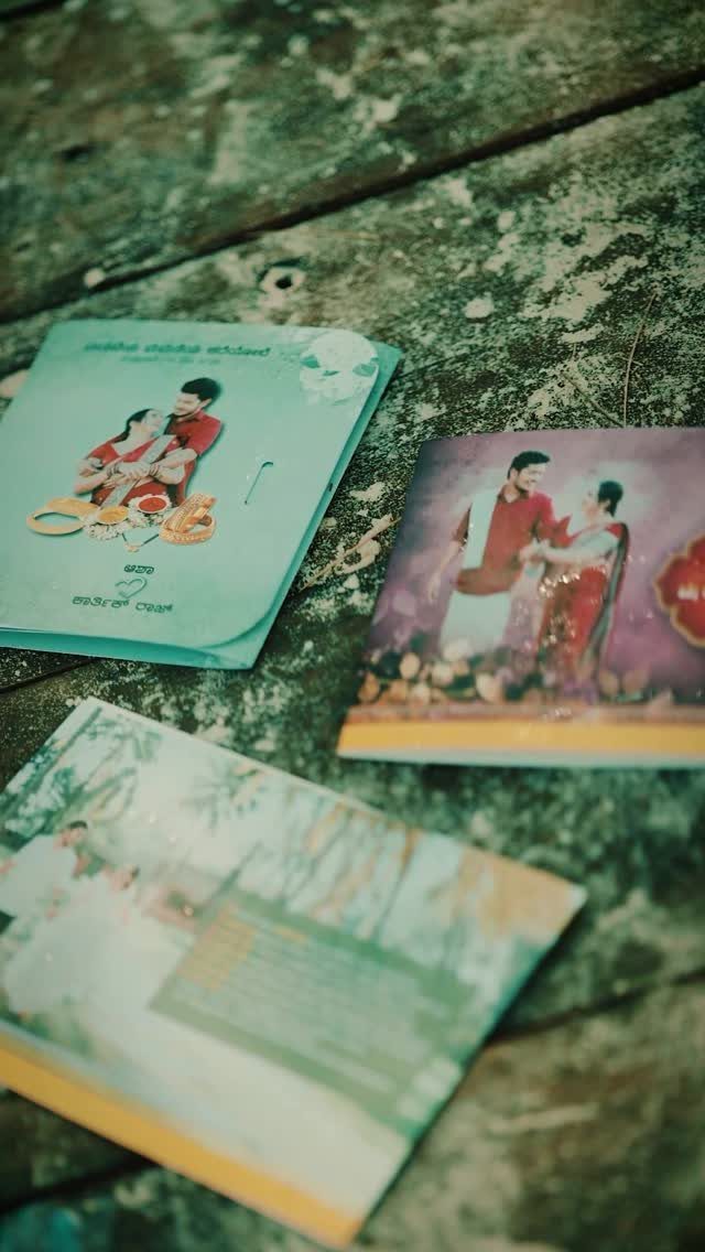
Photos of the couple on the card are a good fit when the template is built for them, as these 3 cards show. Pick a layout with a clear photo frame, then crop your picture to fit.
Cards in more than one script need a template whose fonts support both. Test the second language on screen before ordering, since a missing character can print as a blank box.
Have a fluent reader proof every line of non-English text, because your spell-check will not catch those errors.
10. Handmade Paper with Calligraphy
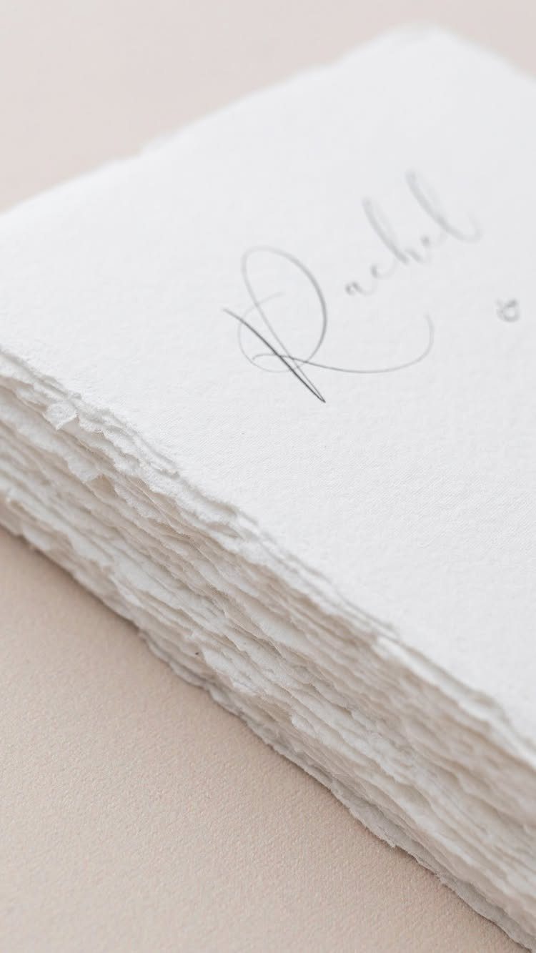
Handmade paper with deckled edges and a single name in grey cursive is the least digital idea on this list, and I like it for exactly that. The torn edge and soft ink make each sheet look individual.
For a template, look for a calligraphy-style font and print on textured stock to imitate it. Real handmade sheets and hand lettering cost much more per invitation, so order a sample first.
Grey ink reads softer than black, so check that it stays legible.
11. Architectural Illustration Invitation
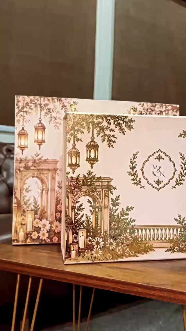
Square cards with gold-toned arches, lanterns and florals work well when the illustration is the decoration and the type stays plain. The circular monogram, here M & N, gives the suite a small mark to repeat on envelopes and seals.
Swap in your own initials first. Then check that the illustration is a vector file, so it prints sharply at any size.
Square cards often need extra postage, so ask the post office first, while the design can still change.
12. Ribbon and Pearl Embellished Invitation
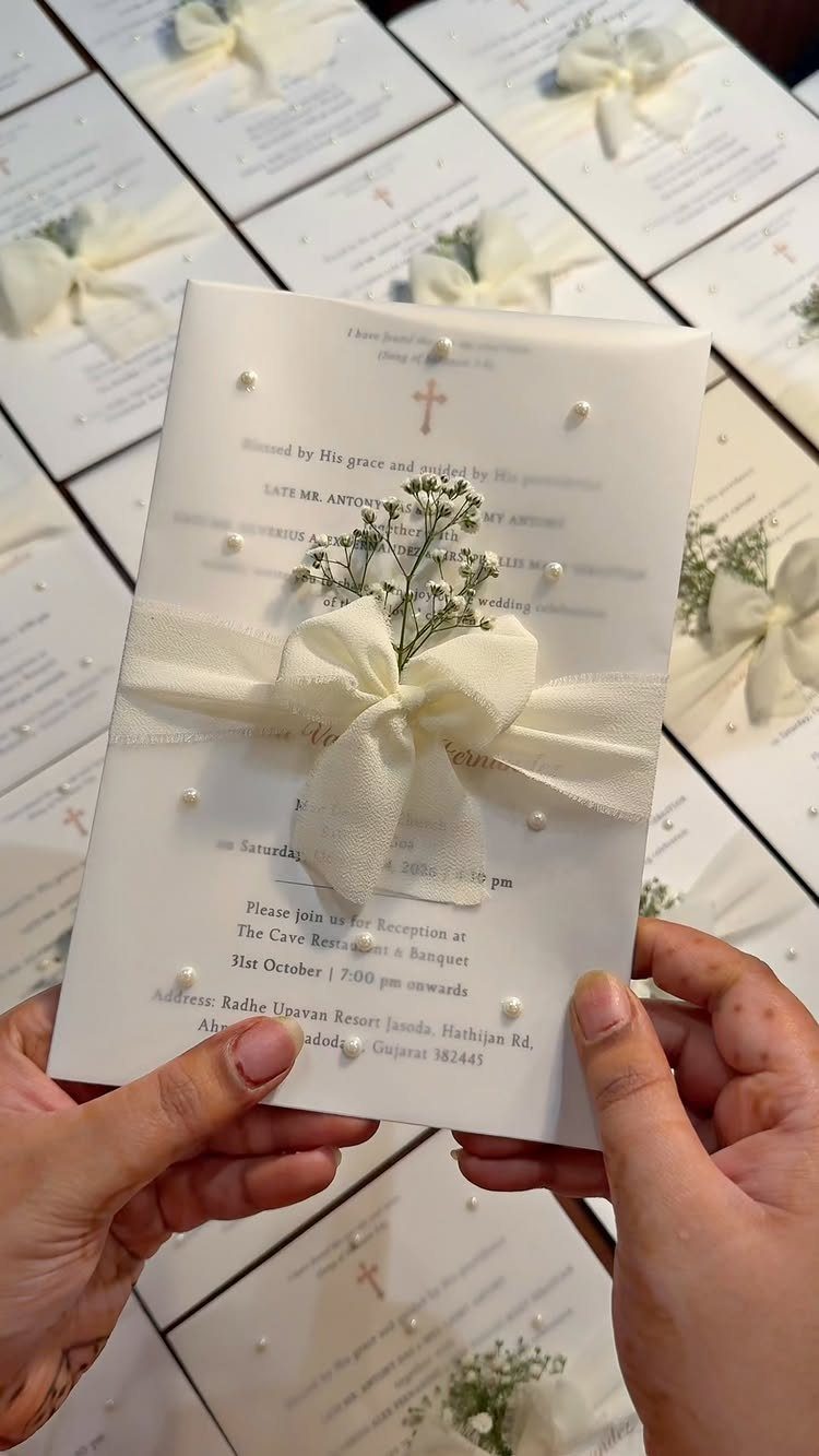
A ribbon bow, pearls and baby’s breath turn a plain white card into something guests will want to keep. Because the extras are glued on, the template itself can stay simple, and I would pick a clean one.
Buy the ribbon and pearl trim separately and attach it by hand. That takes time, so make one test card first and only then commit to all 100.
Embellished cards are bulky and heavy, so hand-deliver them or pay for extra postage.
Choosing the Right Template
Start with the wedding, not the template.
Before you open a single template, jot down 4 facts: where the event is, what season it falls in, how formal the dress code is, and whether it’s a daytime or evening affair. Together they point to a mood.
An old estate in autumn calls for warm tones.
For a wedding by the water, I’d go with soft, pale colors and quiet coastal artwork, like a thin line drawing of waves or a single shell. Choosing from that list beats grabbing whatever looks popular this month.
Stationery in 2026 is leaning personal and tied to a place: hand-drawn illustration, watercolor details and imagery connected to the couple or the location.
So a template that bends to your details will serve you better than one that looks like every other wedding card.
If you feel buried in options, narrow them by your own taste first. Know what you like, and most of the pile drops away.
Tips for Personalization
Change the words first. Set the tone in the wording, whether formal, casual or playful, so the card sounds like the two of you.
Fonts come next, and they should always be editable.
Script suits an elegant wedding, and sans-serif suits a modern one. If a template locks its fonts, I would skip it.
Colors are less certain. You can often match your palette, but some elements, like floral colors or other graphics, may be fixed, so check before you buy.
After that, make it yours with one personal touch: your monogram, a favorite engagement photo, or a custom illustration. One such touch is plenty, and it does more than a pile of tweaks.
Printing Considerations
Paper decides how the invitation feels in the hand, so go thick.
Heavy cardstock holds up in the mail and reads as premium. If your design sits on a white or light background, 16PT uncoated cover stock is a sturdy, affordable pick.
Pick the finish to suit the design. Matte looks clean and modern, glossy makes saturated colors pop, and a textured stock fits a rustic or garden feel.
Printing method is where the budget shows. Digital printing costs the least.
Letterpress and foil stamping look richer, but they raise the price per suite quite a bit. I would go digital on good paper before I would go foil on thin stock.
The standard size is 5"x7".
Square or scalloped shapes add flair, and some printers charge extra for rounded corners. If you want a polished result, have a professional shop print it, and ask for a sample first.
Frequently Asked Questions
What should a wedding invitation include?
At minimum, leave room for the names, the date, the time and the location.
If the schedule is complicated, or guests need dress code or reception details, move that to a separate details card instead of cramming it onto the main one.
Fancy script that reads beautifully on a big proof can blur on a phone screen, so set the names, date, time and place in a plain, clear typeface.
How can I personalize my wedding invitation template?
Start with the wording, then the fonts, and finish with one personal touch.
Colors are less certain, since floral colors and other graphics are sometimes fixed, so check before buying. Pick one personal detail and stop there, whether that is a monogram, an engagement photo or a small custom illustration.
What paper should I print wedding invitations on?
Go thick. Thick cardstock holds up in the mailbox and feels substantial in the hand; 16PT uncoated cover stock is the sturdy, budget-friendly weight I would choose for a white or light design.





