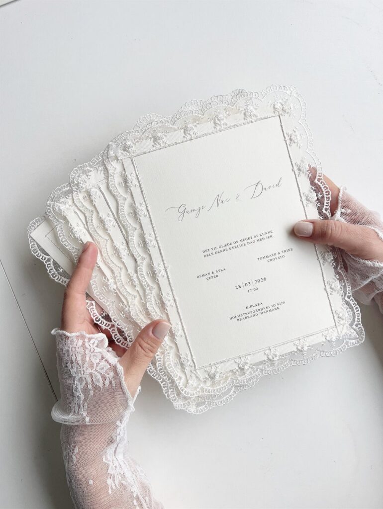
Styles in this list run from twine and a dried flower wrap to clear acrylic, and the price climbs with every extra step: blind embossing, lace or crochet, custom envelope liners.
Your wedding palette and your guest list decide which style fits, so check Choosing a Color Scheme and Personalization Tips below before you fall for a design.
A destination crowd needs an early send, while a local one can stay closer to 6 weeks; the Sending Invitations Timing section below covers the dates.
1. Romantic Floral Wedding Invitations
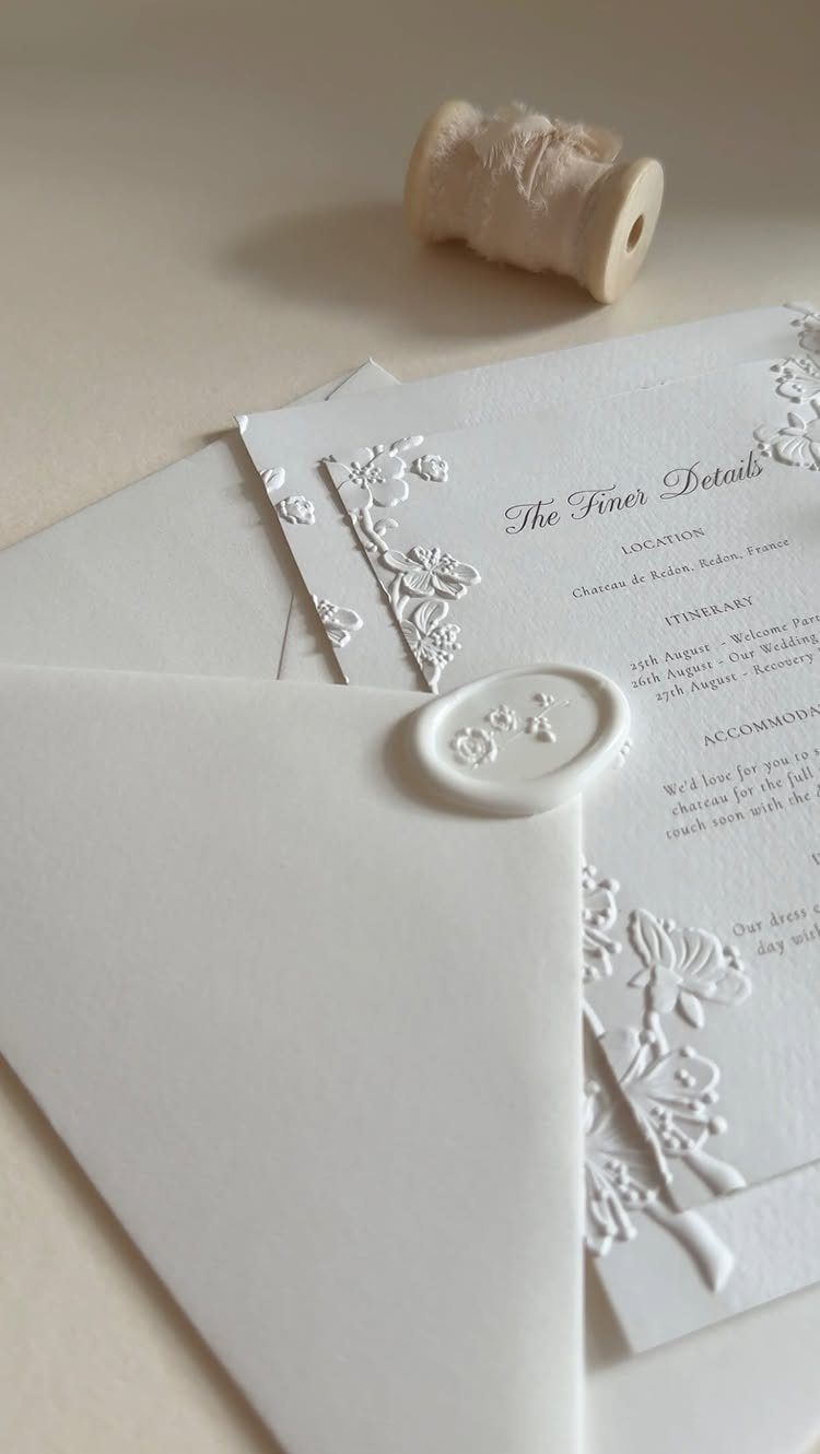
Embossed florals read as romantic without a single printed color, because the flowers show up as raised texture along the border.
A destination wedding gives this style a job to do: a separate "Finer Details" card for location and itinerary lets the main invitation stay uncluttered.
Embossing and wax both add cost, so I would pick one as the star and keep the other simple.
2. Vibrant Colors Wedding Invitations
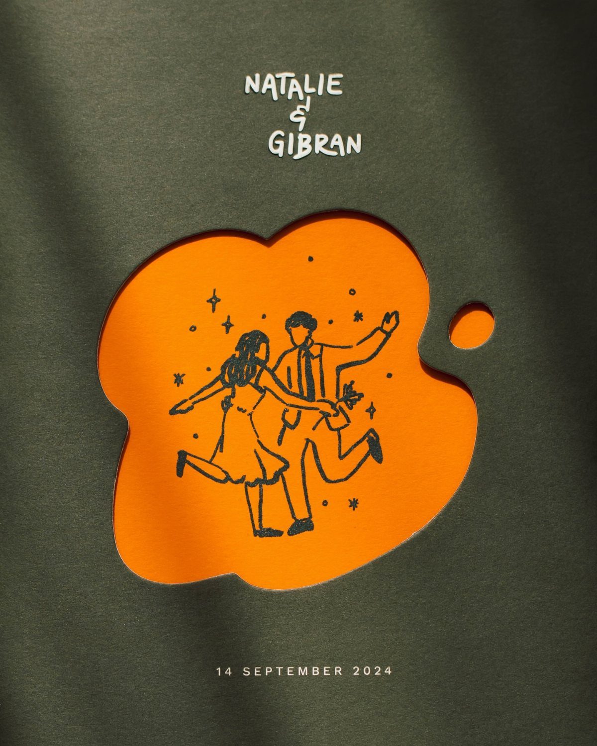
Color does the talking here. A deep green card with an orange cutout is a bold pairing, and the cutout lets a line drawing of a dancing couple peek through like a small window.
Bright invitations tell guests the party will be lively before they read a word. Keep the type minimal, with only who is marrying and when, so the palette carries the mood.
I would pick 2 colors and hold the line there. A third one starts to compete.
3. Classic and Formal Wedding Invitations
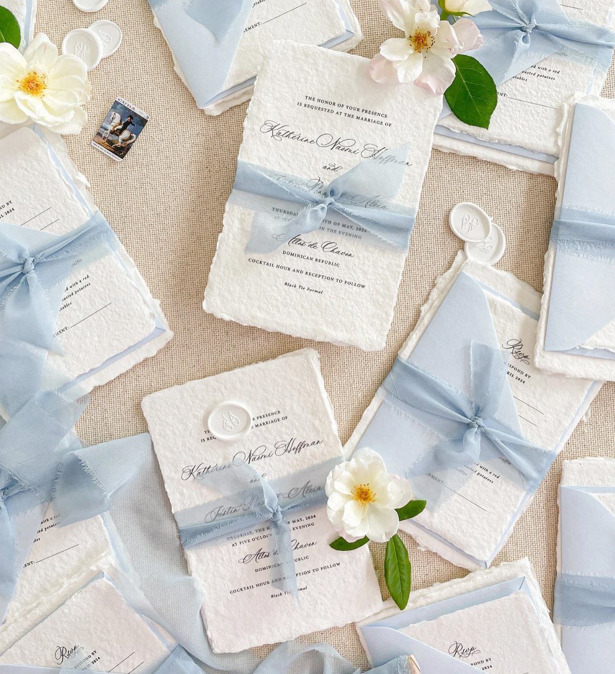
Deckled edges give a classic suite its softness: the feathered paper edge looks handmade even when the wording is strictly formal. Pale blue ribbon and a wax seal turn each invitation into something guests untie, which feels ceremonial.
Formal wording suits this look best, with full legal names written out and the venue spelled in full. Scattering a few fresh flowers is a styling choice for photos or delivery boxes, not something every invitation needs.
4. Monograms
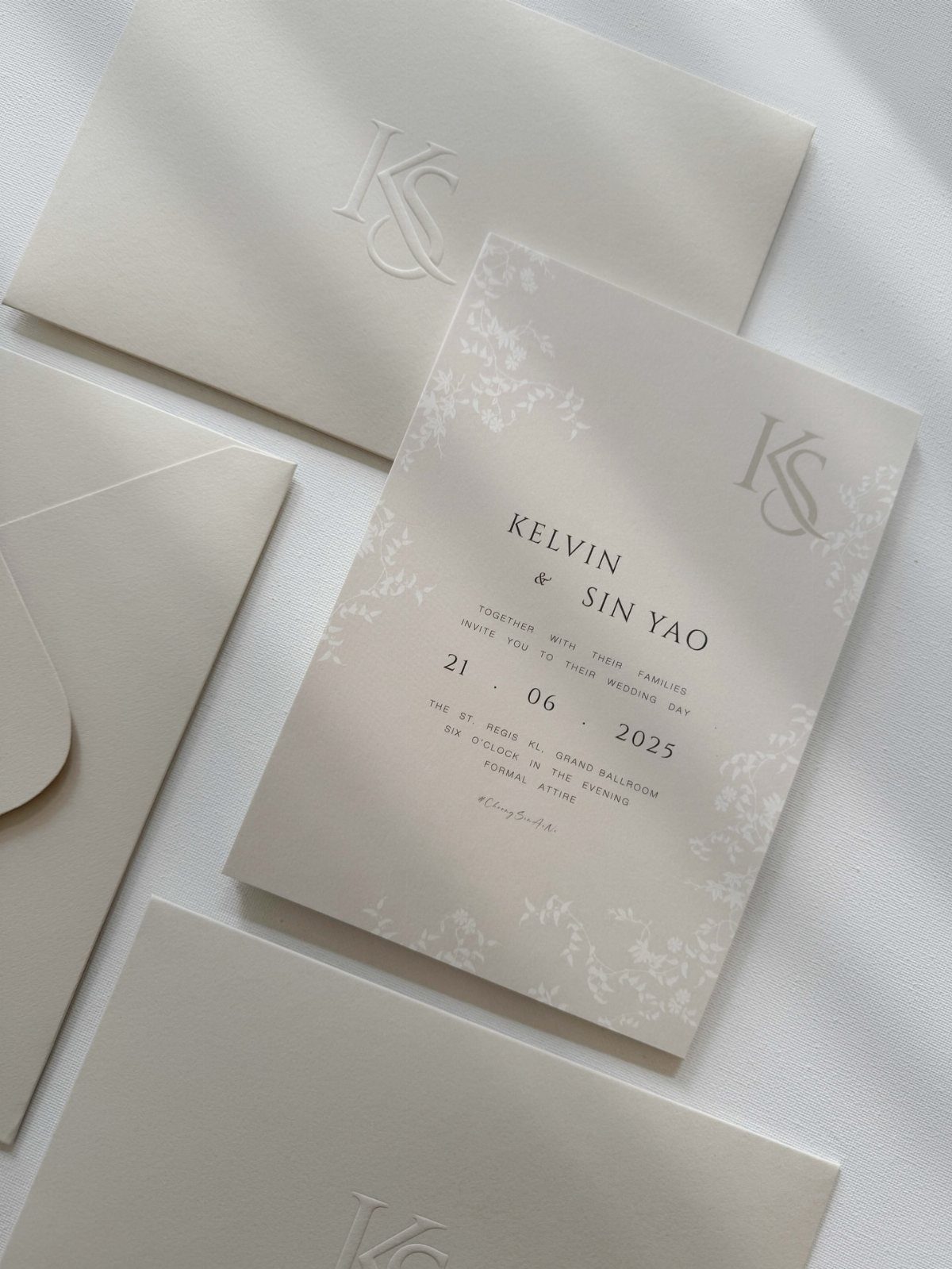
A monogram built from your 2 initials becomes a small logo for the whole wedding. Put it on the envelope as an embossed mark and the invitation feels personal before anyone opens it.
Black type on white paper keeps the monogram from fighting with the wording. Once designed, it can repeat on menus, place cards and favor tags, so the cost of drawing it spreads across the paper suite.
I would ask the designer for a simple letter pairing, since fussy ones lose detail when pressed into paper.
5. Blind Embossing Wedding Invitations
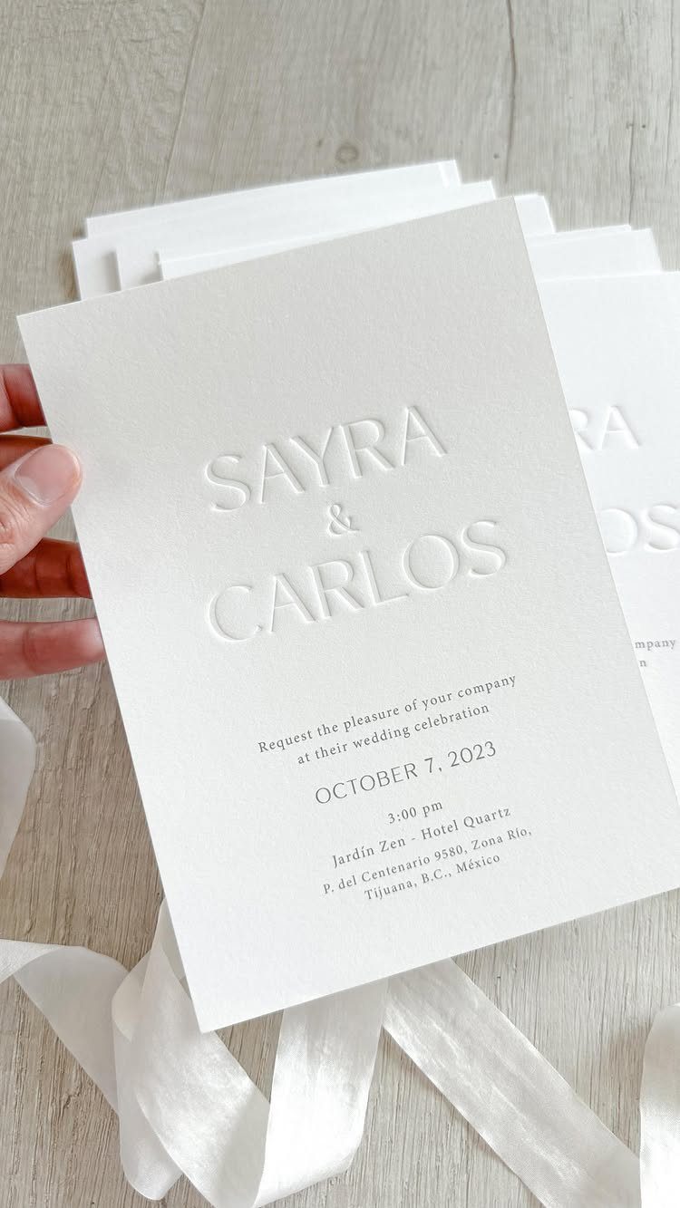
Blind embossing prints no ink at all: the names rise out of plain white paper and show only in light and shadow. Pair them with black printed details below and the contrast does the work.
It suits couples who want quiet elegance, but the effect is subtle, so choose a thick, smooth paper where the raised letters can catch light. Tilt a sample under a lamp before ordering.
Keep the embossed part to names only. Fine print is better left to ink.
6. Botanical Illustration
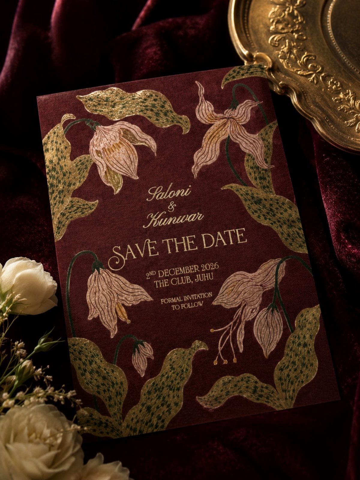
Botanical illustration borrows the look of a scientific plate: each flower drawn with care, stem and leaf included.
On a deep maroon card, gold linework makes the drawings glow, and that pairing suits a save the date for a winter wedding.
Ask an illustrator to draw flowers from your own bouquet, so the invitation previews the day. Foil costs more than flat ink, so I would keep gold to the illustration and print the wording in a plain color.
7. Neutral Greenery
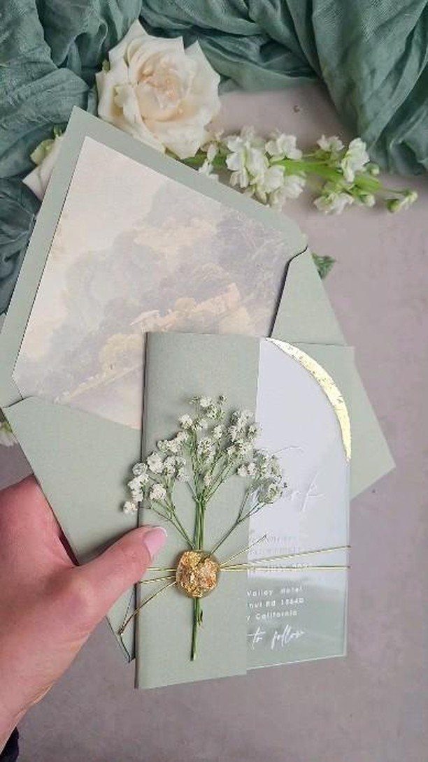
Sage green is the neutral that behaves like a color. It sits quietly beside white roses and green fabric, so the invitation matches a garden or a leafy venue without announcing a theme.
I would keep gold to a small accent, such as a thin foil line or a single stamped detail, so the white roses and green fabric stay the focus.
Foil costs more than flat ink, so the edge is where it pays off.
8. Vintage Wedding Invitations
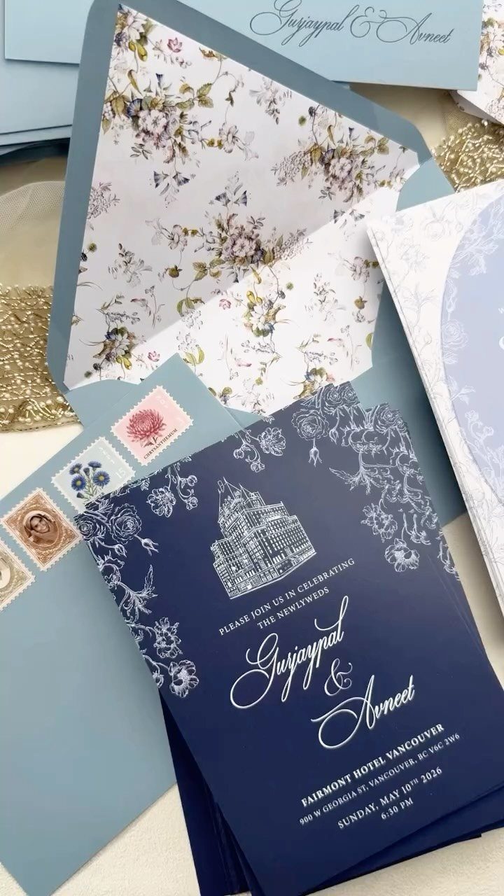
A navy card with white calligraphy feels like mail from another era, and a building illustration of the venue makes it personal. Ask the illustrator to draw your actual venue so guests recognize it.
The envelope does half the work here.
A floral lining in blue and vintage-style stamps give the suite its age before anyone reads a word. I would spend on the lining and the stamps, then keep the card’s type simple so the calligraphy stays readable.
9. Destination Wedding Invitations
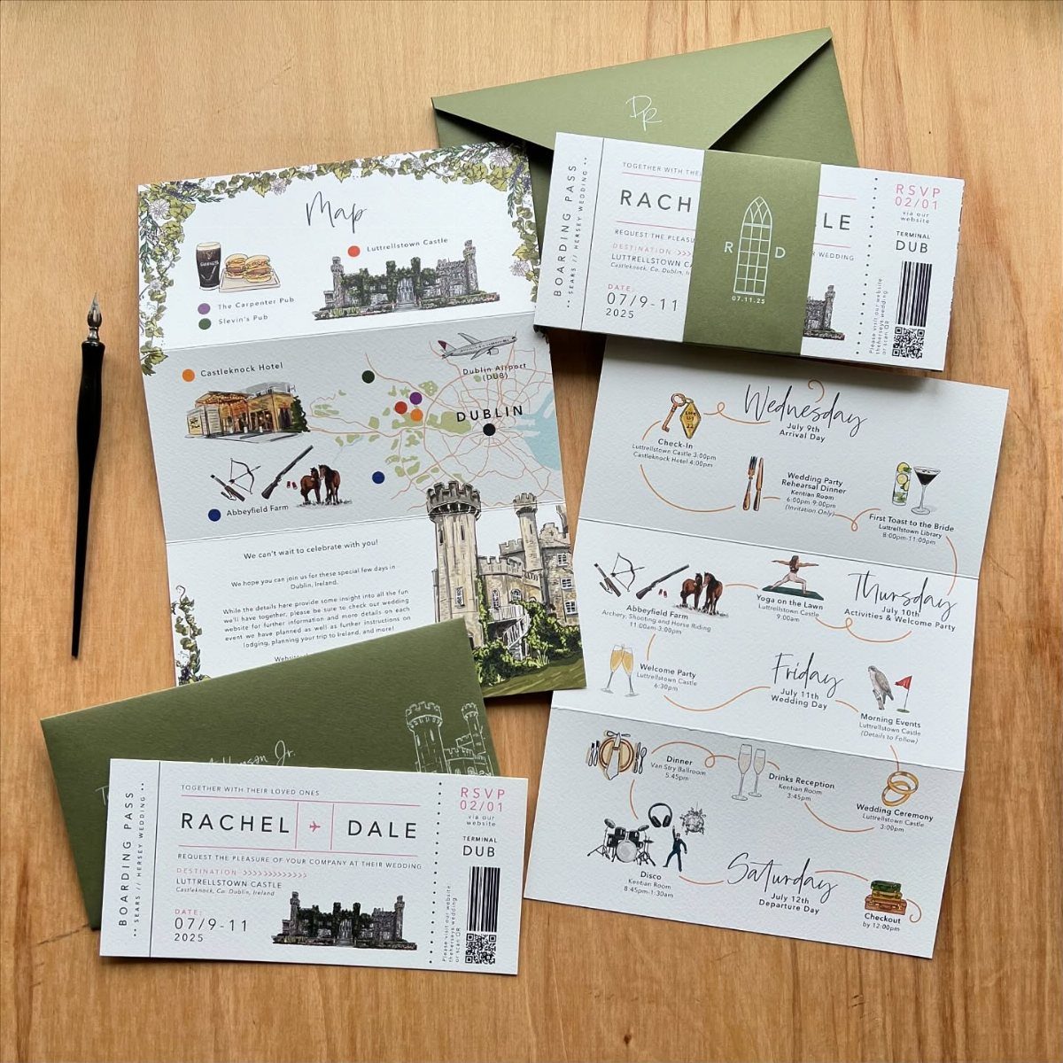
Boarding pass invitations turn the logistics into the design: names, date and city sit where a gate and seat number would. A map of the destination, such as Dublin, shows guests where they are headed.
Itinerary cards keep the main invitation light.
Put travel details, lodging and the schedule there, and leave the pass for who, when and where. Because guests book flights and hotels early, I would send this suite as a save the date first, with the full details following.
10. Contemporary Typography
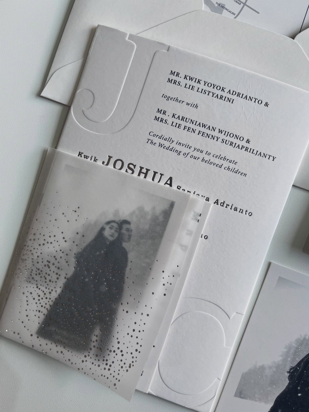
Contemporary typography lets the lettering be the decoration. Clean modern fonts, plenty of white space and one embossed detail look polished without any illustration.
A translucent overlay with a black-and-white photo of the couple adds depth while keeping the palette quiet.
Choose one clean typeface family and vary only size and weight. Order a proof, because thin type over a translucent sheet can get hard to read, and names should stay crisp.
11. Lace & Crochet
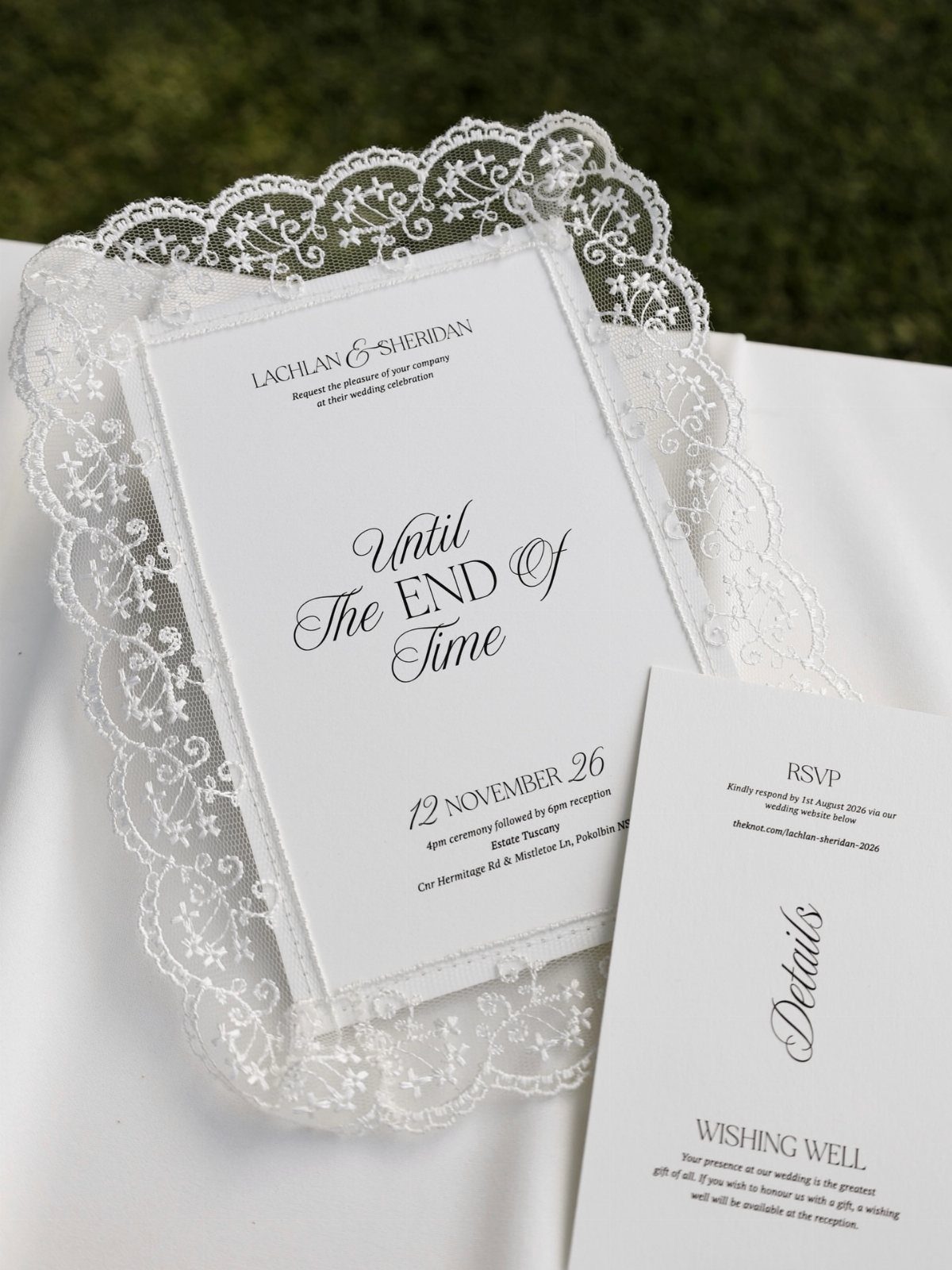
Lace borders bring a handmade feel to a white card. Set the names, date and RSVP inside the border and let the pattern frame them; the more delicate the lace, the simpler the type should be.
I like a lace doily as a styling prop for photos, since it echoes the border. Keep the detail cards plain so the lace stays the one decorative note in the suite.
12. Clear Acrylic Wedding Invitations
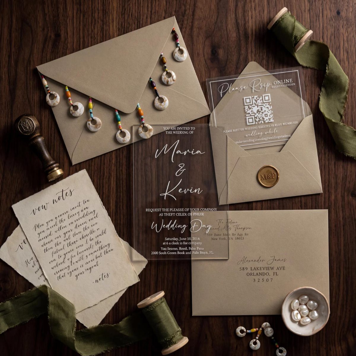
A clear acrylic card with white text looks modern, and the see-through sheet makes the words seem to float. Tan envelopes ground it, and an olive green ribbon with a wax seal adds a soft, earthy touch.
White ink needs a dark or tan surface behind it to be readable, so the envelope or a backing card matters.
I would ask the printer for a sample first and check the text in daylight. Acrylic usually costs more than paper, so use it for the main card only.
13. Traditional Indian Illustrated Invitations
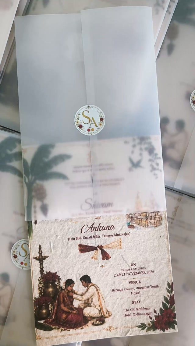
Ask the illustrator to draw you in the clothing you will actually wear, so guests see the real couple rather than a generic pair.
Print the wording on the vellum or on the card beneath it, but not both, or the lines will ghost against each other. I would request a proof first, since translucent paper can blur small type.
Keep the seal to your 2 initials.
14. Twine and Dried Flower Wrap
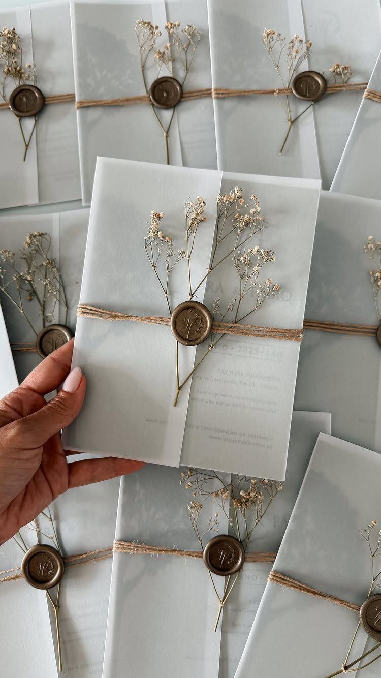
Brown twine, a gold wax seal and one sprig of dried baby’s breath turn a plain white invitation into a small bundle guests untie.
Because the card stays simple, this is an easy way to add texture on a modest budget.
Dried flowers hold their shape, so you can assemble the bundles ahead of time instead of the week of mailing.
I would tie one test invitation first, then decide how many sprigs look right. Wax adds cost and effort per piece, so keep the seal to a single dot.
Flat sprigs travel better than a fluffy bunch, which may crush in the mail.
15. Custom Illustrated Envelope Liners
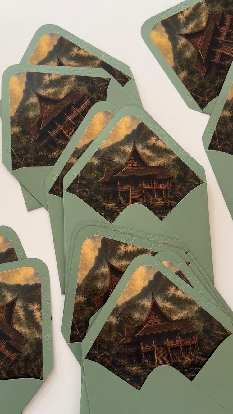
Sage green envelopes with a landscape liner give guests a surprise the moment they open the flap. Printing an illustrated house and setting inside the liner means the card itself can stay plain.
I would ask an illustrator to draw a place that matters to you, such as the venue or a family home, so the picture carries meaning.
Liners are an extra printing step, so expect them to cost more than a standard envelope.
Choose a liner paper thin enough to fold cleanly into the flap. Order a sample and check that the green and the illustration sit well together.
Choosing a Color Scheme
Pick your invitation colors from the wedding palette you already have, not from the paper you happen to love. Guests see the invitation first, so it sets the expectation for the flowers, linens and signs that follow.
Two or three shades is enough. Take the main color and one accent straight from your bouquet or table decor, and let the third be a neutral like white or cream.
Color shifts between screen and paper, so order a printed sample and hold it next to a fabric swatch or a flower stem in daylight. If the match is off, adjust the ink before you print the full run.
Personalization Tips
Personal details work best when they come from your actual relationship, not from a template. A monogram, a custom illustration or a short quote each shows guests who you are before they read the wording.
Choose one or two. A monogram plus a short quote is plenty, and a third element starts to crowd the card.
Keep any quote to a line or two, and pick words you would actually say to each other. If it needs an explanation, it probably does not belong on the invitation.
Digital invitations can carry a monogram too, on the card, the stamp and the email, so the look holds together even if you skip paper.
Sending Invitations Timing
Plan on getting invitations into the mail about 6–8 weeks before the date; that window gives guests time to respond without letting the details slip their minds.
Guests have time to plan, and you still get replies back before your caterer needs a headcount.
If many guests must travel, or the wedding is a destination event, move that up to 8–12 weeks. Some planners go earlier still and suggest 3–4 months, which makes sense if your caterer’s deadline falls early.
A mostly local guest list can stay closer to the 6-week mark. Whichever window you choose, send a save the date several months before the invitation, especially for a busy time of year.
Set your RSVP date a couple of weeks ahead of the caterer’s deadline, so you have room to chase late replies.
Frequently Asked Questions
What are the different types of wedding invitations?
The main styles are classic and formal, romantic floral, vintage, contemporary typography, and bold, colorful designs.
Rustic touches like twine and dried flowers, plus destination styles such as boarding passes, round out the common choices. Pick the one that matches the tone of the wedding, since guests read the invitation before anything else.
What are some unique wedding invitation ideas?
Blind embossing, lace borders, clear acrylic cards and boarding pass invitations all stand out. Illustrated envelope liners are another good one: the card stays plain while the envelope gives guests a surprise when they open the flap.
What are the current trends in wedding invitations?
Contemporary typography, bold color pairings, custom illustration and illustrated envelope liners are all popular. A custom illustration of your real venue or a bouquet from your own florist gives guests something specific to you, which a stock template can’t.
When should wedding invitations be sent?
Plan to get invitations into mailboxes roughly 6–8 weeks ahead of the date, and add a few more weeks if many guests must travel. For a destination wedding or a guest list that must travel, send them 8–12 weeks ahead.
A save the date should go out several months before the invitation, and your RSVP date should fall a couple of weeks before the caterer’s headcount deadline.





