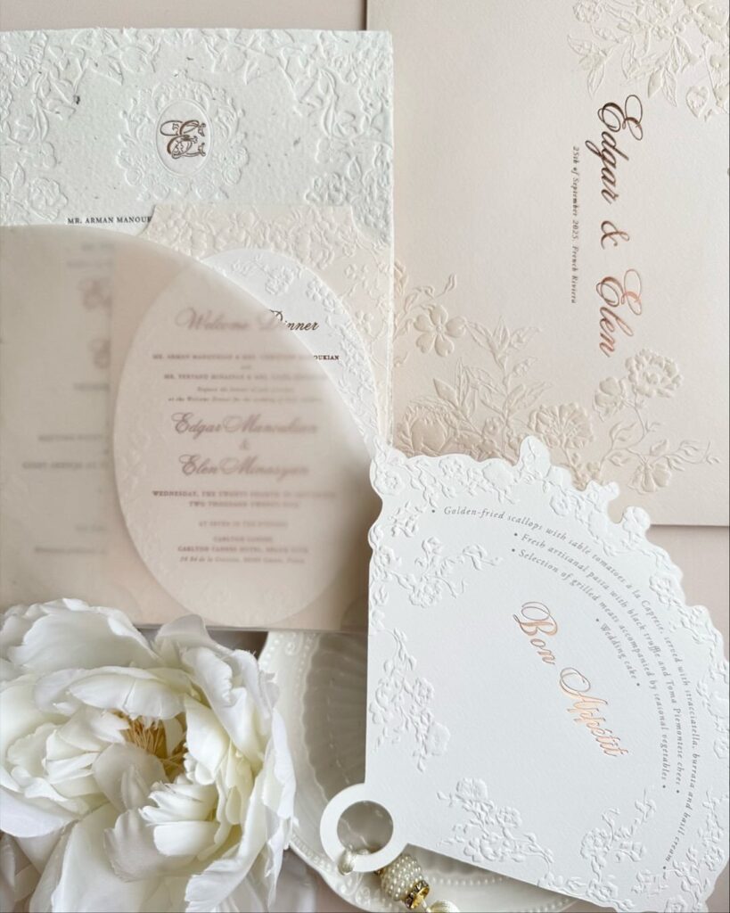
The 9 invitations here run from a flat ivory card with a linen finish to letterpress and embossed crests, where the paper itself carries the design.
What decides the choice is how much raised work your guest list can absorb, because letterpress, embossed crests and embossed monogram envelopes each add a cost for every single invitation.
1. Ivory Cardstock with Linen Finish
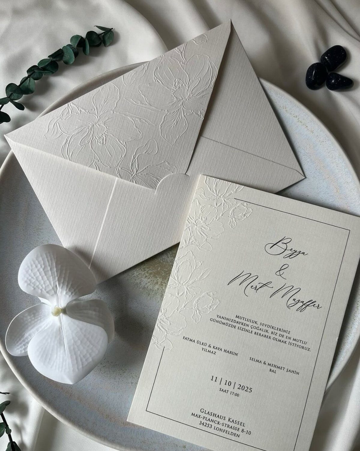
Linen finish adds a faint woven texture to ivory stock, and that quiet grain is why it reads as formal without any extra ornament. Ivory also looks softer than stark white, so dark ink stays easy to read.
Order a sample before committing. Run a thumb across it, then hold it beside your envelope, because linen and a smooth liner can look mismatched if the tones drift.
A floral emboss like this one pairs well, as long as the type stays small and calm.
2. Letterpress Wedding Invites
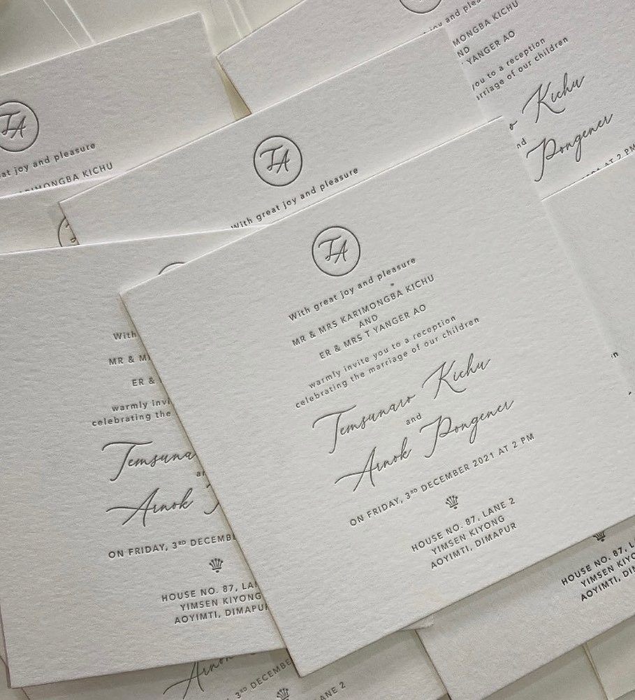
Press a letterpress card with a fingertip and you feel the type sitting below the surface; that dent is the whole appeal.
Debossed grey ink on white paper is a restrained way to use letterpress, since the pressed impression does the work and the color stays quiet.
Letterpress costs more than flat printing, so I would spend it on the invitation itself and keep the smaller inserts digitally printed.
Choose a thick, soft cotton-style paper so the impression has room to show. Keep the monogram simple, since fine lines can fill in.
3. Matching Stationery Suite
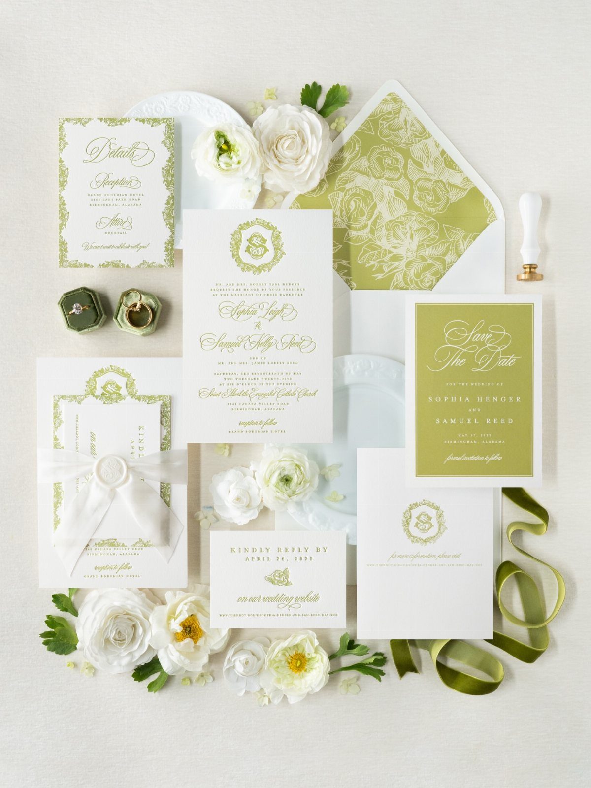
Invitation, RSVP card and envelope should look like one family: same paper color, same typeface, same flower or motif repeated.
A single palette, such as green and white with one flower like ranunculus repeated across every piece, is what makes a suite read as matching.
Pick the palette and the font before you order anything, then apply both to every piece, including menus and programs you will need later.
Mixing printers is where mismatches creep in, so buy the whole suite from one source if you can. Compare proofs side by side, not one at a time.
4. Envelope Liner
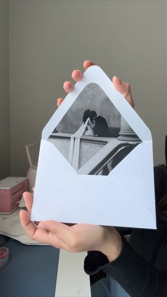
Guests see the liner as soon as they open the envelope, which makes it the cheapest place to add personality.
A black and white photo of the two of you printed on the liner gives a formal invitation a personal surprise.
Choose a photo with plenty of quiet space and strong contrast, since a printed liner loses detail.
If a photo feels too casual for your tone, a patterned or solid colored liner is the more traditional route. Either way, test the fit before gluing a full batch.
5. Classic Wedding Invites with Script Font
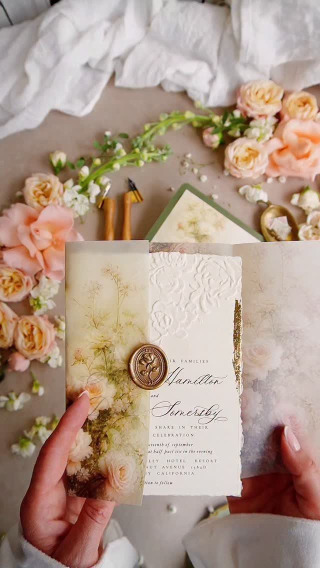
Script lettering suits names better than it suits details. Set both names in script and switch to a plain serif for dates, times and the address, so the details stay easy to read.
Long script blocks tire the eye and older relatives struggle with them.
Keep the flourishes light and the type large enough to read at arm’s length. A wax seal, gold here, makes a fine finishing touch, though it adds a step to assembly.
6. Classic Black and White Invitations
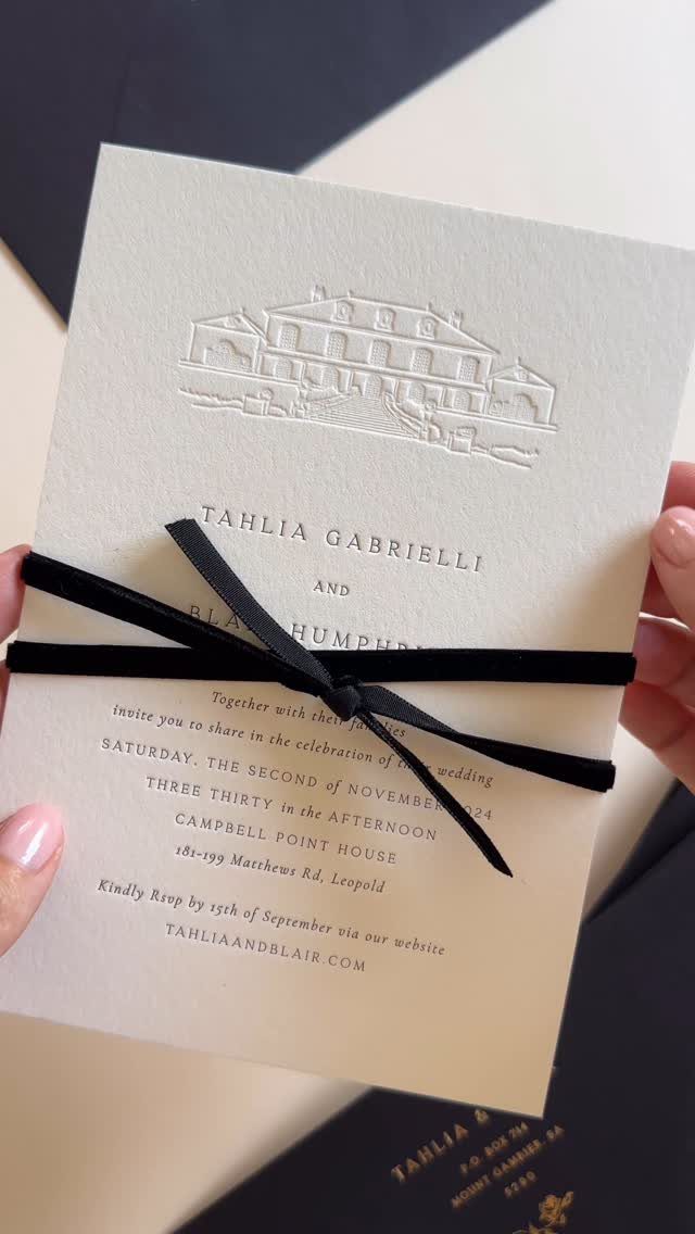
Black ink on white stock is the most formal pairing there is, and a black ribbon bow adds weight without adding color. Embossing the card, as here, gives it presence while the palette stays strict.
Because there is nothing to hide behind, paper quality and type spacing matter more.
Choose a heavy white card and set the names in capitals with generous space around them. Tie the ribbon yourself only if you have time; a bow per invitation adds up quickly.
7. Floral Classic Invitations with Green Motifs
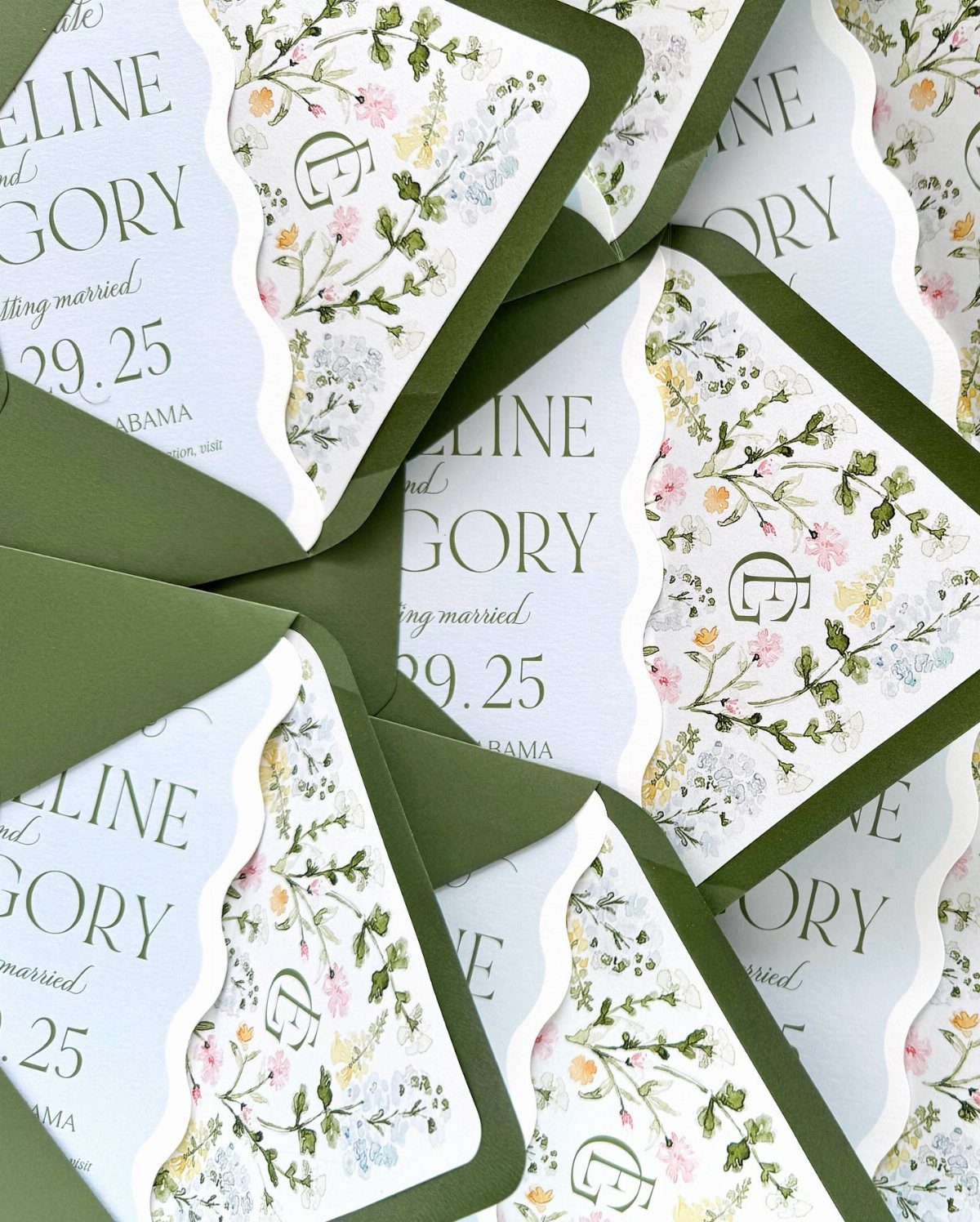
Green leaf motifs on a floral card keep the color story calm: one accent, one flower style, nothing competing. Scalloped edges and a small monogram, as here, add a soft shape without extra ink.
Olive envelopes suit the leaves best, though they need a sample check, since green shifts under different light. Keep the lettering in one dark, quiet color so the florals stay the decoration and the wording stays easy to read.
8. Navy Blue Folded Invitation
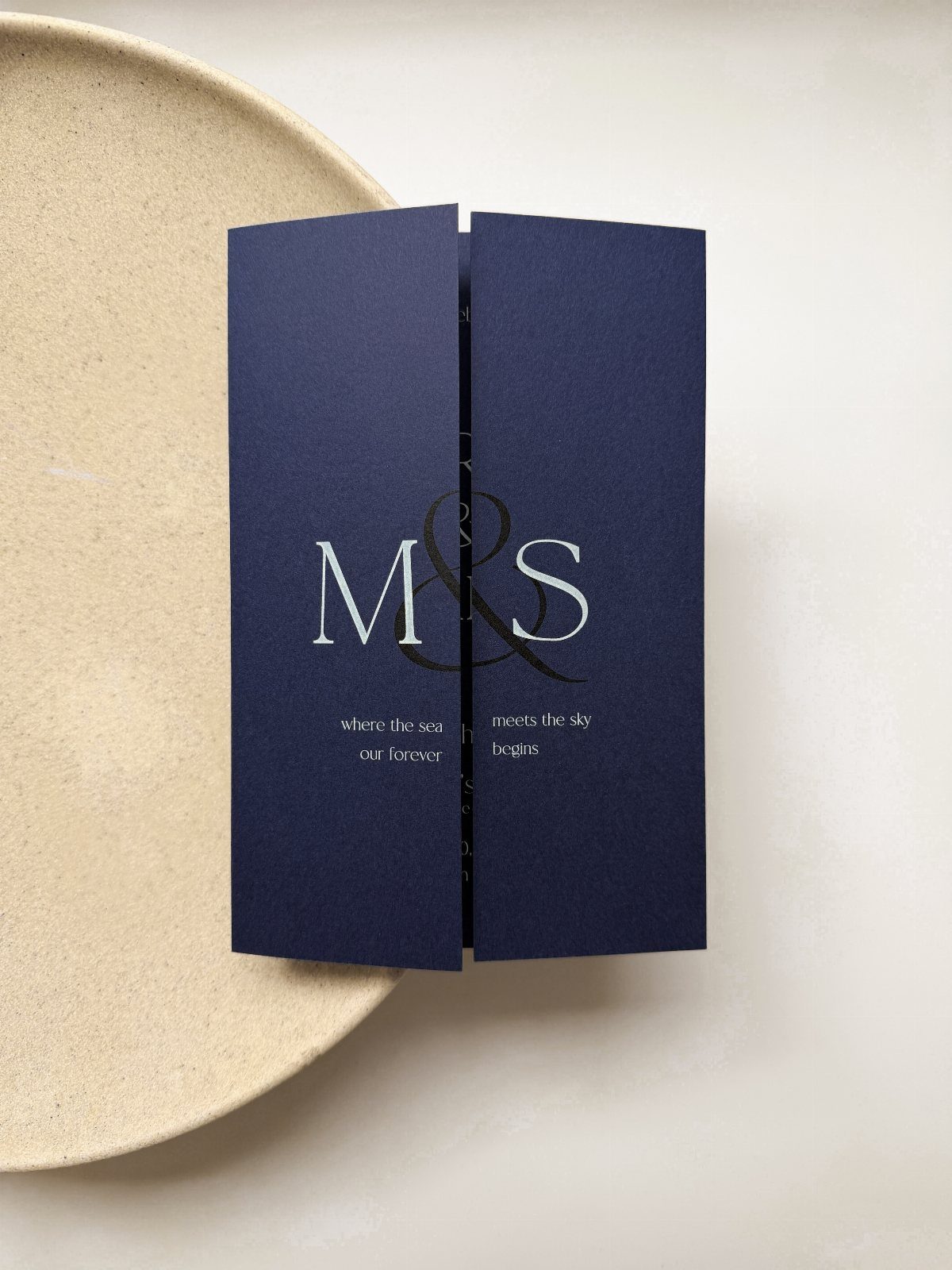
Navy with white or silver serif lettering looks formal without feeling stiff, and an oversized ampersand makes a monogram do the work of a graphic. Keep the initials large and the line beneath it short.
Light type on a dark card needs good contrast, so choose white or silver over a pale gray.
Order a proof, since light ink on navy can look thinner on paper than on screen. Fold the card with a crisp score so the edge stays clean.
9. Embossed Crest Wedding Invite
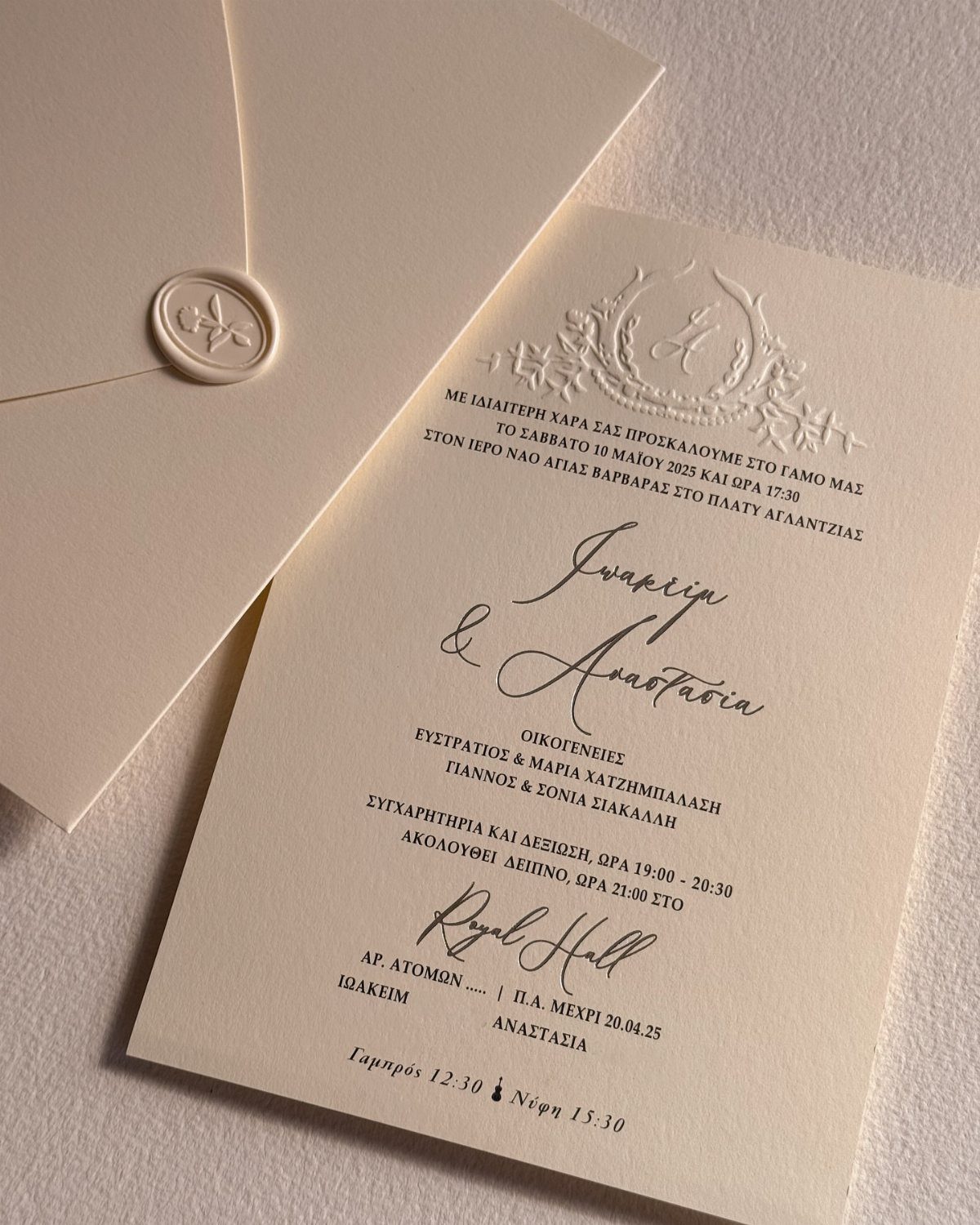
An embossed crest at the top of a cream card does the job a printed logo would, only quieter.
Pair it with script for the names and a plain serif for everything else, as in entry 5, so the crest stays the single decorative element.
A wax seal on the envelope echoes the crest, though it adds hand assembly to every invitation.
If the guest list is long, seal only the outer envelope. Check any non-English text with a native speaker before it goes to print.
10. Embossed Monogram Wedding Envelopes
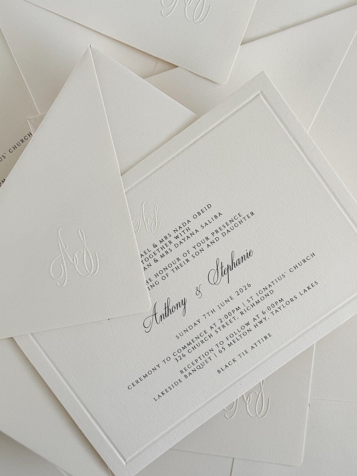
A blind-embossed monogram has no ink at all: the initials simply rise from the envelope, which is why it looks so restrained. Guests notice it by touch and by the shadow it casts.
Pair it with plain white cards in black text, and make sure the monogram on the envelope matches the one inside.
Thin hairlines and tiny serifs tend to fill in under the die, so a bold monogram with generous spacing will press far cleaner.
Because raised work adds to the bill, I would spend it on the envelope flap alone and let the card inside stay flat.





