The ideas here run from a chocolate bar wrapper printed with names and a date to boxed invitations, laser cut acrylic and deckle-edged handmade paper, so the cost per suite swings widely.
How many people need the full treatment decides which one is yours: a boxed or hand-lettered invitation can go to close family and the wedding party, while the rest of the guest list gets standard paper.
1. Personalized Emblems
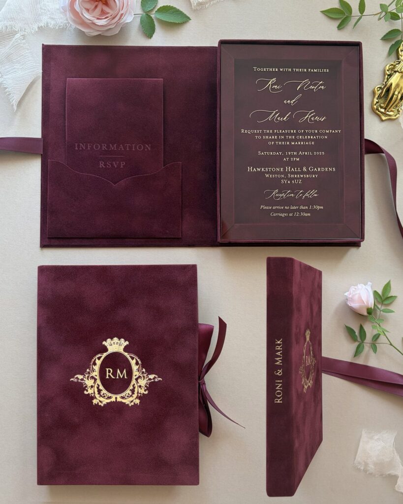
A lapel pin carrying the couple’s initial and wedding date turns a monogram into something a guest or groom can actually wear.
Silver with a single stylized letter reads as formal against a black tuxedo, and a date in numerals keeps the design compact.
Printed on stationery, the same emblem can repeat on the invitation, the menu and the thank you card, so I would settle on it before ordering any paper.
2. Boxed Invitations
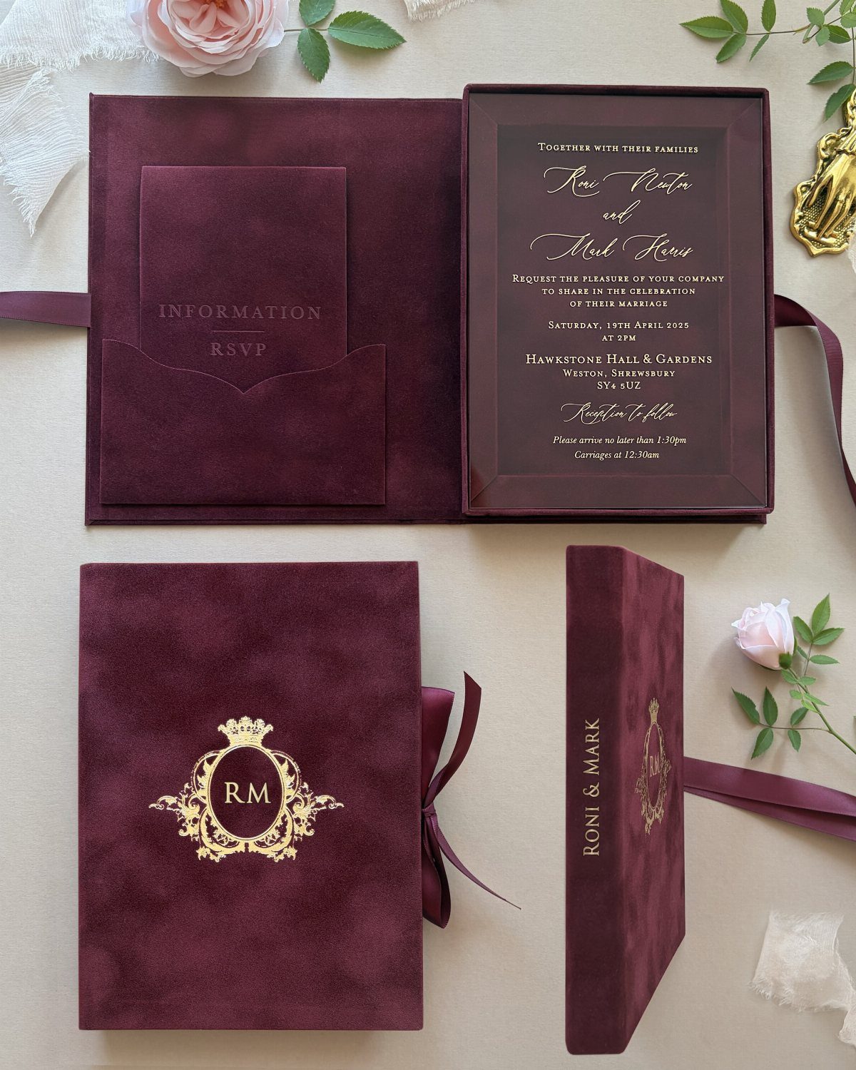
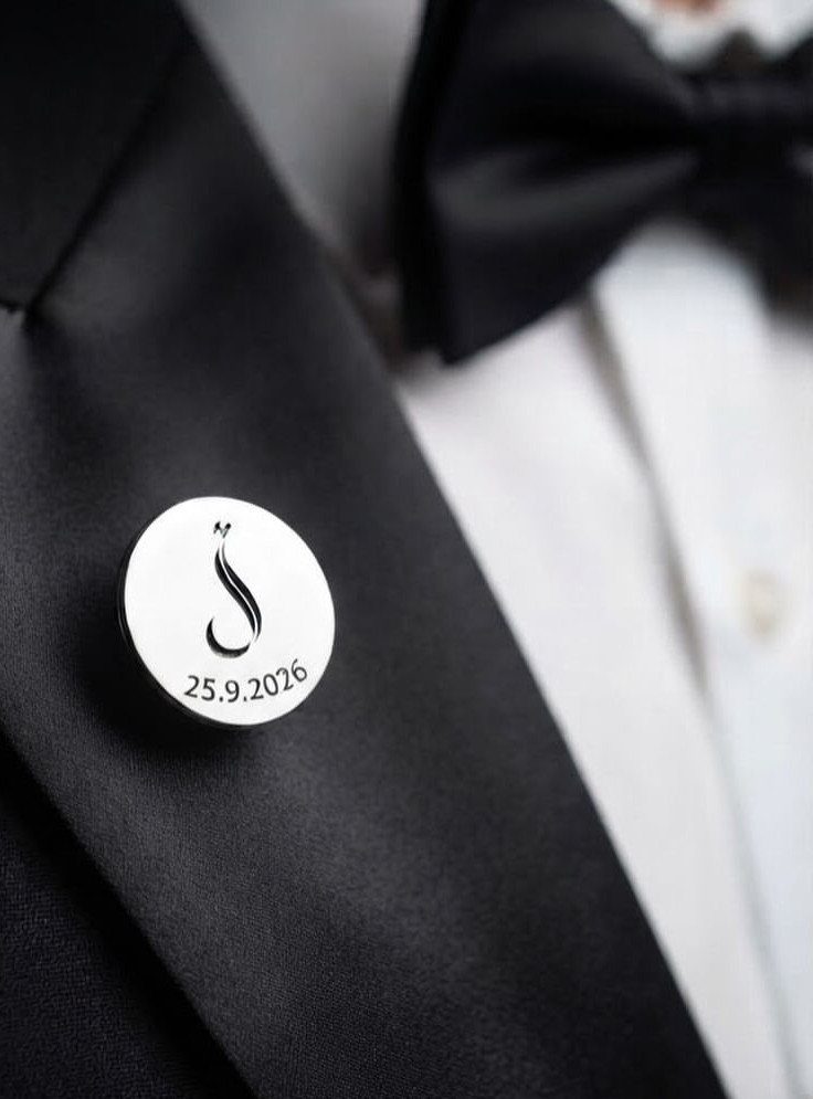
Velvet changes how an invitation feels in the hand before anyone reads a word. A box holds the invitation, an information card and an RSVP card together, so nothing slides loose the way a stack in an envelope can.
Gold lettering on burgundy is a strong pairing. Boxes cost more per suite than envelopes, so I would send them to close family and the wedding party, and use standard paper for the rest.
3. Travel-themed Stationery
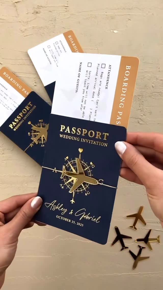
Passport-style invitations give a travel-loving couple an obvious format: a booklet cover, a name and a date, and small foil charms such as a compass or an airplane.
Keep the RSVP card in the same style so the suite feels like one set. Put the practical details, like location and arrival times, inside the booklet pages, where a passport would carry them.
4. Chocolate Bars
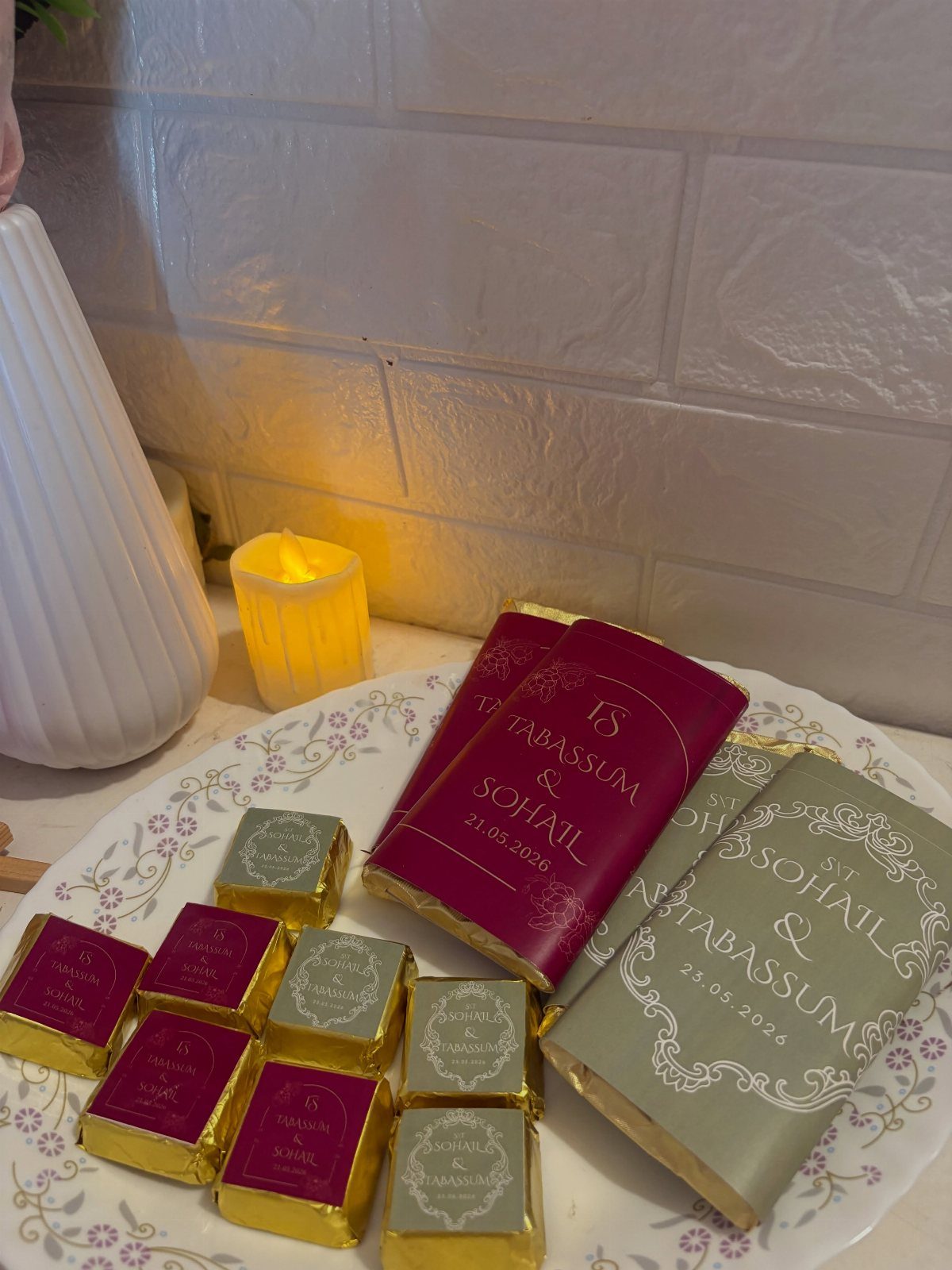
Printing names and a date on a chocolate bar wrapper gives guests an invitation they will open instead of filing in a drawer.
Pick wrapper colors that match your wedding palette, since the bar will sit on a table or tray before it gets eaten.
Wrappers hold little text, so names and date are enough. I would send the full details separately, by card or a wedding website link.
5. Vibrant Hues in Invitations
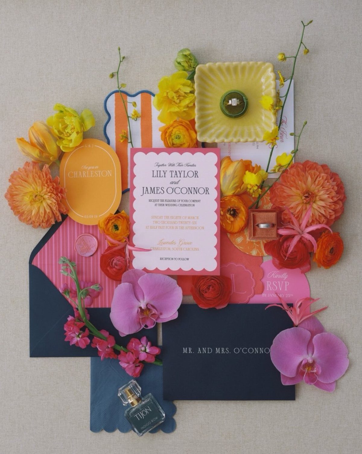
Add a single accent, like orange, in a small detail rather than spreading it everywhere.
Dark envelopes make light invitations pop the moment they come out. If you want color without crowding the page, keep the invitation text in one ink and let the paper do the talking.
6. Black and White Monochromatic Stationery
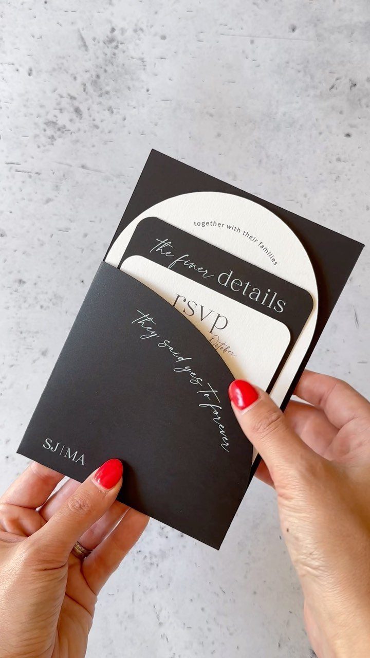
Black and white suites rely on contrast, so the paper stock and type carry everything. A black envelope with white cards looks dramatic, and cursive headings softened by plain small text keep it from feeling cold.
Playful lines like "they said yes to forever" give the strict palette some personality. White ink on black needs a clear, readable font size, so check a printed proof before ordering.
7. Floral Patterns
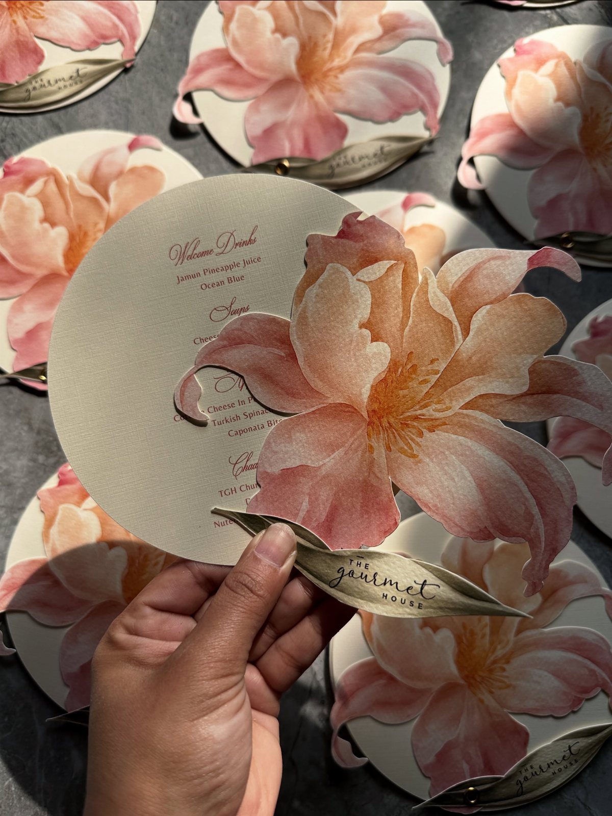
A 3D floral cutout on a round card turns the flowers into the structure of the invitation, not a pattern printed on top.
Because the shape does the work, the cream stock can stay plain and the text short, as on a menu that lists only "Welcome Drinks" and the venue name.
Cutouts are fiddly to produce, so I would use them on one piece, the invitation or the menu, and keep the rest of the suite flat.
8. Wax Seals
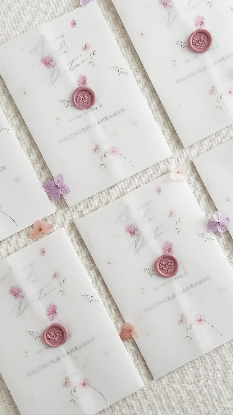
Pink or purple wax pressed over the flap gives a floral invitation a finishing touch that feels vintage without any extra printing.
Match the seal to a flower already on the card, so the color reads as part of the design.
Names printed on the invitation, like the pair here, mean the seal can stay unmarked or carry a simple initial. Ask for a sample before ordering the full run.
9. Hand-lettered Designs
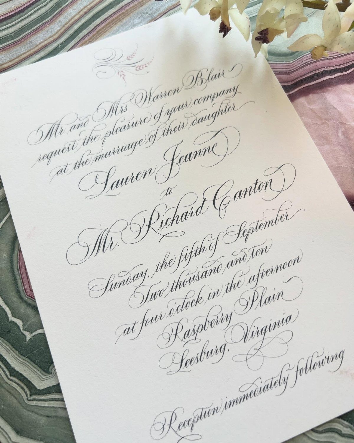
Black ink calligraphy on a white card needs nothing else to look finished. Names, the date and the town, as in a September 5th wedding in Leesburg, Virginia, are enough when the letterforms carry the design.
Hand lettering costs more than a standard printed font, so I would pay for it on the invitation alone and choose a matching typeface for the smaller cards.
10. Metallic Foil Accents
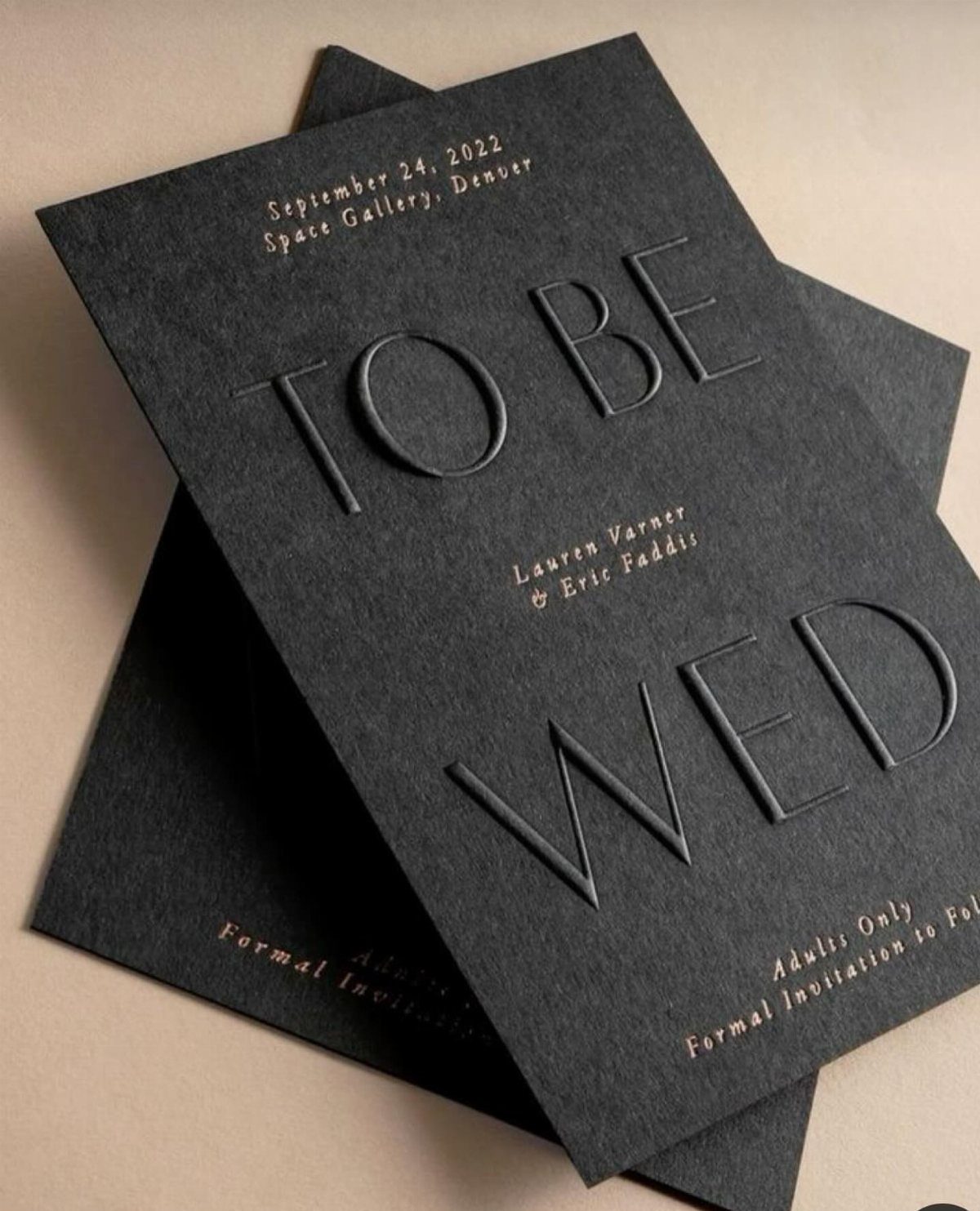
Gold foil on black stock makes the key facts catch the light: date, venue and names glow against a matte surface. Embossed lettering such as "TO BE WED" adds texture that foil alone cannot.
Keep the foil to the lines guests must read, and leave the address and fine print in plain ink. Foil costs extra per piece, so it pays to limit it to a few lines.
11. Envelope Liners
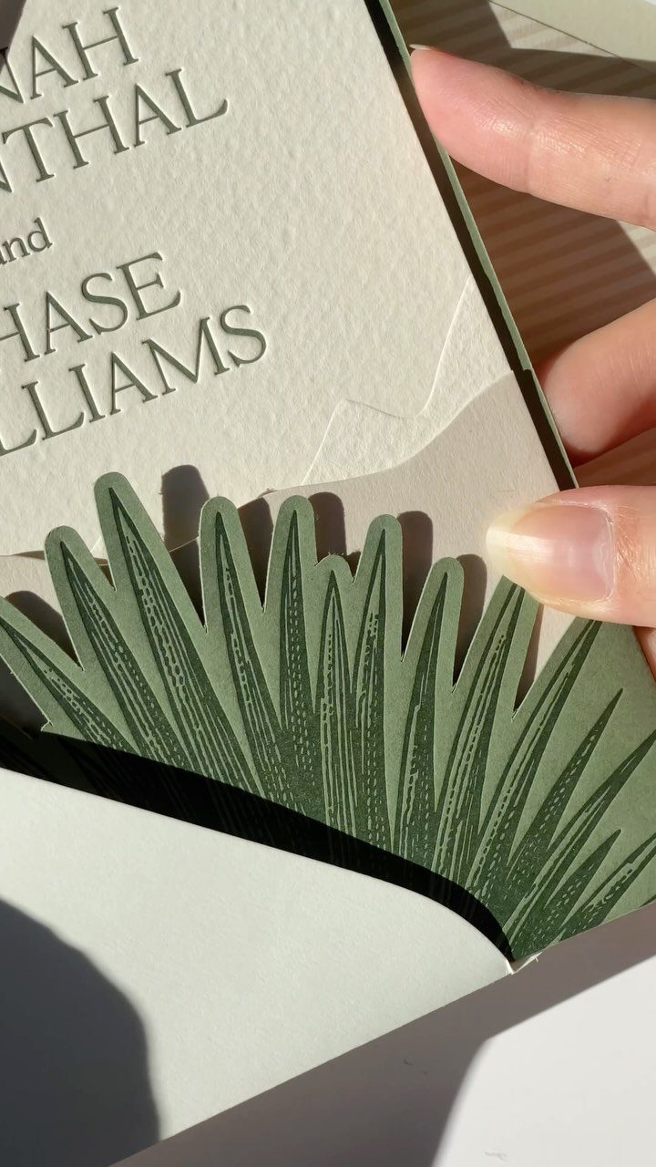
A botanical liner is the surprise guests find only after opening the envelope. A green leaf pattern pairs well with an invitation in black text, since the dark type stays easy to read against the pale card.
Liners add a step of assembly, so order them early and allow time to glue each one in. Choose a pattern that echoes your flowers or venue.
12. Personalized Seating Charts
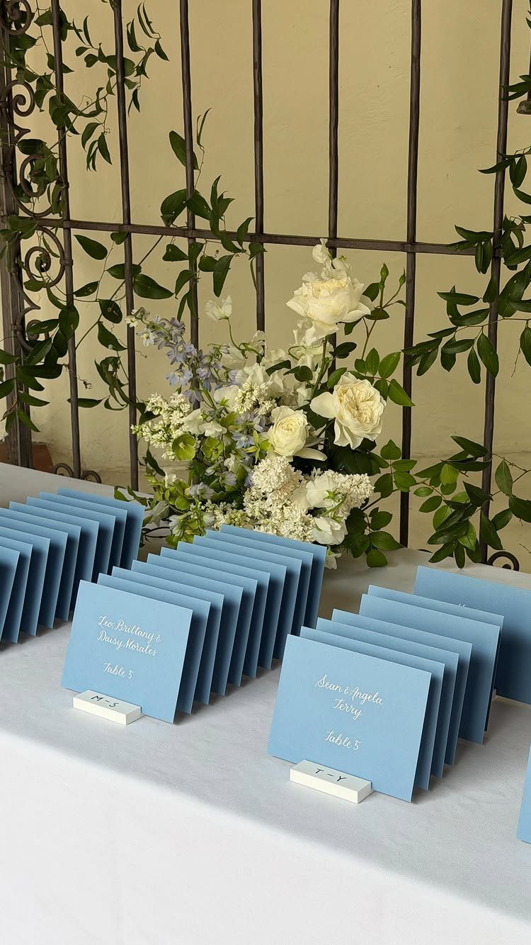
Names written on cards in one color make a seating display feel considered, and blue place cards on a white table read crisp beside white flowers.
Listing a family together, as in "Leo, Brittany & Daisy Morales," lets one card seat a whole household.
I would write every name the same way, with one font and one format, so guests can scan quickly and find their table without a crowd forming.
13. Acrylic Invitations
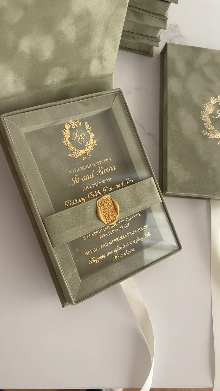
Clear acrylic makes the invitation look like a pane of glass, and gold lettering stays legible on it because the ink sits on the surface.
Sage green is a calm backdrop for the box, so the transparent card reads clearly when it is lifted out.
Order a sample first, since you should see how the lettering looks against a plain table before committing to the full run.
14. Laser Cut Invitations
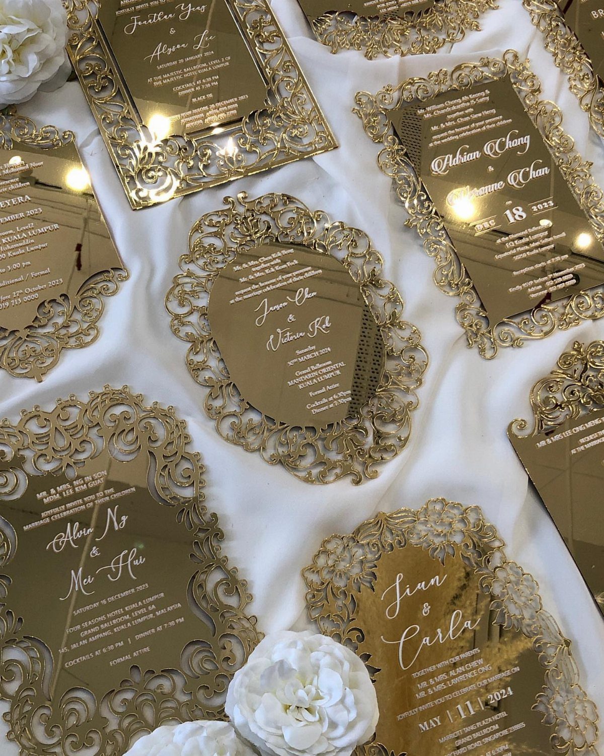
Lace borders cut straight through gold acrylic turn the edge of the card into the decoration. White cursive text sits inside the cut frame, so the lettering has room and the border does the ornamenting.
Intricate cuts take more production than a flat print, so I would keep the invitation as the one cut piece.
Choose simple, sturdy lettering for the cards that go inside, and check a proof for how the cut lines meet the text.
15. Handmade Paper
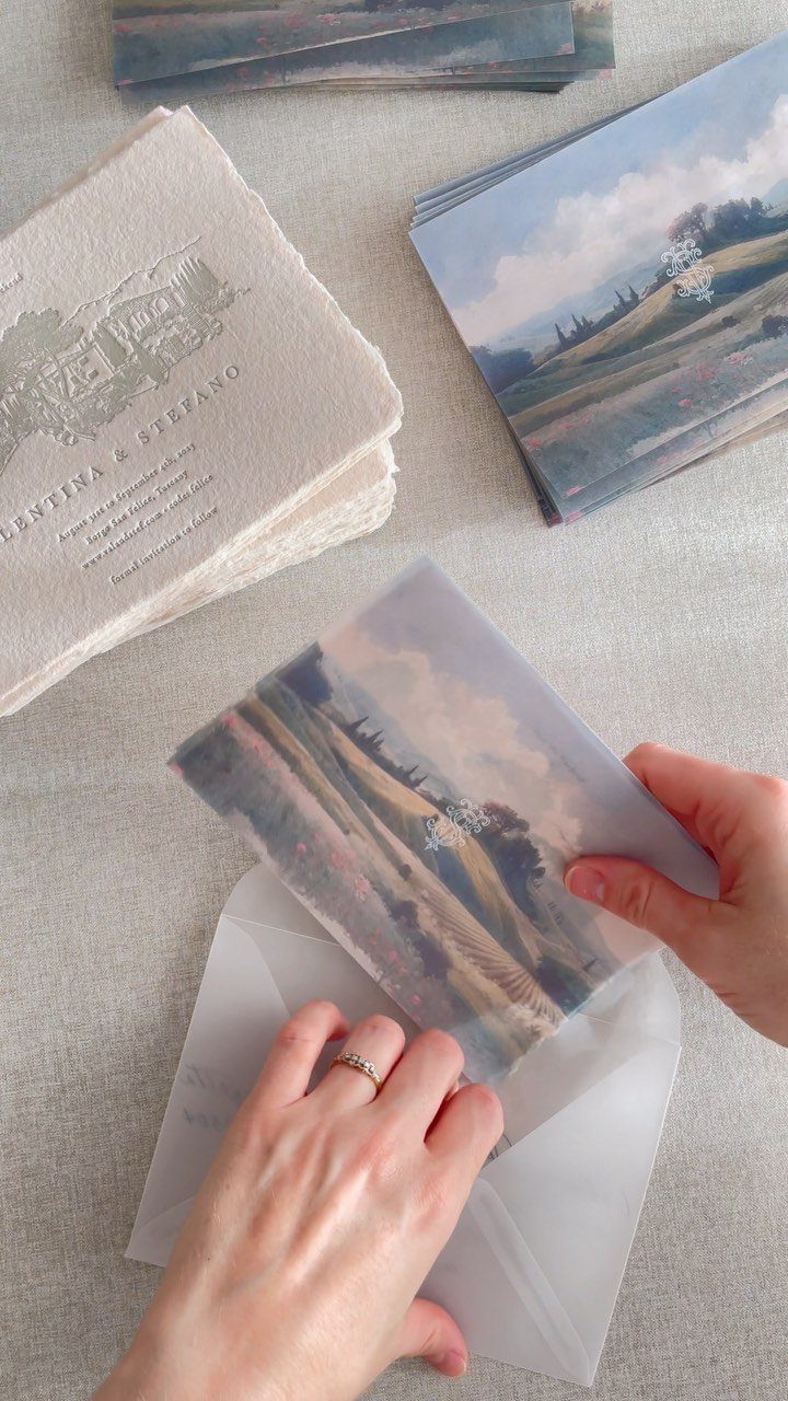
Deckle-edged handmade paper has a soft, torn-looking border that no printed frame can copy. Names alone, as on the stack here, are enough when the paper itself carries the texture.
A translucent vellum envelope lets that edge show before anyone opens the flap. Pair it with a card printed with a simple illustration, such as a landscape, and keep the wording short.
Before committing to the full count, request a printed sample, since deckled, cotton-rich sheets run well above standard cardstock and the ink can sit differently on the fibers.
16. Celestial Motifs
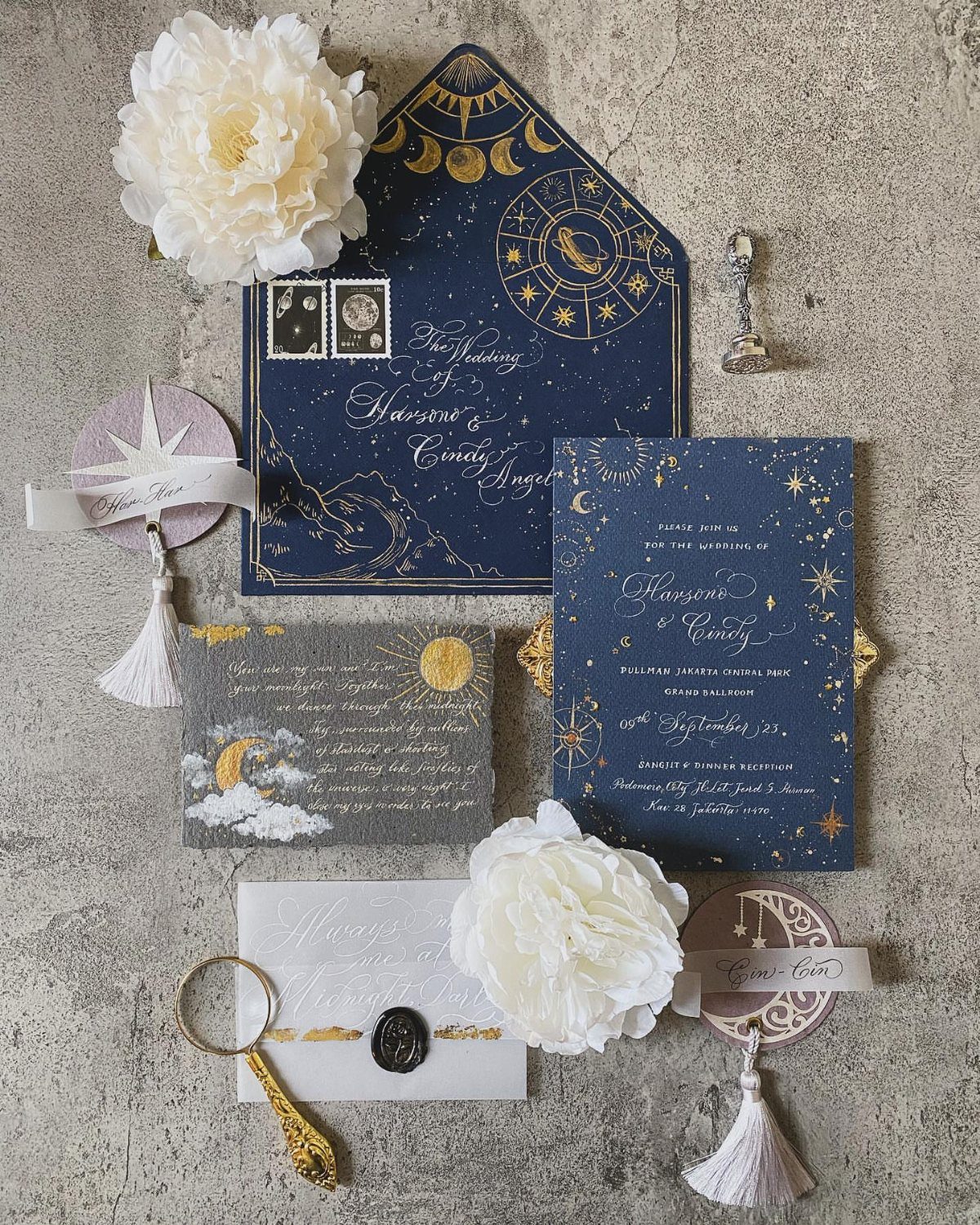
Navy stock with gold stars and moons gives a night-sky feel without any extra props. Gold against navy has strong contrast, so even small celestial details stay readable.
Keep the motifs to a border or a corner and let the names, as in "The Wedding of Harsono & Cindy," stay clear of them.
White peonies and a wax seal soften the dark palette. I would repeat the same star pattern on the other cards so the suite looks like one set.
Tips for Designing Stationery
Start with a folder on your phone or computer, split into one subfolder for images and one for text.
Save anything that catches your eye: fonts, wording, color combinations, layouts. After a week or two, patterns show up, and so do the things you keep scrolling past.
Design at its simplest is arranging pictures and words. That framing makes the job smaller, and it helps you see whether you lean toward photographs, illustrations or a stripped-back look.
Set a research deadline, though. Collecting is the fun part, and it can quietly turn into putting off the actual work.
Once you know your taste, start from a template instead of a blank page.
Then change the fonts, colors and wording until it sounds like the two of you. A customized template costs far less time than building from scratch, and nobody guesses where you started.
Choosing the Right Materials
Your saved inspiration images are the best guide to materials. Look at what you kept: if the pictures you saved are bold brushstrokes and abstract color, a painterly pattern may suit you better than a plain, traditional layout.
Sort what you saved into 3 piles: paper type, finish and embellishment.
If the same finish shows up again and again, that is your answer. If an embellishment appears only once, it can probably go.
Choose one or two of these upgrades and let the rest stay simple. A suite where everything is special tends to read as busy, and the budget thins out fast.
Printing Options
If you design in Canva, you can print from the same place. Click Share, then Print Your Design, and choose the format that matches your piece, such as Invitation (landscape).
After that, choose a paper weight and decide how many pieces to order, adding a few extras for mistakes and late guests. The prompts also walk you through proofing, and I would not skip that step.
Read the proof slowly, then have someone else read it. Names, dates and times are where a typo does the most damage, and it is far cheaper to catch one on screen than on 100 printed cards.
In Canva, start by searching ‘ Wedding Invitation.’ There are over 20,000 wedding invitation templates to help you fast-track your wedding stationery design.
— Canva
Frequently Asked Questions
What are the latest trends in wedding stationery?
Black and white monochrome suites, personalized emblems, bold accent colors, envelope liners, wax seals and metallic foil all show up often.
A black envelope holding white cards makes a bold, high-contrast set, though it only works on a heavy, smooth stock with crisp type.
How can I make my wedding invitations unique?
Change the material or the format, then keep the wording simple. Clear acrylic, laser cut lace borders, deckle-edged handmade paper, velvet boxes and passport-style booklets all feel different in the hand.
What should I include in my wedding invitations?
Names, the date and the venue are the core, with the town if guests need it. Practical details like arrival times belong on an information card or inside a booklet, and an RSVP card should match the invitation’s style.
Proofread slowly, then hand the file to a second reader, because a wrong name, date or time costs the most.





