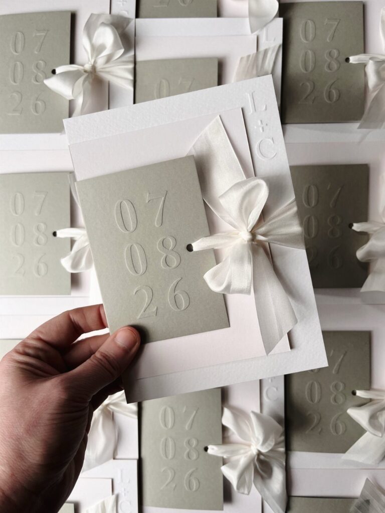
The list below covers blind embossing, which presses the design tone-on-tone with no ink, and foil embossing, which lays a metallic layer over the raised lettering, along with monograms, florals and scalloped edges.
With room in the budget, I would spend it on one raised detail, a monogram or a foil-pressed border, rather than spreading embossing across every insert.
1. Embossed Paper Design
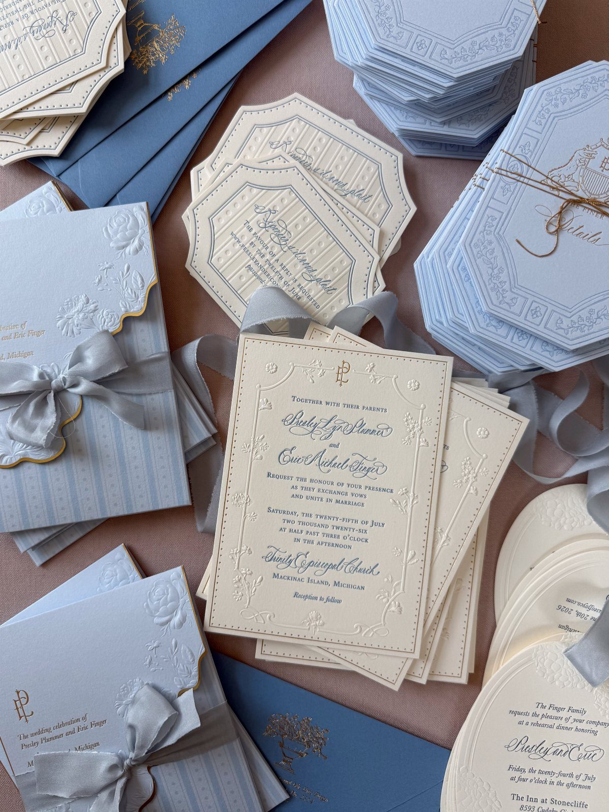
A metal plate pressed into the paper is what makes embossing work, and it is why the design can be felt as well as seen. Florals and calligraphy suit it well, because the raised lines catch light along their edges.
Cream and pale blue keep the effect soft. On a small budget, emboss just one piece, such as the invitation card, and print the rest flat.
2. Luxury Embossed Invitations
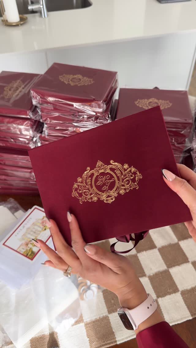
Hold a deep burgundy card with a raised crest and it reads as formal before anyone reads a word. That weight is what you pay for with luxury embossing.
A crest in gold against a dark stock is a strong pairing, and I would put the money there rather than spreading it across every insert.
Ask your printer for a physical sample first, since the raised detail is hard to judge on a screen.
3. Foil Embossing
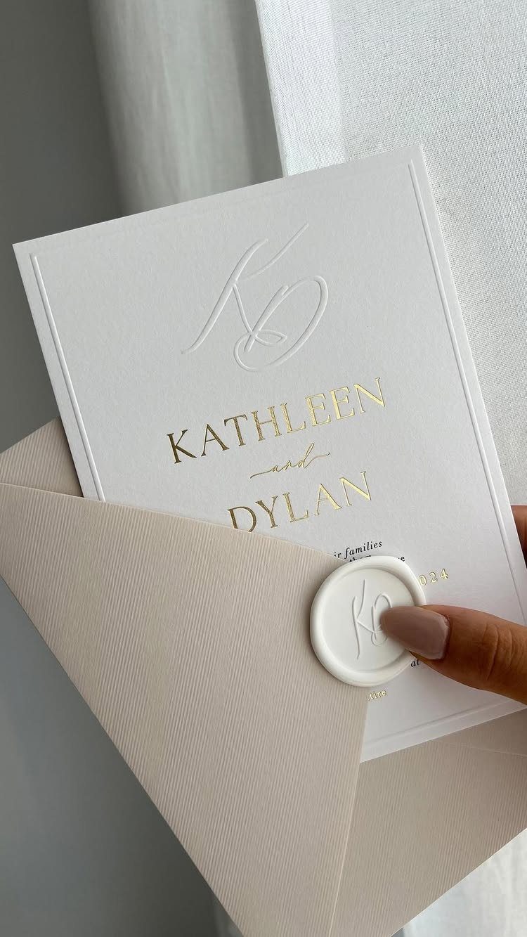
Foil embossing adds a metallic layer to the raised design, so the lettering shines and stands up off the page. Gold on white is a classic pairing, and the names are the best place to use it.
Pair foil names with a plain blind-embossed monogram and you get shine without crowding the card. Keep the foil to one element per piece; more than that starts to look busy and adds cost.
4. Embossed Monograms on Invitations
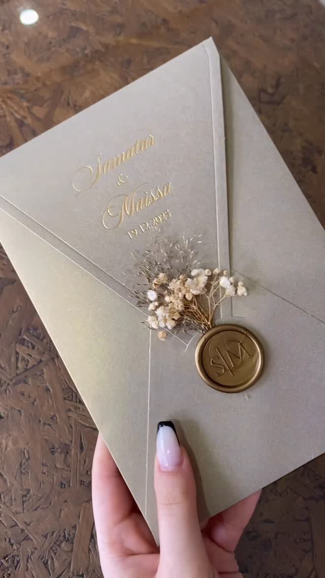
Initials give embossing a personal anchor. A monogram can sit on the card, the envelope flap or a wax seal, and each placement works differently.
On an envelope, a pressed or foiled name and date means the piece looks finished before it is opened.
I like repeating the same 2 initials across the envelope, seal and card, because it ties the set together without extra decoration. Settle the letter style before ordering so everything matches.
5. Blind Embossing
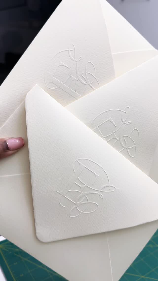
Blind embossing uses no ink at all. The design is pressed into the paper and shows only as raised, tone-on-tone texture.
That makes it the quietest option here, and I think the most elegant for a monogram.
It does depend on lighting and thick, soft paper, so ask for a sample and tilt it under a lamp. Pair it with dark printed text so the details stay readable.
6. Embossed Floral Wedding Invitations
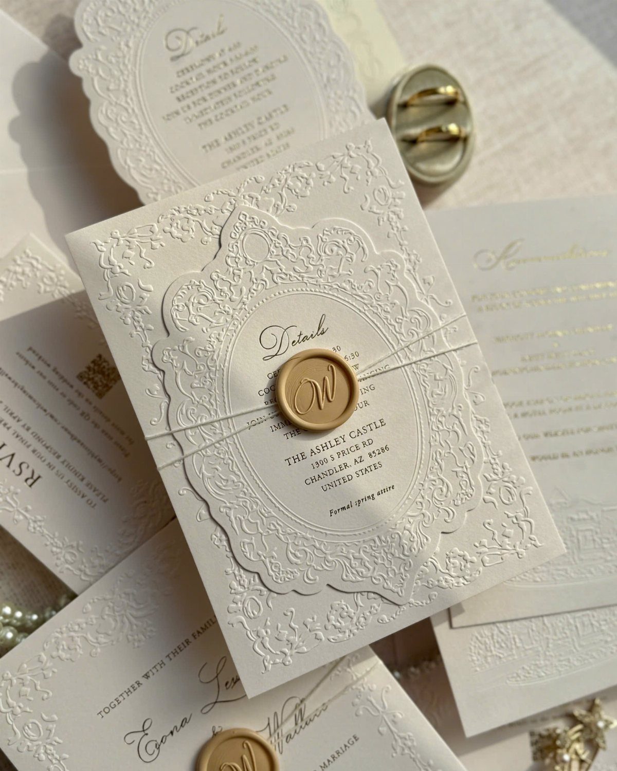
White paper with a raised floral pattern needs very little else. A gold wax seal gives the single note of color, and the venue name and wording can stay simple.
Flowers work well because their curves and layered petals show depth when pressed.
Keep the pattern to one area, like a border or corner, so the text has room. If the budget is modest, emboss the main invitation and leave the details card flat.
7. Scalloped Edge Embossed Invitations
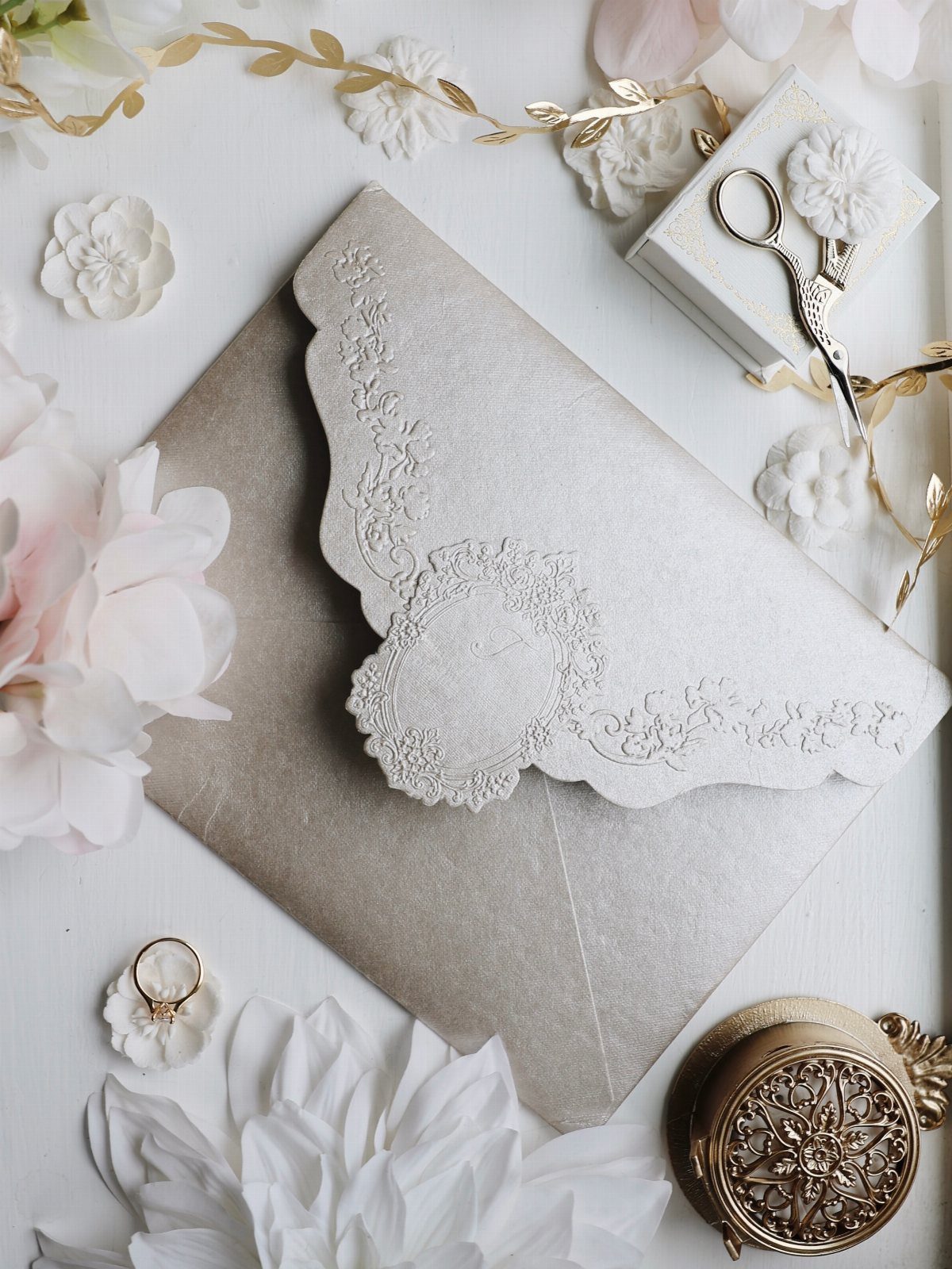
A scalloped border turns the card’s outline into a design, so the edge works as a second piece of ornament.
White stock with a raised floral pattern fits it well, since the curves of the border echo the curves of the petals.
Keep the embossing busy only in one place. If the florals fill the center, let the scallops frame them quietly, and the card still reads as calm.
Ask your printer whether the cut scallops are an extra charge, and request a sample so you can check that the edges stay crisp.
A taupe or metallic envelope lets the white card stand out when it comes out of the envelope.
Choosing the Right Design
Start with the theme, then check it against the paper.
A formal ballroom, a garden party and a beach wedding each pull toward a different weight of card, so decide the setting and your two or three colors before you look at a single design.
The plate presses into the paper and raises the design, so simple shapes with clean lines tend to come out best.
Trust your hands over a screen. When a sample feels right to hold, that is usually the one, and if you are still undecided, set the choice aside until your wedding style is settled.
Ordering Process
Custom work takes longest. A design that needs its own metal die has to be made before a single card can be pressed, so ask your printer for the full timeline at the start, not after you approve the artwork.
Work backward from your mailing date. Count the proof, the die, the pressing and shipping to you, then add a buffer for a reproof or a delay.
If the schedule is tight, ask whether the printer has stock designs with dies already made. That can save you the wait and some of the cost.
Mailing Considerations
Raised detail can flatten in transit, so ask about thicker envelopes or a stiff backing. A padded feel costs a little more, but a crushed crest costs more.
Embossed pieces are thicker and heavier, so they may need extra postage. Take one fully assembled invitation, with every insert, to the post office and have it weighed before you buy stamps.
Do this before you order envelopes in bulk. Then you will know the postage for the whole mailing, including return stamps if you use them.
Frequently Asked Questions
What is embossing?
Embossing presses paper between a metal plate and a matching die so the design rises off the surface.
You can feel it as well as see it, and no ink is needed for the raised effect. Because the plate has to be made for each design, it costs more than flat printing.
What paper works best for embossing?
Thick, soft paper holds a raised design best, and 100% cotton is the top pick for deep embossing. For crisp edges, pick a smooth paper; a double-thick cardstock around 110–130 lb cover also holds the raised shape without going soft.
How can I get embossed invitations on a small budget?
To save money, emboss only the main invitation card and leave the other pieces flat. Keep the embossing to one area of the card so it stays simple.
Does embossed stationery need extra postage?
Yes, often, since the raised detail and heavier stock add thickness and weight.





