The list runs from a flat black card with gold lettering to a suite with lace and satin ribbon, and the price climbs with every piece of handwork or custom cutting.
Time of day and money pick the style for you: a black-tie evening wedding suits dark stock and foil, while a daytime garden event calls for something lighter, and a small budget keeps the suite to an invitation and reply card.
Whatever you choose, order a printed sample in your real paper and ink before committing to 100.
1. Formal Wedding Invitation Styles
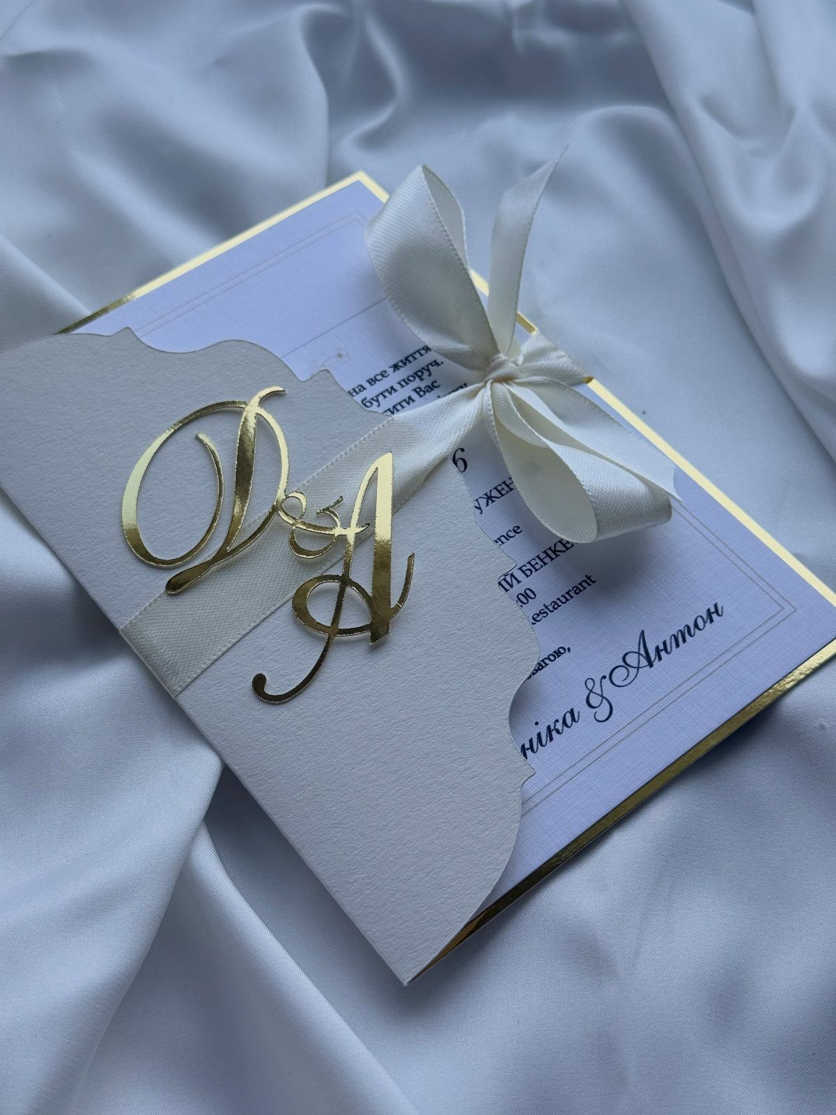
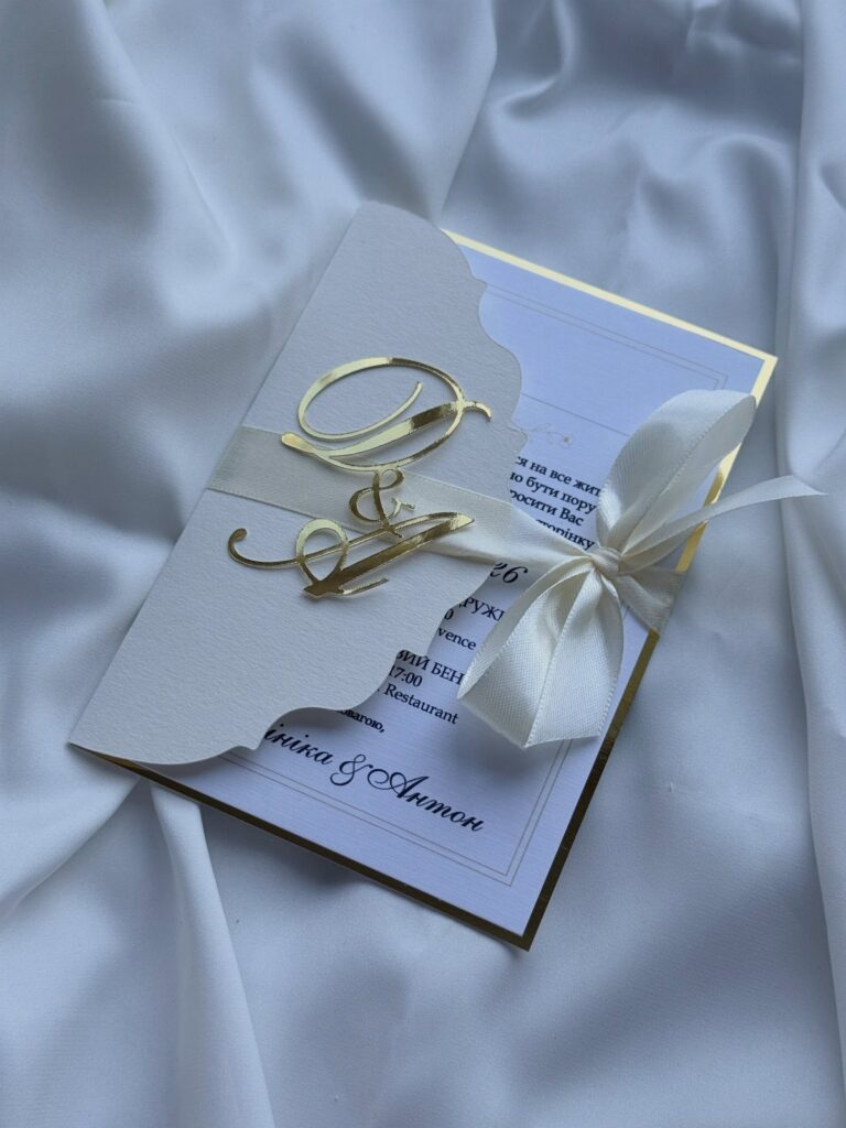
The initials carry the whole design, so a formal suite needs nothing louder.
Choose one metallic and stay with it.
The trade-off: a fabric backing and a tied bow add handling, and likely cost, over flat cardstock. Ask for a sample first, ideally a printed one in your actual paper and ink, and only then place an order for 100.
2. Dress Code Details on the Invitation
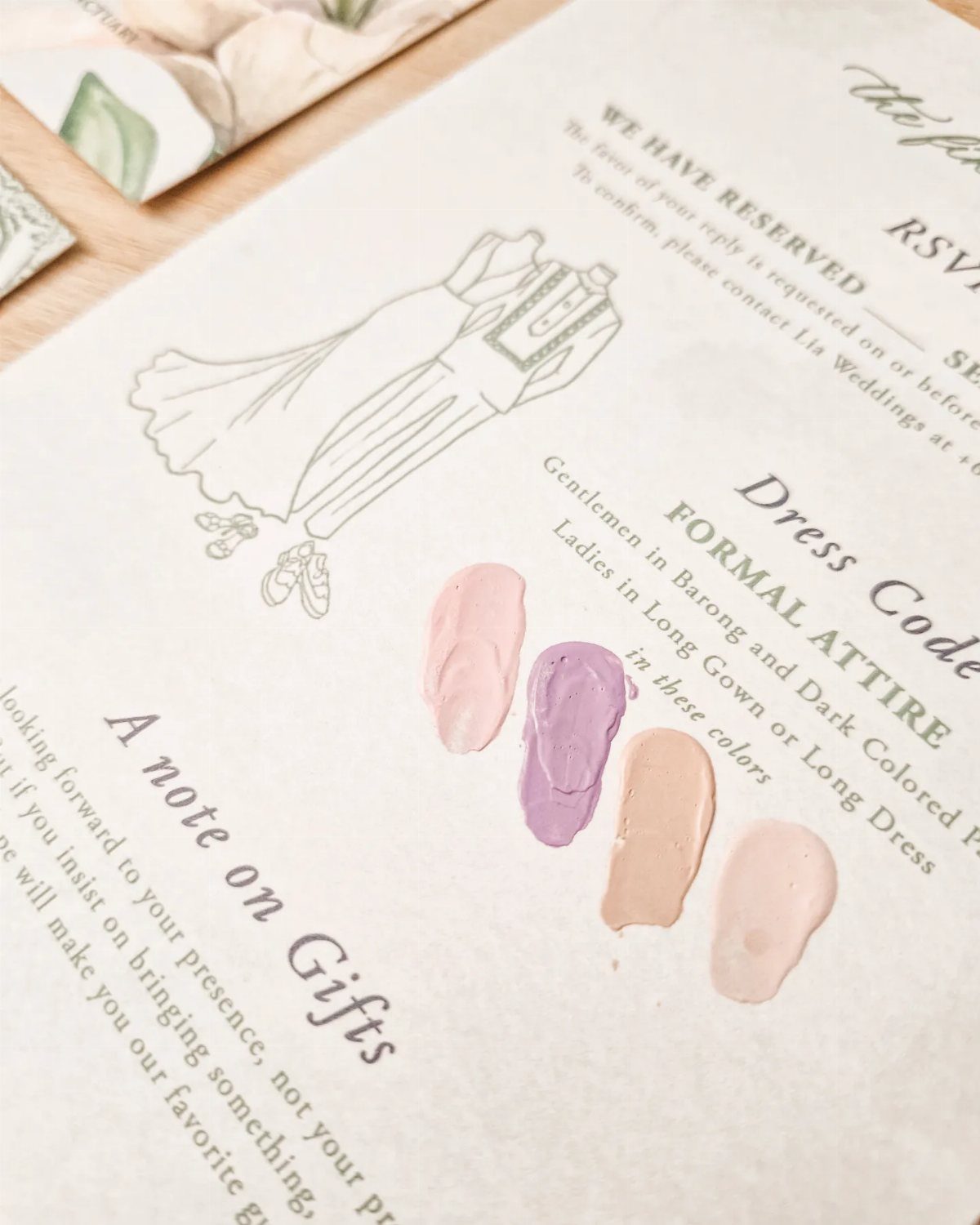
A line reading "Formal Attire" settles a question guests would otherwise text you about. Printing it on the card itself, small and near the bottom, is the traditional spot.
A sketch of a dress plus painted swatches goes a step further: it tells guests which colors you hope to see. That suits a couple who care about the palette in photos.
Two or three words is plenty here: "black tie" or "cocktail attire" says it. Swatches add printing cost, so skip them if money is limited and the words alone are clear.
3. Traditional Wedding Invitation Wording
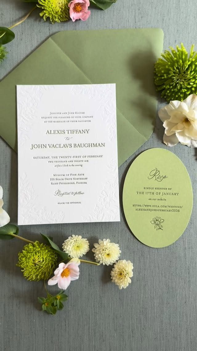
Blind letterpress means the floral border is pressed into the paper with no ink at all, which leaves the olive wording to do the talking. That is the kind of quiet detail a formal suite rewards.
Traditional wording puts full names, the date and the venue in centered lines, as this one does with the museum.
The RSVP can echo the look: the maker die-cut it in a coordinating olive stock with letterpress and one floral detail.
For the classic tone, spell out the date in words, never numerals.
4. Envelopes with Calligraphy
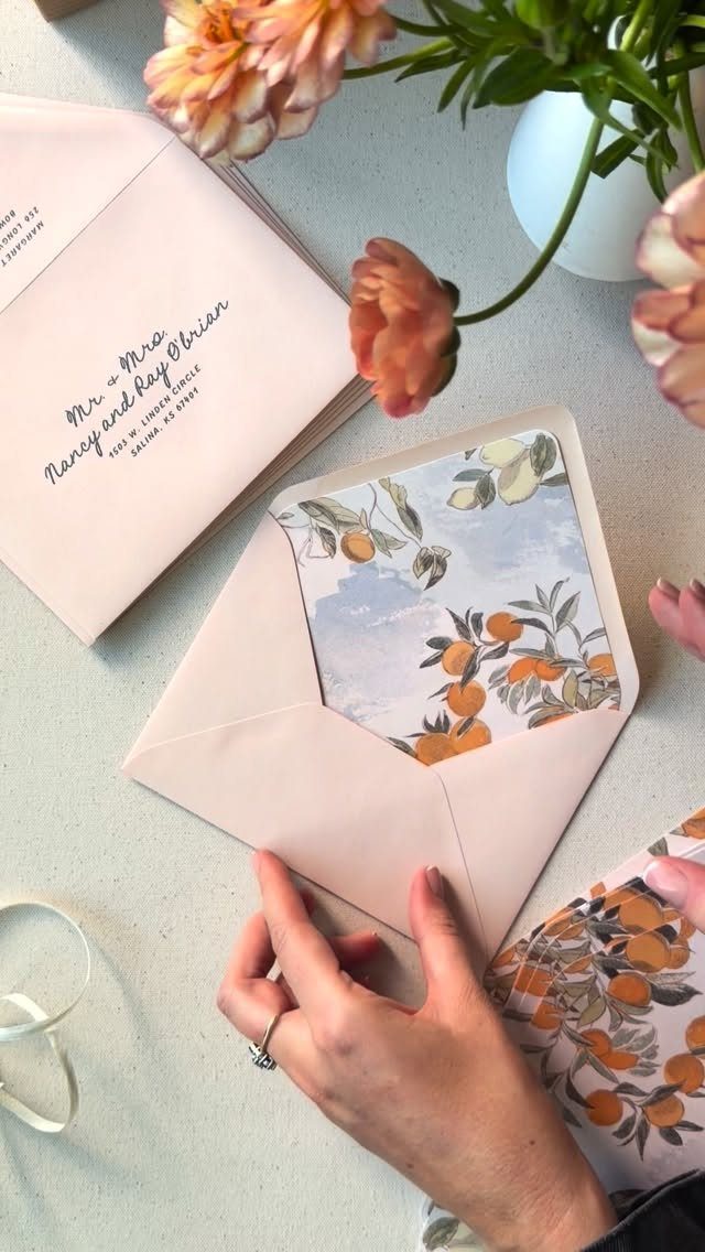
Calligraphy on the envelope is the first thing a guest sees, so it sets the formality before the card is opened. Pale pink paper with a patterned liner adds personality without breaking the rules of a formal suite.
Match the hand to the card. Flowing cursive suits a formal suite; a plain, upright script reads more casual.
Write guest names in full and check each spelling against your list before the pen touches paper. Calligraphy is hard to fix, so ask whether the calligrapher can supply a few spares.
5. Separate Reception Card
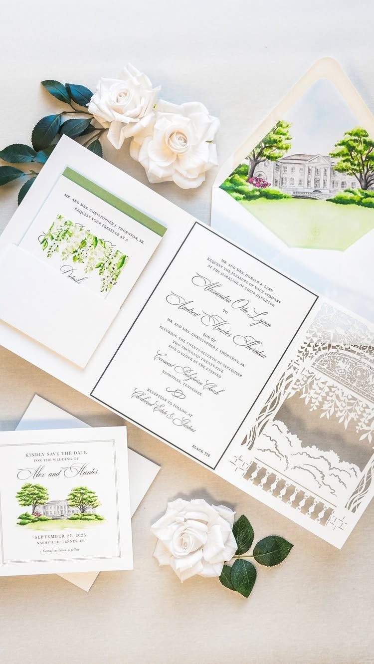
Moving the reception details onto their own card keeps the main invitation clean: names, date and ceremony stay on one piece, and the dinner address, time and any note about dancing go on another.
It is worth doing when the ceremony and reception are at different places, or hours apart. Guests then tuck the reception card away and don’t hunt through paragraphs for it.
Print it in the same ink and paper as the invitation so the set matches. Expect one more piece to price and mail, which adds a little weight at the post office.
6. Black Card with Gold Lettering
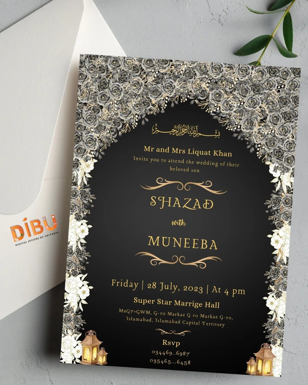
Black stock turns an invitation into an evening event before anyone reads a word. Gold lettering gives enough contrast to read, and silver floral borders soften the dark ground.
Foil or metallic ink is the usual route, and it asks for a printer who has done it before. Ask to see a proof under indoor light, since gold can look flat or muddy.
Black suits an evening, black-tie wedding best. For a daytime garden event, I would pick something lighter.
7. Lace and Ribbon Embellishments
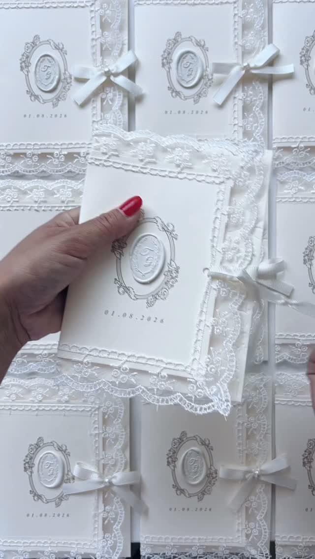
Lace trim, a wax seal and a satin ribbon bow on one white card is a lot of texture, so I would keep everything else plain. The date stays small and the ink stays quiet.
Each of those 3 details is handwork, which means more assembly and likely more cost than a flat card.
Ask the maker for a sample before ordering, and check that the ribbon and seal survive a trip through the mail. A padded or hand-canceled envelope may be worth the extra postage.
8. Classical Art Stationery Suite
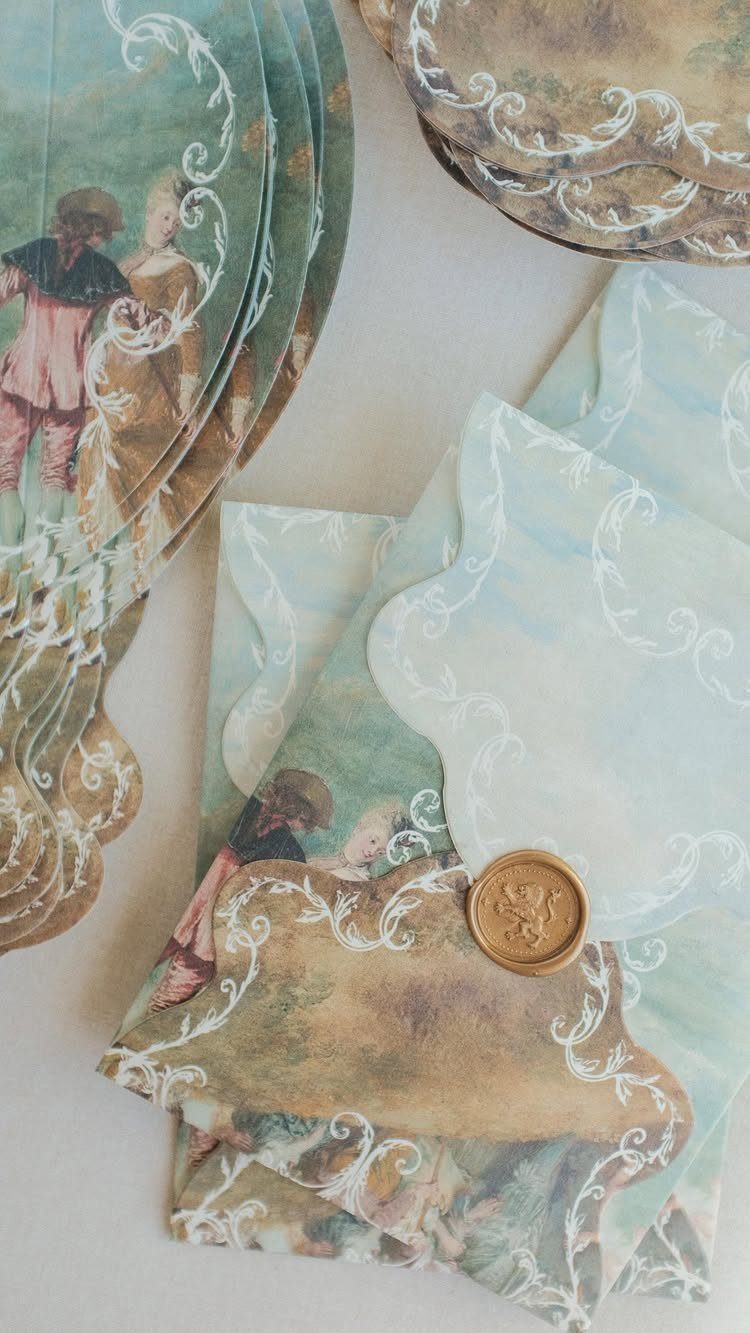
Classical painted figures on scalloped light blue stock feel like a gallery wall turned into paper. Beige pairs well with the blue, and a gold wax seal ties the suite together.
Scalloped edges and ornate swirls mean a custom cut, so expect that to cost more than a standard rectangle. I would hold the rest of the wording to a simple typeface and let the art lead.
Ask the printer for a proof of the paintings first, since colors in fine art reproductions can shift on paper and you want to see that before the full run is printed.
Fine detail on faces can blur on the wrong paper.
9. Sage Green Invitation Suite
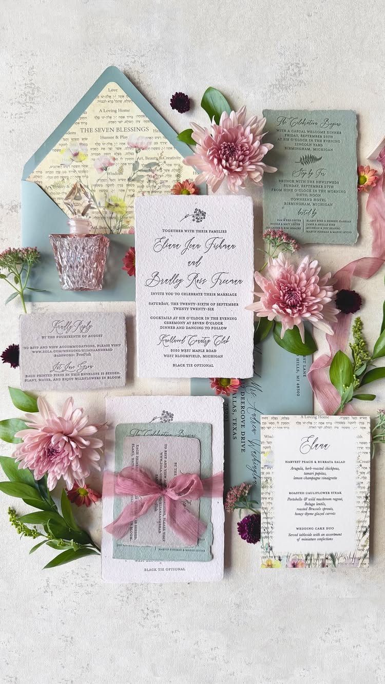
Sage green is easy on the eyes, and pink chrysanthemums give it just enough warmth to feel formal rather than flat. Pairing the 2 across the invitation, reply card, menu and envelopes makes the suite look planned.
Pull the flower color into one accent only, such as the blooms themselves, so the green stays calm. Match the paper and ink across every piece.
Each extra piece, a menu included, adds printing and postage. On a small budget, I would mail only the invitation and reply card, and save the menu for the tables.
Proper Invitation Etiquette
Timing matters as much as wording. Save the dates go in the mail 6–8 months ahead of the wedding, while the formal invitations follow about 8–12 weeks before it.
A reply deadline falling 3–4 weeks before the wedding works best. That gap gives you time to finalize the guest list, the seating chart and the headcount for the caterer, and nobody has to be chased for a late answer.
Clarity is the other half. Check every name, date, address and time against your master list before anything goes to print, because a typo on 100 cards is a reprint bill.
Stay with the traditional conventions your wording already follows, and keep each detail where guests expect to find it. A reader should never have to guess where to go or when to reply.
Online Invitation Options
Digital invitations make the most sense when RSVP tracking is your main headache. Platforms like Paperless Post build tracking in, let you set a response deadline, and let you send reminders or updates to guests who haven’t answered.
Whatever you choose, give clear reply instructions. A printed suite needs a reply card with a stamped, addressed envelope; an online one needs an email address or link guests can use.
Set the response date 3–4 weeks before the wedding so your caterer gets an accurate headcount.
Zazzle offers the widest range of designs I know of, since independent designers upload their work there and you can change the size, the shape and the paper stock on nearly every one.
Reviews sit on each design, so I would read them before ordering to judge quality.
Frequently Asked Questions
What are some websites that offer wedding invitations?
Zazzle has the widest range of designs I know of, since independent designers upload their work and you can change the size, shape and paper stock on nearly every one.
Paperless Post suits digital invitations, with built-in RSVP tracking, response deadlines and reminders. The Knot also sells invitations alongside matching menus and thank you cards.
How do I write a formal invitation?
Formal wording follows a set order: the hosts’ names, a request line, the couple’s full names, then the date, time and venue on centered lines, with the date written out in words.
A small line near the bottom, reading "Black Tie" or "Formal Attire," tells guests what to wear.
When should I send my wedding invitations?
Formal invitations should go in the mail 8–12 weeks ahead of the wedding, while save the dates belong in mailboxes 6–8 months out. With a digital invitation, a response date 2–3 weeks out works for the caterer.
What style of wedding requires a formal wedding invitation?
Black-tie evening weddings are the best fit for this style.
A black card with gold lettering, for example, signals an evening event before anyone reads a word. A daytime garden wedding calls for a lighter card, in my view.





