The ideas run from a gold-accented card to a hardcover box, a laser-cut peacock design and wax-sealed envelopes, and the cost climbs with every box, cut and seal you add.
The size of the list decides it: the splurge formats suit a smaller group or close family, while everyone else gets a plain printed card in the same palette.
Keep the colors to 3, such as burgundy, cream and gold, and the two tiers will still look like one suite.
1. Royal Fairytale Wedding Invitations
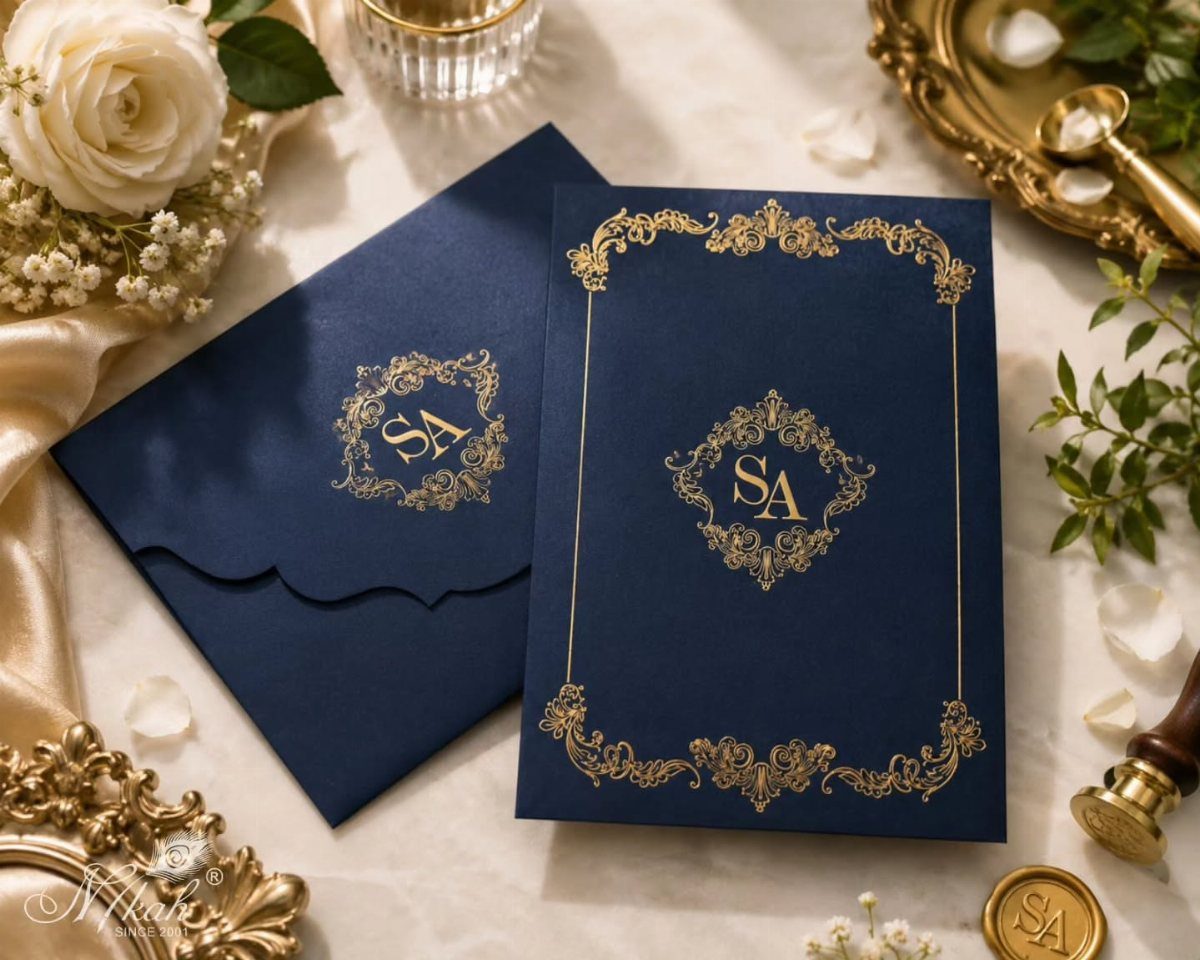
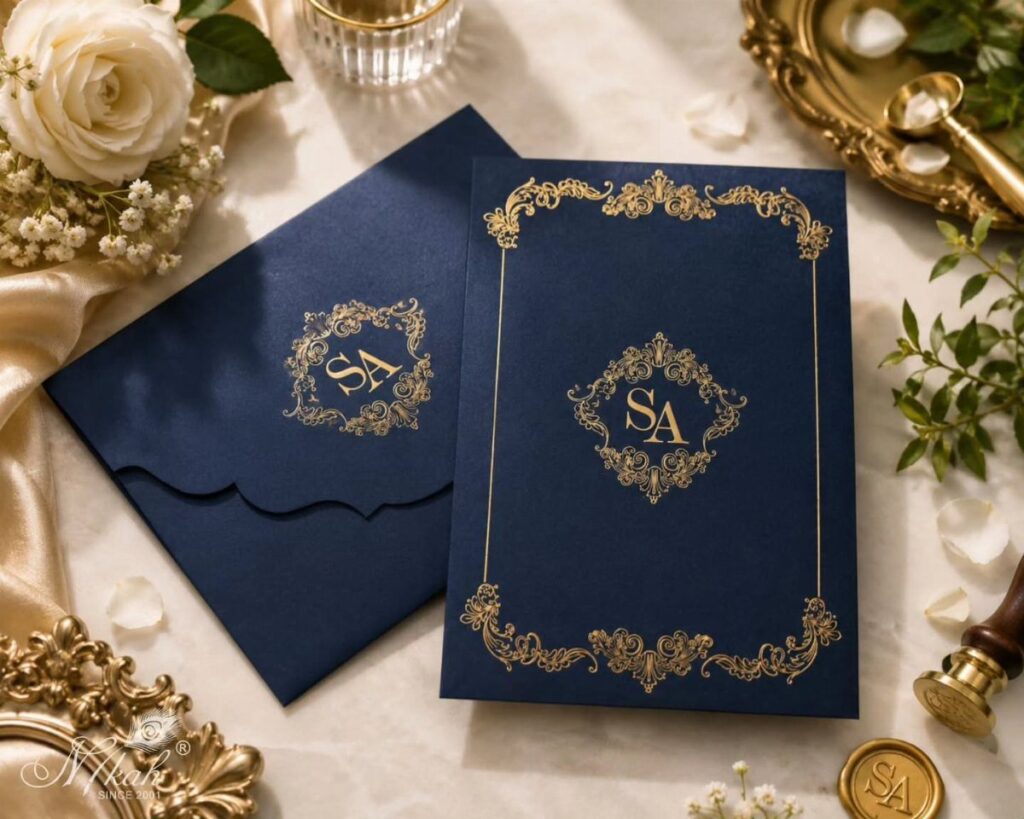
Navy paper with gold ink is a pairing I would pick over black and gold, because the navy reads softer and still looks formal.
Ornate borders and a monogram already tell the story on a royal-style invitation, so let the text stay short and plain.
For the vintage, hand-drawn feel, ask your designer for illustrated accents instead of stock flourishes. A single drawn detail beside the monogram goes a long way, and the rest of the card can stay quiet.
2. Elegant Royal Wedding Invitation
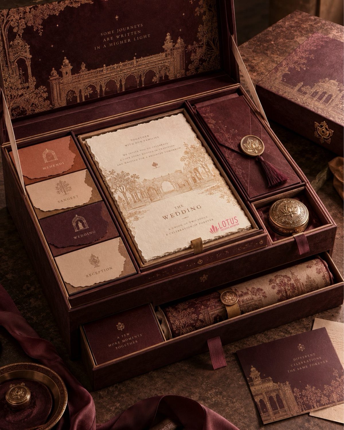
A box that holds separate cards for each event is the clearest way to show a multi-day celebration. Mehendi, Sangeet, Wedding and Reception each get their own card, so guests see at a glance which gathering they are invited to.
Burgundy with gold foil feels rich without needing extra decoration.
Architectural illustrations add place and character. Expect this format to cost more than a flat card, so decide early how many guests truly need the full box.
3. Gold Royal Wedding Invitations
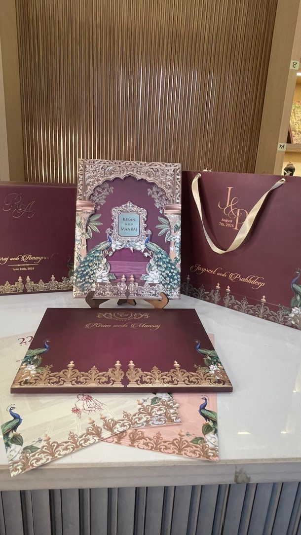
Purple and gold, with peacock motifs, is a bolder take on royal than the usual cream and metallic. Gold works best as the accent: names, borders and the peacock lines, with the deeper color carrying the background.
If you reuse a motif, keep the gold identical across every piece so the suite matches.
4. Calligraphy Fonts Royal Wedding Invitations
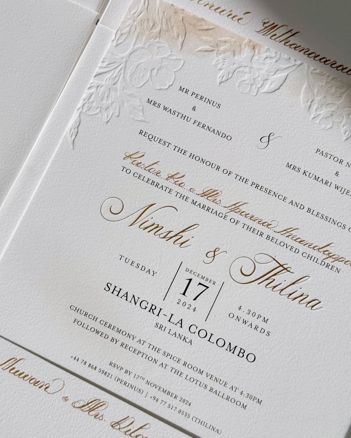
Names set in calligraphy decide whether an invitation feels royal or just fancy. Gold script for the couple’s names, with plain black type for the date and venue, keeps the page readable.
Embossing adds a raised floral texture without more color, and white paper lets the gold stand out.
Test the script at the actual size your details will print, since a flourish that looks fine on screen can blur into mush on paper. Fancy letterforms lose readers fast when the date is the hard part.
5. Wedding Invitations and Menus Cohesive Look
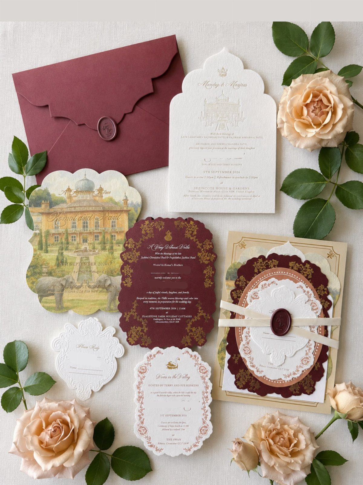
Burgundy, cream and gold carry across a whole suite when you repeat them on every card. Pick one illustration, such as the palace here, and let it return on the invitation, response card and any inserts.
Peach roses soften the deep burgundy, so consider echoing them in a small printed bloom on the cards. I would limit the palette to 3 colors; any more and the set stops looking like a family.
6. Hardcover Box Wedding Invitations
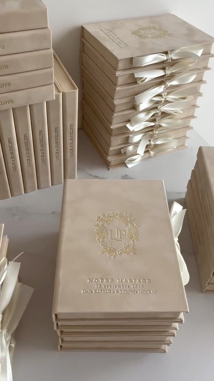
Cream hardcover boxes with a gold foil crest feel like receiving a small keepsake instead of a mailer. A satin ribbon tie finishes it, and the date and names can sit right on the lid, as the French wording shows.
This is a splurge, so I would reserve it for a smaller guest list or for close family only. Send everyone else a simple card in the same cream and gold, and the two will still look related.
7. Laser Cut Peacock Invitations
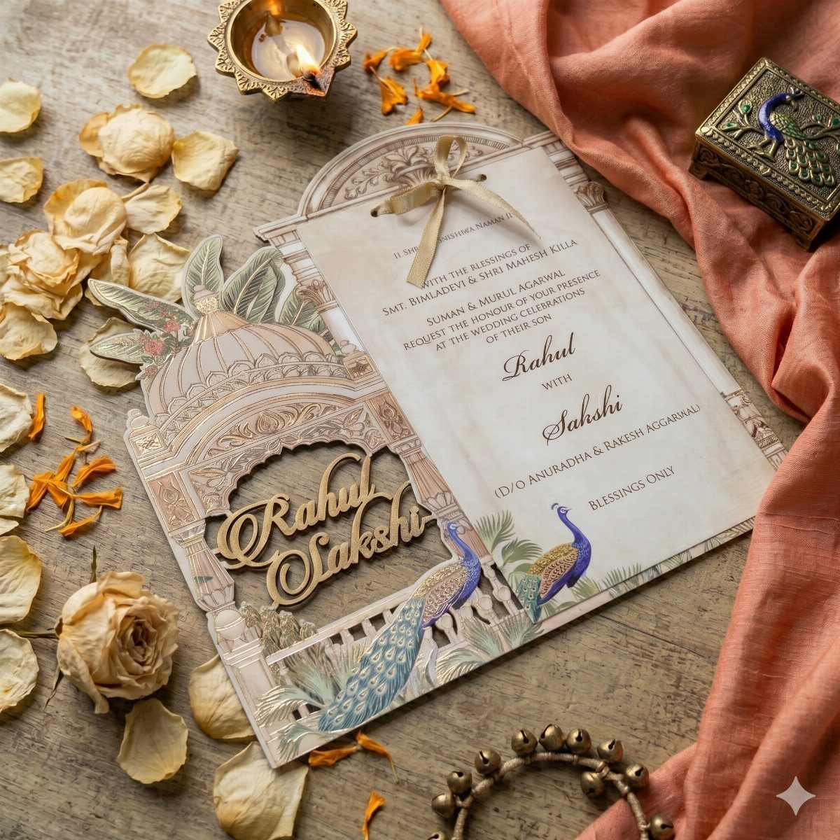
Laser cutting turns a dome and peacock into open lacework, so the shape itself does the decorating before any ink is added. Names and calligraphy can then stay small and quiet on the card.
A cut-out design like this is best saved for the main invitation.
Ask your printer how many of your guests need one, since this will cost more than a flat card, and send a plain printed version in the same palette to everyone else.
Keep the envelope simple. The cut edges are the star, and a busy liner will fight them.
8. Wax Sealed Envelopes with Corners
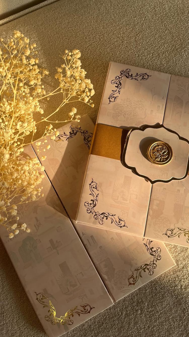
Black floral corners on cream envelopes make the outside as formal as the card inside. A gold band and a gold wax seal complete it, so the envelope reads as part of the invitation instead of packaging.
I would pick one seal color and use it on every envelope, which keeps the set looking deliberate. Corner filigree works best when the address sits clear of it, so ask your printer or calligrapher to leave the corners free.
A seal adds a step to every envelope, so settle on a final guest count first and then decide if the extra work is worth it.
For a long list, seal only the family envelopes and leave the rest with the printed corners alone.





