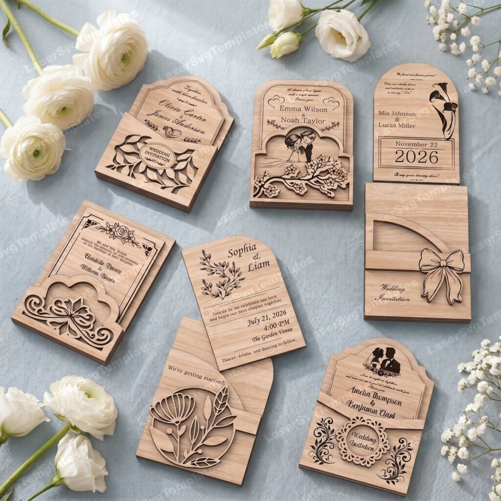
These ideas run from paper scrolls wrapped in burlap and sealed with red wax to clear acrylic printed in white cursive, and the price and assembly time climb with every custom shape, die or hand-tied detail.
Guest count decides which one is yours: wood, transparent acrylic and custom illustrations cost more per invitation than a standard paper card, so they suit a smaller list, while watercolor designs and leaf-textured envelopes with string ties stretch further.
Whatever you pick, order a sample first, since a stuck pull tab or a misspelled letter in laser-cut wood can’t be fixed after the full run.
1. Wood Invitations
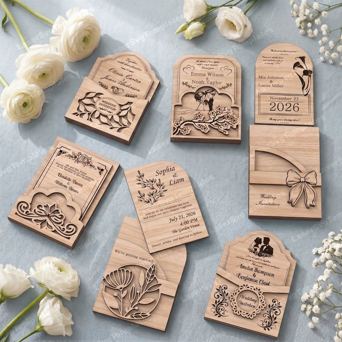
Laser-cut wood suits couples who want an invitation that feels like an object, not a flat card. Engraved text and carved florals give wood a design that holds its detail without any ink.
Get a proof from the maker, and approve it, before placing the full order.
Names and dates are where a wood piece goes wrong, since a misspelled letter can’t be fixed once it’s cut. Wood also costs more per invitation than paper, so I’d save it for a smaller guest list.
2. Interactive Invitations
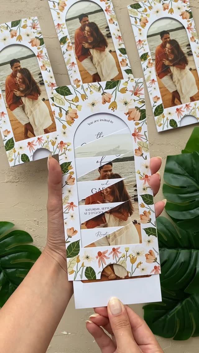
A pull tab turns an invitation into something guests handle, and that is the whole appeal. Slide the strip and a photo of the two of you appears, with the date and time waiting beside it.
Short wording works best, because the mechanism takes up room.
Put the names and the day, such as "Saturday, September," where they stay visible before the tab moves. Test one by hand before ordering the full run, since a tab that sticks will annoy guests more than delight them.
3. Custom Illustrations
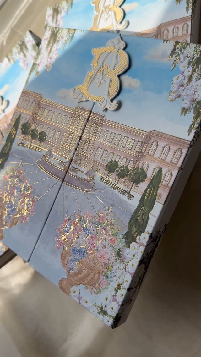
Hand-drawn artwork of your venue gives an invitation a focal point no template can match. A grand estate under a blue sky, framed by flowers, tells guests where they are going before they read a word.
I like adding one small foil or embossed element, like a gold monogram, so the illustration doesn’t carry the whole card.
Send the artist clear reference photos of the building, and ask how many revision rounds the price includes. Custom art costs more than stock designs, so plan for it early in your budget.
4. Bespoke Designs
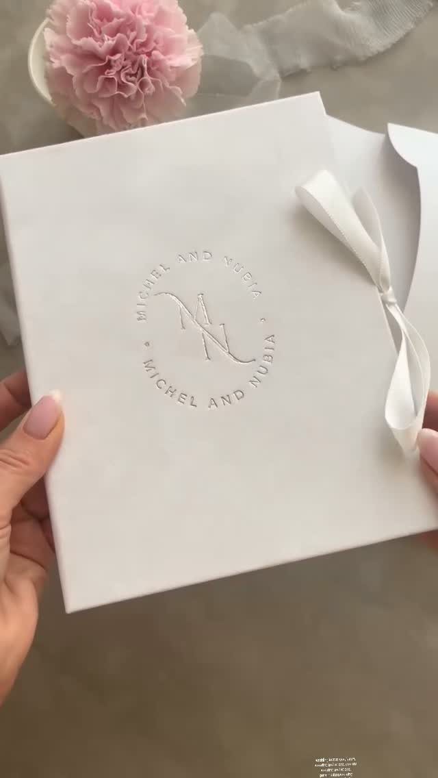
A white embossed card tied with ribbon is bespoke in the quietest way: the design is built around the two of you, and nothing else competes. Raised lettering catches light and reads as formal without needing color.
Decide on your names and date wording before you contact a designer, because changes after the embossing die is made get expensive.
A ribbon bow gives a hand-tied finish but adds assembly time, so ask who does it. Pair it with a single flower for photos so the stationery shot looks finished.
5. Curved Invitations
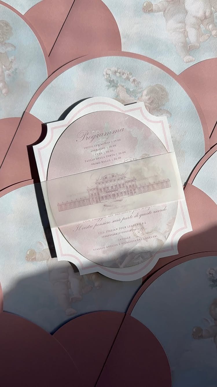
Scalloped, circular paper breaks the rectangle rules, and that alone makes guests look twice. A rounded edge also leaves room for a full schedule of events.
Remember that a custom shape means a custom die, so expect a higher price than a standard card. Check that the envelope fits at the proofing stage; a round card often needs a square one.
6. Watercolor Designs
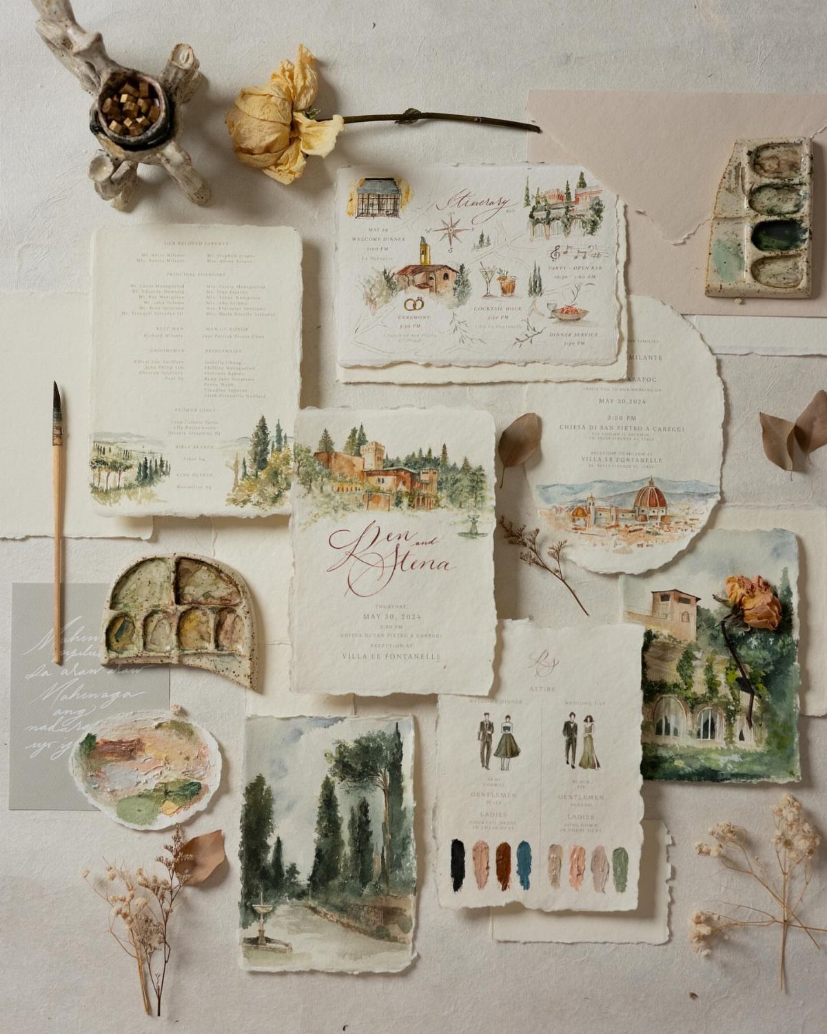
Watercolor works best when it paints something specific to you, like villas and landscapes from the place you are marrying. Deckled edges add a handmade look that suits soft, loose brushwork.
Choose a palette that matches your flowers so the whole suite feels related.
Ask the artist whether the originals are scanned and printed or painted individually; the first is far cheaper for a full guest list. I’d choose a printed version with a few hand-painted extras.
7. Leaf-textured Envelopes with String Ties
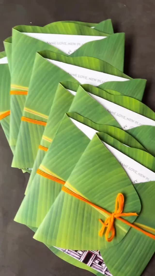
Green envelopes with a leaf texture and a loop of orange string say outdoors before anyone opens them. The contrast between green and orange does the decorating, so the white card inside can stay plain.
Printing on the inner lining makes the envelope part of the message, since guests see the pattern or a short line of text the moment they open it.
Check that the lining text isn’t cut off by the flap; a trimmed line, like "NEW PLA," reads as a mistake. Tie one sample by hand first, since string adds assembly time across a full guest list.
8. Transparent Acrylic Invitations
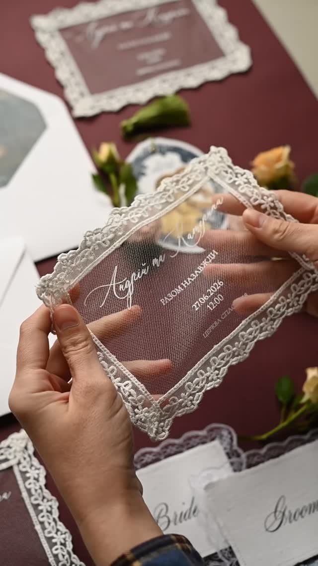
Clear acrylic printed in white cursive, edged with a lace border, makes the invitation look like glass. White ink on a transparent sheet is soft, so the lettering and lace carry all the detail.
Lay a sample over a dark surface and a light one before approving the design, because white text reads very differently on each.
Acrylic leaves little room for text, so names, date and place are all that should go on it.
A matching "Bride" and "Groom" pair is a fun extra for the wedding party, but it costs more per piece than paper, so I’d keep the rest of the suite simple.
9. Burlap Scroll Invitations
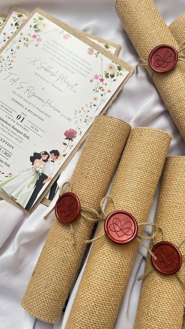
Rolling an invitation into a scroll and wrapping it in burlap gives guests something to unwrap. Twine and a red wax seal hold it shut, and the rough fabric against the red looks old-fashioned in a good way.
Pair the scroll with a flat floral card for the details, so the roll only has to carry the main message.
Seal a few test pieces before the full batch, since wax needs practice to look even. I’d hand-deliver scrolls where possible; a rolled shape is awkward to mail.
Importance of Invitations
An invitation is the first thing guests see of your wedding, so it sets their expectations before anyone arrives. Formal wording and heavy paper suggest a black-tie evening; a loose, casual card suggests a backyard party.
Let the card match the day you are planning. If the invitation promises more than the budget can deliver, guests will notice the gap at the venue.
An envelope can only hold so much, which is why a plain invitation can feel lackluster. Pick one detail to carry the personality, and keep the rest of the card easy to read.
Invitations provide guests with their first taste of your wedding style, so use the opportunity to truly "wow" them! For instantly unique invites, think beyond paper and choose unconventional materials.
Personalization
Personal touches work best when they come from your own story, not from a template. Artwork made for your wedding feels more sentimental and intimate than a stock design, and guests can tell the difference.
Start with something you already have: a place that matters to the two of you, or the colors you chose for the day. Give the designer those details in writing.
Keep the personal element to one or two spots on the card. A reader should still find the names, date and place without hunting for them.
Creative Expression
A couple who plan the whole day like a gallery piece can let the invitation be the first thing hanging on the wall.
A loose watercolor wash previews your palette before anyone sees a single flower, while a detailed illustration can trace your relationship from the first date to the proposal.
Decide how much of your style you want on the card before you contact an artist. A designer can only work from what you tell them, so collect a few images you like.
Pieces like this tend to be kept long after the vows. Order a few extras for yourselves, since a small spare batch costs less than a reprint.





