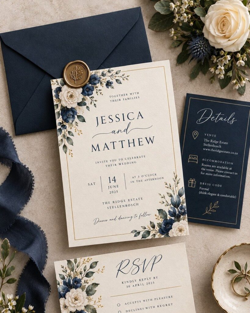
The ideas below run from digital invitations to foil-pressed suites, deckle edges with velvet ribbon, wax seals and laser-cut designs, so the price swings far more than the look does.
Your deadline and your guest count pick the winner, and the sections on when to send invitations and cost considerations are where I would start: a mostly local list can mail 6 weeks out and afford one special detail, while a travel-heavy list needs 8–12 weeks and a plainer suite.
Whichever you choose, the die-cut shapes, wax seals and ribbons are where a quote grows, so keep to one or two of them.
1. Customizable Wedding Invitations
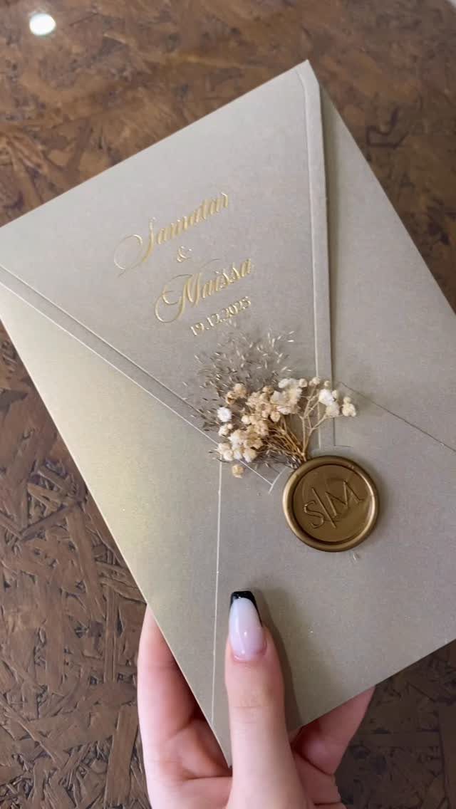
Calligraphy on the envelope does a lot of the personalizing before anyone opens it.
Gold script for the couple’s first names and the wedding day, a wax seal stamped with a short word, and a few small dried flowers pressed against the flap make a piece that feels made for one couple.
Pick the one or two details that carry your story, like initials, a word in your family’s language, or a flower you love. Stopping there keeps the cost and the proofing manageable on a deadline.
2. Matching Wedding Stationery
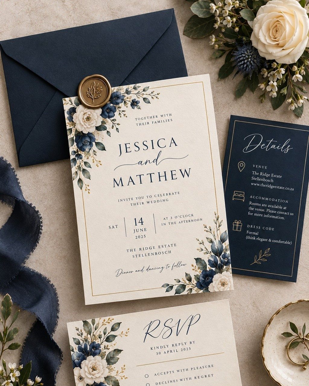
A suite works best when every card shares one palette and one flower motif.
Navy ink on cream stock, with the same floral sprig on the invitation, details card and RSVP, reads as a single design instead of 3 separate purchases.
Order the thank you cards in the same print run as the invitations. I would rather pay for them now, while the files are open, than hunt for a near match months later.
3. Scalloped Edges Wedding Invitations
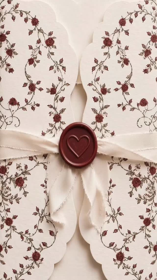
Scalloped edges soften a rectangle without adding a single extra word or color. Against red florals on cream, the curved border reads as a little frame, and a heart-stamped burgundy wax seal picks up the red.
Ask your printer whether the scallop is a die-cut shape, since it usually costs more than a straight trim. On a small budget, keep the scallop and skip the ribbon.
4. Foil-pressed Invitations
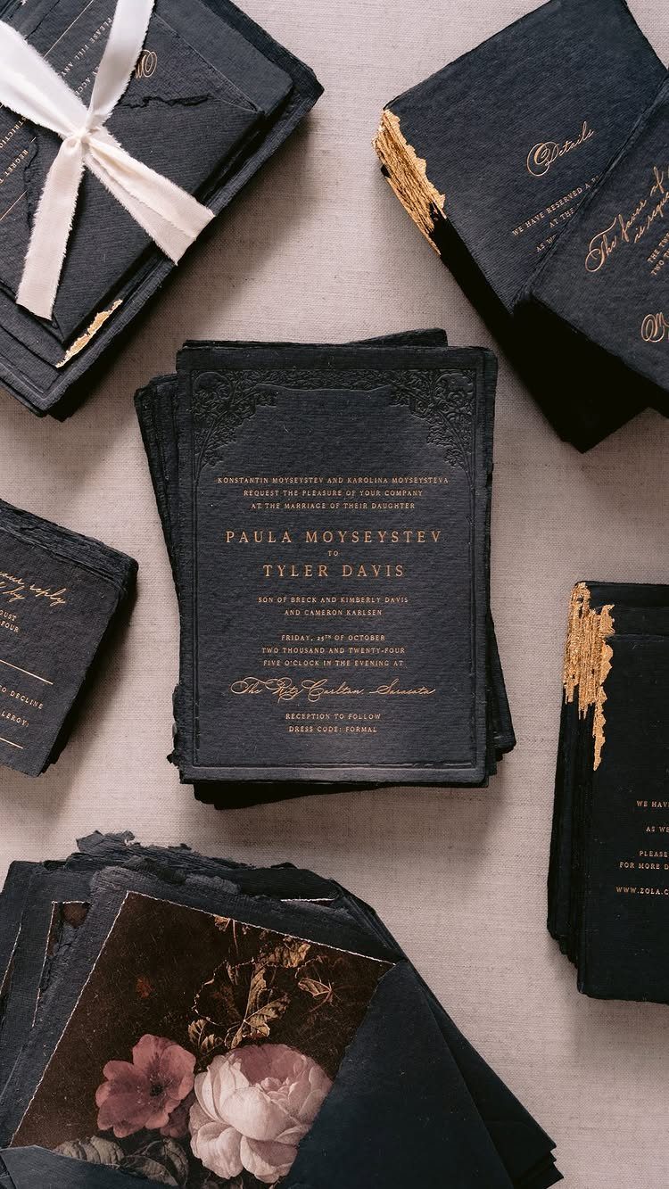
Gold foil on dark, textured paper is the version I would save money for. The metallic text catches light against the black, and a handmade-feeling sheet gives the foil something rich to sit on.
The maker of this suite pairs foil with blind letterpress, which presses the design into the paper with no ink at all. Use foil for names only, and let plain ink handle the details card.
5. Save the Date Cards
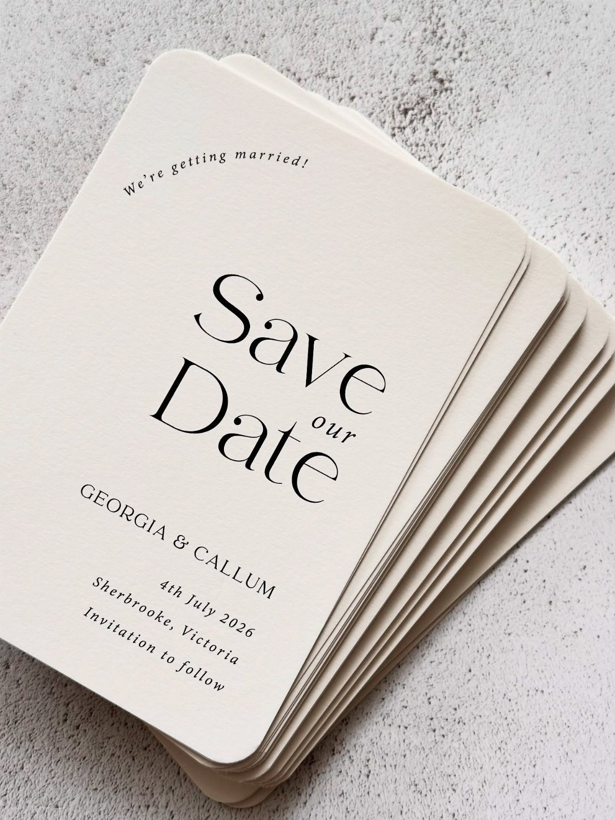
Everything else can wait.
Send it before the invitation so guests can hold the date and plan travel, and keep the wording close to your final invitation so the two feel related.
6. Digital Wedding Invitations
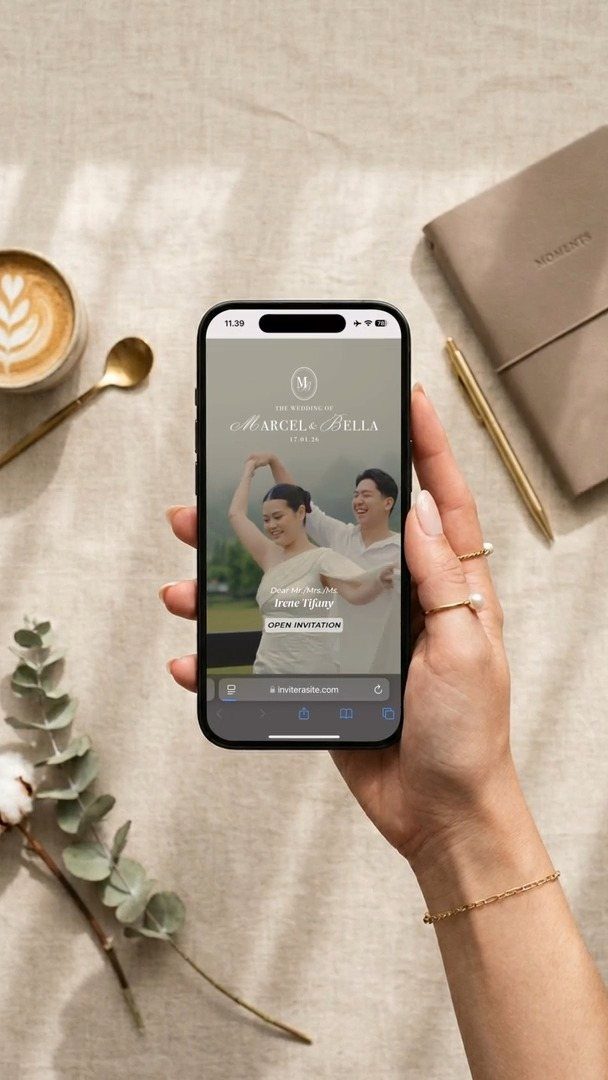
A digital invitation costs the least and moves the fastest, which helps when the deadline is close. It arrives by email or text, and guests can open it on the phone already in their hand.
Choose a design that matches your printed save the date or details so the look stays consistent.
I would still mail paper to any guest who dislikes screens, and check that the RSVP link works before you send it to everyone.
7. Traditional Wedding Invitations
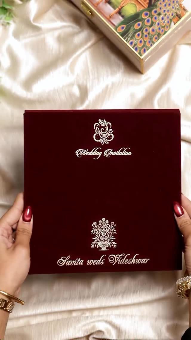
Deep red velvet with gold motifs and white ornate lettering looks like an heirloom before anyone reads a word. A folder format also gives the couple’s names a quiet spot to sit in the center.
Traditional works best when you keep to one or two familiar elements and let the material carry the rest.
Velvet will cost more than card stock, so I would use it for the main invitation and print inserts on plain paper.
8. Rustic Wedding Invitations
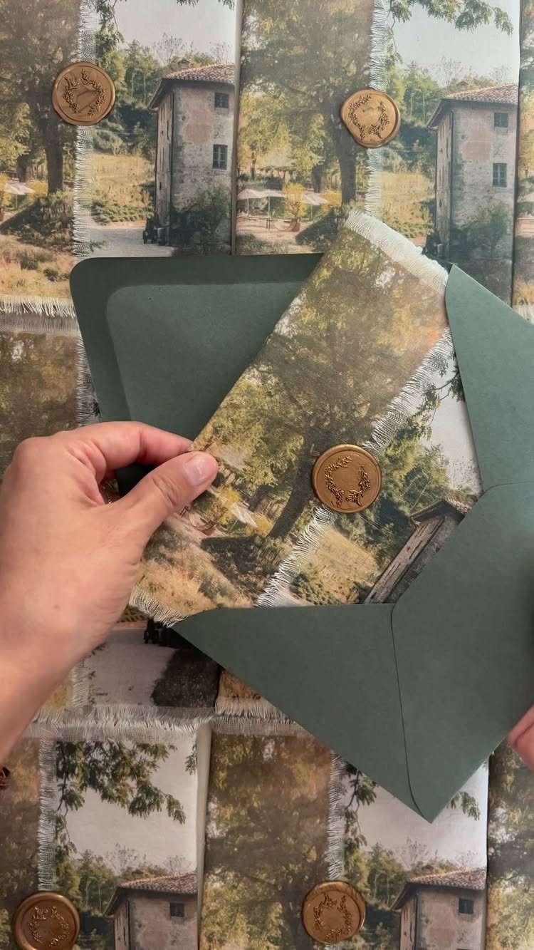
A landscape painting printed on the card does the work of a rustic theme without a single hay bale.
Choose a muted palette that echoes your venue, and let a gold wax seal be the one shiny detail.
I would skip extra twine and tags here. The print already says country, and added trims raise the cost without adding much.
9. Destination Wedding Invitation
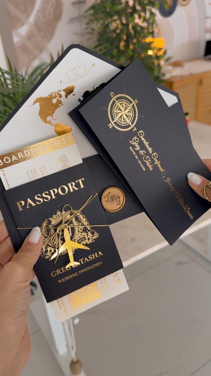
For a destination wedding, the format also tells people to book flights before they open the details.
Put the practical information on the boarding pass: dates, location and RSVP deadline.
Keep the passport card for names and a short welcome. Fewer pieces keep the proofing and postage manageable, so I would stop at those three.
10. Customization and Design Choices Wedding Invitation
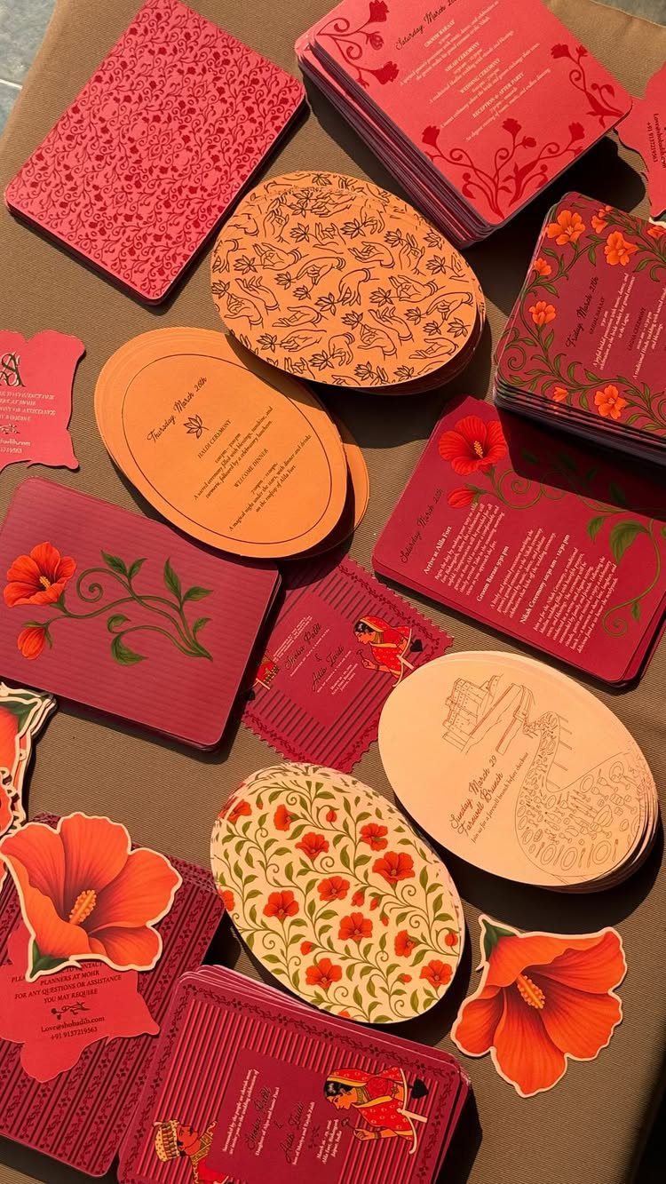
Shape and pattern are the 2 easiest ways to make a card feel individual, and both can be changed without touching the wording.
Custom-cut cards with bold florals look nothing like a standard rectangle, and putting the schedule on a separate card leaves the main one free for design.
Pick one shape and use it across every piece.
Mixing several multiplies the die costs and the proofing. If money is limited, I would keep a standard cut and spend the effort on color and illustration.
11. Photo Wedding Invitations
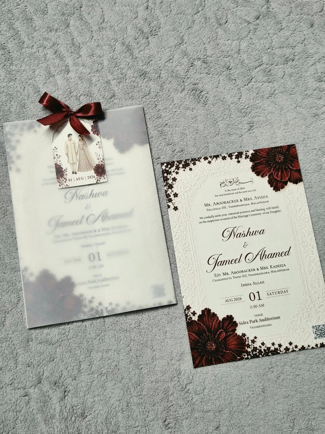
A small photo of the two of you, tied on with a red bow, lets guests match faces to the names. Burgundy florals and a clean date line keep the photo from crowding the text.
Choose a picture with plenty of plain background so it still reads at that small size.
Print it as a separate piece and attach it by hand, which lets you order the photo prints cheaply. I would use a photo on the main invitation only, not on every card.
12. Modern Wedding Invitations
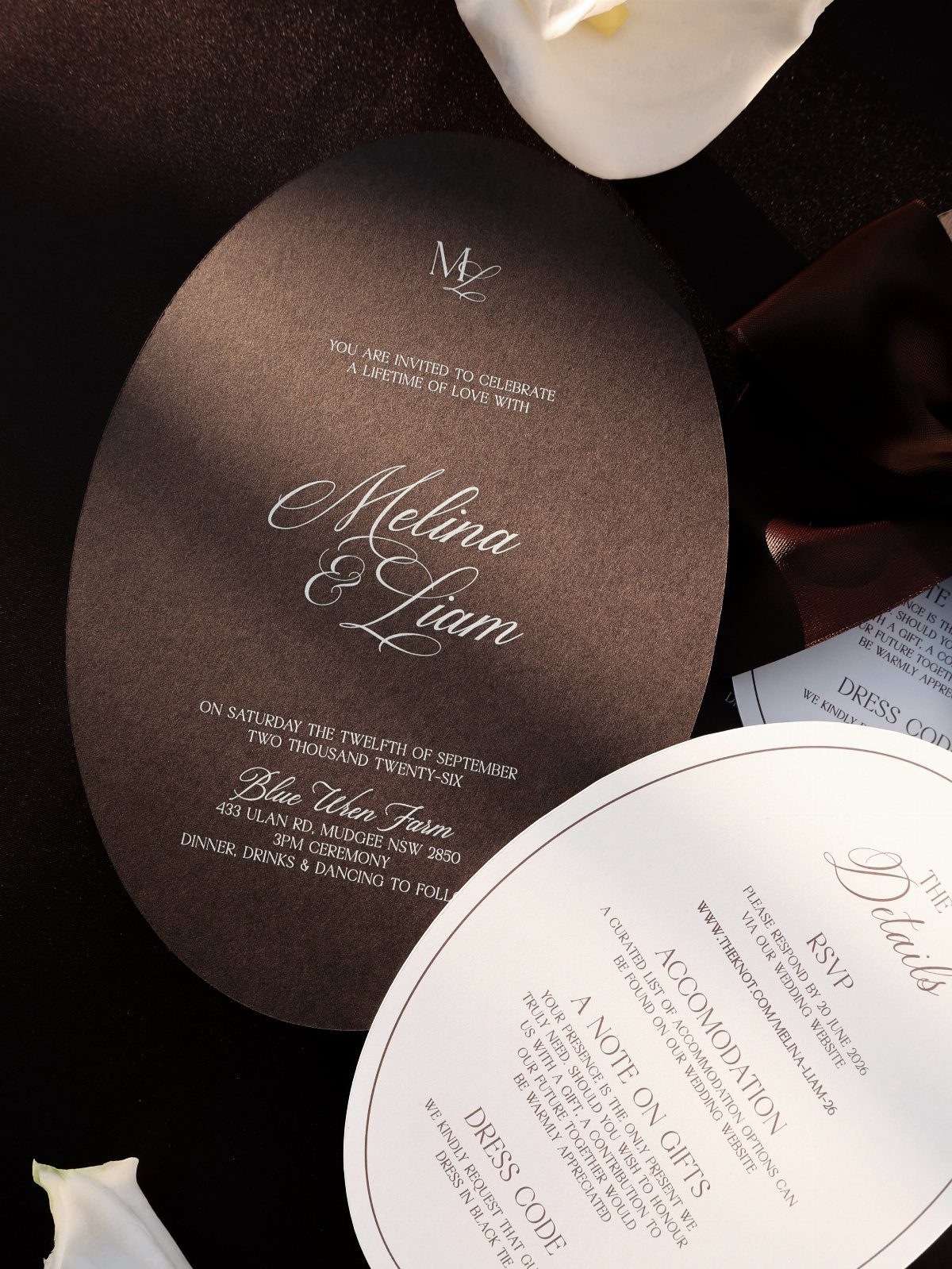
An oval card in dark brown with white type feels modern because the shape is unexpected and the layout stays spare. Give the names plenty of room, and let a matching details card carry the logistics.
Oval cuts usually cost more than a straight trim, so get a quote from your printer first.
A white flower or a piece of fabric makes a nice mailing touch, but I would put the money into the paper and the type first.
13. Floral Wedding Invitations
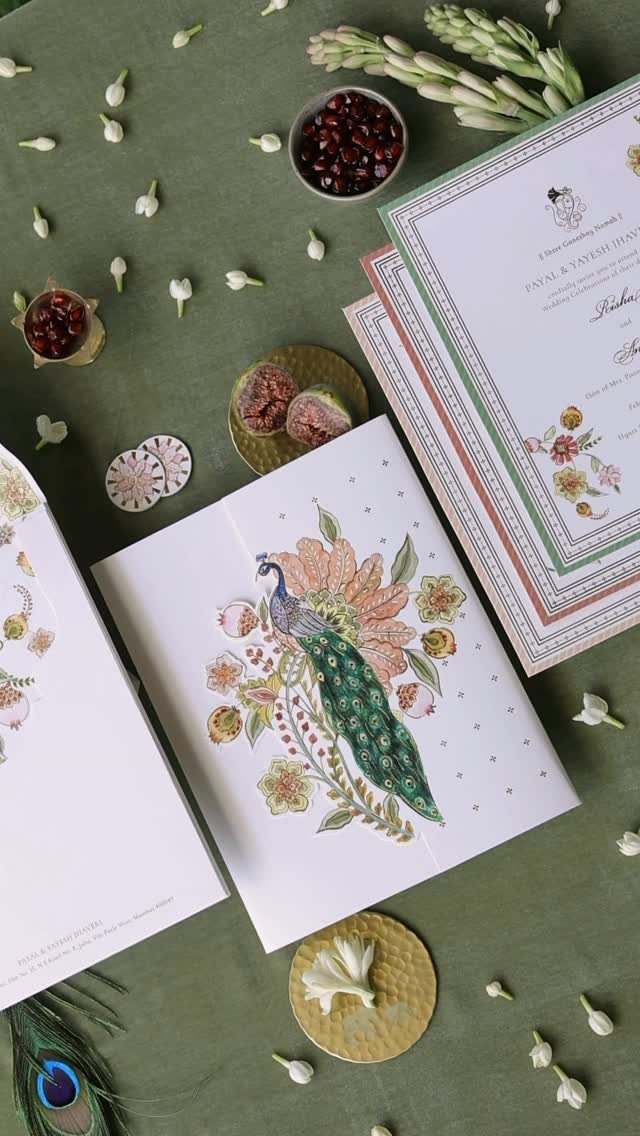
A peacock paired with florals gives a card a focal point, so the rest of the design can stay quiet.
Set an illustrated floral invitation against a solid green fabric or paper backdrop and the artwork reads as a full scene instead of a border, so choose the surface under it as carefully as the print.
Pick one animal or flower to lead and let the others play support.
Keep the names in a plain, readable type, since a busy illustration already supplies the decoration. I would print the details on a separate card and leave the front for the artwork.
14. Embossed Envelope with Swan Seal
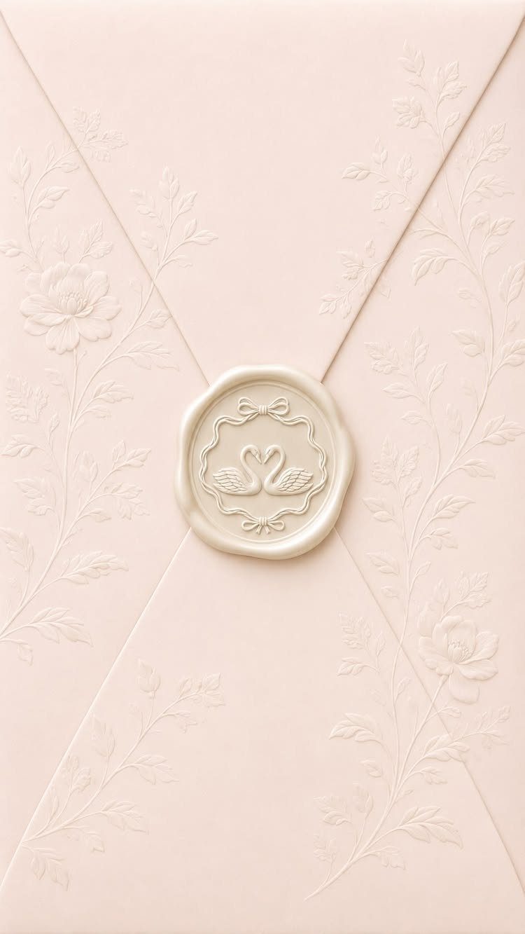
Pale pink paper with a floral relief makes the envelope worth keeping before anyone opens it. A custom seal of 2 swans forming a heart adds the personal part.
A custom motif costs more than a stock initial, so I would choose it over a printed liner or ribbon and skip those extras.
Ask the maker for a proof of the seal design first. Swans suit a couple who want a symbol rather than monograms.
15. Die-cut Oval Invitation Cards
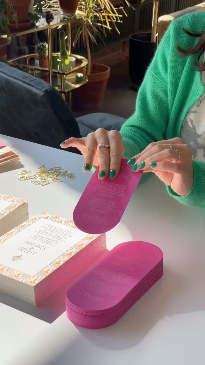
Bright pink in an oval cut is a bold choice, and the shape does half the work. White cards with gold accents beside it keep the color from taking over.
Use the pink for the main invitation and let the supporting pieces stay white.
Before you commit to an oval, get a written quote, because the custom die adds a line item a straight trim never has. Gold on the small cards only is enough.
16. Illustrated Indian Wedding Mandap
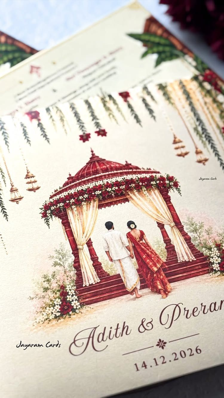
A couple walking toward a red mandap tells guests the ceremony before they read the date. Cream stock keeps the red and the lettering from fighting.
Ask the illustrator or printer to match the mandap to your own ceremony setup, since that detail is what makes the card yours.
Write the date in the format your guests actually use, whether that is month-day-year or the day-month-year style common in many Indian families, and check it twice in the proof. Keep names large and the illustration central.
17. Delicate Lace Border Invitation
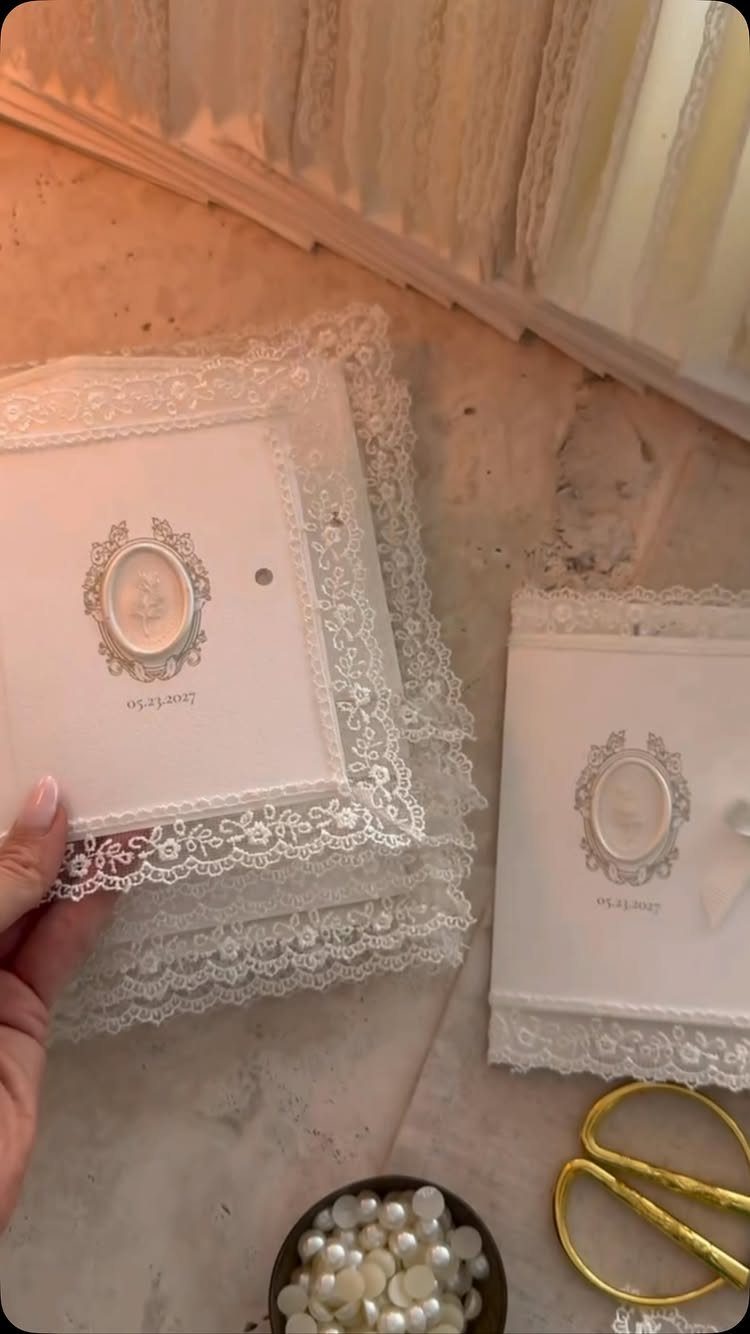
Lace borders look delicate, and an oval portrait in the center makes the card feel like a keepsake. White stock lets the pattern do all the talking.
Keep the wording short so the lace has room. I would choose a portrait with a plain background, since it prints small.
Intricate borders are likely to cost more than a simple trim, so ask your printer for a quote. If money is tight, drop extras like pearls and spend on the cut.
18. Arched Wedding Invitations
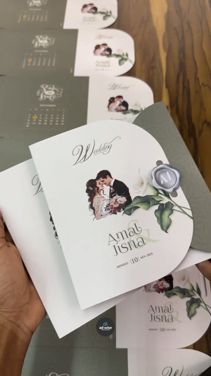
An arched top gives a card a doorway shape, and a whimsical couple illustration fits that story-book feeling. White stock with floral details keeps it light.
Set the couple’s first names and the wedding date inside the arch, where the curve frames them, and put everything else on a standard rectangular card. Use the arch on every piece or none.
19. Wax Sealed Envelopes
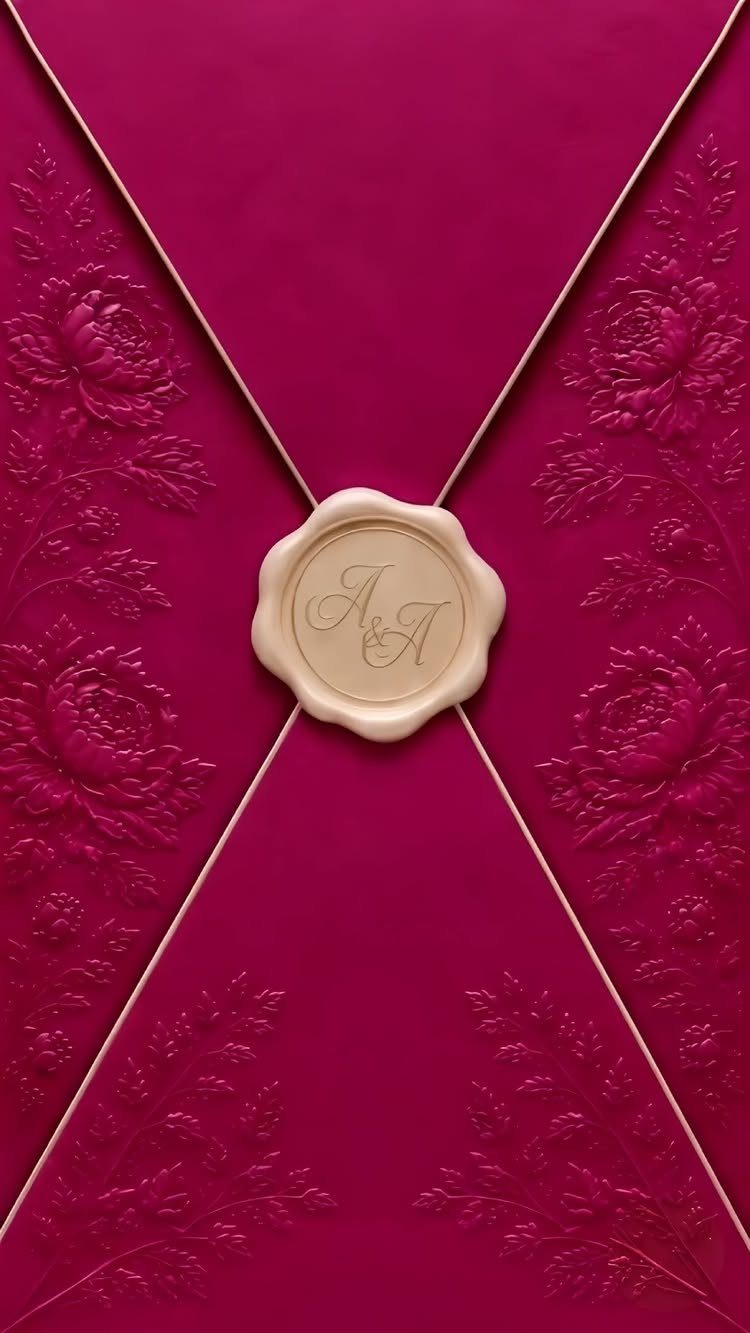
A magenta envelope with a floral emboss is bold enough that the cream wax seal can stay small and quiet. Initials such as "A & A" are the simplest stamp to commission, and cream against that pink reads cleanly.
Seal the envelope flap only, and keep the invitation inside plain so the envelope gets the attention.
Ask for a proof of the initials before the stamp is cut, since a small seal leaves no room for a spelling or spacing error.
20. Deckle Edge Invitations with Velvet Ribbon
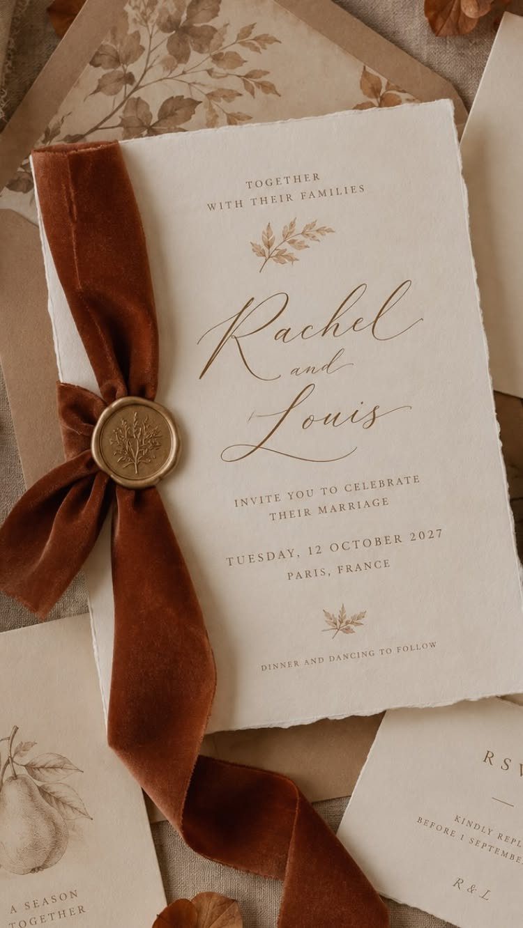
Deckle edges give a card a torn-paper softness, and a rust velvet ribbon tied around it makes that softness feel warm instead of rough. A gold wax seal over the knot holds everything together.
Gold calligraphy keeps the names the first thing guests read. Velvet ribbon costs more than satin, so I would tie it on the main invitation and leave the matching stationery untied.
Lay the whole suite on a neutral fabric before you order, to see whether the rust holds up beside the paper.
21. Belly Band Invitation Suites
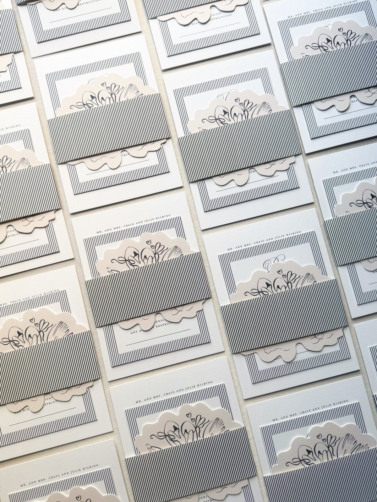
A belly band lets one white card carry a pattern without printing the pattern on every piece. A grey striped band around laser-cut floral overlays adds 2 layers of detail while the cards underneath stay plain.
Print the band’s wording small, such as a hosting line like "Mr. and Mrs. Craig and Julie Milbing," so the guest’s name or host line shows when the suite is stacked.
On a tight budget, I would pick the band or the laser-cut overlay, not both.
22. Wax Seal with Dried Flowers
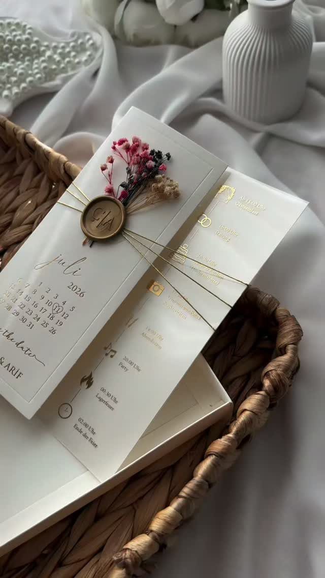
Dried flower sprigs under a wax seal turn a gold string tie into the focal point of a white suite.
Keep the cards plain, with a small calendar page for the month of the wedding, so the flowers do the decorating.
Press the sprigs flat against the seal while the wax is still soft. Dried stems are fragile, so I would assemble a few spares and pack the suites flat for mailing.
Pink blooms against white stock look soft without adding a printed pattern.
23. Custom Couple Illustration Invitations
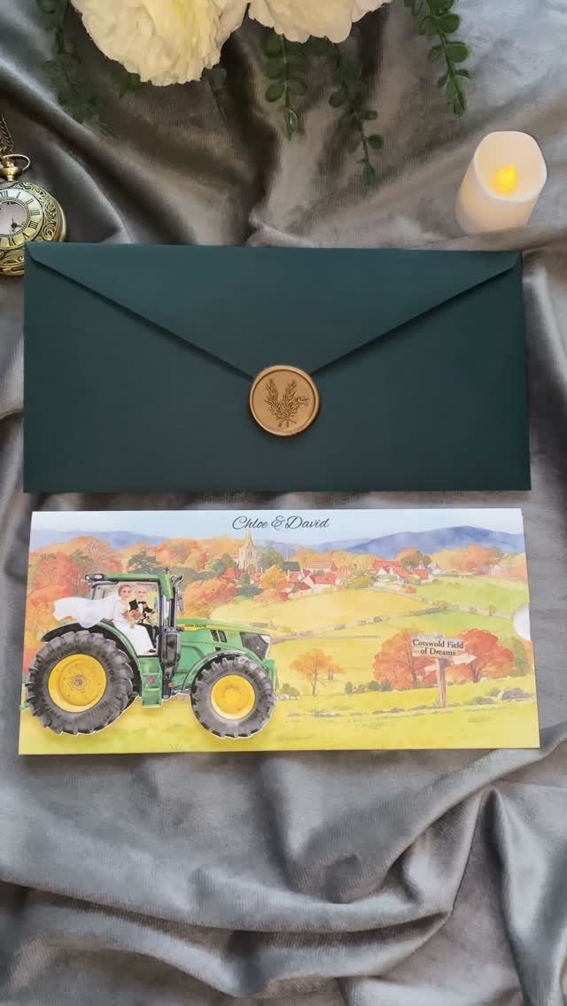
A watercolor of the two of you on a tractor says more about a couple than any border could. Name the place on the card, as "Cornwall Field of Dreams" does, and the illustration and venue explain each other.
Send the illustrator a few clear photos and a short list of props that matter to you. Ask for a sketch approval before the final painting.
A darker envelope liner, such as forest green, keeps the eye on the illustration when the guest pulls the suite out, so I would pick the liner color after the artwork is final. Spend on the art first.
24. Dark Textured Paper Invitations
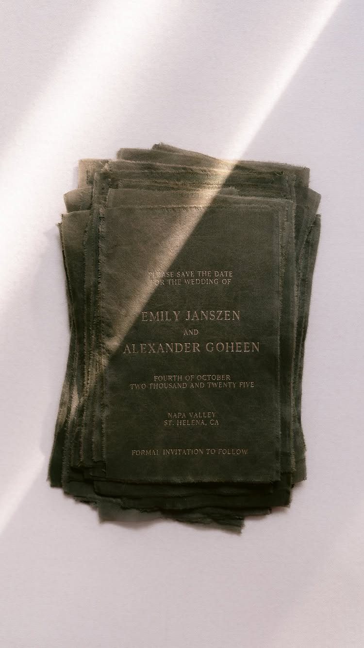
Charcoal paper with crisp white type gives an invitation real drama, and the deckle edge keeps it from feeling cold.
Set the names, date and "Napa Valley, St. Helena, CA" in a clean, simple typeface so the contrast does the work.
White ink reads best at a larger size, so I would avoid thin script for the small print. Ask your printer for a test on the actual stock before ordering the full run.
A white envelope liner is optional, and I would skip it unless money is left over.
25. Laser-cut Designs Wedding Invitations
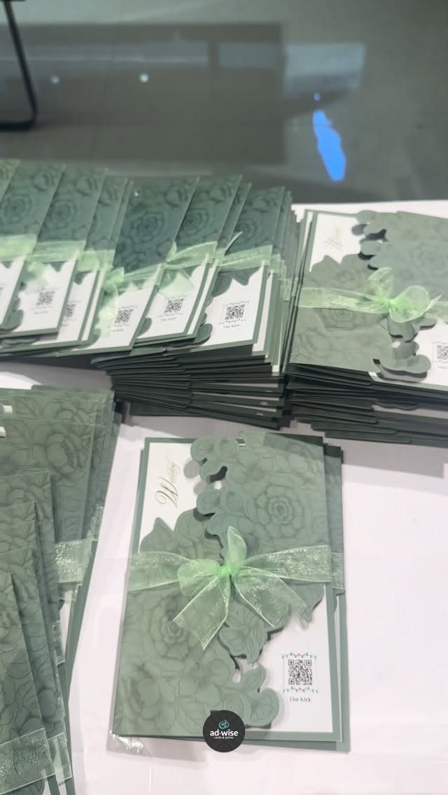
Cutwork this fine is the whole decoration, so I would keep the printed wording short and clean.
The QR code is a practical add-on for RSVPs. Place it on a plain section of the card, away from the cutwork, and test it before you order the full run.
26. Printed Addresses on Envelopes
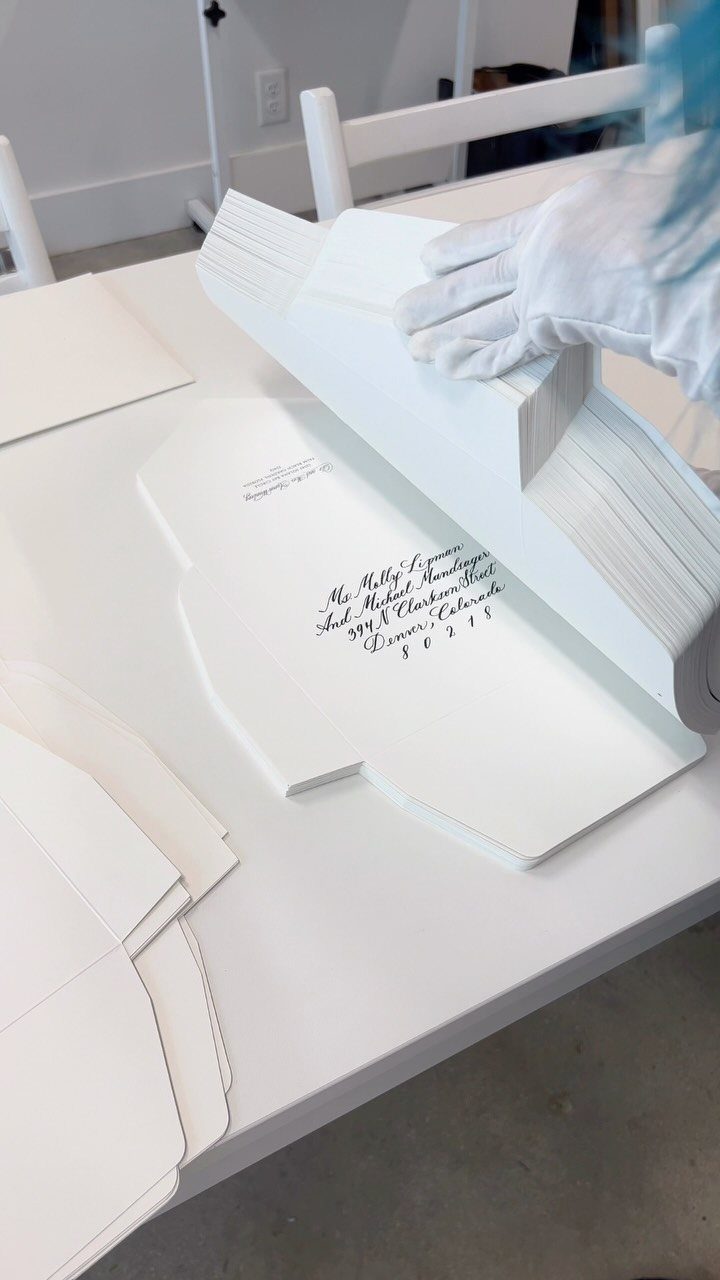
Printed addresses on white envelopes, in black cursive, give a suite a formal look and save your hand from a long evening of writing.
Check every name and title before the file goes to the printer, because a special character like the ä in Mundtläger or a doubled pair of titles is easy to miss on screen.
Hand lettering is the other route.
One maker lettered 140 envelopes individually by hand for a wedding, which tells you the scale of the job. For a guest list that size, I would print and save the hand work for a few envelopes.
27. Invitation Samples
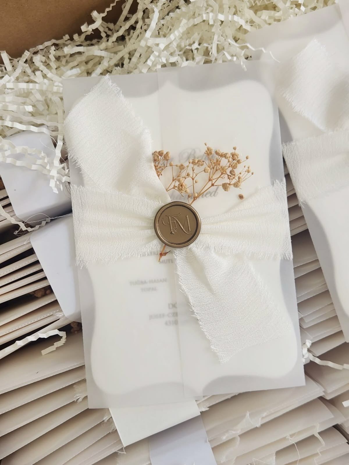
A sample tells you what a screen never will: how the paper feels, how heavy the stock is, and whether the wax seal and the sheer wrap hold together.
Order a sample first, and ask for the exact paper and finish you plan to use.
Look at the edges and the print sharpness, and check that the ribbon or seal arrives intact.
A sample that comes through shipping in good shape is a good sign. I would pay for samples from 2 shops and compare them side by side.
28. Invitation Design Inspiration
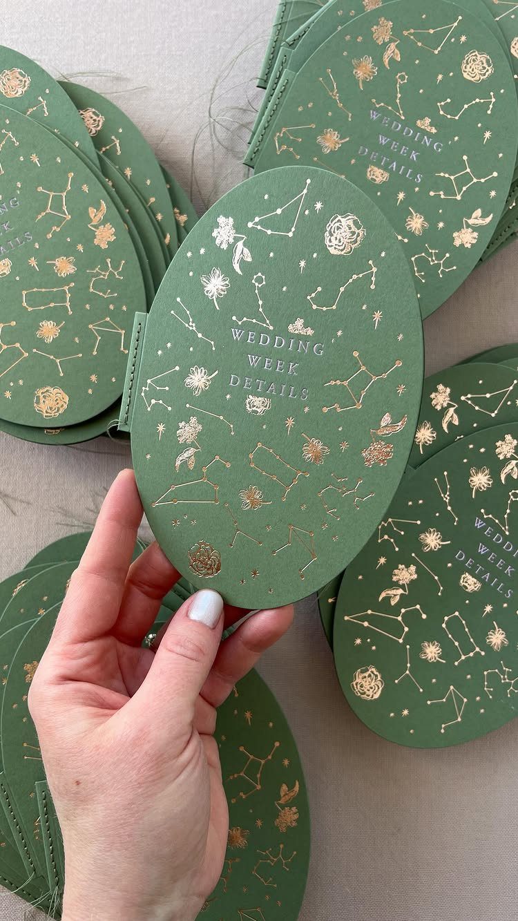
Notice that the card reads as a wedding week details piece before you read a word.
Start your search by saving cards you keep returning to, then look for what they share: a shape, a color or a finish.
Pick one of those and build from it. I would keep the saved images to a short stack, or the choices start to blur.
When to Send Invitations
Invitations should land in mailboxes 6–8 weeks before the wedding. Count backward from that date, then add a few days for printing, assembly and the post office, so the mail date is not also your finish date.
Destination weddings and any list with a lot of long-distance travelers need more room. Aim for 8–12 weeks, since guests have to request time off and book flights.
A mostly local list can sit near the 6-week mark.
Send a save the date several months ahead of all this. It matters most if the wedding falls in a busy season or many guests are traveling, and it is what lets you keep the invitation timeline short.
Cost Considerations
Budget around $160 for a run of 100 invitations; that is the typical spend for couples, though paper choice and printing method can move it a long way.
Treat that as a midpoint, not a target: design, paper, printing method, inserts, envelopes and RSVP cards all move it up or down.
Price the whole suite, not the front card. Inserts and RSVP cards are where a quote tends to grow, so get the full per-set cost in writing from the printer before you sign anything.
If the budget is tight, free online templates exist.
Digital versions travel easily: send them as a download, attach them to an email, or pass them along in a group text. One site offers a premium membership at $3.49 a month or $26.99 a year for a larger design library.
Frequently Asked Questions
Can you design a wedding invitation?
Yes, and you can keep it simple by choosing one or two personal details, such as initials, a flower you love or a custom couple illustration.
If you hire an illustrator, send a few clear photos and ask to approve a sketch before the final art.
What should wedding invitations include?
At minimum, include the names, date, time, location and RSVP details.
A wedding website address can go on a separate details card, which also leaves the main card free for design. Check every name and title in the proof before printing.
When should wedding invitations be mailed out?
Aim for delivery 6–8 weeks ahead of the wedding date, which means the mailing date sits earlier than most people expect. Destination weddings and lists with many long-distance guests need 8–12 weeks, while a mostly local list can go out near 6 weeks.
Is it OK to send wedding invitations online?
Yes: email or web invitations are the cheapest route and the quickest to deliver, which helps when the calendar is tight.
Many guests still expect paper, so I would mail a printed copy to anyone who dislikes screens. Test the RSVP link before sending it to everyone.





