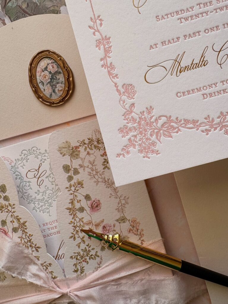
The stationery in this list runs from a plain paper belly band and a single black ink color to acrylic, red and gold foil and circular and oval shapes, and each step up adds cost per piece.
Guest list length and budget decide where to splurge: stationery usually takes about 5% of the overall budget, so a short list can afford one showpiece while a long list should save foil and acrylic for the invitation alone.
1. Save the Dates
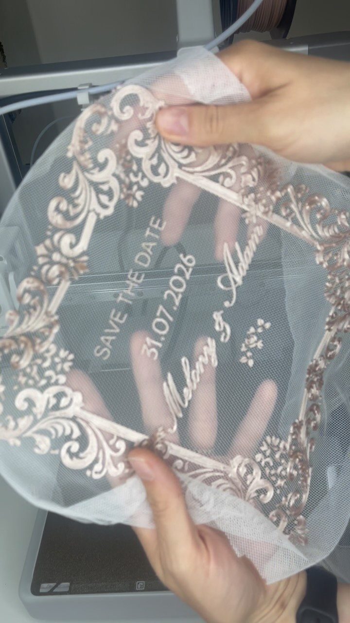
A date like 31.07.2026 does a lot of work on a save the date, so print it large and let the names, Melany & Adam here, take second billing. Guests need to find the day first and everything else later.
Acrylic with a gold border looks like a showpiece, but it costs more than a flat card. On a tight budget, I would put the money into the invitation and let a simple card carry this job.
2. Belly Bands
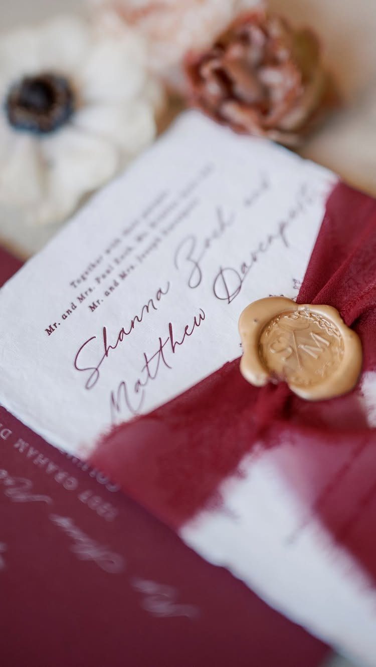
Loose cards slide around in an envelope, and a belly band fixes that by holding the whole stack together in one wrap. Burgundy fabric closed with a gold wax seal adds a color accent without a second printed piece.
Wrapping and sealing each one by hand adds time, so count your guest list first and decide whether the hours are worth it. For a modest budget, a plain paper band is the lighter lift.
3. Wedding Invitation Suite
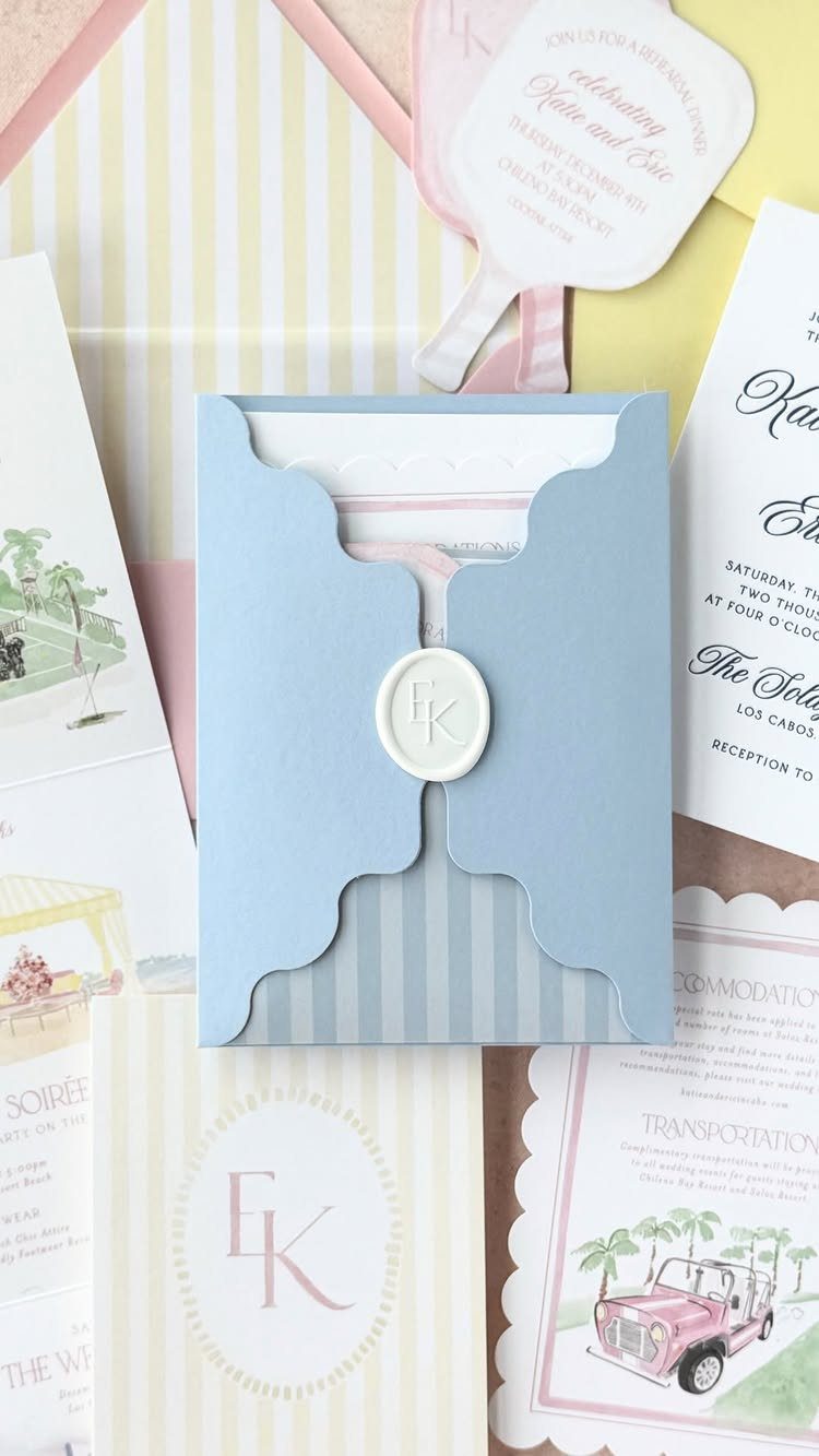
Matching pieces are what make a suite feel like a suite: invitation, RSVP card, enclosure cards for details like transportation, and later the thank you cards, all sharing one color and type style.
Every extra card adds printing and postage weight, so I would keep only the enclosures guests will truly use. A single details card often replaces 3 separate ones.
4. Ceremony Programs
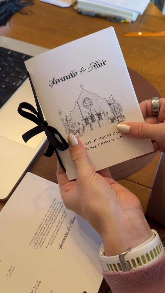
Programs tell guests who is standing where and what happens next, which is why the order of the ceremony belongs at the center of the page.
Print only what you need. One program per household, rather than per guest, trims the bill without anyone noticing.
5. Menu Cards
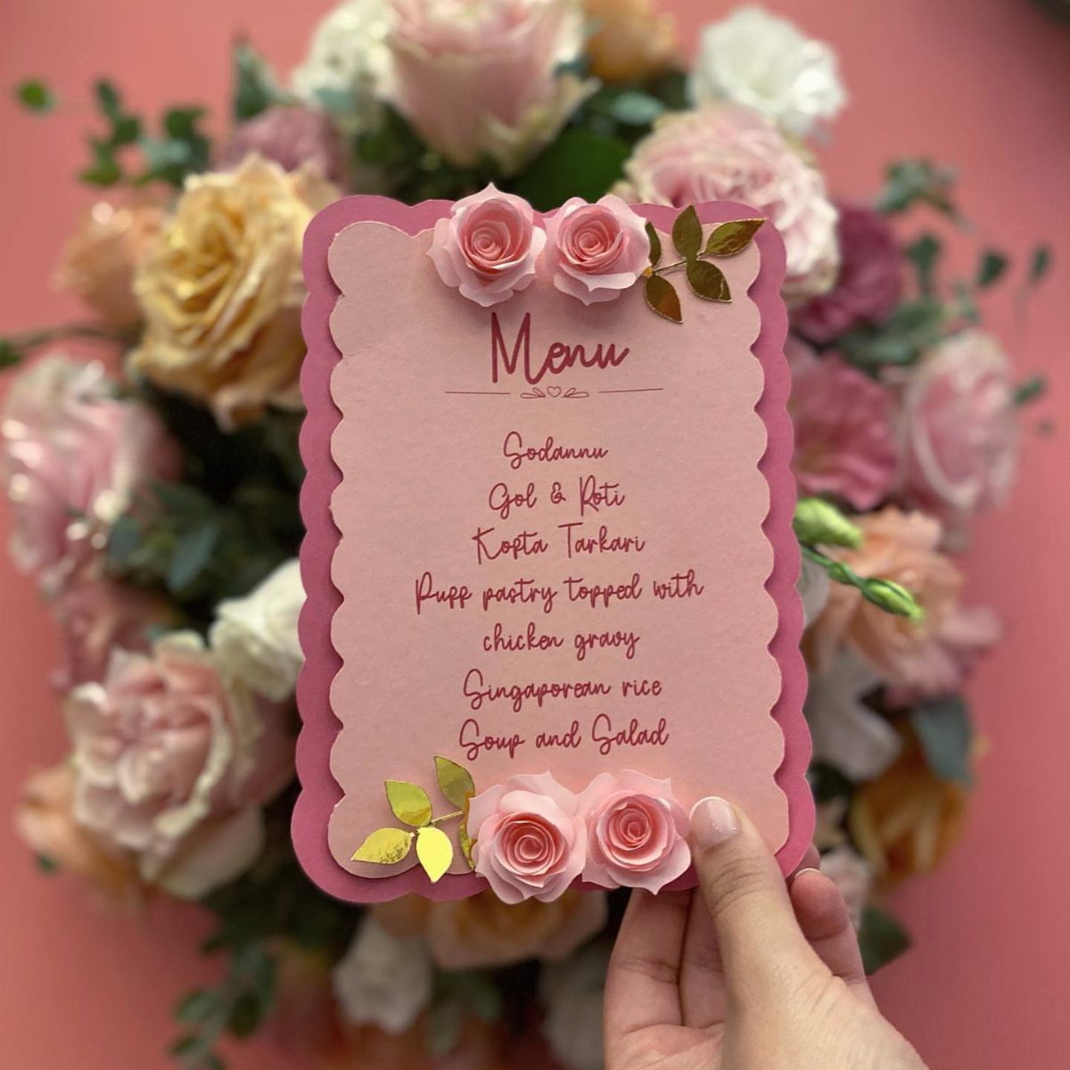
Guests like to know what is on the plate, so list each dish by its real name, the way "Godannu" and "Singaporean rice" appear here. Unfamiliar dishes especially deserve a short description.
Keep the card readable before making it pretty.
Scalloped edges and 3D roses look lovely, but handmade flourishes multiply fast across a full set of tables. I would add them to a few cards only, or skip them, if money is running short.
6. Online RSVP Options
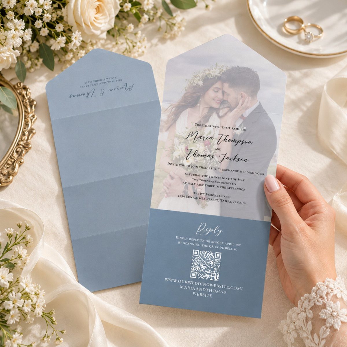
A QR code on the invitation sends guests straight to an online RSVP form, which saves you the cost of a reply card and a return stamp. Test the code before printing, and size it large enough to scan easily.
Some guests, often older relatives, will want paper. I would add a phone number or email line for them so nobody is left unsure how to answer.
7. Wax Seals
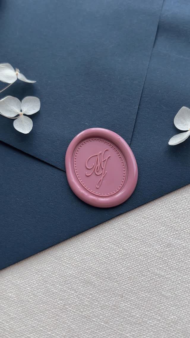
Mauve wax on dark blue gives a soft, dusty contrast that reads as formal without shouting. A cursive monogram suits the material, since script presses cleanly into a round seal.
A seal is a finishing touch, so I would put one on the envelope flap only, not on every inside piece. Dried flowers tucked beside it are optional, and they add bulk to the mailing.
8. The Floral Wreath
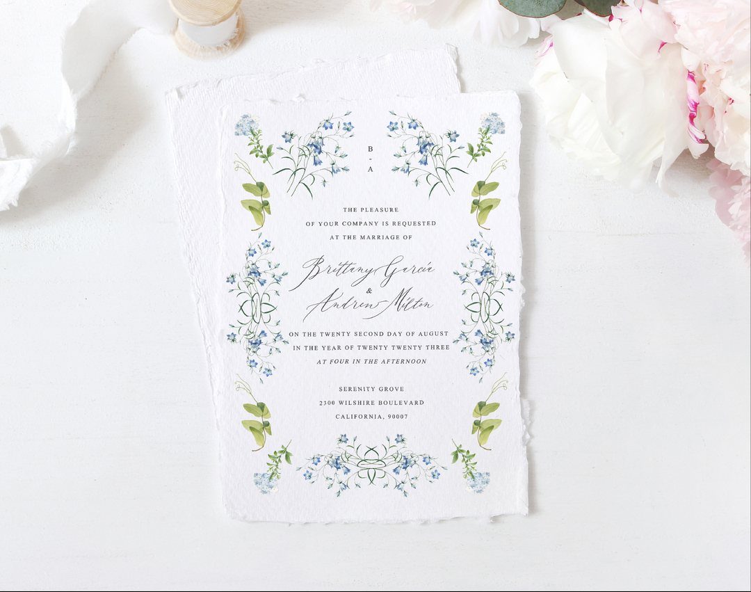
Deckle edges and a hand-painted blue wreath make the paper itself feel like part of the decoration.
Once your florist confirms a palette, say blush and white garden roses, pull those exact colors into the wreath so the invitation and the bouquets match.
Wait for that confirmation before you order. A wreath in the wrong shade is hard to fix once the cards are printed.
9. Custom Addressing Envelopes
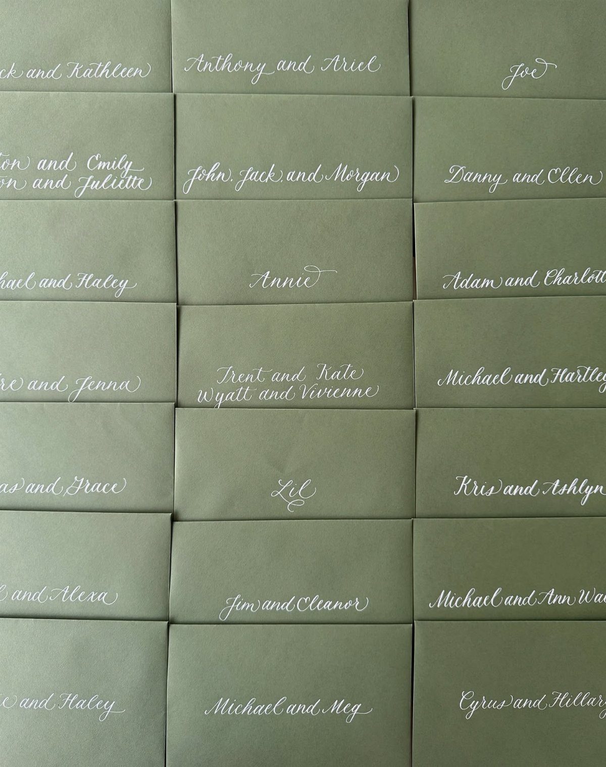
White cursive on sage green envelopes turns the address into the design, so the card inside can stay simple. Names such as "Anthony and Ariel" fit neatly when each couple or household gets one line.
Check the spelling of every name against your guest list before anything is lettered. Light ink on a dark envelope also shows smudges, so allow extra envelopes for mistakes.
10. Wedding Stationery
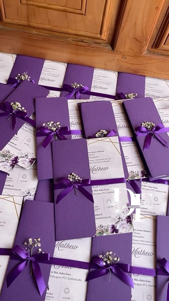
Keep the palette to purple and white so the ribbon and blooms read as part of the suite.
Tying each set by hand takes time, so I would count your guests first. On a tight budget, ribbon alone, without the flowers, still gives the look.
11. Illustrated Envelope Liners
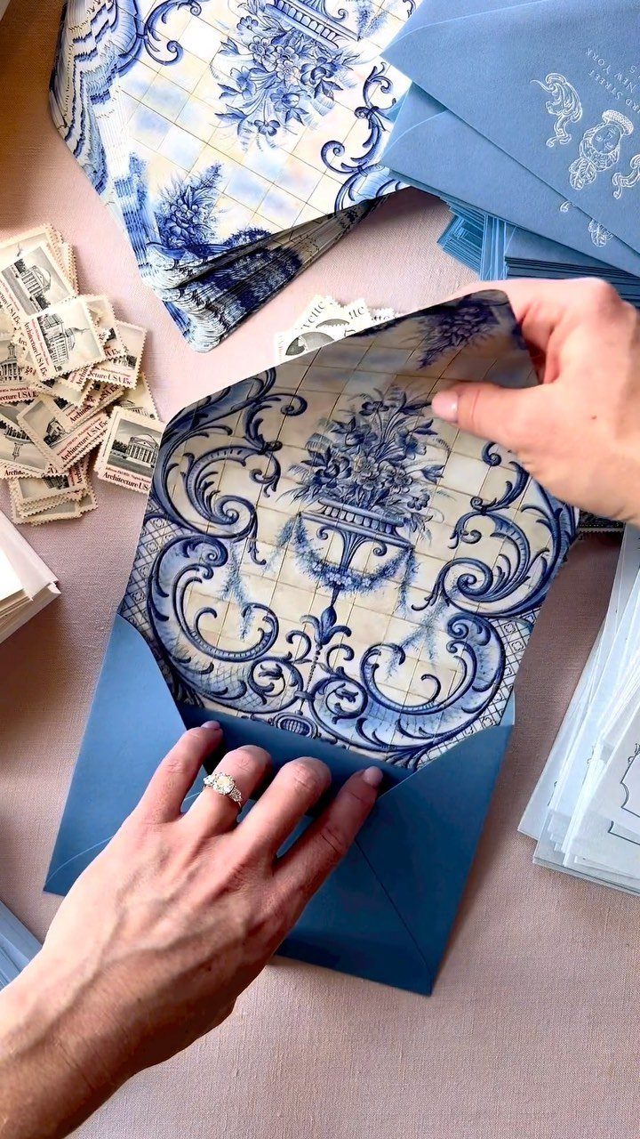
A patterned liner is a small surprise that guests see the second they open the envelope. Blue and white florals work well when they echo the invitation, so the pieces clearly belong together.
Liners add cost per envelope, which is why I would use them where the budget allows and keep the outside plain. Matching stamps to the color scheme is a cheap way to extend the idea.
12. Art Deco Border Invitations
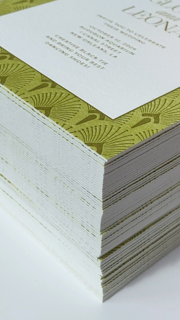
A geometric green border gives an Art Deco invitation its character, and black text in a clean, elegant typeface keeps it easy to read.
Venue and date sit comfortably inside the white center of an Art Deco border, so keep the details short enough to leave room around the text.
Let the border carry the style and keep the wording short. Crowded text fights with strong geometry, and the design loses its sharpness.
13. Red and Gold Foil Stationery
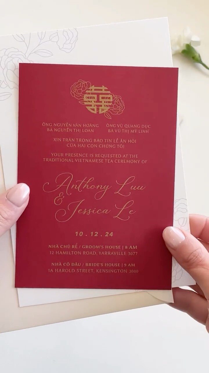
Red paper with gold foil lettering is a traditional pairing, and a bilingual layout like this one, Vietnamese and English, lets every guest read the same card.
Foil shines most on large, simple letters, so keep the names big and the details short.
Foil costs more than flat ink, and I would use it on the invitation alone. A plain printed insert for the details card saves money without dulling the look.
14. Minimalist Black and White Invitation
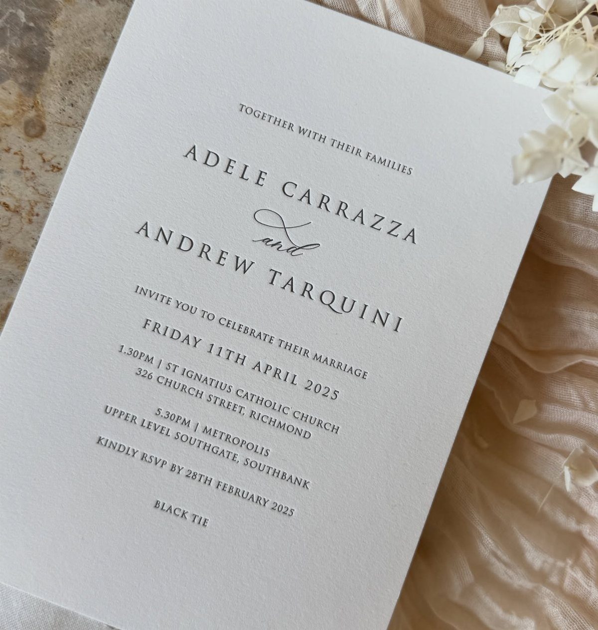
Black ink on white stock, with a serif for the details and a script for the names, is about as classic as paper gets.
2 typefaces are plenty.
Pick one script for the names and one serif for everything else, and the card stays calm. For a modest budget, this is the cheapest style to print well, because a single ink color keeps costs down.
15. Silk Ribbon Tied Invitations
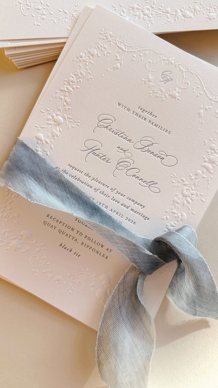
A dusty blue silk ribbon tied around a white embossed card gives the suite a soft finish without any extra printing. The embossing adds texture, so the ribbon can stay plain.
Cut every ribbon length before tying anything, so the bows match.
Ribbon and embossing both add cost, and I would pick one if money is tight: the ribbon is the easier one to do yourself. It also adds bulk, so check postage with a finished set before mailing.
16. Acrylic Wedding Invitations
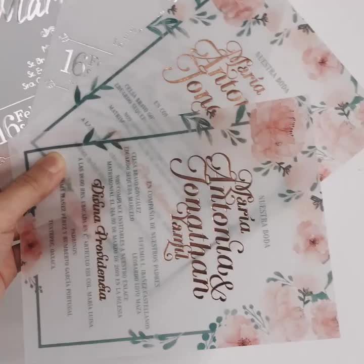
Clear acrylic lets the gold script and pink floral corners seem to float, which paper cannot do. Metallic ink reads best on a clear sheet when the lettering is large, so avoid tiny fine print.
Acrylic is a splurge, and I would keep it for the main invitation.
Put the logistics on a paper details card instead. Ask the printer for a proof first, since light text on clear material can be hard to read.
17. Circular and Oval Invitation Shapes
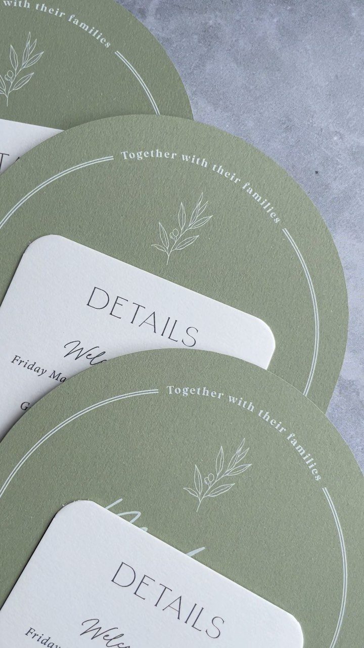
Cutting an invitation into a circle gives you a shape nobody expects from the mailbox, and sage green keeps it soft.
The white rectangular detail cards beside it hold the practical information, so the round card only carries the headline wording.
Custom shapes cost more than standard rectangles, because the paper needs a special die.
I would shape one piece only and leave the rest rectangular. Ask your printer whether a round or oval card fits a standard envelope, since odd shapes often need custom sizes or extra postage.
18. Scalloped Edge Detail Cards
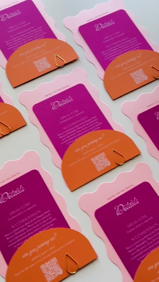
A scalloped border softens a detail card, and a contrasting semi-circle layer behind it adds color without extra words. Pink and purple against orange makes a bold set, and a QR code on the card keeps the page uncluttered.
Paperclips hold the layers together, which beats gluing and costs very little.
I would keep the scallop on the card and use plain shapes behind it. Too many curves on one piece starts to feel busy, and the QR code needs a clear space around it to scan.
When to Send Invitations
Send invitations at least 8-12 weeks before the wedding. If your caterer wants a headcount early, or many guests will travel, mail them sooner: 4 months out is a comfortable target, and 5 months suits a travel-heavy list.
Early mailing gives out-of-towners time to price flights and hotels before your RSVP deadline arrives.
Save the dates have their own window, 6 months to 1 year ahead.
Going much further out, such as 18 months, tends to backfire, because guests forget a date that far away. Destination weddings are the exception and call for more lead time.
Set your RSVP deadline with your caterer’s cutoff in mind, then work backward to the mailing date.
Budget Considerations
Stationery usually takes about 5% of the overall wedding budget, though that share moves with your priorities, so a couple who adore paper can pull a little from somewhere else.
Treat that as a starting point. If paper is your favorite part of the day, trim something else and spend more here; if it isn’t, spend less without guilt.
A seated dinner pushes the number up, since you will need table assignments and probably seat markers.
Get that figure in hand before you fall for a finish, because each upgrade, flat foil included, adds to it.
Invitation Wording Etiquette
Keep the wording clear and complete: who is hosting, who is getting married, the full date spelled out, the time, the venue, and the city and state.
Say whether a reception follows. When the reception is at a different place, give it its own card and let the invitation stop with the ceremony’s city and state.
Leave the registry off the invitation entirely.
Even "no gifts please" suggests you expected one, and a registry link reads like an invitation to buy something. Put it on your wedding website instead.
For traditional wording, "request the honour of your presence" suits a house of worship, and "request the pleasure of your company" suits other venues. List the groom’s parents as hosts only if they helped pay for the wedding itself.
Frequently Asked Questions
What should be included in the invitation suite?
A suite starts with the invitation, an RSVP card, and enclosure cards for details such as transportation, with thank you cards following later. All of them should share one color palette and type style so they read as a set.
A single details card usually does the work of 3 separate ones, and each card you cut saves on printing and on the postage weight that pushes an envelope into a higher rate.
When should you send save the dates?
Send save the dates 6 months to 1 year before the wedding. Mailing 18 months ahead usually backfires, since guests lose track of a date that far off.
How much should you budget for wedding stationery?
Plan on about 5% of your overall wedding budget as a starting point. Plan on spending more if dinner is seated, because table assignments and likely seat markers add pieces to the order.





