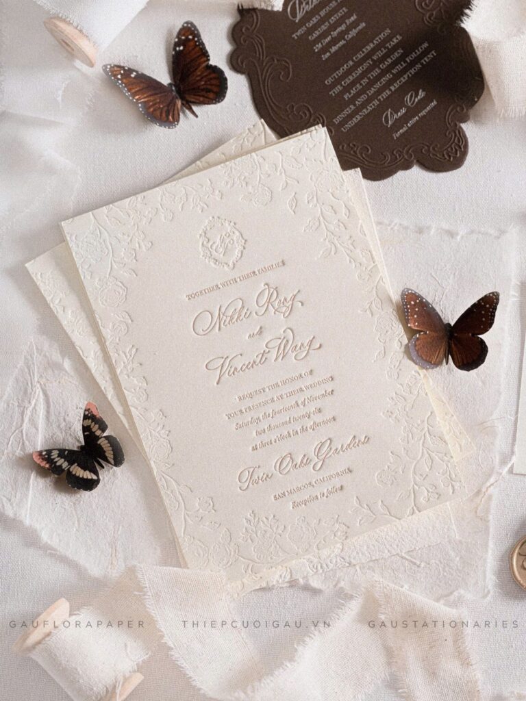
Fall invitations here run from a single line of gold or copper foil on a classic card to hand-calligraphed envelopes in burgundy, sage and cream, and the price gap comes down to how many pieces get the special treatment.
The rule that picks one is your guest list: foil on the names, a color-heavy envelope liner or a wax seal costs little, while calligraphy is priced per envelope and a long list adds up fast.
Spend the extra on one piece, such as foil on the invitation or a wax leaf seal on the envelope, and keep everything else in the suite simple.
1. Foil Wedding Invites
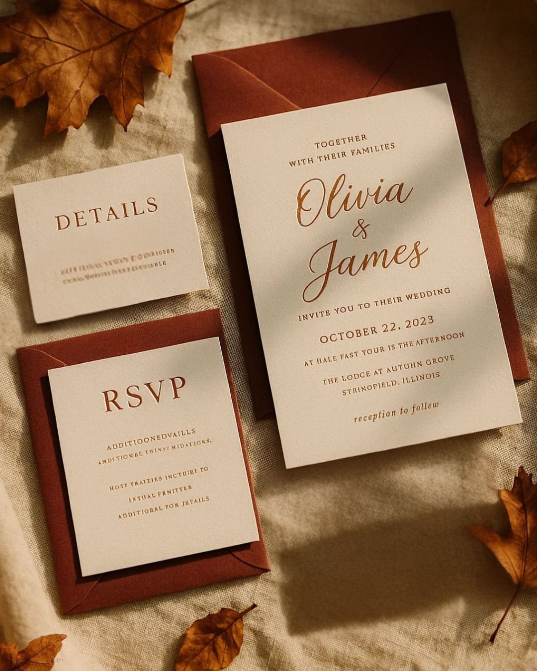
Gold or copper foil on a classic card is the quickest way to make a fall invitation feel formal. Copper reads warmer and sits well beside rust envelopes, which is the pairing I would pick for October.
Keep the foil to the names and leave the RSVP and details cards in plain ink. Foil costs more per piece, so spending it on one line of type gets you the shine without padding the invitation budget.
2. Foldable Watercolor Card with Seal
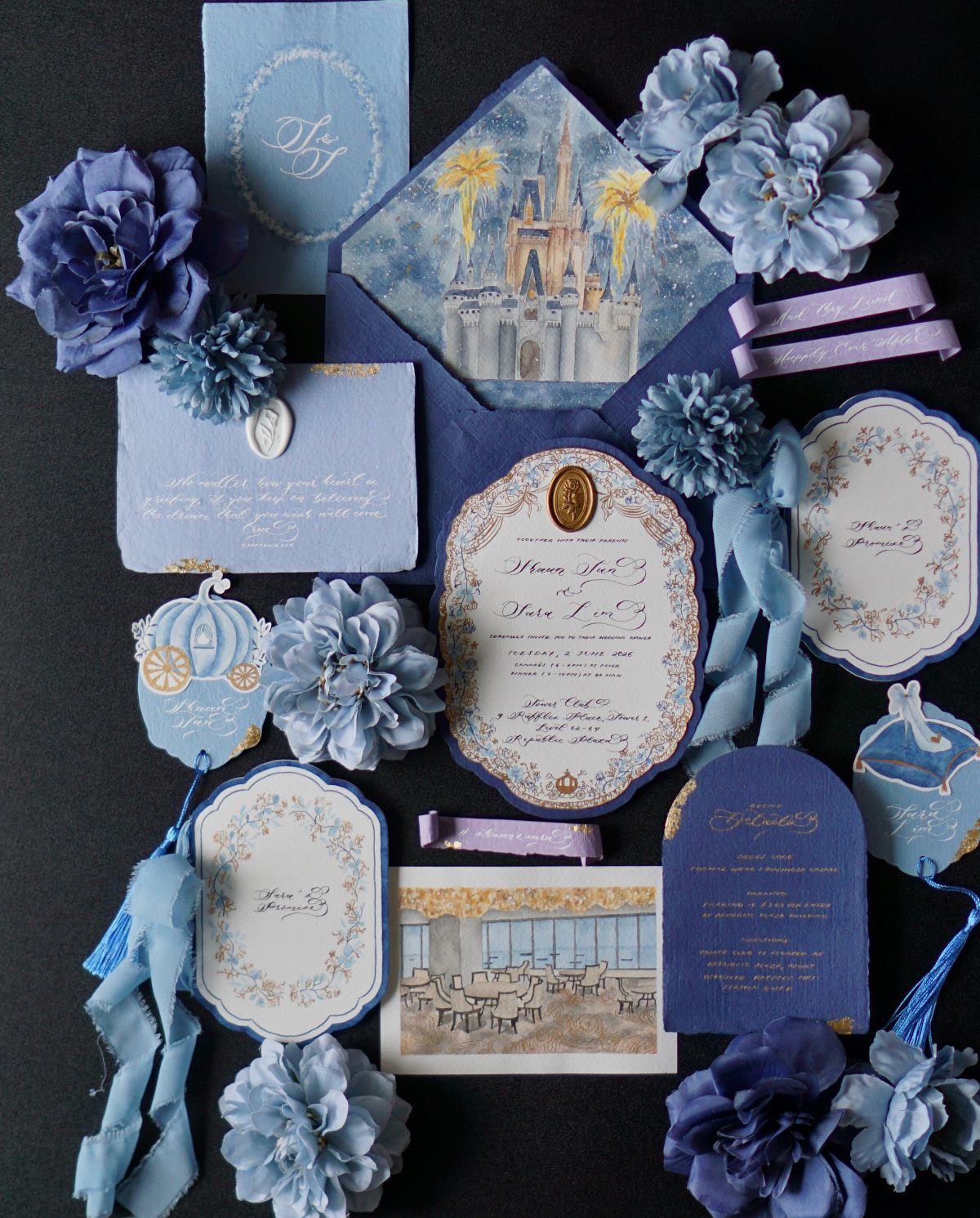
A watercolor card that folds open feels like a small storybook, and a wax seal closing it adds to the old-world mood. Blue is an unexpected choice for fall, and I like it against black or deep envelopes.
Pick a painted scene that means something to you, such as a castle or a venue. Then add a ribbon to the seal, since it costs little and makes the fold feel finished.
3. Fall Foliage
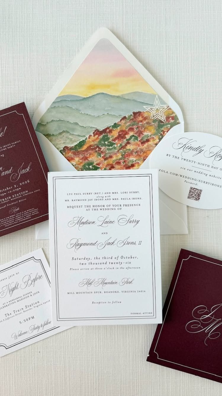
Autumn mountains painted on an envelope liner give guests a pleasant surprise the moment they open the flap. Burgundy envelopes pick up the reds in the leaves, so the whole suite stays in one season.
With the artwork printed on the liner, the invitation card itself can stay plain white, and the names will stand out clearly. For a limited budget, I would put the color in the envelope and keep the card plain.
When it comes to fall wedding planning, there’s nothing as charming as seasonal stationery. The rich autumn palettes and whimsical fall foliage make for striking designs that are sure to score you an RSVP.
4. Tree-sprinkled Fall Wedding Invites
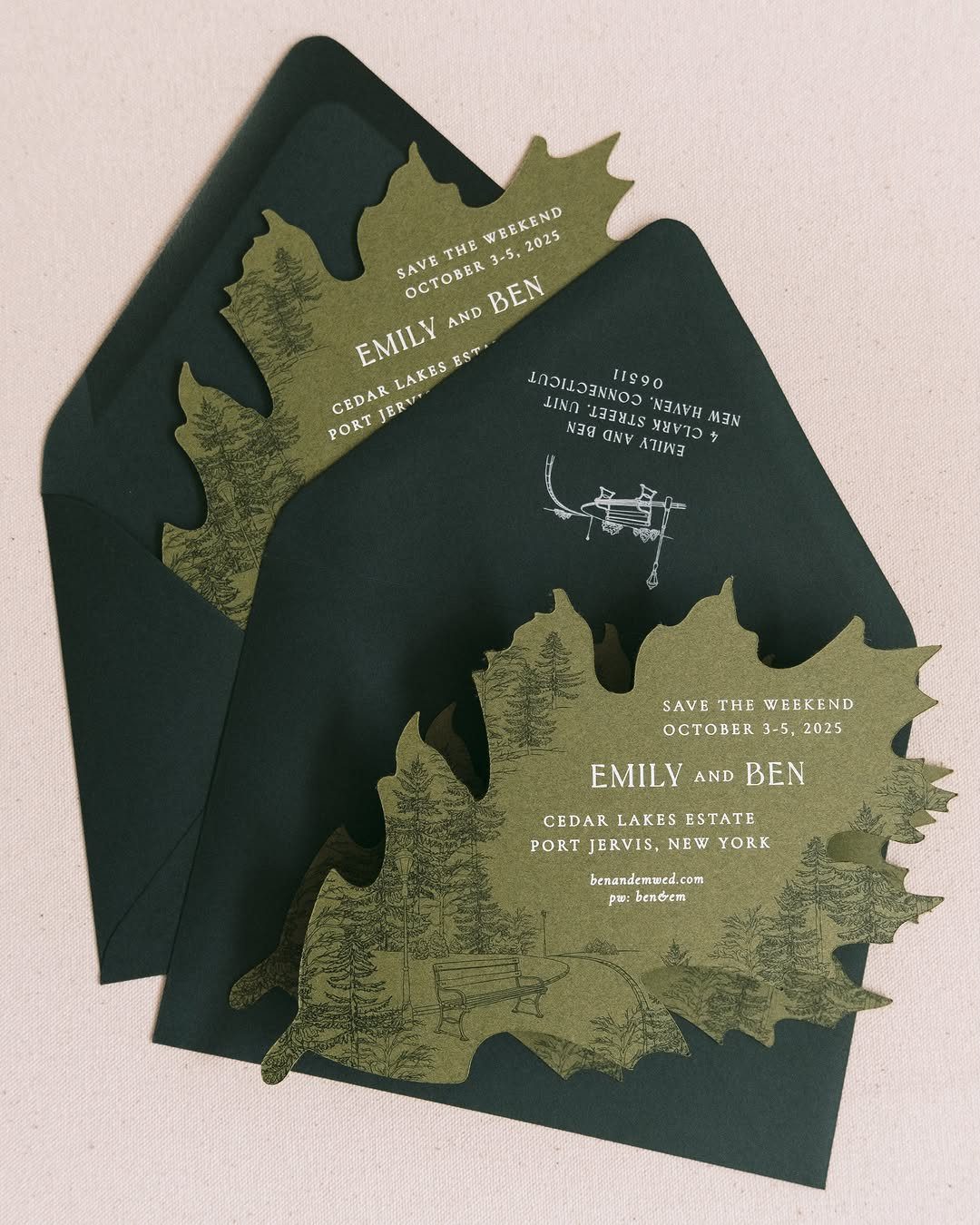
Save-the-weekend wording suits it well, since a multi-day celebration at a lake estate or similar venue deserves a forest-themed first impression.
Put the date and place in plain type so the cutouts do the decorating.
Cutouts take more production than a flat print, so get a quote from your printer first and see what the extra cost does to your paper budget.
5. Floral Wedding Invites with Dark Accents
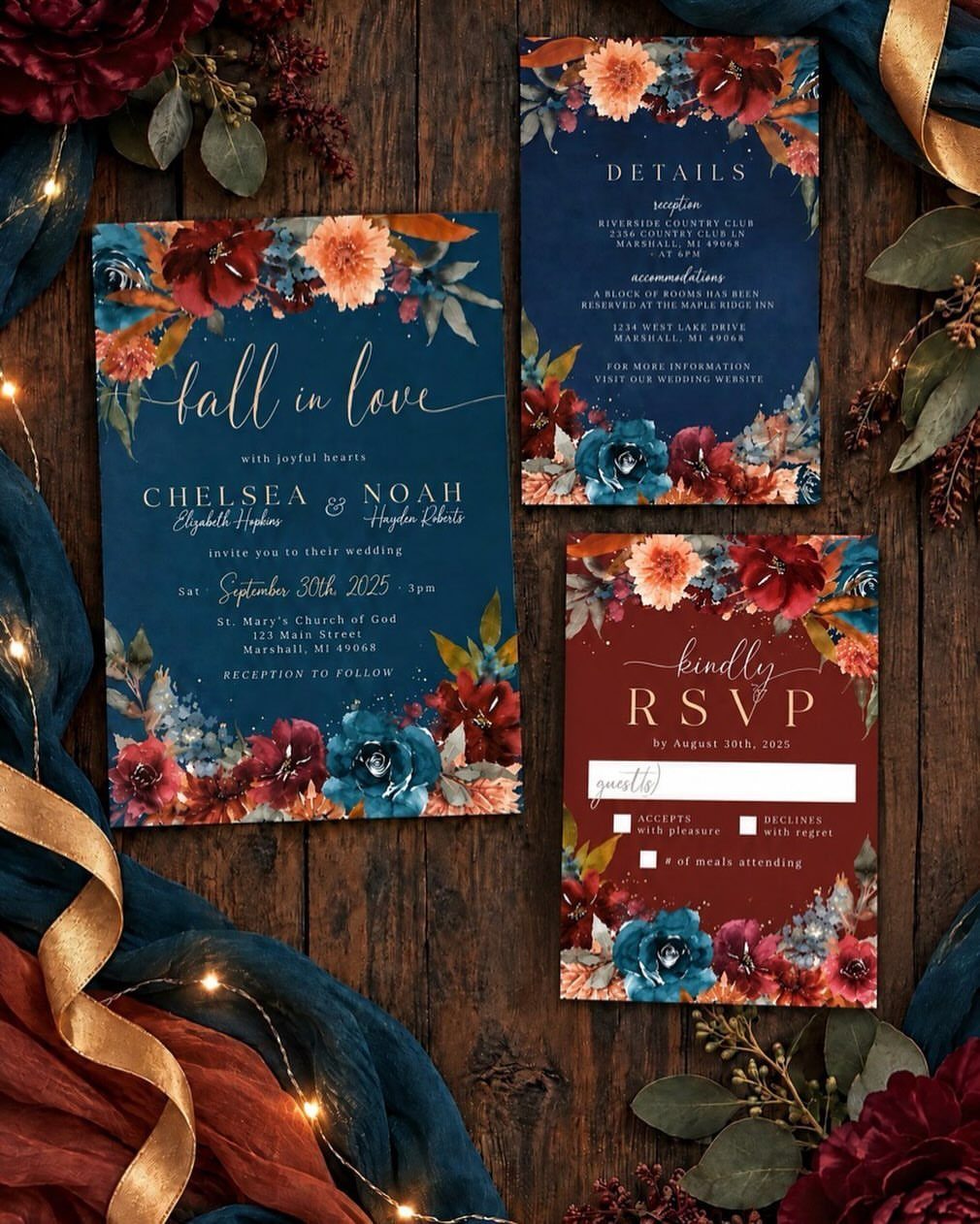
Navy and burgundy florals on a dark ground give fall a richer look than the usual orange and yellow.
A phrase like "fall in love" works because the pun carries the season by itself, so the card doesn’t need a single leaf to say autumn.
I would add a gold ribbon, as it ties the dark tones together and costs very little.
6. Burgundy and Forest Green Suite
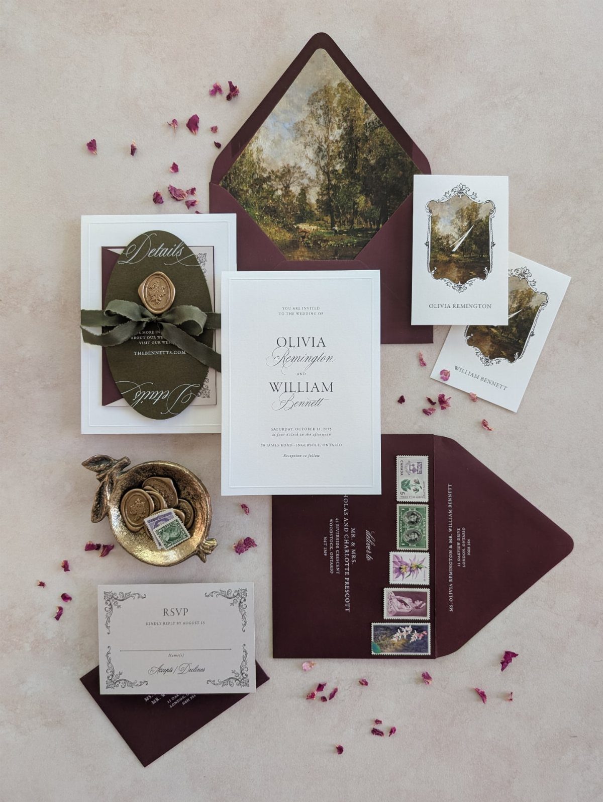
Forest green and burgundy are my favorite fall pairing because both are deep enough to feel rich without turning heavy. A green pocket fold holds the cards neatly, and burgundy envelopes with illustrated liners add a second layer of color.
Finish with a wax seal. It adds a tactile detail guests will notice first, and a pocket fold lets you slip in extra cards without crowding anything.
7. Autumn Envelope Palette with Leaf Seals
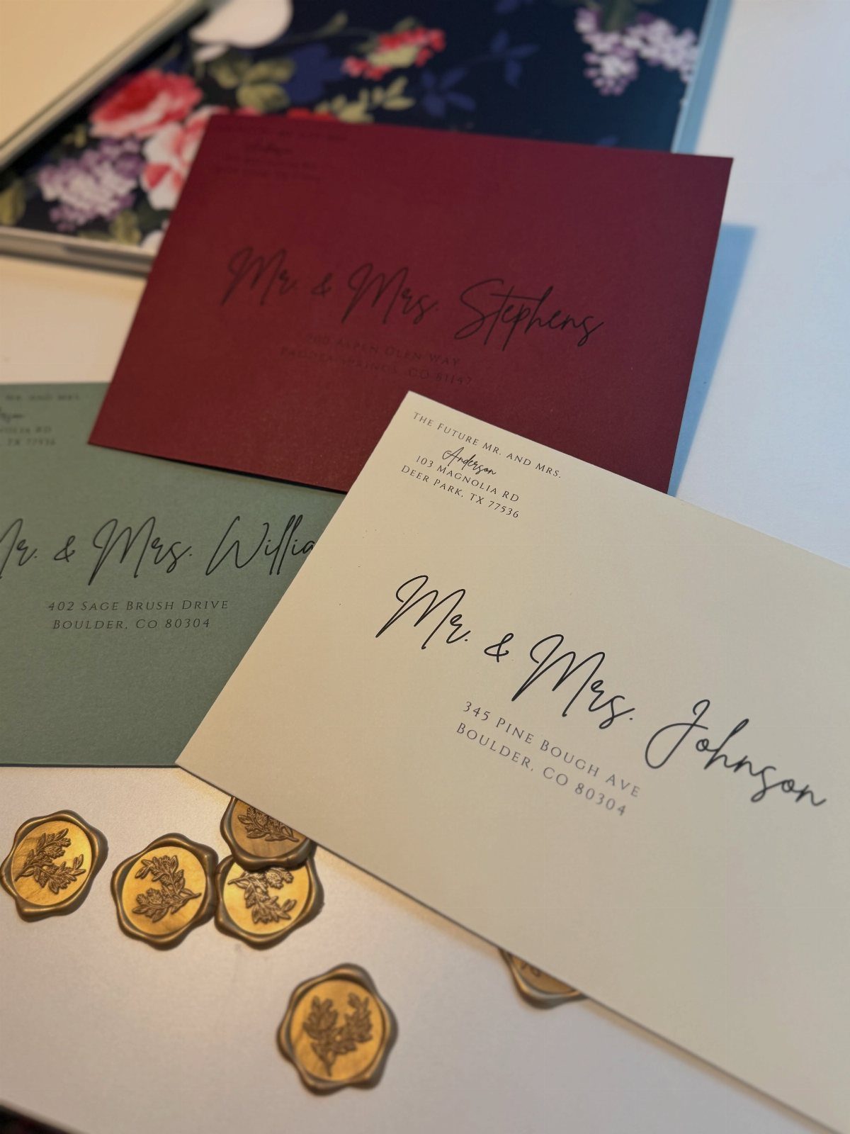
Burgundy, sage green and cream make a three-color envelope set that stays in fall without a single orange leaf. Hand calligraphy on each one gives the mailing a personal feel before anyone opens it.
Gold leaf-embossed wax seals tie the 3 shades together, so the colors read as a planned palette rather than a mix. Since the earlier entries lean on burgundy and green, I would use sage here for a softer look.
Ask your calligrapher for a quote early, as hand lettering is priced per envelope and a long guest list adds up fast. Cream envelopes are the cheapest place to save if you need to.
Finding Inspiration for Designs
Start with a palette before you look at a single layout.
Fall runs warm and golden, but bisque and slate are worth a look as neutrals, and ruby red or coral can sit in a fall scheme as crisply as pumpkin does.
If you shop on Minted, you can search invitations by color, which cuts a long scroll down fast.
Then go outside. Walk somewhere with trees and notice what you see, smell and hear.
If your date is a year off, that walk shows you the real colors of the season. If it is closer, a search for "fall aesthetic" does the same job.
Texture is the last piece. Letterpress has a warm, regal feel, and it fits a fall invitation because you can feel the impression in the paper.
Food can carry the season too, so let your palette guide the menu and favors. Hot cocoa, maple syrup, butternut squash soup and mini pumpkin pies all fit.
Customization Options
Before you fall for a design, check whether you can change its colors. Many invitations let you swap the palette and see an instant preview, so a layout you love is not ruled out by the wrong shade.
Some printers will also address the envelopes for you at no charge, so ask before you pay a calligrapher or spend an evening writing 100 of them by hand.
Your printer fills in each guest’s address, which saves you hours of handwriting and keeps your list tidy.
Ask whether the matching pieces come in the same design, such as place cards, table numbers and programs. Buying them as a set keeps the paper consistent without a second round of searching.
Popular Fall Wedding Themes
Fall weddings are popular for good reasons: the weather is beautiful, venues offer plenty of choice, and there are fewer bugs. That makes an outdoor ceremony an easy yes.
Popularity has a cost, though. Prime weekends fill early, so lock in your date and venue ahead of any paper purchase, and let the invitations follow the setting.
An outdoor ceremony also gives you wording to think about. Note the setting on the invitation so guests dress for it.





