Ideas here run from a die-cut card to a scroll in a glass box, and the price climbs with every extra piece, whether that is a tassel, a lace appliqué or a pearl and bow.
Postage and assembly money decides which one is yours, because heavy, fragile or raised pieces like the boxed gift set or the chocolate bar cost more to mail, and I would send a test envelope to myself first.
Set the invitation budget before choosing a design, then put the money on one feature, such as laser-cut detail or a gold deckled edge, and keep the wording plain.
1. Custom Illustration Invitations
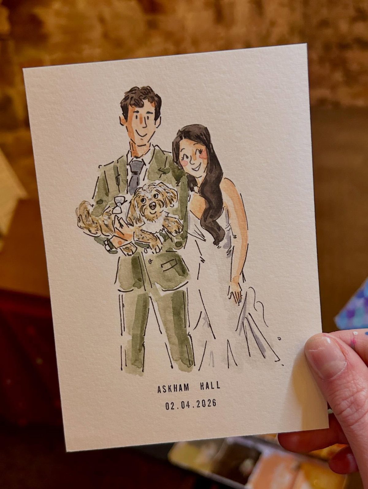
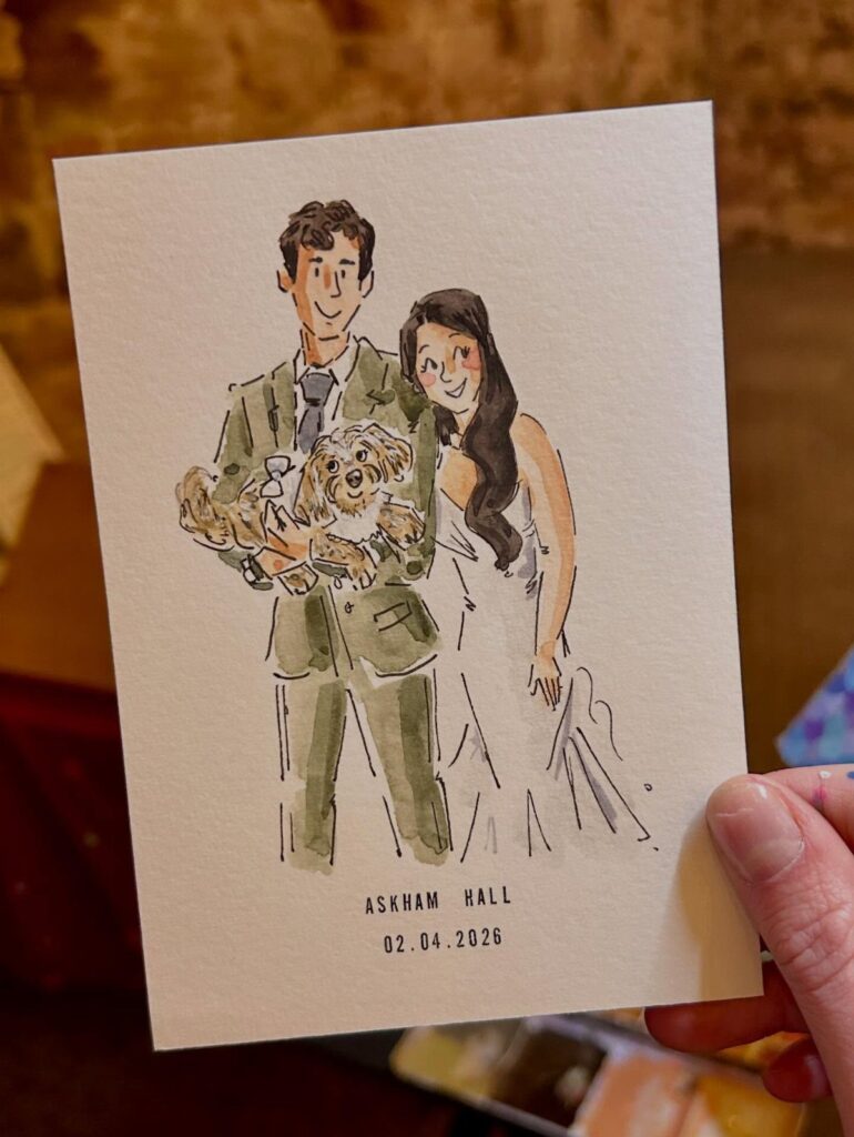
A watercolor portrait of the two of you, dog included if you have one, does what no template can: guests recognize your faces before they read a word.
The artwork carries the card, so the type can stay quiet, as the simple date line does here.
Hire an illustrator early, since original art takes longer than ordering a printed suite. Ask for a digital file so the same image can return on the envelope liner, the program or the thank you card.
2. Interactive Elements
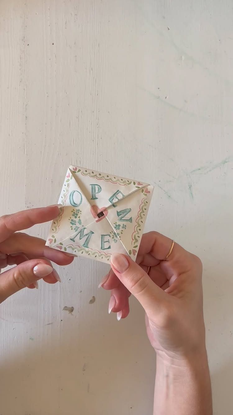
A short printed instruction on the front, like "OPEN ME," turns a plain folded square into a small task, and guests tend to enjoy that.
People like being told what to do with a piece of paper, and they remember the fold long after a flat card is forgotten.
Put the date and venue inside, where the reveal happens, and keep the floral border light so the text stays readable.
3. Laser-cut Invitations
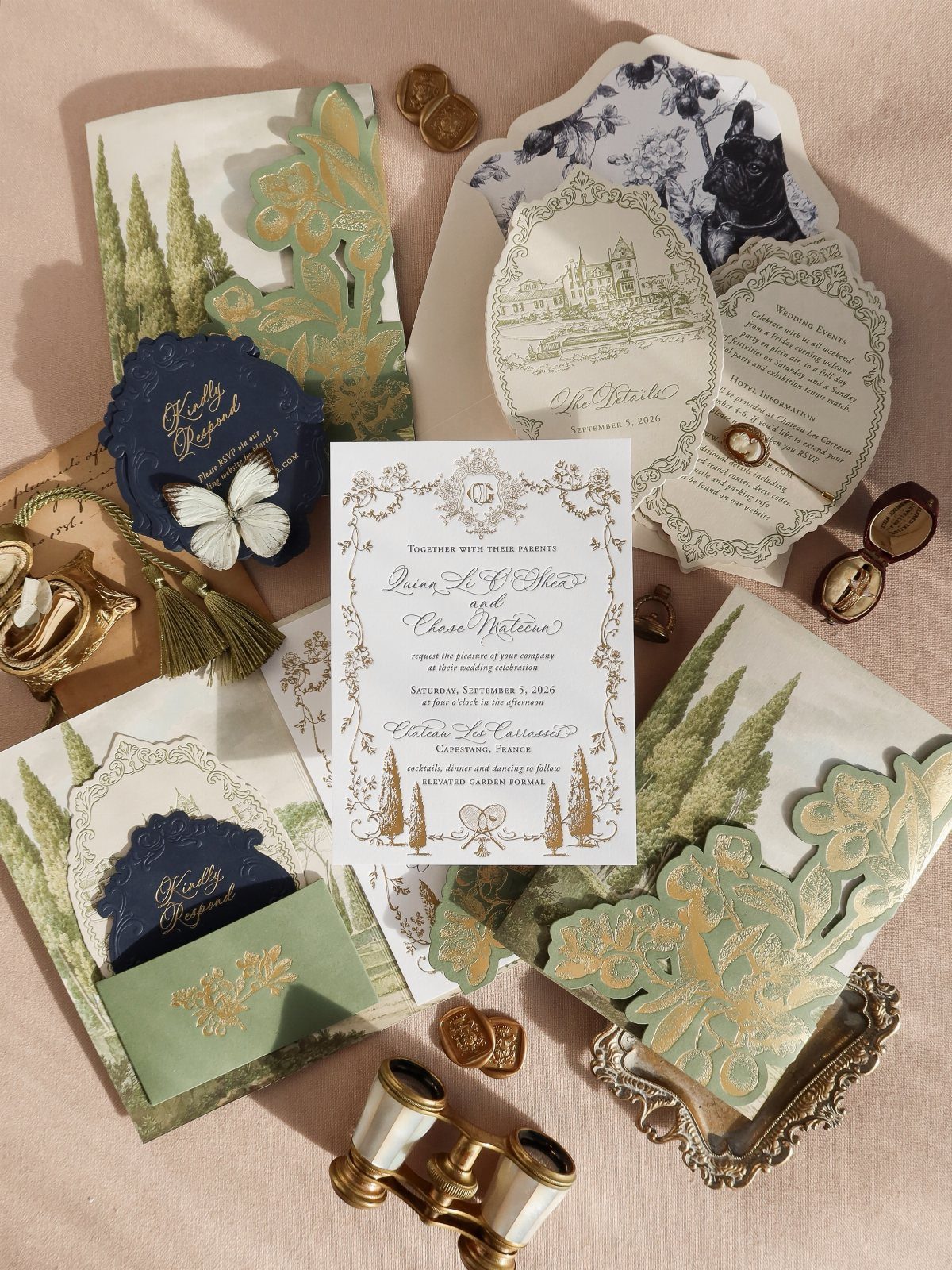
Gold laser-cut foliage over navy is the version I would pick: the cut lets the color underneath show through, so the card looks layered without extra pieces.
Laser cutting costs more than flat printing, and I would spend that money on a single card rather than the whole suite.
Let the cutout be the star and keep the printed wording plain. Order a sample first to check that the thin parts of the design hold their shape.
4. Handkerchief Invitations
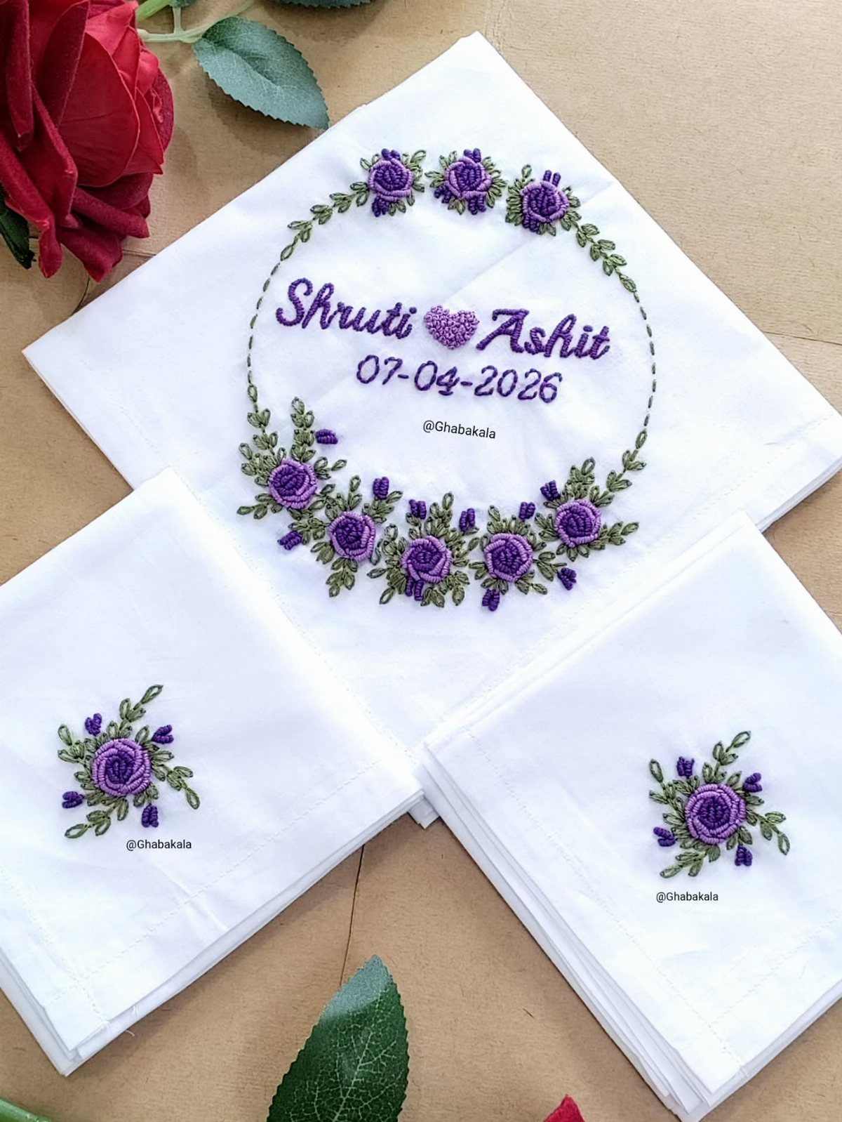
Fabric changes what an invitation is: guests can keep a handkerchief, tuck it into a pocket on the day, or frame it.
Cloth cannot carry as much text as a card, so move the logistics to your wedding website and print only the couple’s names and the day itself.
5. Celestial Wedding Invitations
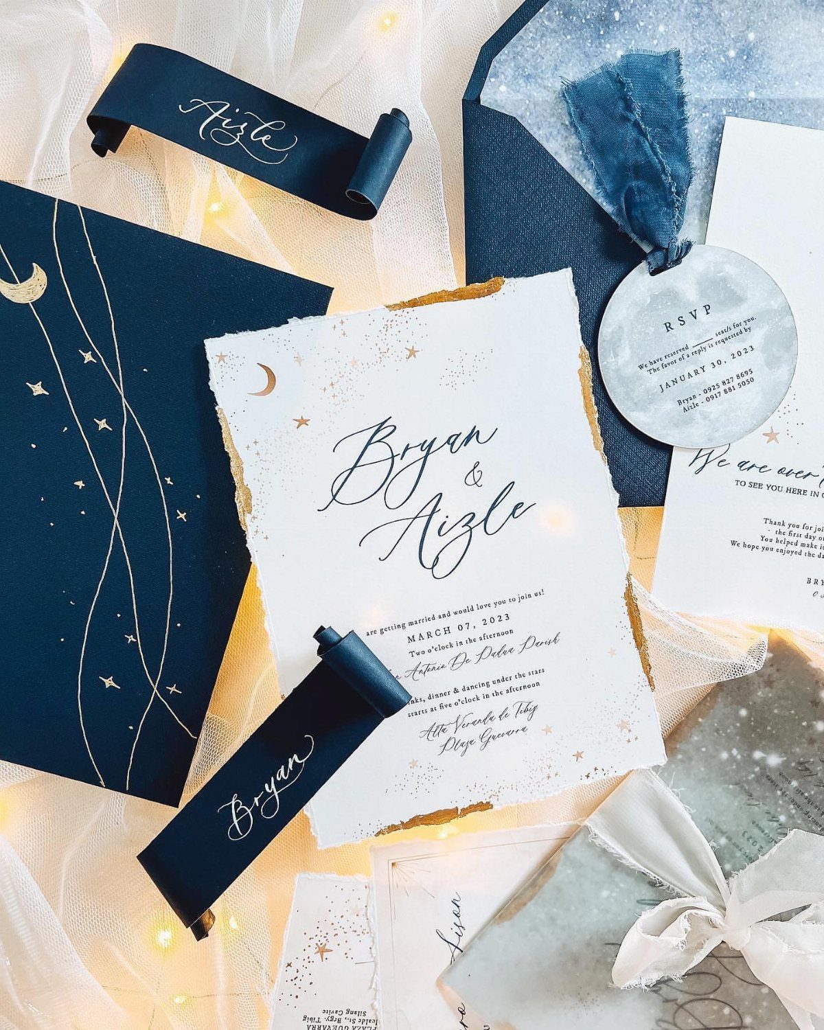
Muted tones keep it calm, and the rough paper edge softens all that metallic shine.
Match the suite across pieces: invitation, RSVP card and envelope should share the same palette, so they read as one set. Tie the stack with a ribbon, which costs little and photographs well in a flat lay.
6. Chocolate Bar Wedding Invitation
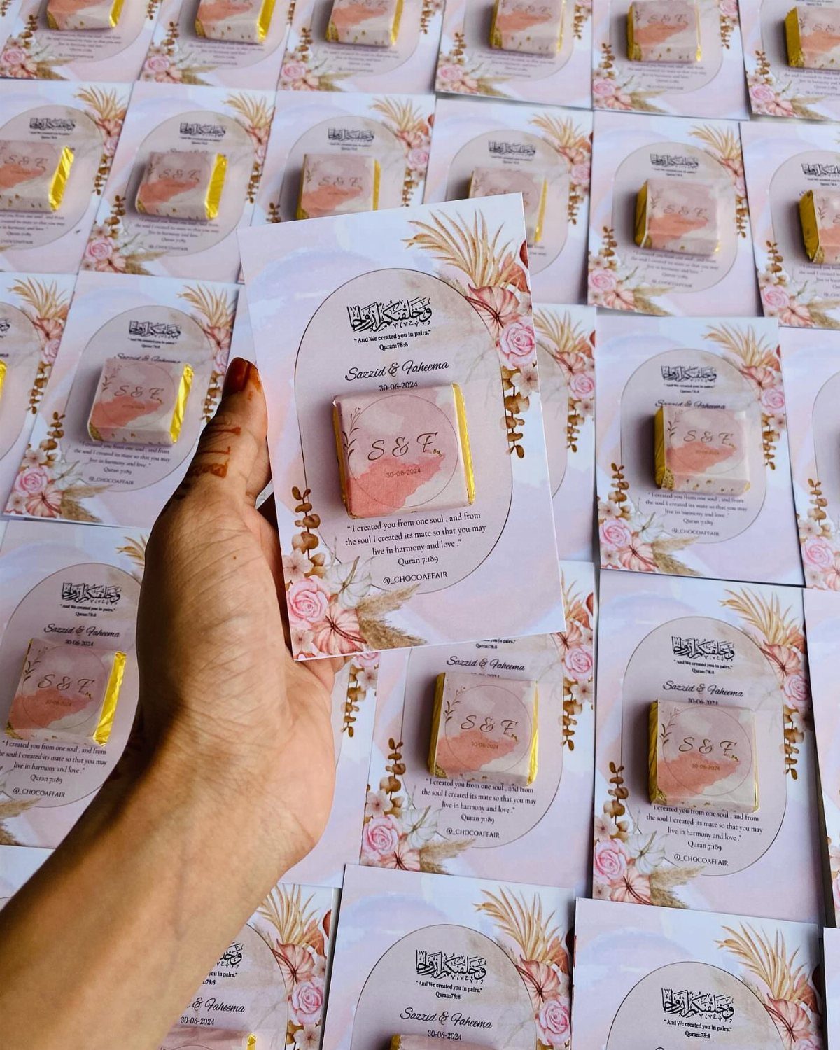
A small chocolate bar fixed to the card, printed with your initials and names, is a rare invitation people eat. Guests will open the envelope for the sweet and read the date while they unwrap.
Make the bar the label’s whole job: initials large, names beneath, and the card itself gets the venue and time. Order extras for your own keepsake pile, and ask the maker how the bar should be packed for mailing.
7. Gold Deckled Edge Invitations
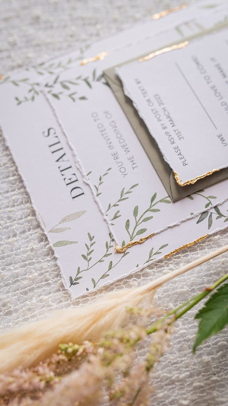
Hand-torn edges rewrite the rule that invitations should be crisp: each card tears a little differently, so no two match exactly.
Tiny Pine Press makes stationery this way, and the gold along the rough edge catches light against the green leaves.
Keep the printed wording simple, since the edge and the botanical print already carry the design. Put the RSVP date where it can’t be missed, as it is under "Details" here.
Expect small variations from card to card; that irregularity is the whole appeal.
8. Die-cut Invitations
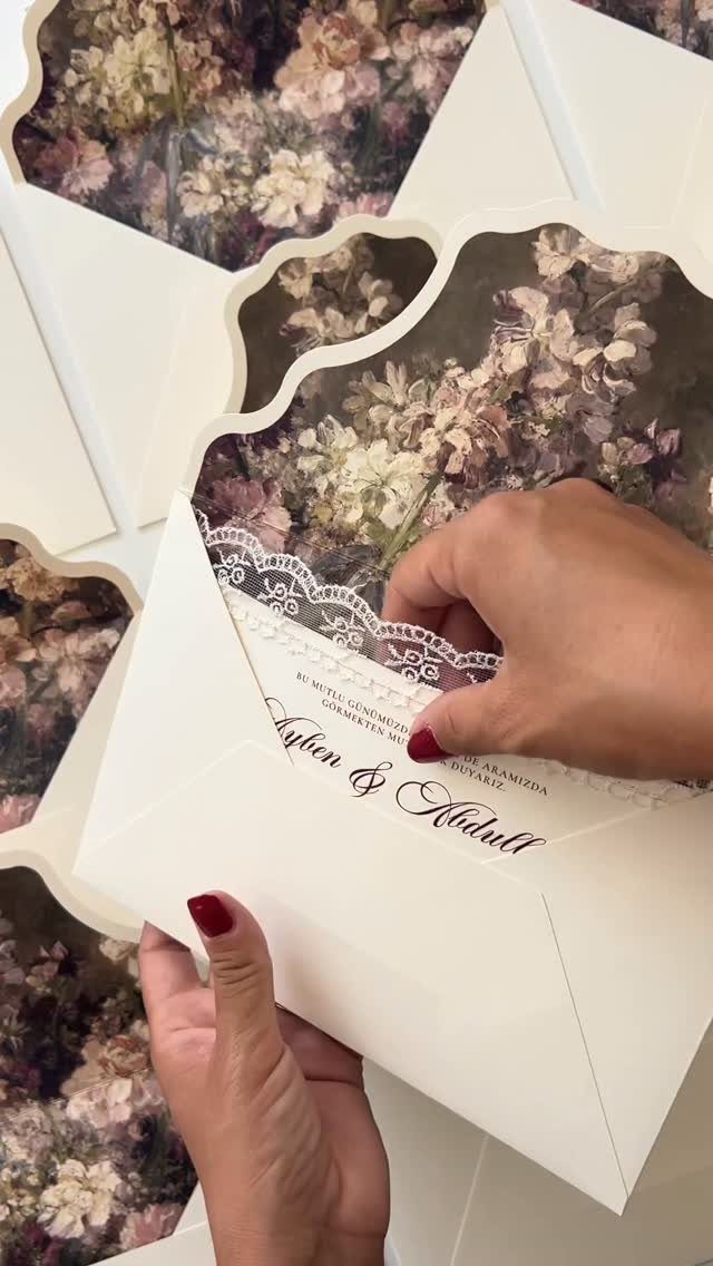
Pick one motif from your wedding, such as a flower, and cut around it.
Cutting costs more than a flat rectangle, so ask the printer for a quote before you fall for a complex outline. Keep the names in cursive on a solid area, away from the cut lines, so they stay readable.
9. Unique Materials
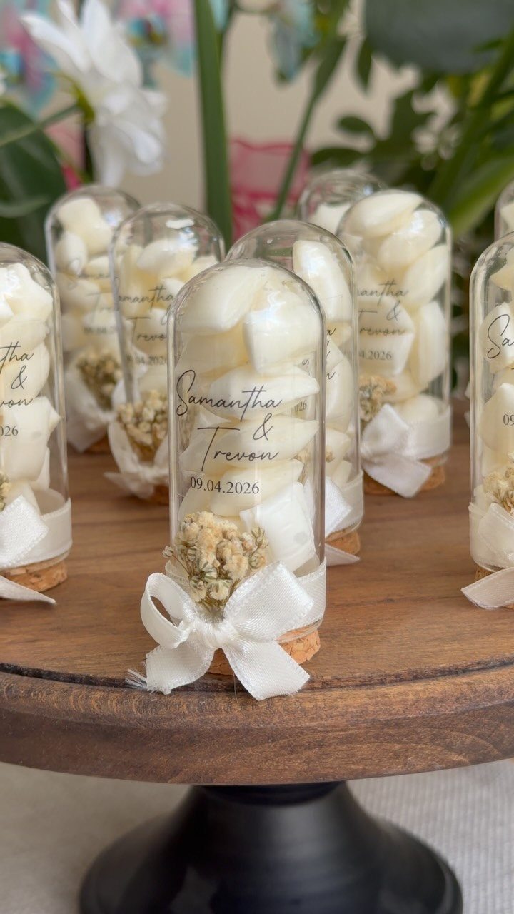
A glass vial of candies and dried flowers, tied with a white bow and tagged with names and the date, replaces paper altogether. Guests get something to hold and keep on a shelf.
A tag has little room, so limit it to the couple’s names and the date, as here, and send the venue and time through your wedding website.
Test one finished vial in the mail before ordering all of them, because glass needs careful packing.
10. Pop-up Invitations
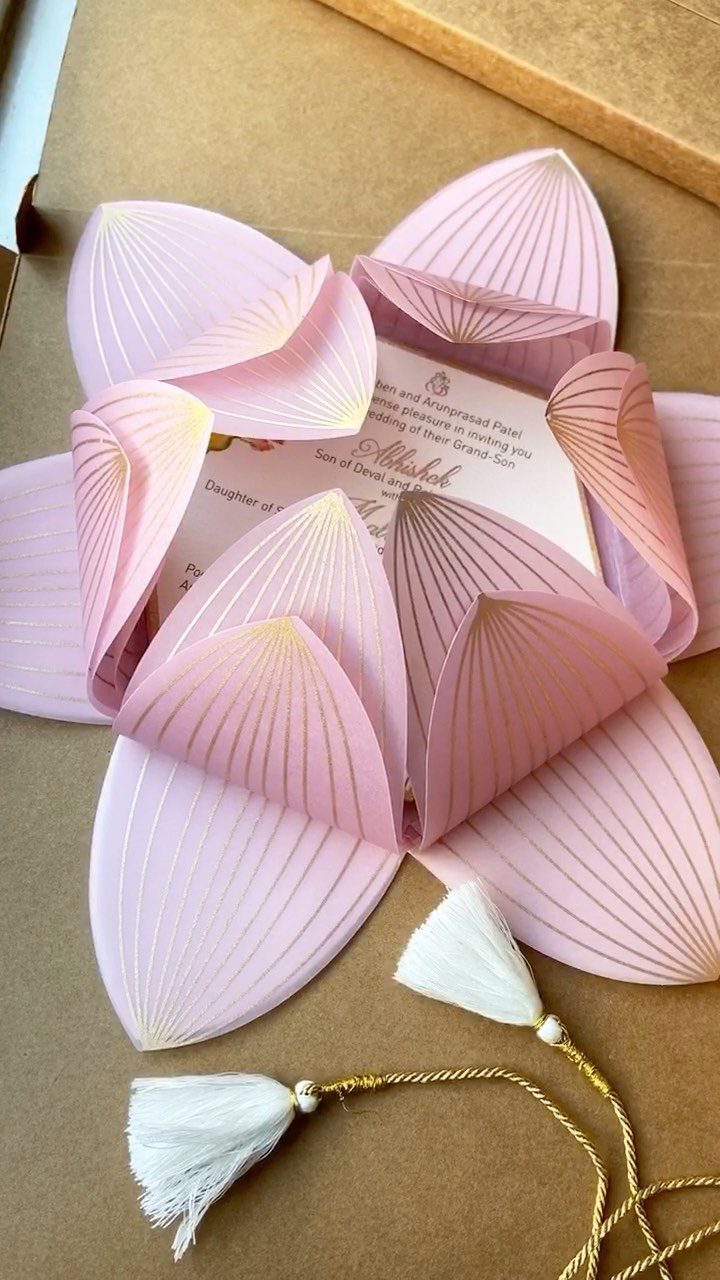
Open the box and a pink paper lotus rises, folded flat until the lid lifts. That moment of surprise is the reason to choose a pop-up over a standard card.
Pop-ups cost more and take more time to assemble than flat cards, so I would order a sample to check that it unfolds cleanly.
11. Adventure-themed Invitations
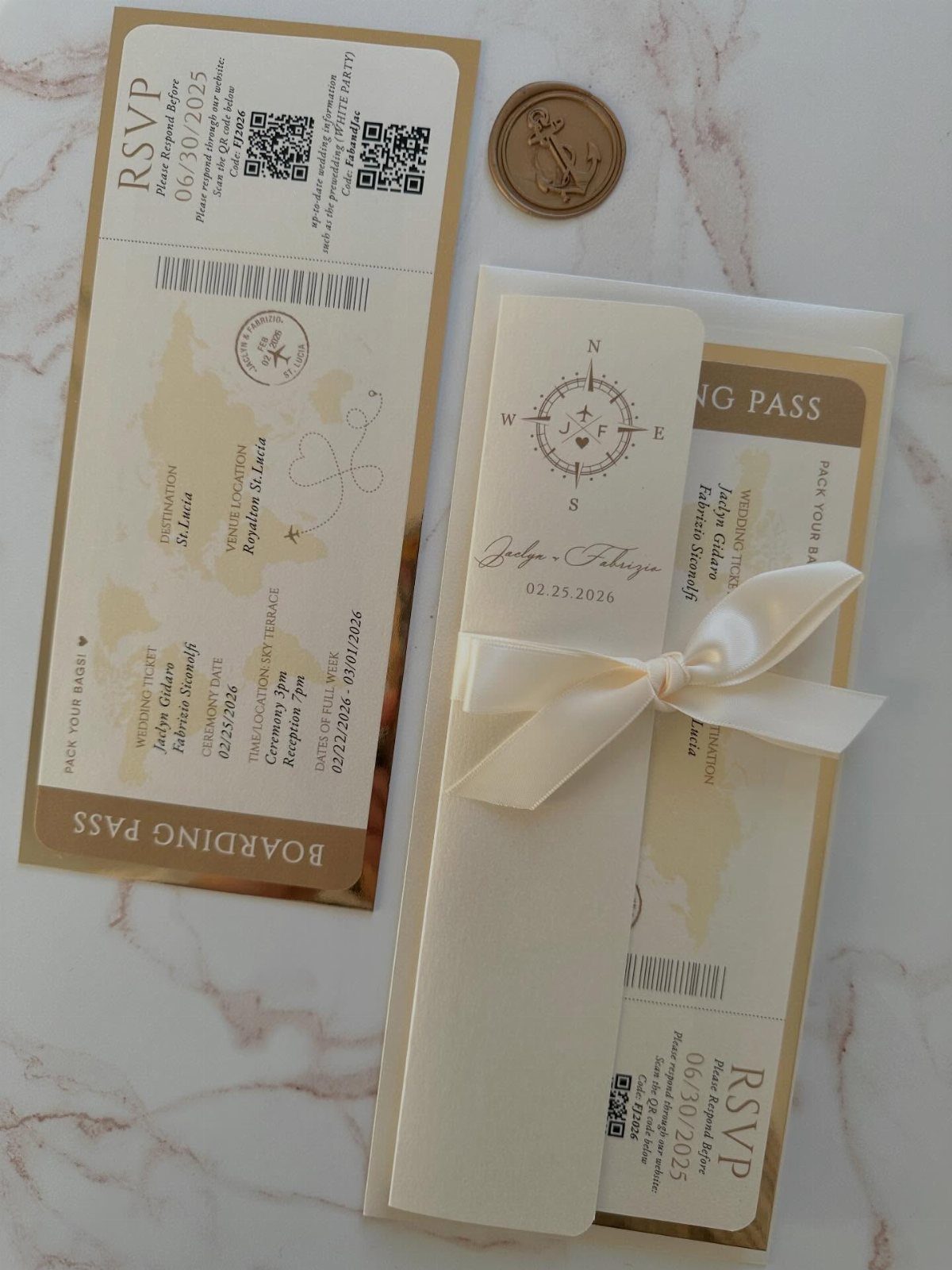
Shaped like a boarding pass, this suite turns the invitation into a ticket: names, dates, a compass logo and a QR code in the layout of real travel paperwork.
It suits couples whose wedding involves a trip, or who simply love to travel.
Use the QR code to link to your wedding website, and test it on a few phones before printing. Tie the set with a white ribbon, as here, so the pieces stay together in the mail.
12. Scroll in Glass Box Invitation
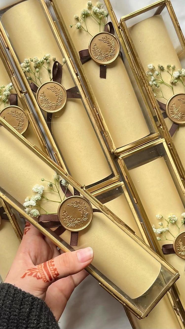
A rolled parchment scroll with a wax seal, set inside a gold-framed glass box with small dried flowers, is the most formal invitation I can think of. The box turns paper into a keepsake guests can display.
It is also a heavy, fragile item, so plan on higher costs for the boxes and for postage.
I would order a single sample and mail it to yourself first. Keep the scroll text short enough to read when unrolled.
13. Fabric Appliqué Illustration Invites
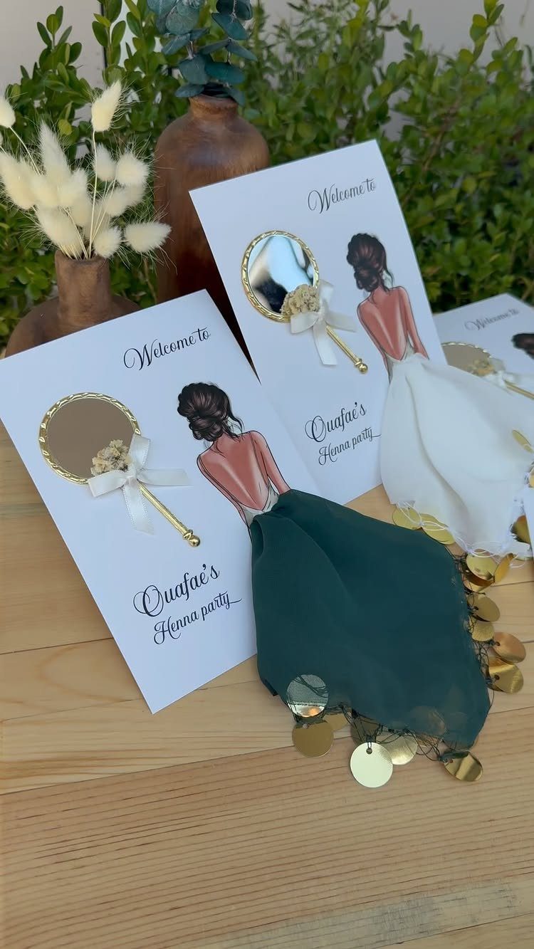
Real fabric dresses on illustrated women, finished with gold sequins, give a flat card a texture guests will want to touch. The figures do the decorating, so the wording underneath can stay short and plain.
Ask the printer how the appliqué is attached and whether the cards need extra padding in the mail. Order a sample first, since sequins and cloth add handling time and cost over a printed card.
14. Boxed Gift Set Invitations
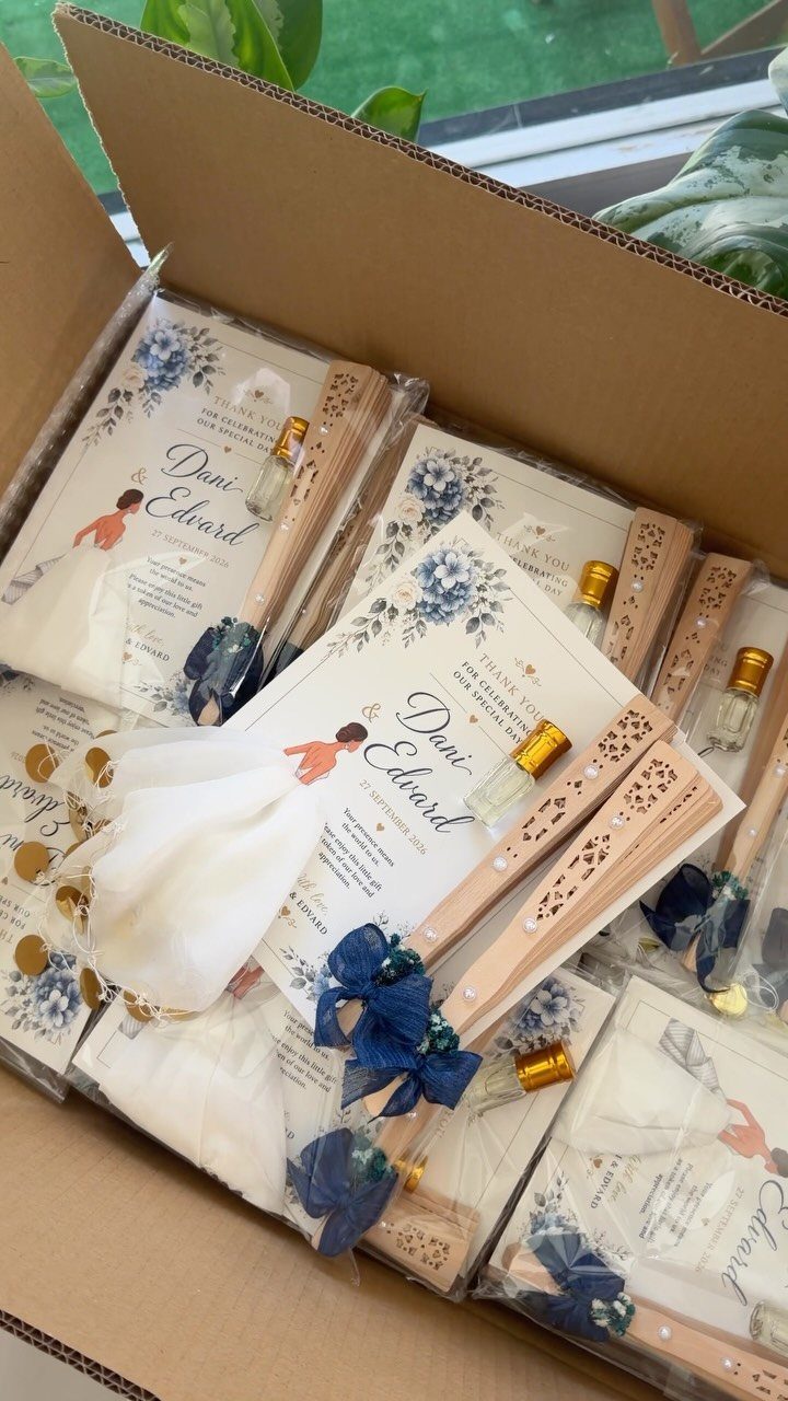
A card, a wooden fan, a small perfume bottle and a white fabric pouch, all packed in one box, make the invitation a gift before anyone reads a name.
I like it for a wedding where guests will use the fan, which is the one item here that earns its place.
Boxes cost more to fill and ship than flat mail, so price every piece before you commit. Perfume adds a fragile item, so I would mail a test box to yourself first.
15. Fantasy Board Game Invites
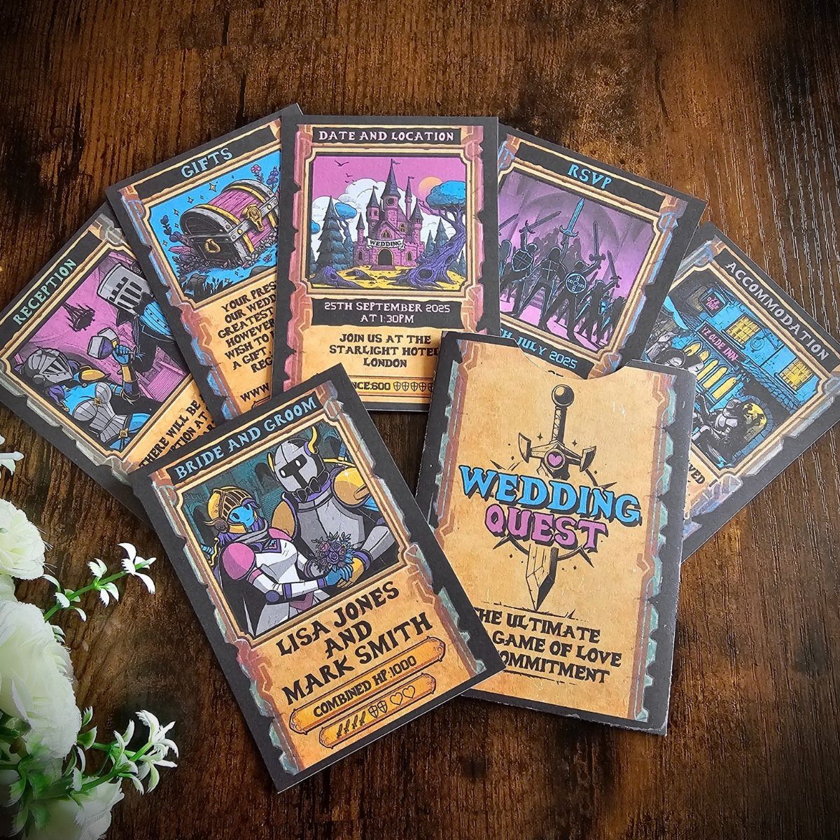
Turn your invitation into a quest: a board game map with castles and characters, and the details sorted under headings like "Date and Location," "RSVP," "Gifts" and "Accommodation."
Guests find each answer in its own spot, so the information is easy to scan.
Give each card one job, and keep the wording short so the illustrations stay readable. This idea suits couples who play games together, and it needs a custom illustrator, so allow extra time and budget.
16. Tassel-tied Cardstock Invitations
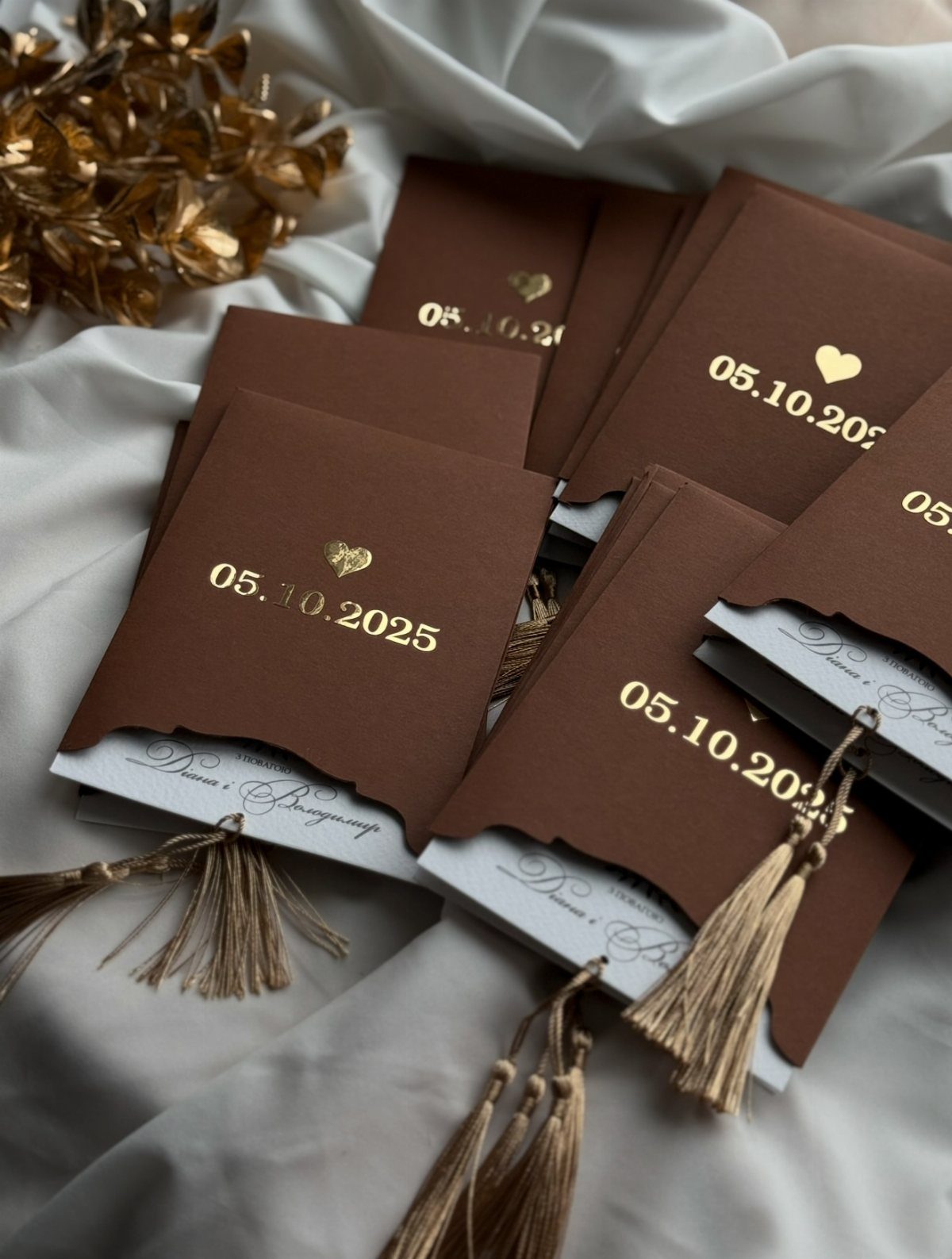
Brown cardstock with gold foil is a warm pairing, and a gold tassel is a cheap way to make a plain card feel finished.
Foil works best on small things like the date and a heart, as here, rather than long paragraphs.
Put the date in foil and print the rest in a simple type. Check that the tassel can’t snag the envelope flap, and ask your printer for a foil proof before you approve the whole run.
17. Embossed Floral Envelope Design
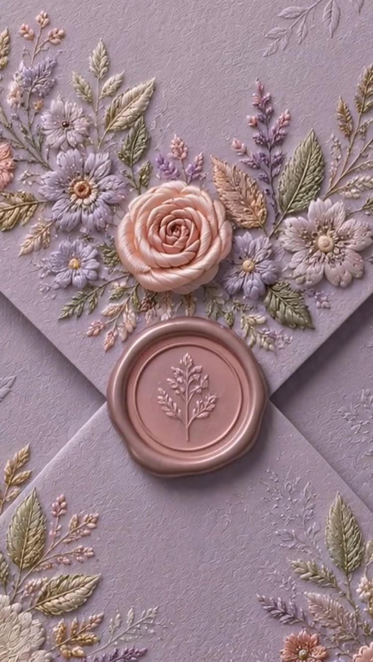
Embossed flowers on the envelope mean guests meet the design before they open anything.
Raised petals in pink, purple and green on a purple textured stock, closed with a pink wax seal, make the envelope the best part of the suite.
I would put the money here and keep the card inside simple. Raised work can get crushed in the mail, so ask your post office whether hand canceling is available, and mail one test envelope first.
18. Pearl and Bow Embellished Card
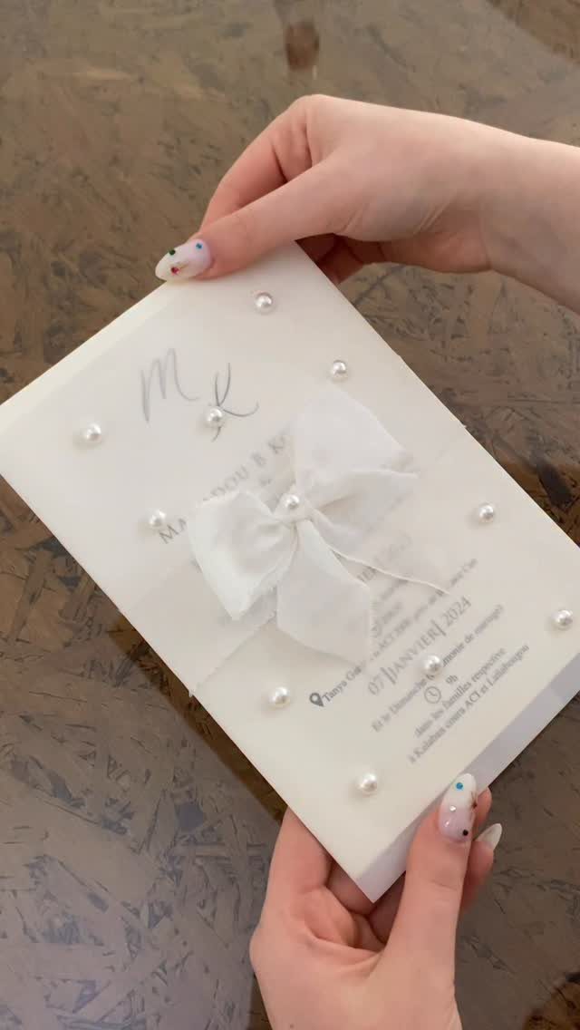
Small pearls and a neat fabric bow on a white script card make a classic invitation feel hand-finished, without needing a custom illustration. A white card lets the pearls read clearly, so I would skip any busy background print.
Keep the script for the names and use a plainer face for the date, as the date line here does.
Embellishments add weight and assembly time, so ask the printer how pearls are fixed, and mail a sample to check they stay put.
19. Lace Floral Appliqué Card
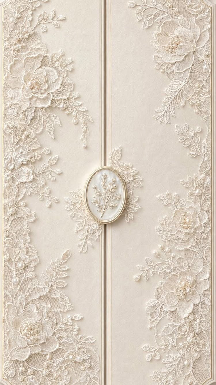
White lace appliqués on cream stock give a folding card a soft, bridal look, and an oval wax seal with a botanical design closes the fold the way a letter was sealed a century ago.
Tone on tone keeps the effect quiet, so the card suits a traditional wedding.
Set the inside text in a plain, dark type, because the lace and seal already supply the decoration.
Lace and wax both add handling time and cost over a flat printed card. Ask the printer how the lace is attached, then mail a sample to yourself to see whether the seal holds up in transit.
Personalization Options
Real wood is the personalization option the list leaves out.
A wood invitation suite can run from the invite to the menu and even the envelope, which lets one material tie your whole paper set together, and Cards of Wood is one shop that makes all three.
Because wood is so different from the paper most guests expect, it sets the invitation apart without any added decoration. Their bookmarks also work as wedding favors, which gives you a second use for the same maker.
If you hire a graphic designer for custom art, ask for extras that tie the card to your wedding: greenery, a border, or other elements that match your theme and your story as a couple.
Decide on those up front, because they are easier to build into the first design than to add later.
Choosing the Right Invitation Style
Start with the theme and your own style, then decide what the card should tell guests before they open it. A formal evening and a backyard party send different signals, and the invitation is the first one.
Space is the real limit, since only so much fits in an envelope. A plain card can feel lackluster, so choose one element to make less traditional rather than changing everything at once.
Pick the style you would be glad to see on your own mantel. If it fits your personality, it will likely fit your guests’ expectations too.
Budget Considerations
Print techniques are the budget route to a richer card. If wood or acrylic is out of range, a simpler paper with letterpress, foil stamping or embossing adds texture and depth, and the card feels more luxurious.
You can combine several techniques for a more unusual result, but each one adds cost. I would pick one or two and put them on the part of the card guests look at first.
Get quotes for each technique before you commit, and set the invitation budget before you fall for a design. Stay within that number, because postage and extras come on top.





