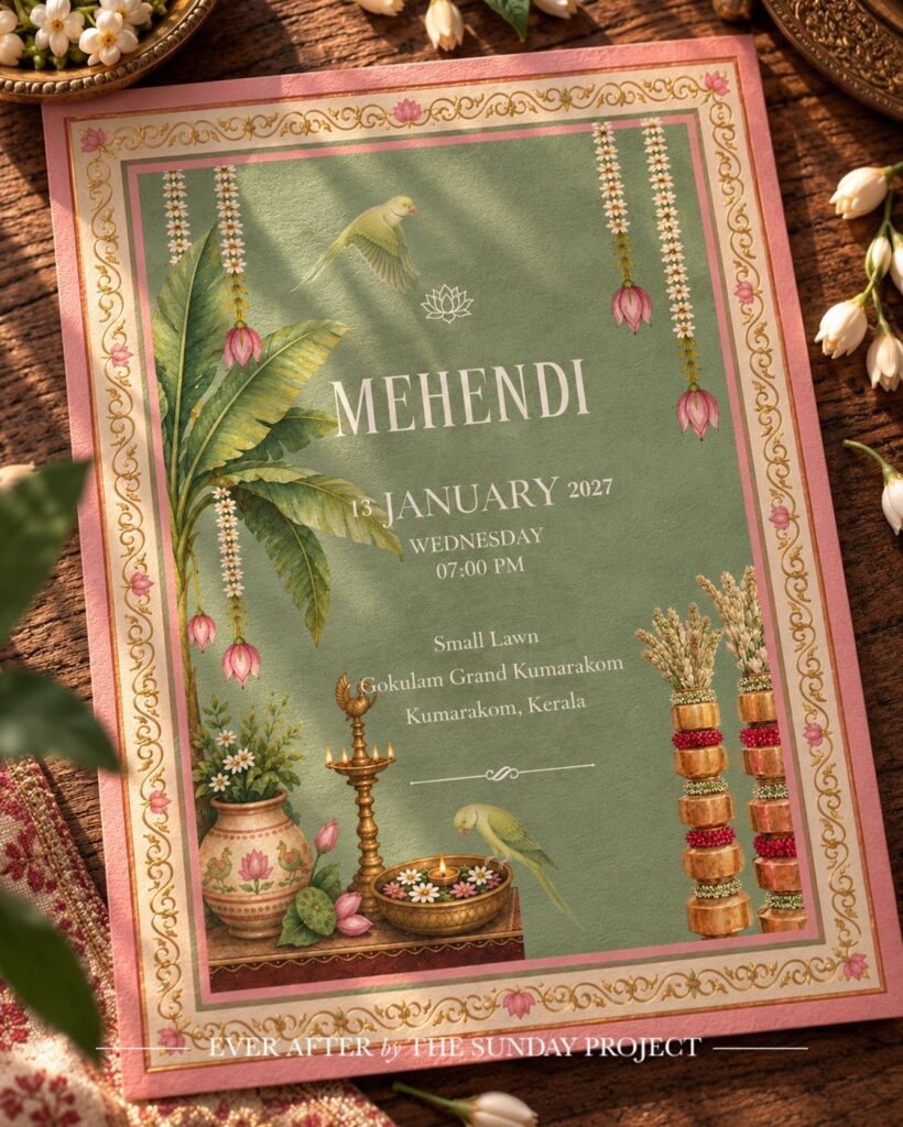
These ideas run from a classic card to velvet or fabric, and the cost climbs with every handmade step: foil stamping, hand calligraphy, die-cut shapes, wax seals, hanging tassels.
Budget per household drives this choice, because a single invitation covers a whole couple or family, so you order fewer pieces than your guest count suggests.
1. Classic Invitations
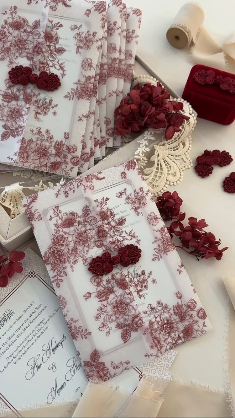
Limit the color to one accent and repeat it, in a floral print and a wax seal for example, because that restraint is what makes a classic suite look expensive. White stock with one color keeps the look timeless.
Pick the accent first, then match the seal to it.
A one-color palette also keeps the whole suite simple to order and easy to extend to menus and place cards later.
2. Illustrated Invitations
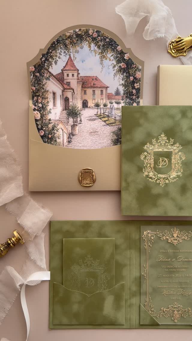
If your venue has a face worth painting, put it on the card.
Hire an illustrator and ask for a quote first, since custom artwork costs more than a template. Match the gold on the seal to the crest so the set feels like one piece.
Write the invitation in a language your guests can read.
3. Calligraphy Invitations
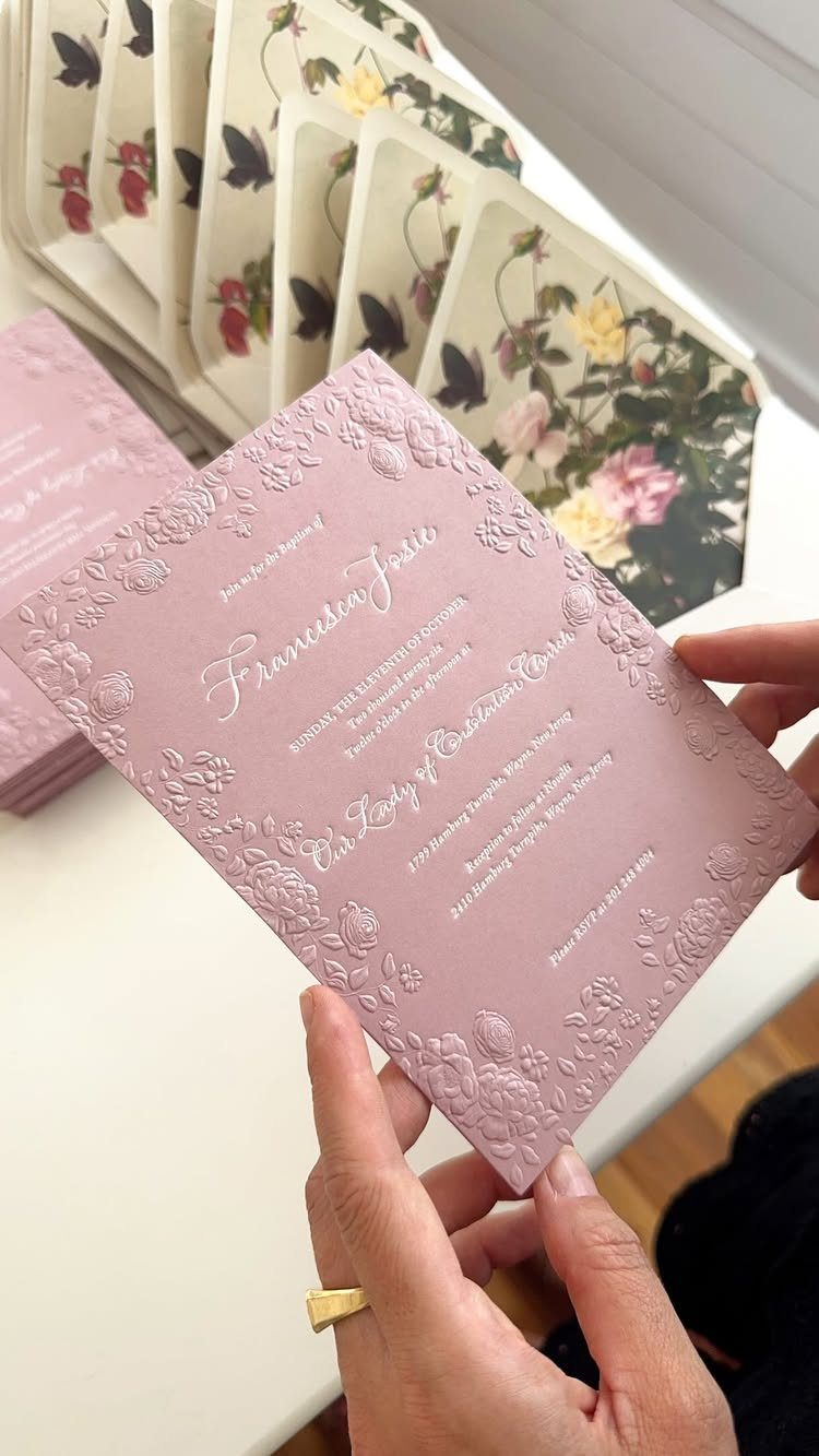
Handwriting gives an invitation a personal feel that type rarely matches. White lettering on mauve, pressed into an embossed card, reads soft but formal.
I would put calligraphy on the names and leave the details in plain type, because a long block of script is hard to read. Check that the lettering fits your wording before you print.
Hand-lettering costs more than printing, so ask for a quote early and expect to budget for it.
4. Vellum Jackets
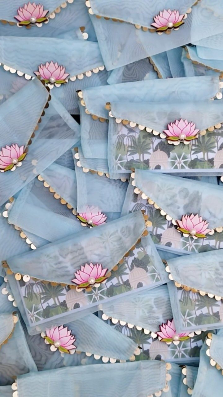
Vellum is translucent and soft, so a light blue jacket with gold scalloped edges, or a small pink lotus accent, gives the invitation a delicate layer without adding much to the print bill.
A jacket lets the card underneath show through like a veil.
I like pairing a colored jacket with a plain white card, so the wording stays easy to read. Gold edging keeps the pastel from looking childish.
Order one sample before you buy the full set.
5. Foil-Stamped Details
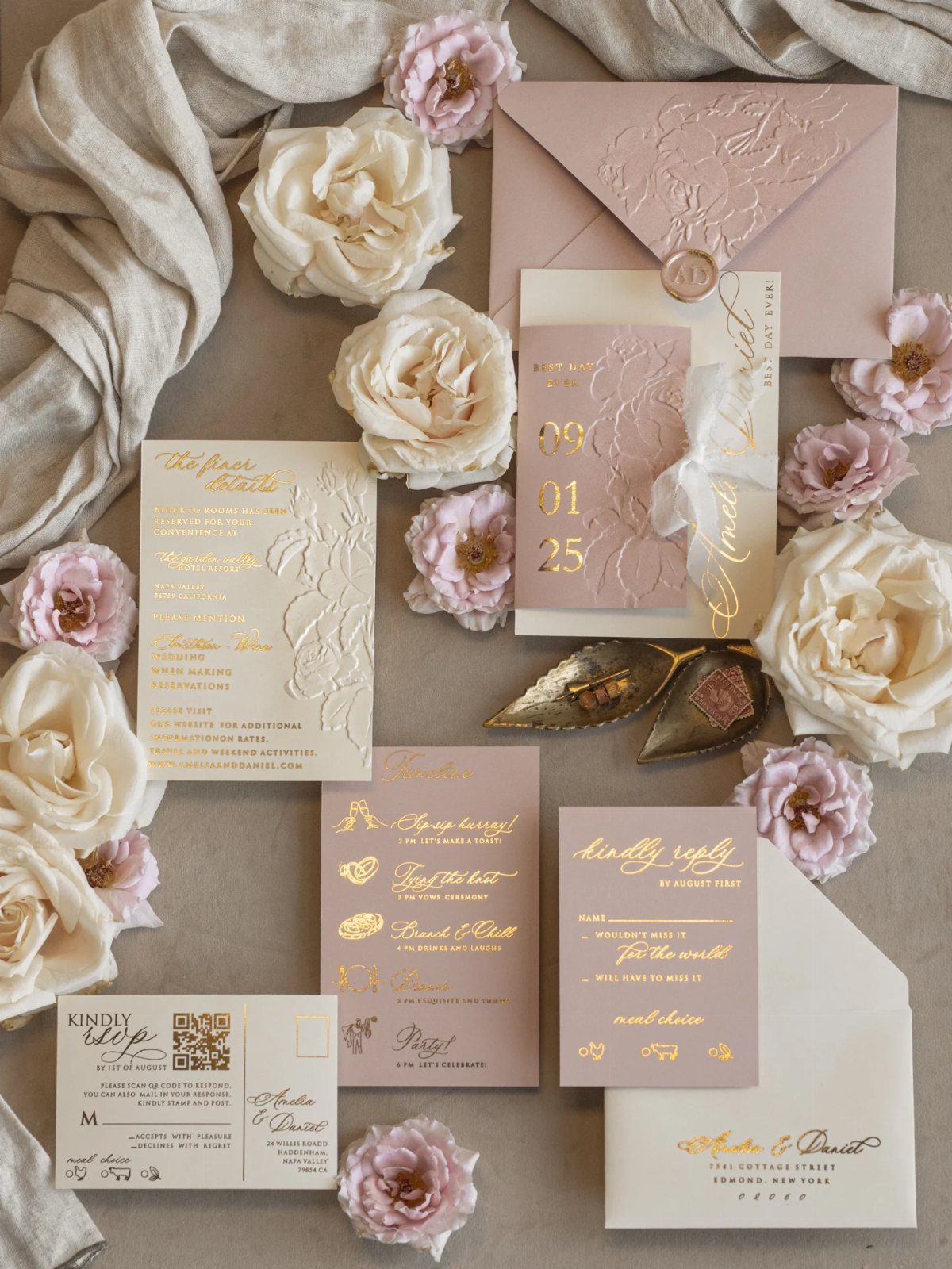
Gold foil on blush and white paper catches the light, and it works best on a few words rather than a whole page. "Kindly Reply" in foil is a small touch that gets noticed.
Save foil for the names and the reply line, which keeps the cost under control on a tight budget. Embossing adds texture without extra color.
Foil on every card in the suite adds up quickly, so pick the two or three pieces that matter most.
6. Rustic Invitations
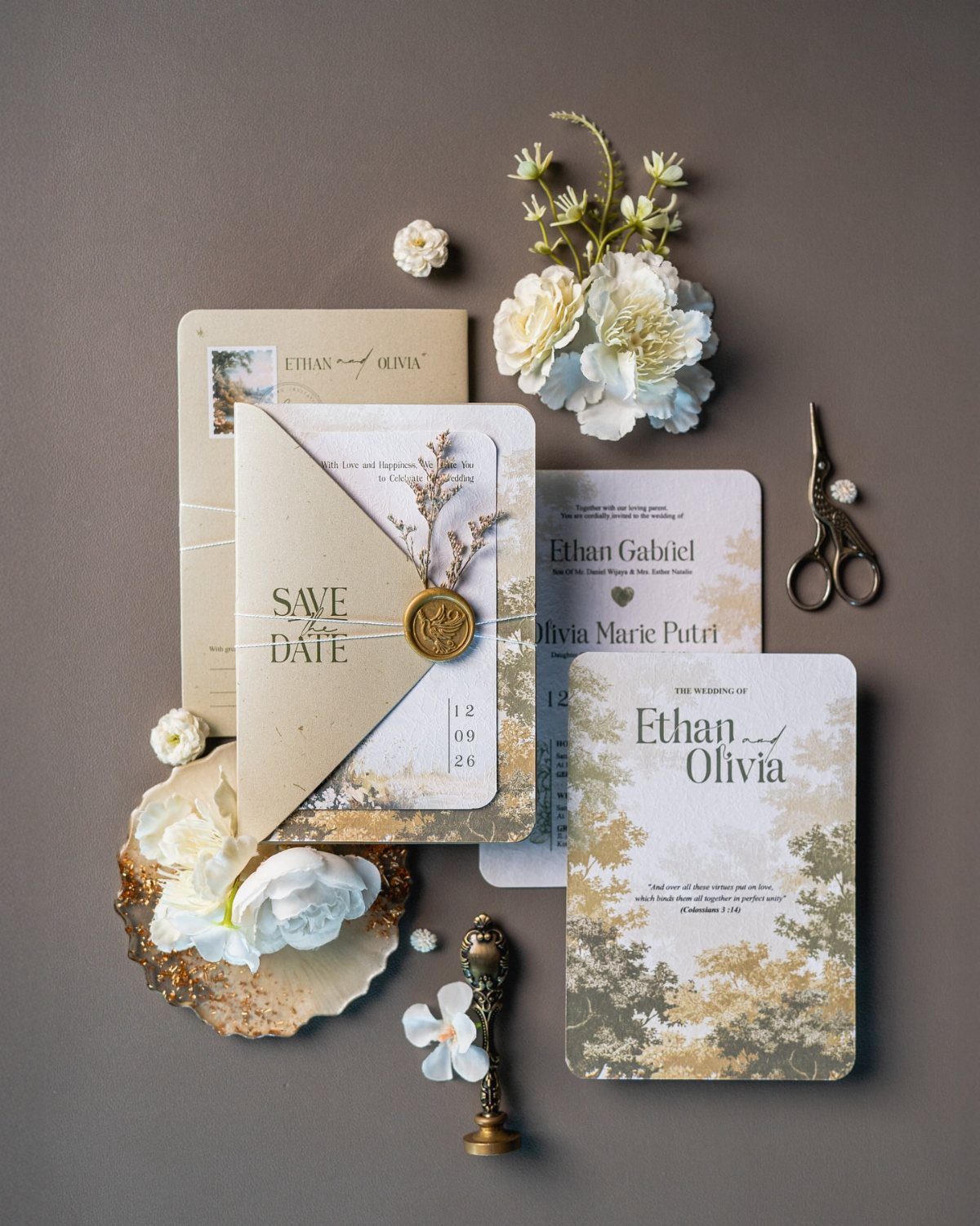
The brown base makes white ink and white blooms stand out.
For me, kraft wins on cost and mood, since the paper itself is the decoration and little else is needed. A save the date in the same stock ties the set together.
Print white or dark ink on kraft, and test it first, because light colors can fade into the brown.
7. Die-Cut Invitations
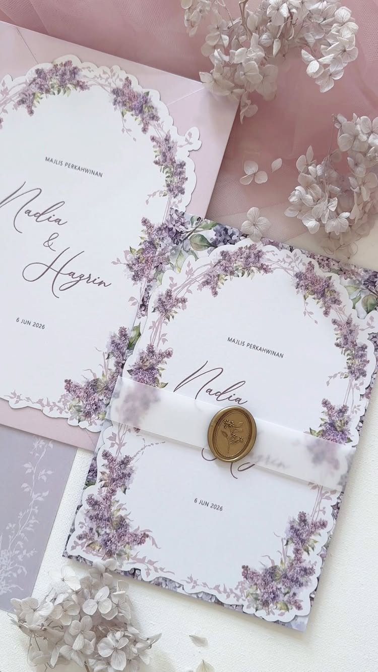
A die-cut edge turns the card’s outline into the decoration, and scallops are the gentlest version.
Get a printer’s quote for the cutting first, because a custom shape costs more than a straight trim. To save money, cut only the main card and leave the inserts square.
8. Fabric Invitations
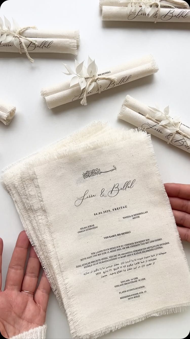
Printing on fabric gives the invitation a softness paper cannot copy, and frayed edges make a deliberate, handmade look. Rolled and tied with twine, the cloth also keeps its shape in the mail pile.
Fine print can blur on woven cloth, so short wording works best. Test one sample for legibility before ordering the full set.
The maker adds handcrafted embellishments to each piece, which I would treat as an optional extra to price separately.
9. Wooden Invitations
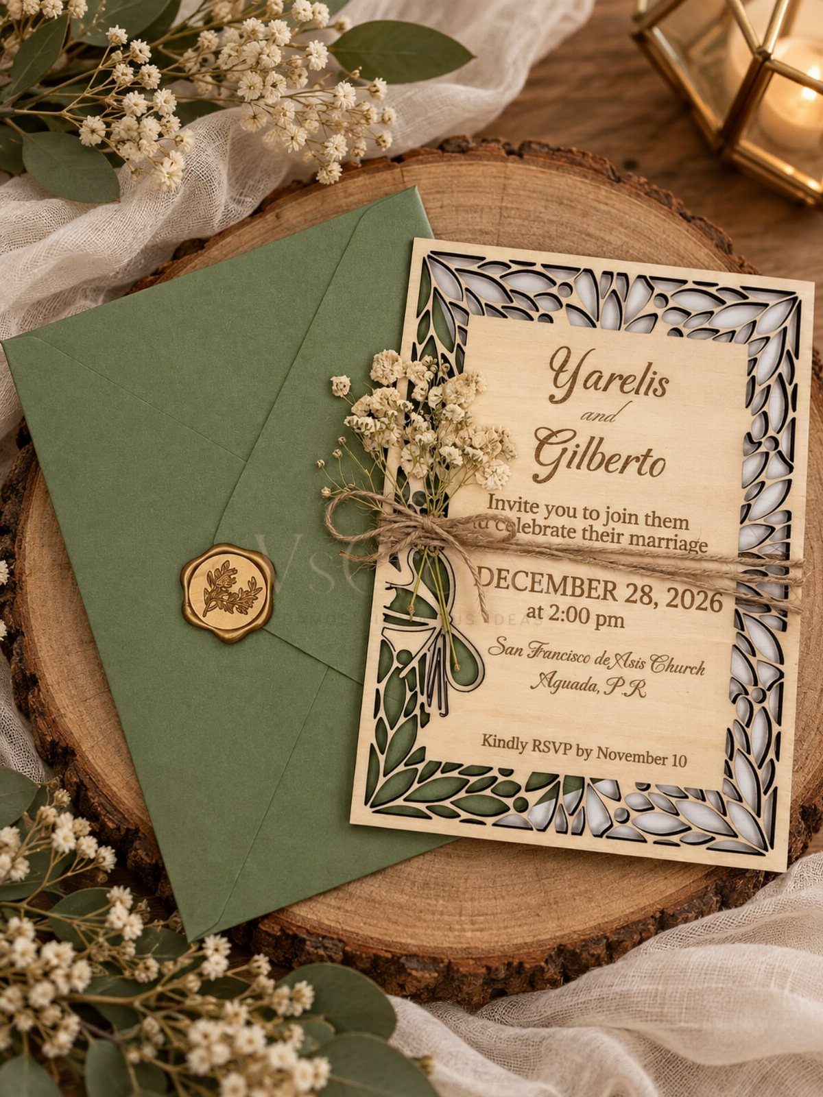
Laser-cut wood makes the invitation an object guests may keep on a shelf.
For me, wood wins on keepsake value and loses on cost and weight, so ask for a quote and have a finished sample weighed at the post office before you order. Heavier pieces can mean extra postage for every guest.
A thin wood invitation is also easy to chip, so ask how it will be packed.
10. Deckle-Edged Paper Invitations
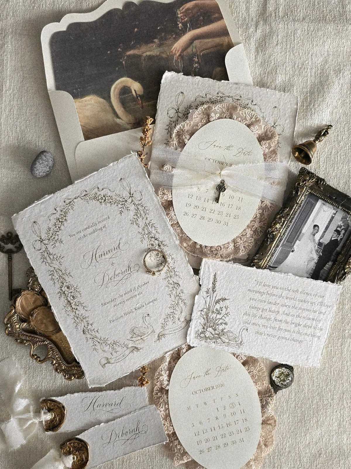
Torn deckle edges make fresh paper look like an heirloom. Paired with cursive names and a small gold accent, the look leans vintage without needing much else.
I would choose a heavy cotton-type paper so the ragged edge looks intentional, not damaged. Keep the cursive to the names and set the date and details in a plain, readable face.
Order a sample first, since the edge varies from sheet to sheet.
11. Scroll Wedding Invitations
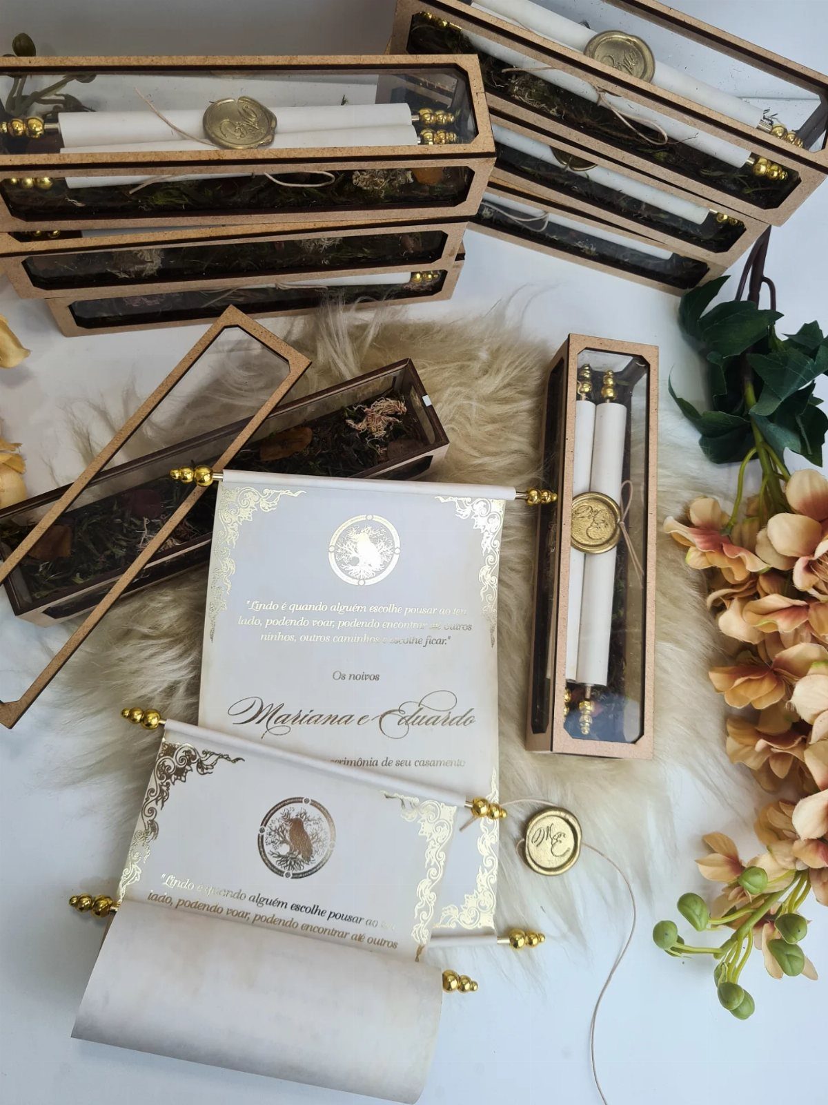
A scroll invitation is read by unrolling it, which makes opening it part of the event. String and a wax seal hold it closed, and a clear box turns it into a keepsake.
Boxes and wax add cost to every guest, so I would box only the scrolls for family and the wedding party and tie the rest with string. Keep the text short enough to fit a narrow roll.
Matching stationery in the same paper makes the set cohesive.
12. Velvet Invitation Cards
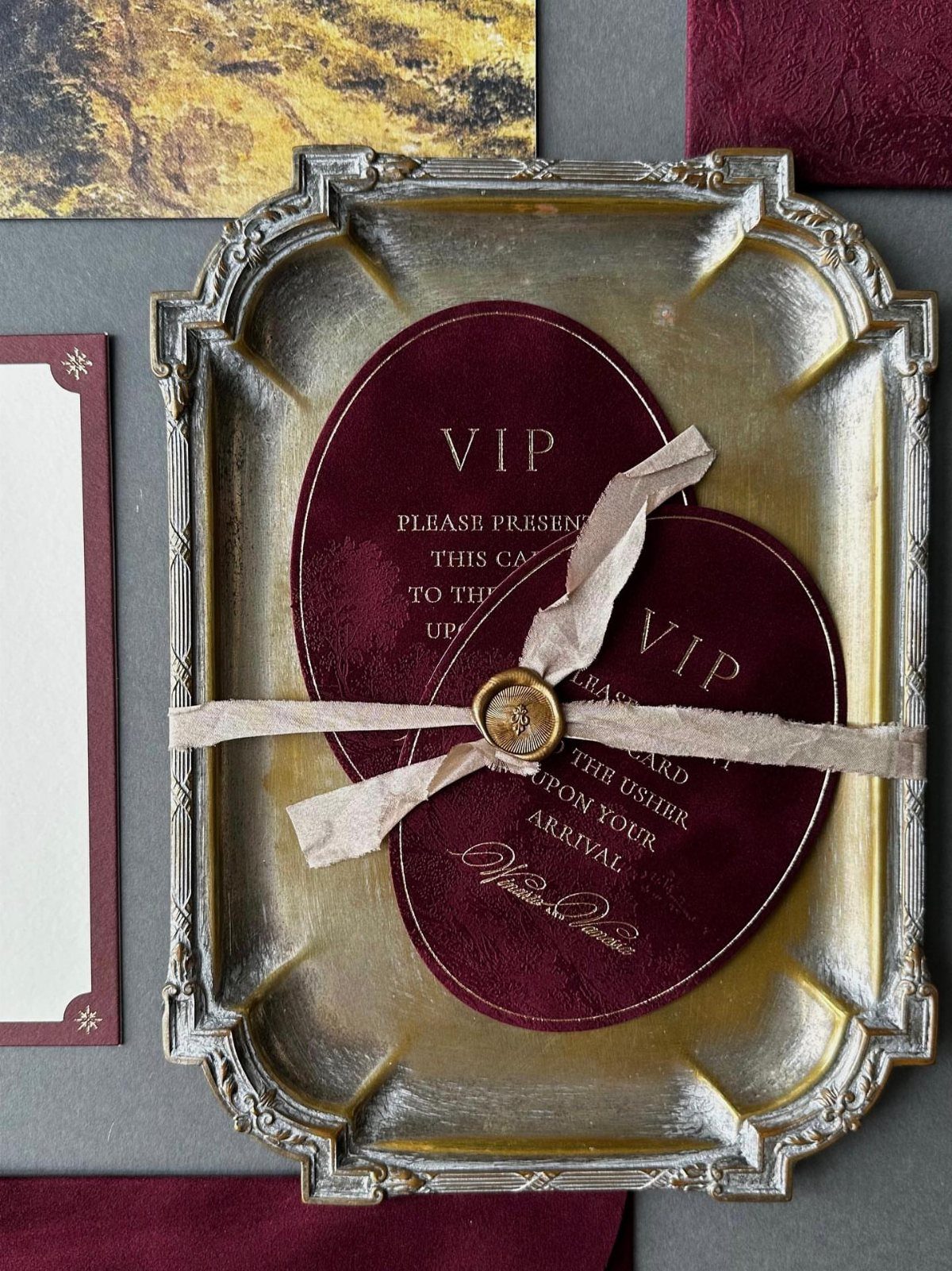
A velvet card in deep burgundy reads as an admission pass, and the "please present this card to the usher" line makes the idea playful. Tied with a ribbon and wax seal, it feels like a ticket to something special.
Velvet is a splurge, so I would save it for a small group, such as parents and the wedding party, and send paper to everyone else. Ask for a sample before ordering, because pile and color shift between suppliers.
13. Dried Flower and Wax Seal Accents
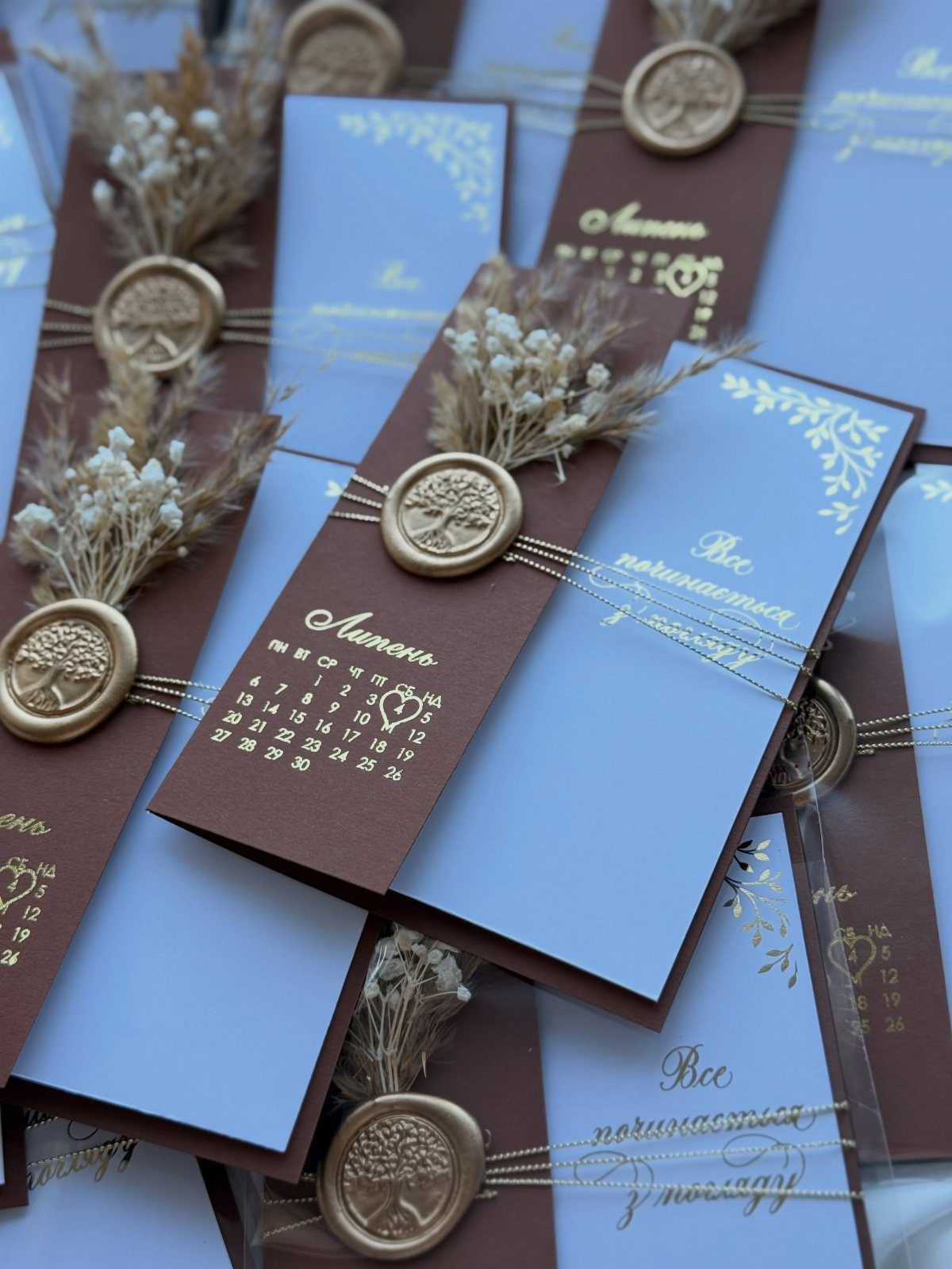
Gold wax seals and dried sprigs give layered blue and brown cardstock a tactile finish that a flat print can’t match. The 2 papers do the color work, so the seal and the flowers can stay small.
I would use one seal per invitation and press the dried stems flat before gluing them down, so nothing snags in the mail.
Wax and real botanicals add handwork to every piece, so order one finished sample and check its price against your full guest count first.
Keep the dried florals to the top layer only; the inner cards stay clean and easy to read.
14. Invitations with Hanging Tassels
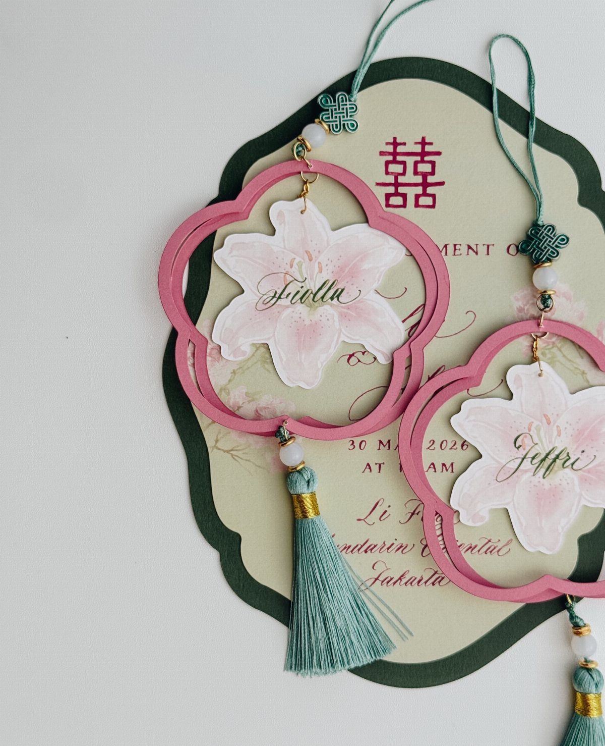
Teal tassels hanging from a pink floral cutout card give the suite movement, and the color contrast does most of the styling. A tassel is the cheapest way I know to add a third color without redesigning the paper.
Pick a tassel shade that already appears somewhere on the card, or one that sits opposite it, as teal does against pink.
Names and any second-language text can stay in plain, readable lettering, since the tassel and cutout supply the ornament.
Hanging pieces can snag in an envelope, so ask the printer how they are packed, and have one finished sample weighed before you order.
Choosing the Right Design
Pick the theme before the paper. A single idea, whether a place, a decade, or a favorite artist, settles your palette and the visuals that repeat across the suite, so later choices get easier.
If you want a strong theme but have a tight budget, start from a template and adjust the design until it suits you, then print it yourself. A template costs far less than commissioning something from scratch.
If an artist’s work is the spark for your theme, hand that name to an invitation designer and let them translate the palette and brushwork into paper.
Custom work costs more, but it is the surest way to get something nobody else will have.
Customization Options
Paper weight, ink color, and print method are hard to judge on a screen, and a kit lets you hold the options side by side.
Customization usually covers colors, fonts, and layouts. Change one thing at a time, then request a proof so you can catch typos and color shifts before the full run.
Keep fonts to two at most, one for names and one for details. Check the proof in daylight, since indoor light changes how a color looks.
Budget Considerations
Prices swing widely, so set a per-invitation ceiling before you look at designs. Then count your households, not your guests, since one invitation covers a couple or family.
Calligraphy shows how wide the range runs. Prices vary a lot: a 4-piece custom suite can start at $750 for 25 sets, while a Minted calligraphy-style design runs $450 for 60 and throws in a wedding website and printed guest addresses.
Check what each price includes, because a minor revision or address printing can save you a separate bill.
Hand-addressed envelopes are a cheaper way to get calligraphy. One studio charges $7 per envelope, plus $4 more for a two-line return address, so on a short list it can beat a full calligraphy suite.
On a small budget, choose a template and print it yourself, or keep the design simple and spend on one detail.
Frequently Asked Questions
What wording goes on a wedding invitation?
The basics are the couple’s names, the date, the time, and the venue. Save the decorative lettering for your names, and let the date, time and venue sit in a clean, legible typeface that guests can read at a glance.
Long blocks of script are hard to read, and short wording also works best on materials like fabric or kraft.
Who does the best wedding invitations?
No single company wins; it depends on your style and budget. Line up what each quote actually covers, because a small proof revision or printed addresses can spare you an extra charge later.
Is it actually cheaper to DIY wedding invitations?
In most cases it is cheaper, provided you buy a template and run the printing yourself, since a template costs a fraction of commissioned custom artwork.
On a small budget, I would keep the design simple and spend on one detail, such as foil on the names.
Before printing the whole batch, get a single proof or sample so typos and color shifts show up while they are still cheap to fix.





