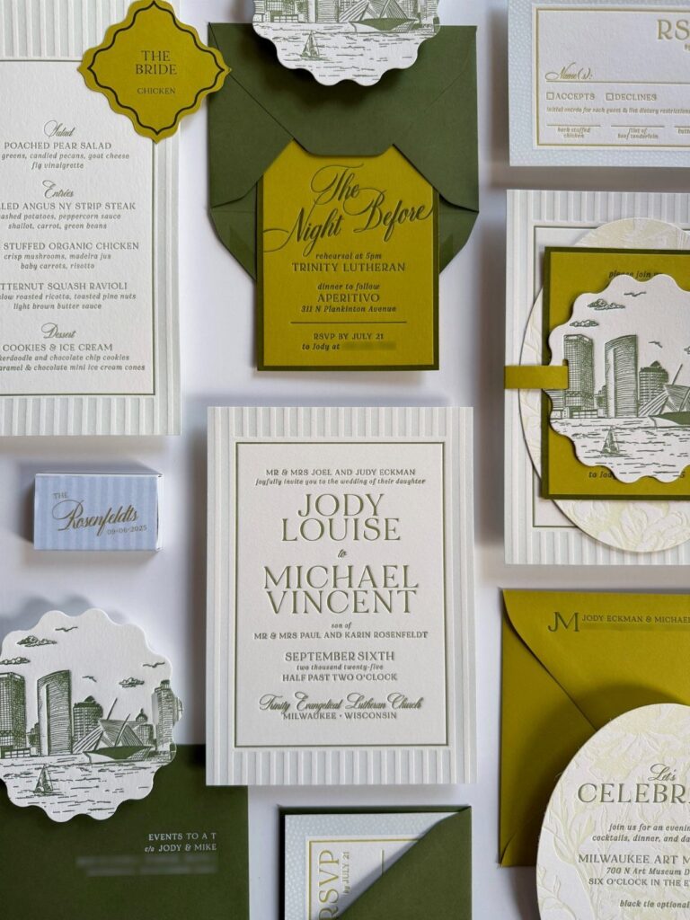
Letterpress runs from a plain debossed serif on thick cardstock to a full suite with botanical or venue illustration and wax seals, and each added detail pushes the price up.
Budget decides which idea fits: a tighter one points to minimalist debossed typography with short lines of text, while a bigger one can pay for an architectural venue illustration or a botanical suite.
1. Paper Quality
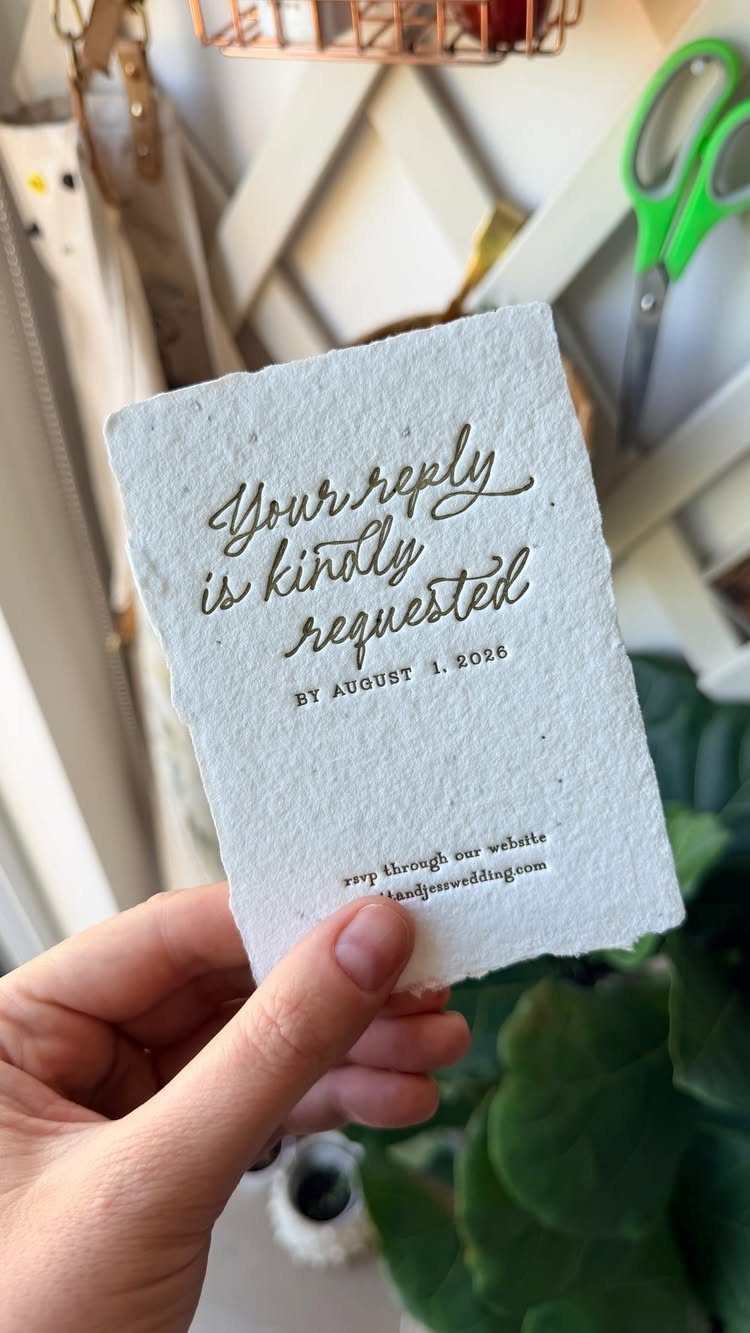
Letterpress only shows off its deep impression on soft, thick, fibrous paper, so the stock matters as much as the printing. Seeded handmade paper, as the maker of this piece used, gives that texture a lot to bite into.
Deckled edges suit an RSVP card especially well, since it is the piece guests handle most. Request a sample of the exact stock from your printer, and press your thumbnail into it, before any deposit changes hands.
A smooth, thin sheet wastes the technique, and I would rather cut the guest count on a fancy piece than print on weak paper.
2. Wax Seals
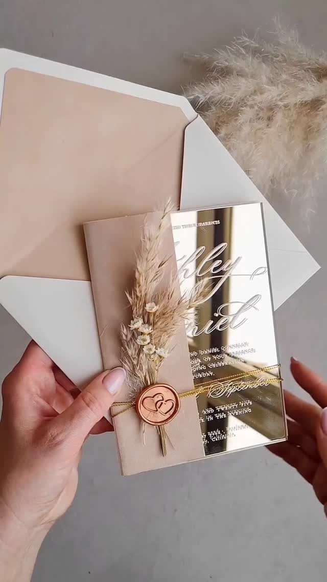
A wax seal adds a small raised object to a flat invitation, and a copper one reads warmer than a plain stamp.
Seals cost more in time than in materials, and each one takes hands. If your guest list is long, I would seal only the main invitation and leave the rest plain.
3. Matching Day-of Stationery Menus
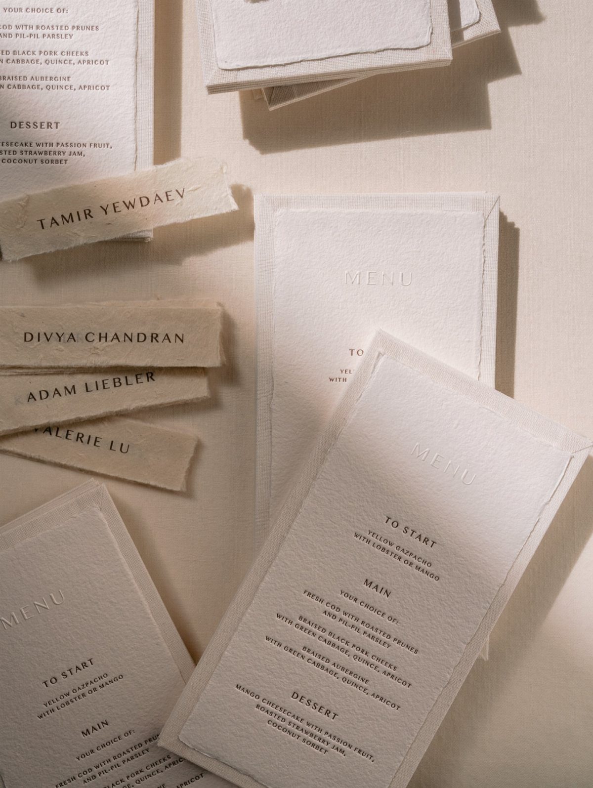
Menus and place cards printed on the same textured, deckle-edged stock as your invitation tie the dinner table back to the first piece guests received. Debossing the type keeps the look quiet, with no ink needed to read well.
Matching the paper later is harder than it sounds, and a single setup is usually cheaper than two.
4. Luxury and Elegance
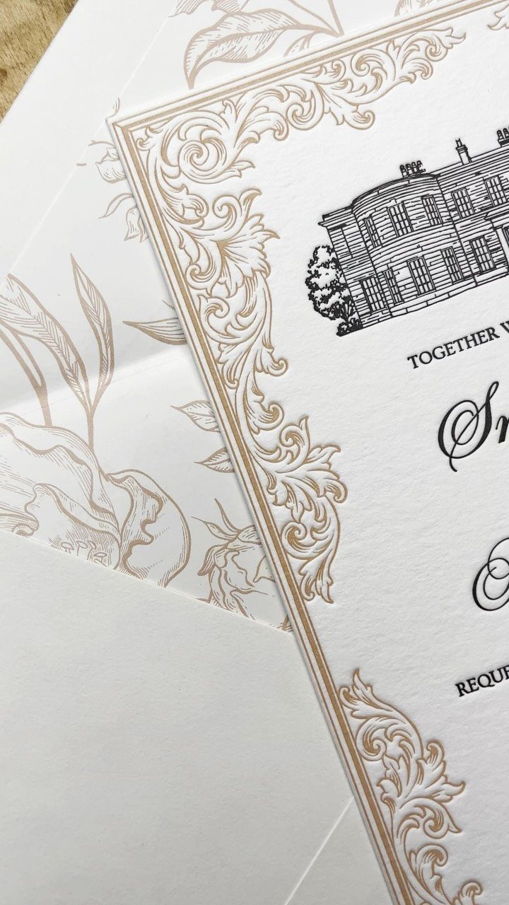
Gold ornate borders paired with black cursive type are the classic way to make letterpress feel formal. A sketch of a manor house at the center turns the card into a small portrait of the venue.
Foil or metallic ink adds cost, so I would pick one gold element, the border, and let the lettering stay simple. Too many flourishes fight each other.
5. Letterpress Wedding Invitations Tactile Experiences
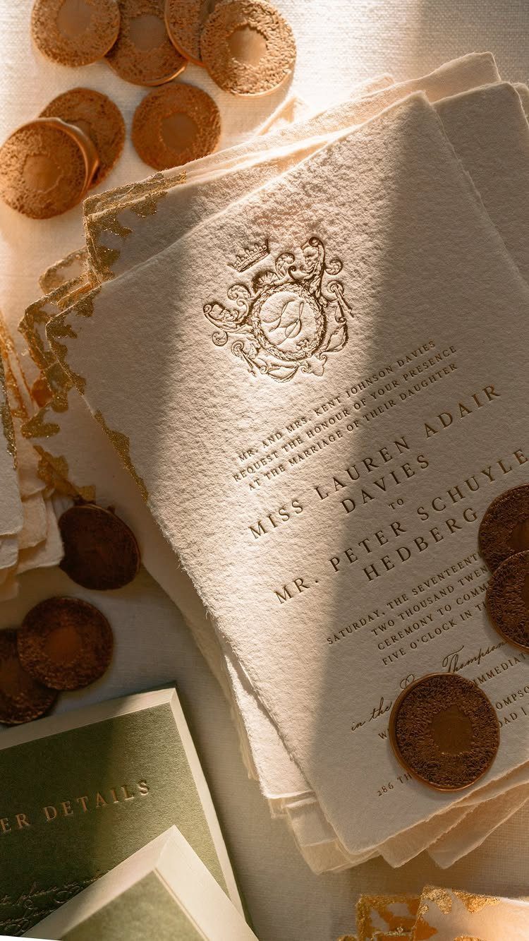
Run a thumb across a letterpress card and the type is felt before it is read.
Guests notice this when they hold the invitation, so it pays to choose weight and finish by touch rather than from a screenshot.
A sample suite is worth paying for, since the weight and bite of the impression only show up in your hands.
6. Minimalist Debossed Typography Invitations
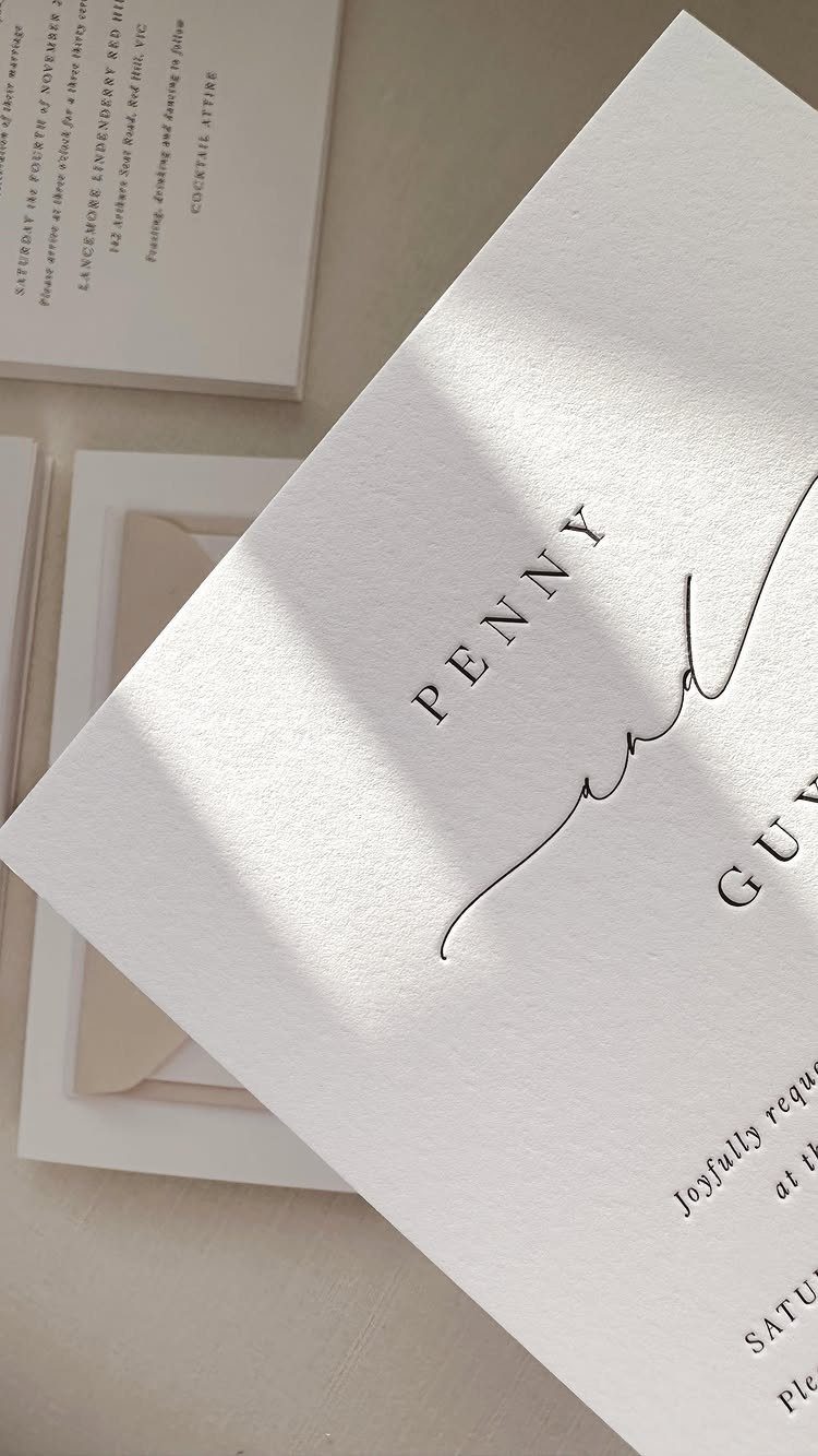
Debossing presses the type into thick white cardstock, so the shape of each letter depends on shadow and depth. Pairing a crisp serif for the names with a script for the rest gives it character while staying restrained.
This is my pick for couples who want letterpress on a tighter budget, since you skip extra colors and embellishments. Short lines of text let each letter press cleanly, while long paragraphs crowd the impression and blur it.
7. Botanical and Floral Letterpress Suites
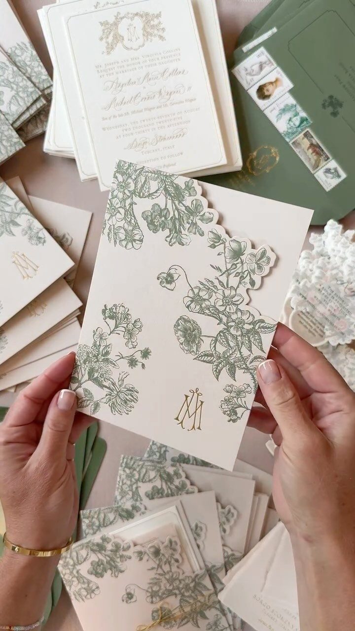
Green leaves and a gold monogram on cream paper give a suite a garden feel without any color fighting for attention.
The maker of this piece mentions handmade paper accents, gold foil and a die cut vintage urn alongside the letterpress wording, which is a lot of finishes for one set.
I would keep the botanical print as the star and choose just one add-on, such as the foil monogram. Each extra process adds cost, and the leaves already carry the design.
Ask your printer to price the suite piece by piece, so you see what each card costs before signing for the whole set.
8. Architectural and Venue Illustration Cards
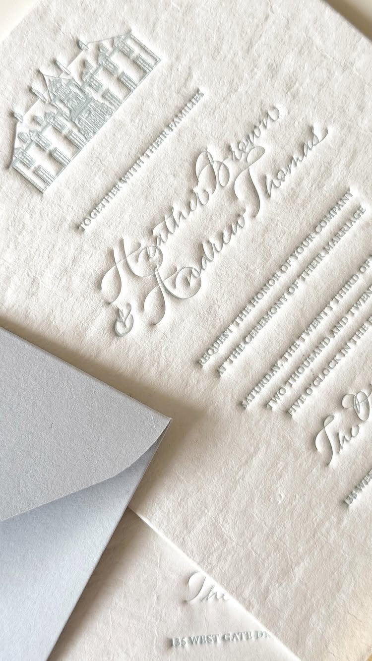
A small illustration of your venue, embossed at the top of the card, gives guests a picture of the place before they arrive. Paired with a script for the names, it reads as formal without extra ink.
For couples with a higher stationery budget, this is where I would spend: a custom drawing costs more than a stock design, but it can’t be copied by anyone else’s invitation.
Send your illustrator or printer a clear, straight-on photo of the building.
Keep the surrounding text short so the embossing stays the focus.
9. Vintage Illustrated Cherub Invitations
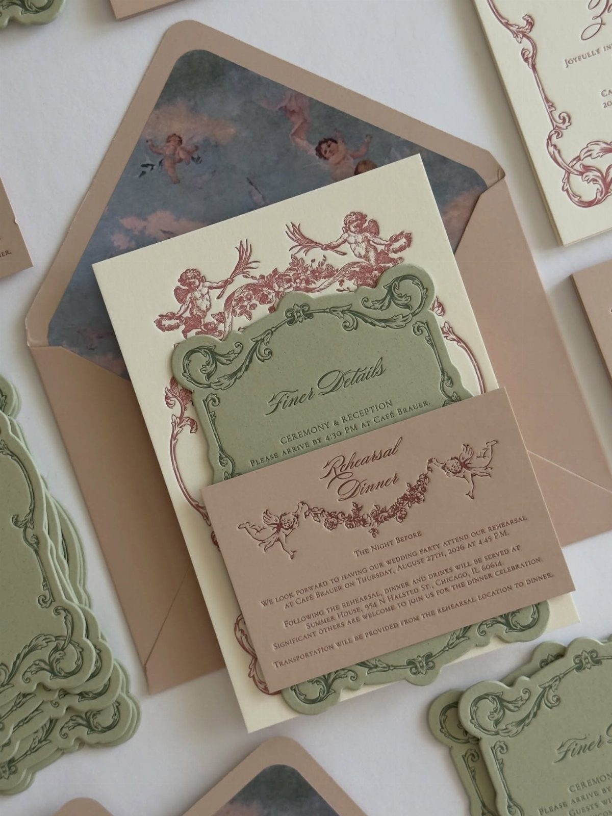
Red cherubs on sage green and cream feel playful and old-fashioned at once, and cursive type keeps them from tipping into costume.
Because the red is so strong, I would let the cherubs be the only bold color in the suite.
A set like this also stretches across pieces. Smaller cards for details and a rehearsal dinner can repeat the same illustration, so the whole weekend looks like one story.
Ask for a proof before printing, since fine linework can fill in on soft paper.
Customization and Personalization
A letterpress suite is built from 4 decisions: the paper, the ink color, the typeface, and whatever finishing touch you add, such as a wax seal or a ribbon.
Settle them in that order, because paper and ink limit what the rest can do.
Ask whether the printer mixes ink to order or works from a fixed palette. Custom-matched ink lets you hit your exact wedding color, and some shops will match a Pantone swatch you bring in.
Starting from a printer’s base design and changing only a few options costs less than a fully custom suite.
Choose the changes guests will actually notice, like the ink color or the paper, and leave everything else at the studio’s default.
If you want a material the printer doesn’t list, ask. Many small shops will source something on request, though it may add time.
Ordering Timeline
Letterpress shops are usually small businesses juggling many projects at once, so ask about openings before you have a final design. Give yourself a lead time of 6–8 weeks or more before the date your invitations need to hit mailboxes.
Mailout is not the wedding date. Invitations typically go out 6 to 8 weeks before the wedding, so work backward from that.
The two figures describe different clocks, so check which one a printer is quoting.
If you are using the 6–8 week lead time for production, count it from the day you want the envelopes in the mail, then add a buffer for proofs and shipping.
Save-the-dates and envelope addressing take time too, so book those slots early.
Design Considerations
Bold typography and simple line work print best. Gradients, photos, and very fine detail don’t suit letterpress, so save the photo for your website or a save the date printed by another method.
Find a designer who has already built files for letterpress, because it behaves very differently from flat printing.
Your talented friend who builds websites may not know how plates, ink spread, and impression depth behave, and a file that looks sharp on screen can print badly.
Before approving anything, ask the designer or printer to flag any element that may not press cleanly.
Frequently Asked Questions
What are letterpress wedding invitations?
A letterpress invitation is made by pressing an inked metal or polymer plate into soft, heavy paper, which leaves the lettering sunk in so a fingertip can feel it.
That deep impression is what people pay for, so the paper deserves as much attention as the press. A thick cotton or other fibrous stock holds the dent; a thin, slick sheet can’t, and the technique is wasted on it.
How long does it take to get letterpress invitations?
Production usually takes 6–8 weeks, and some printers run longer.
Start the clock at the day you want envelopes in the mailbox rather than the wedding date, and pad it for proof rounds and shipping. Small shops often book up, so ask about openings before your design is final.





