The styles here run from minimal typography on plain card stock, where you pay only for paper and type, to personalized illustrations and venue illustrations, where you pay for the artist’s time and revisions.
Your budget ceiling for the whole paper suite picks the style: a template for the main card costs the least, and custom work belongs on one piece if the number is tight.
Foil accents, acrylic designs and translucent paper each add cost or assembly time, so I’d pick one of them per suite and stop there.
1. Calligraphy Wedding Invitations
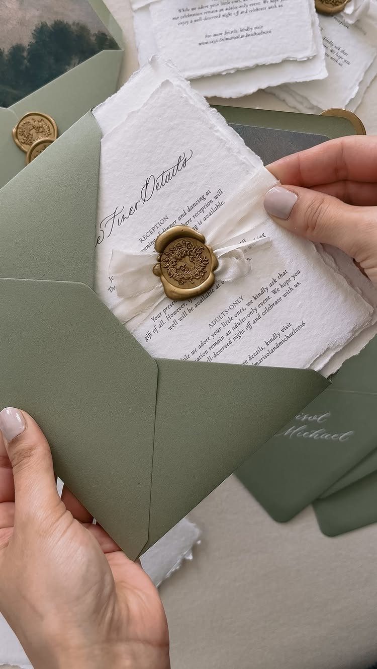
A deckle-edged sheet with hand-lettered names looks expensive before anyone reads a word. The ragged edge and the ink do the work, so I would keep everything else quiet.
Pick one script and let it carry the names and nothing more. Set the date, venue and adult-only note in a plain type, and your hand-lettered lines stay easy to read.
A wax seal and ribbon add a finishing touch, but they cost extra, so choose them only if the budget allows.
Enhance your invitations with vellum jackets or overlays and personalized belly bands for an elevated presentation. Coordinate your cards into a matching wedding stationery suite for a polished, cohesive look.
2. Moody Colors Wedding Invitations
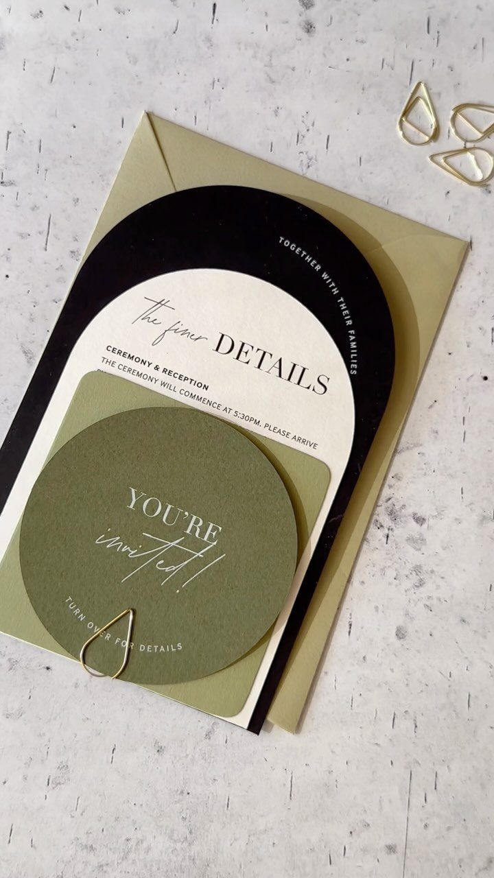
Black, white and olive green make an invitation feel like an evening wedding before anyone opens the envelope. A black arch against a white card is a strong shape, and I like that it needs no ornament.
Keep the wording short, with "ceremony & reception" on its own card so the main invitation stays clean. Dark ink and dark paper can be hard to read, so put the details on the white card.
A gold envelope warms the palette without adding another color to the set.
3. Translucent Paper Wedding Invitations
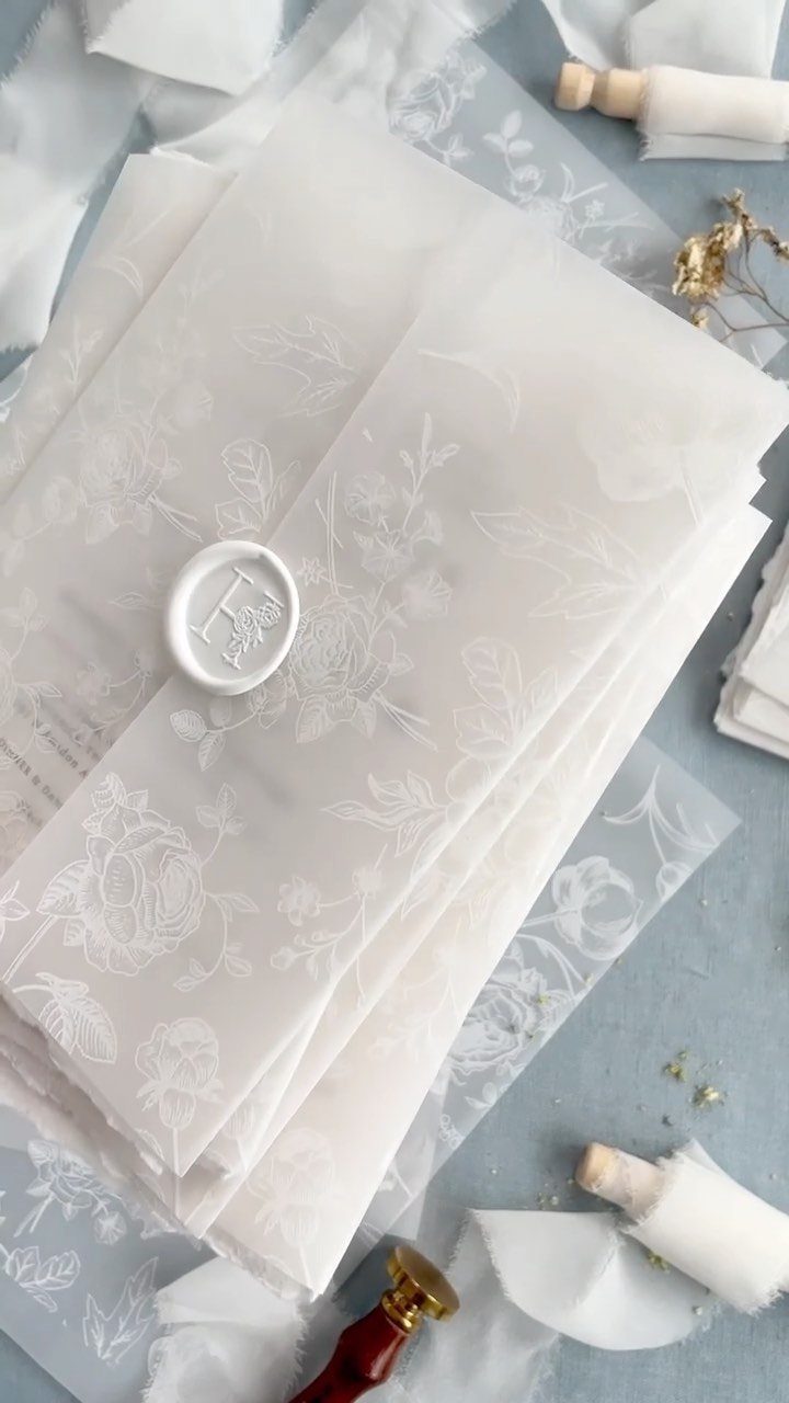
Vellum makes guests slow down. Florals printed on a translucent sheet and sealed in white wax feel like something to be handled, not just read.
Order a sample before you commit, because ink looks different on see-through paper than on a screen. Choose a design with plenty of white space, since anything behind the sheet shows through.
Vellum ribbons and a wax seal stamp pull the look together, though each adds a bit of assembly time. I would pick this when you want mystery and have a few evenings to put the suites together.
4. Envelope Liners
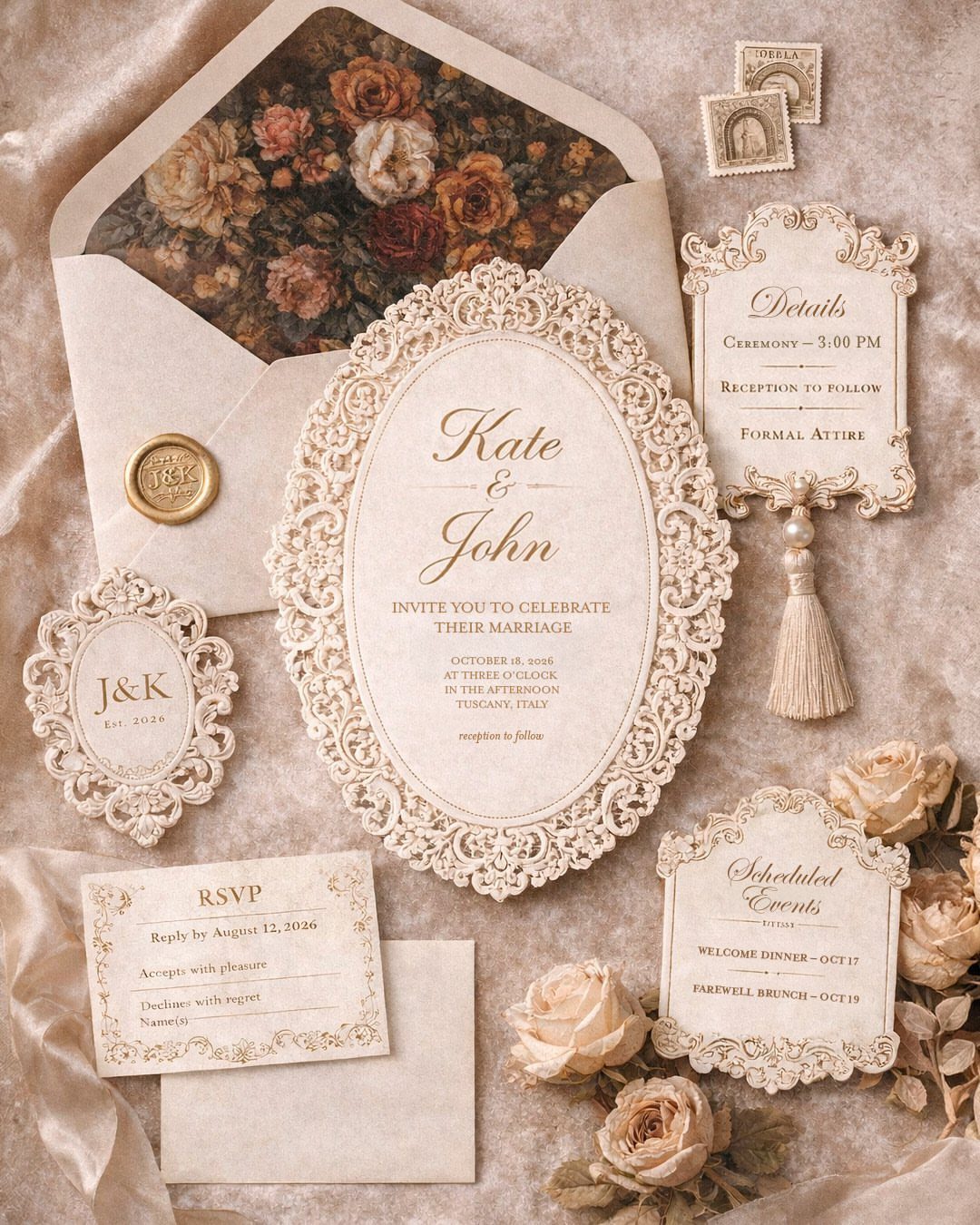
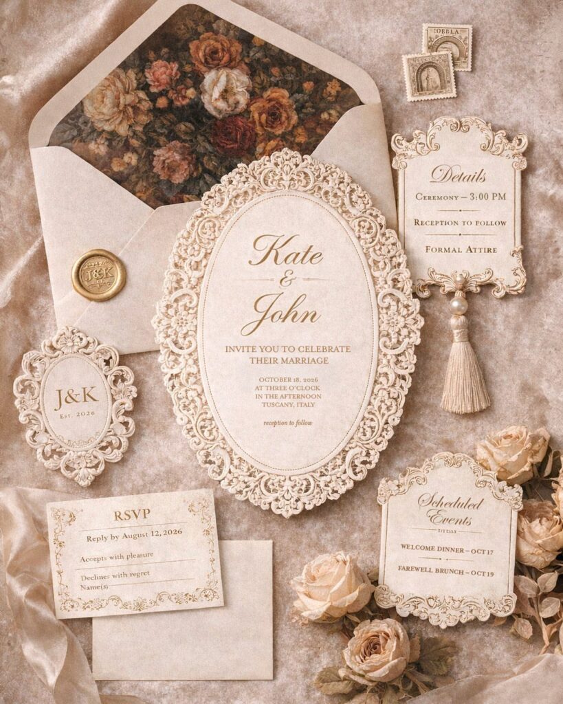
Open the envelope and the floral liner is the first thing a guest sees, which is a good reason to spend money there. It is a small surface with a big effect.
If your budget is tight, I would put the money into the liner and keep the invitation card simple. A patterned liner can make a plain cream suite feel finished.
Lace-cut cards and an RSVP card inside already give the suite plenty of detail, so choose a liner that matches your palette and not one that competes with the cards.
5. Personalized Illustrations
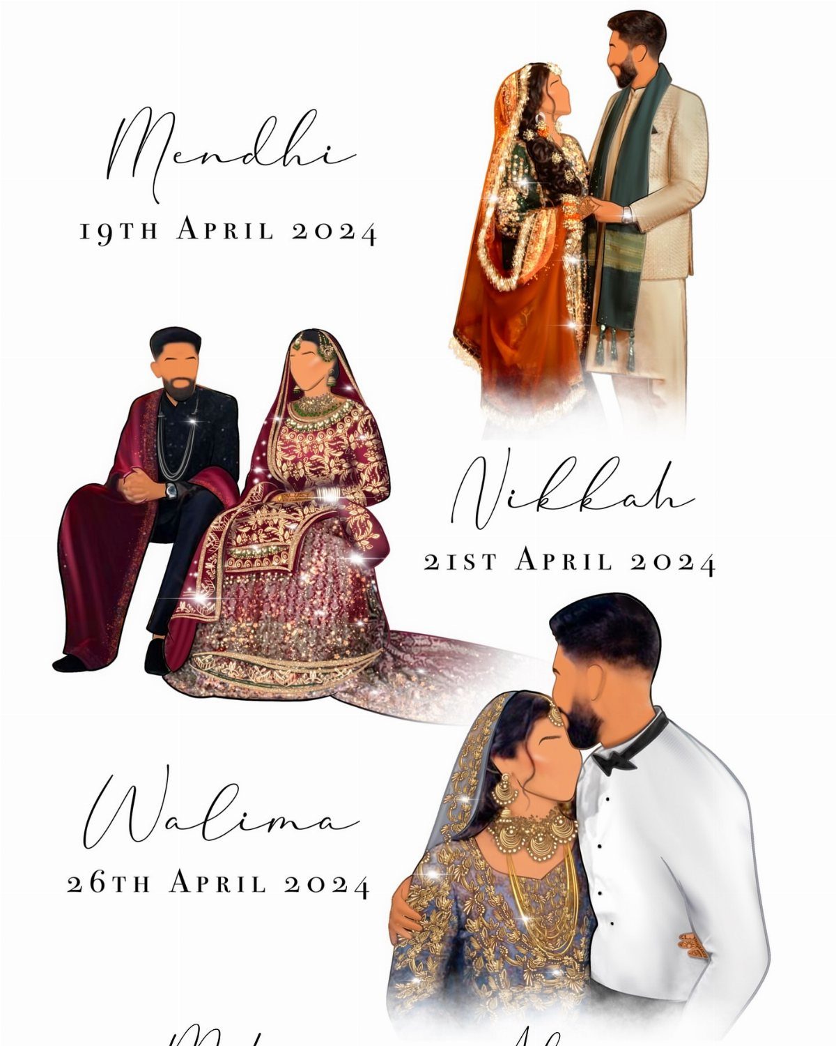
Three events, three illustrated outfits: custom artwork lets one invitation set carry a whole multi-day celebration.
If your celebration runs across several events, such as a Mehndi, Nikkah and Walima, give each one its own date line and its own illustration so guests can tell the cards apart at a glance.
Give the artist your outfit colors and a clear idea of each event. Then keep the dates in a simple type so the details stay readable.
Custom work costs more than a template, so ask for a quote early and leave time for revisions. For a couple who wants the invitation to look like them, I think it is worth it.
6. Glam Monogram Wedding Invitations
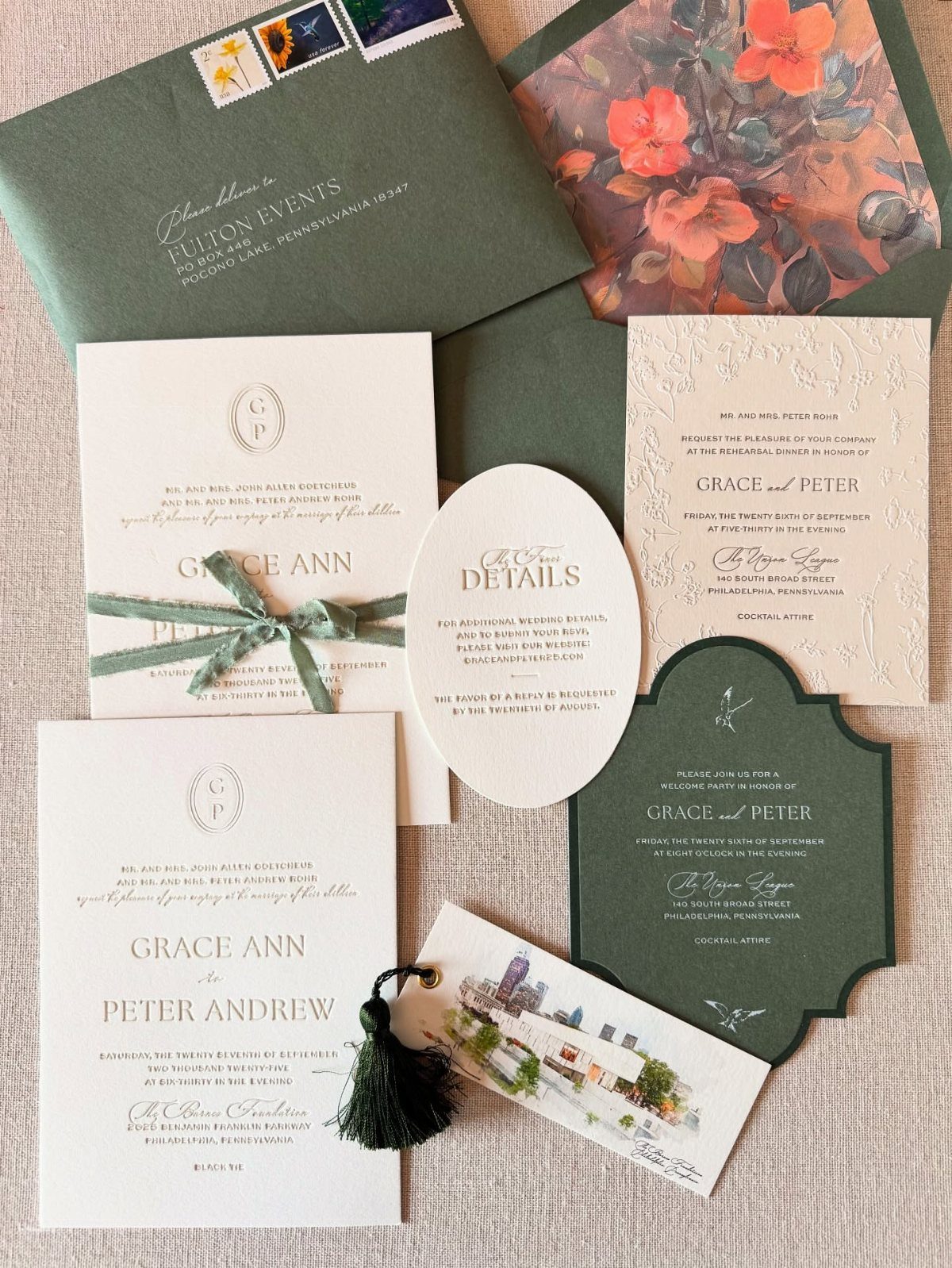
A monogram turns two sets of initials into a logo, and a good one can run through every piece of paper you send.
Color contrast is what makes a monogram read from across the table, so pair a deep envelope with a white card and keep the circular mark as the single focal point.
You choose the paper, the colors, the styling and which enclosures go in the envelope. The details card and rehearsal dinner invite in this set can repeat the same monogram, so each piece looks related.
I would settle the monogram first and then build the rest around it. It keeps the suite consistent, and it keeps decisions from piling up.
7. Minimal Typography Wedding Invitations
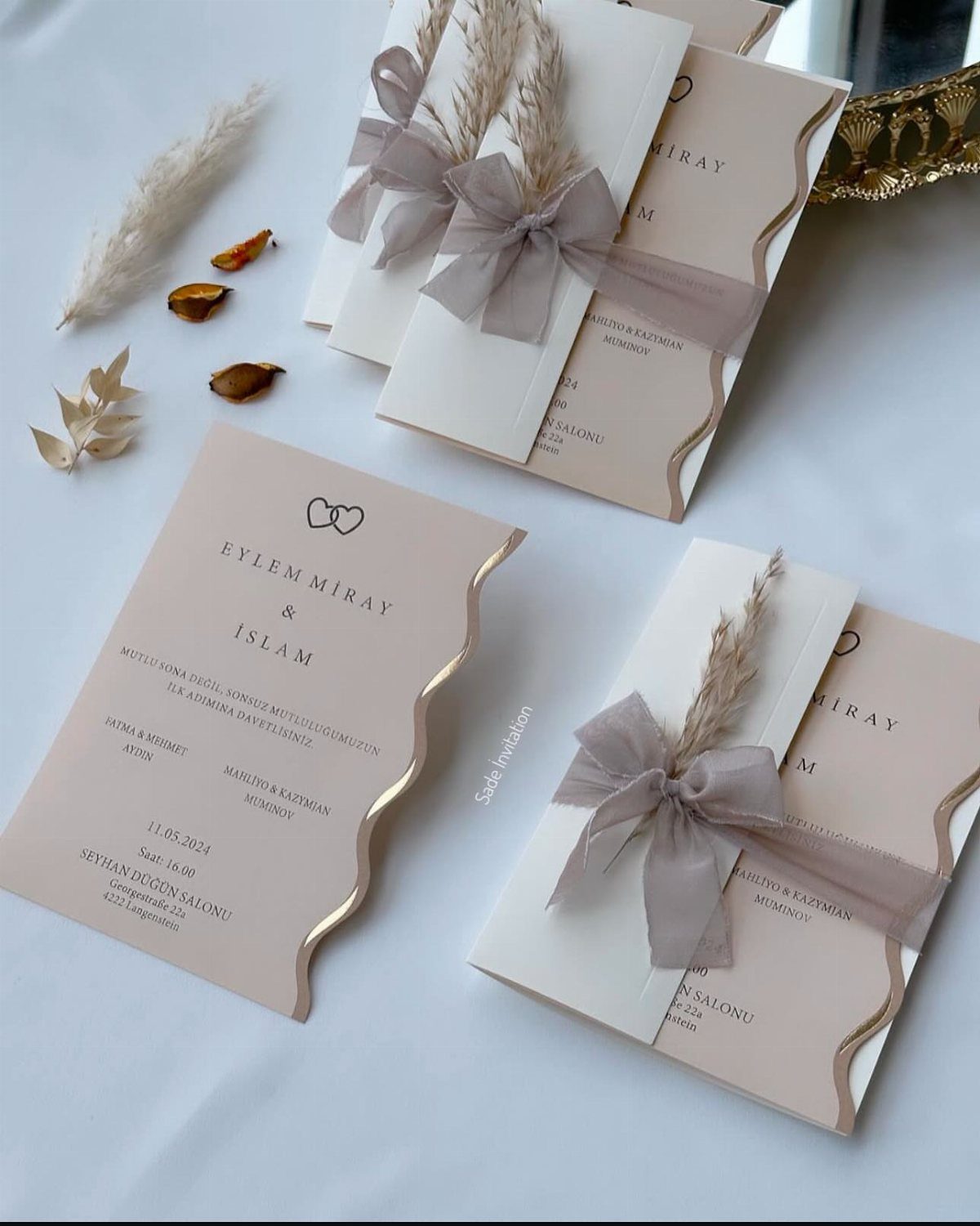
Beige card stock, plain white envelopes and a name line set in clean capitals: this style leaves nothing to hide behind, so the spacing has to be right.
A sheer bow or a sprig of dried grass adds softness without adding print cost. I would pick one tie and use it on every invitation.
Minimal suits a tight budget well, since you pay for paper and type, not for artwork.
8. Acrylic Designs
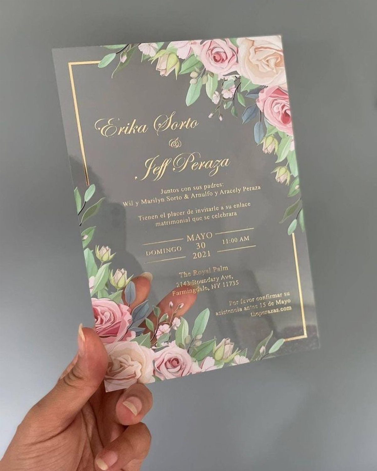
Clear acrylic is the one invitation material guests may keep on a shelf. Clear acrylic keeps an invitation light, and a little gold script or a few printed floral corners adds color without hiding the see-through base.
Ask the printer for a proof before ordering the full run.
Gold lettering on a clear sheet can disappear against a dark table, so check it on both light and dark surfaces. Keep the date and venue lines short so they stay readable.
Acrylic costs more than paper, so I would choose it for a small guest list.
9. Foil Accents
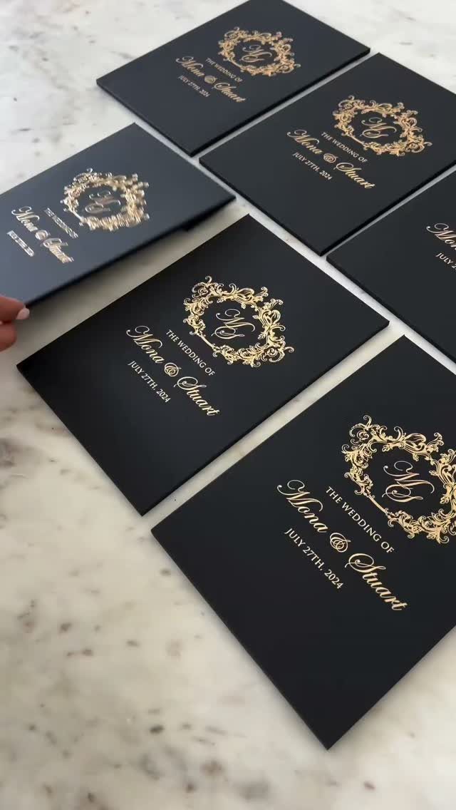
Gold foil on black paper is the strongest contrast you can print, and it catches light the moment a guest tilts the card. Foil calligraphy and a crest give the set a formal, evening feel.
Spend the foil on the names and the crest, then print the details in a plain type.
Too much metallic text tires the eye. A marble-gray envelope or a black one both suit the palette.
Foil adds cost per color, so I would limit it to one metallic.
10. Venue Illustrations
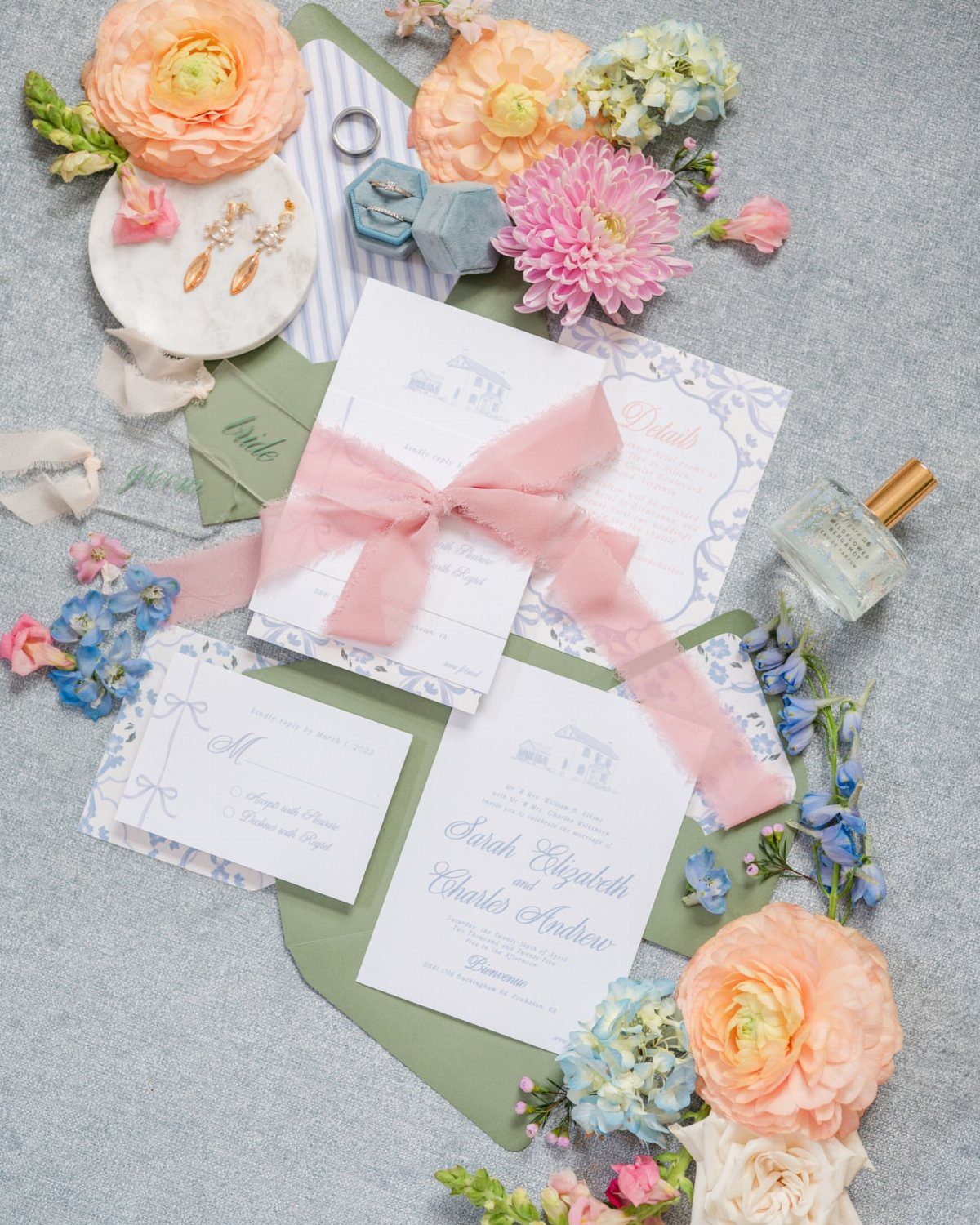
A line drawing of your venue tells guests where they are going before they read the address. Place the illustration at the top of the card, and keep the names and date beneath it in a simple type.
Send the artist clear photos of the building from a few angles, plus your palette. A soft-colored sketch of the venue pairs well with a pink ribbon or a few pressed spring flowers tucked into the envelope.
Custom artwork takes time and money, so request a quote early. I would use it when the venue is a big part of why you chose the date.
11. Wedding Invitations Samples
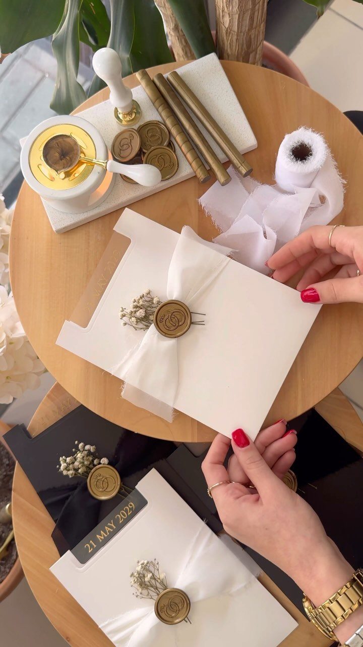
Order a sample suite before you place the full order.
A white card with a gold wax seal and sheer ribbon looks different in your hands than on a screen, and the paper weight, ink color and ribbon texture are easier to judge in person.
Compare at least 2 designers side by side. Check how the seal sits, and whether the ribbon slips.
Samples cost a little, but they cost far less than reprinting a whole run. I would never skip this step.
Customization Options
Ask any company you are considering which 3 things it lets you change: ink colors, paper type and enclosures. Packages that look alike on the surface often differ here, and the difference shows up in the final price.
Get the quote with your exact choices written out, not the starting price. Then compare the totals side by side.
Decide which one change matters most to you and spend there. Leave the rest at the default.
Choosing the Right Style
Start with a theme only if you have one. For some couples the wedding itself is theme enough, and a clean card in your colors is a complete answer.
If you do have an idea, a place, a decade or a favorite artist can set both the palette and the look of the whole set.
Palm Springs in the 60s, summer camp and disco all give a designer something clear to work from.
Bringing a favorite artist to a designer is one of the more personal routes, and the result tends to look like nobody else’s.
Pick the theme first, then the colors. Reverse that order and the palette ends up fighting the idea.
Budget Considerations
A pre-designed template saves the most money, since you skip the designer’s fee and only pay to personalize the wording and print.
You can adjust the design until it suits you and print it yourself, so you pay for paper and ink, not for design time.
Custom work asks for a higher budget, and it pays off when you want something no one else has. Settle on a ceiling for the whole paper suite before you talk to any designer.
If the number is tight, I would do a template for the main card and save custom work for one piece. Printing at home also means testing a page first, because a misprint on good paper is money lost.
Frequently Asked Questions
Who does the best wedding invitations?
No single company wins, because the best choice depends on the style you want. A hand-drawn illustrator suits a couple who wants the invitation to look like them, while a template from a stationery company saves the most money.
Ask for a quote with your exact paper, ink and enclosure choices written out, then compare totals side by side.
Before you settle on a designer, pay for sample suites from two of them and compare the paper weight and print quality side by side.
What do you write in a wedding invitation?
Include the names, the date, the time and the venue. Set those details in a plain type so they stay easy to read, even if the names use a script or calligraphy.
If the event is adults only, say so on the card. Put extra details, like a ceremony and reception line, on a separate card to keep the main invitation clean.
Is it actually cheaper to DIY wedding invitations?
Usually yes, since a pre-designed template skips the designer’s fee and you only pay to personalize the wording and print.
Run one test page on cheap stock before the good cardstock goes into the printer, since a single misprint can eat a chunk of the savings. A minimal style, with beige card stock and clean type, also keeps costs low.





