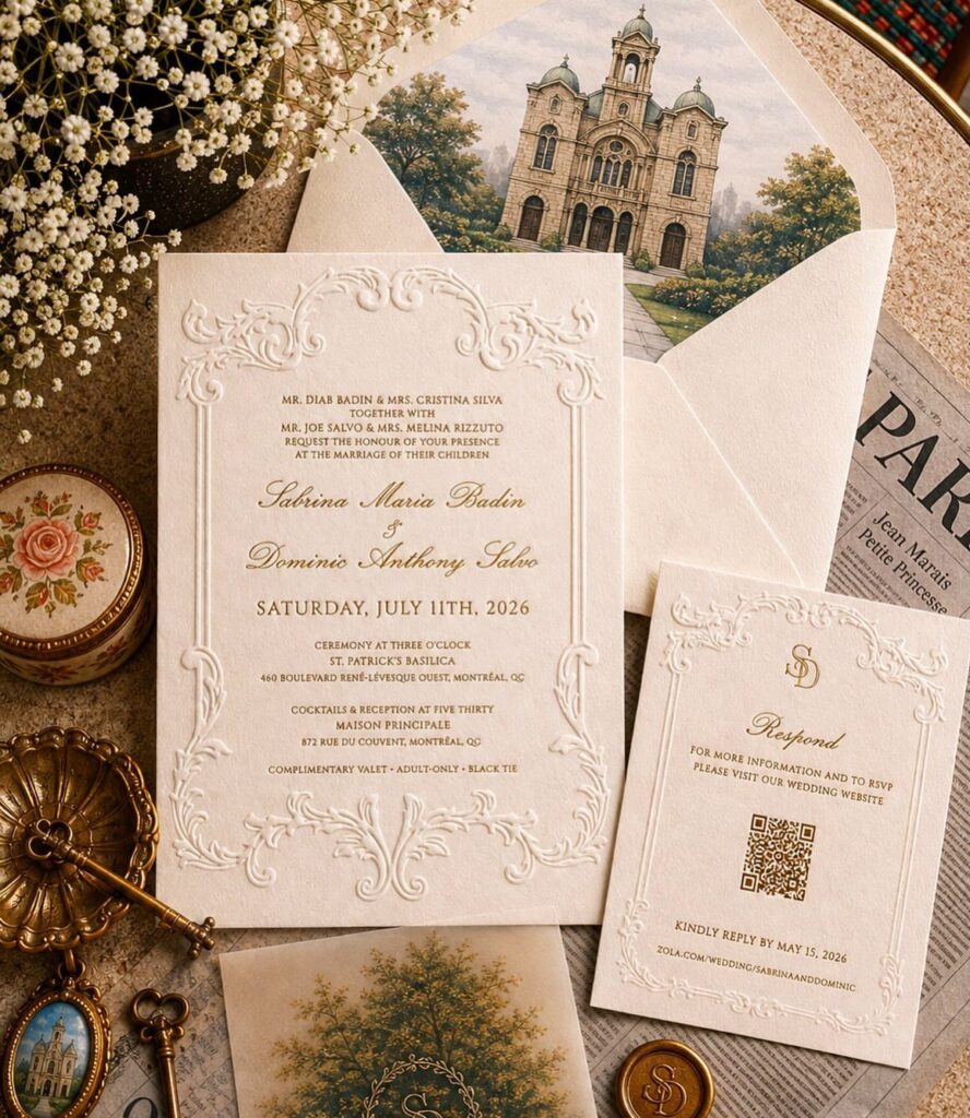
The designs here run from a flat printed white card with gold accents to a satin ribbon bow, a religious icon wax seal and a monstrance illustration on handmade paper.
Your guest list decides which one is yours, because anything done by hand, whether a satin ribbon bow or a wax seal, multiplies across every envelope.
With a long guest list, I would save the wax seal or the ribbon bow for the closest family and print the rest flat on a classic white card.
Shipping and delivery time eats into your schedule, so order early enough that the invitations arrive well before you need to mail them.
1. Classic White, Religious Blue, and Golden Accents
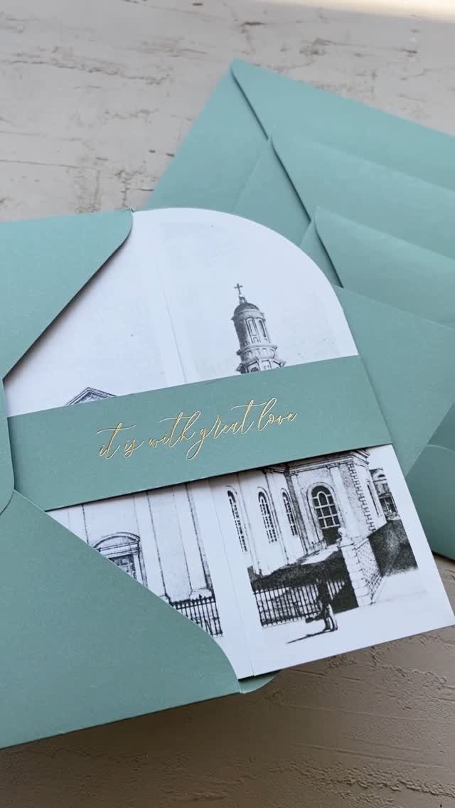
White paper, pale blue and gold ink make a quiet palette for a church wedding. White reads as purity, blue points to the Marian tradition, and gold adds a formal finish.
A gold cursive on white keeps the names easy to read. Let the blue envelope do the color work, so the card itself stays simple.
I would keep gold to the names and one small sketch. A church line drawing already gives the invitation its subject.
2. Pre-Designed Catholic Wedding Invitation Suites
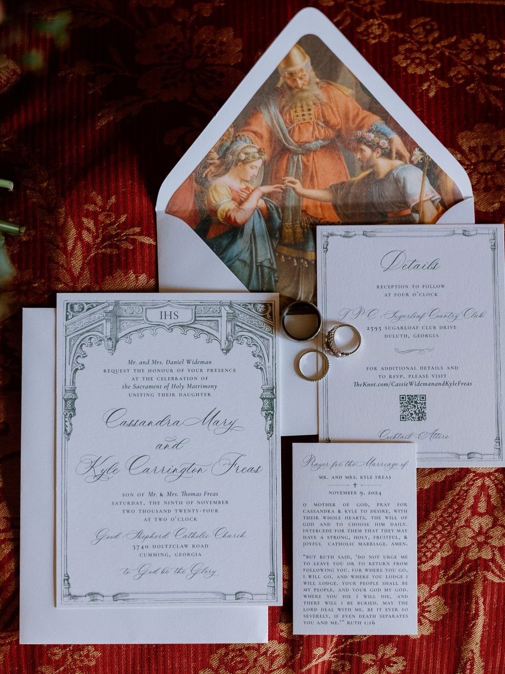
A ready-made suite saves the most time when the church and a prayer card are already part of the set. Invitation, details card, prayer card and a patterned envelope liner arrive as one coordinated package.
Customizing usually means swapping in your names, the parish and the ceremony details. Check that the church name is spelled exactly as the parish writes it.
For a modest budget, I would pick a suite like this over a custom design. The prayer card gives guests something to keep, too.
3. Personalized Graphics
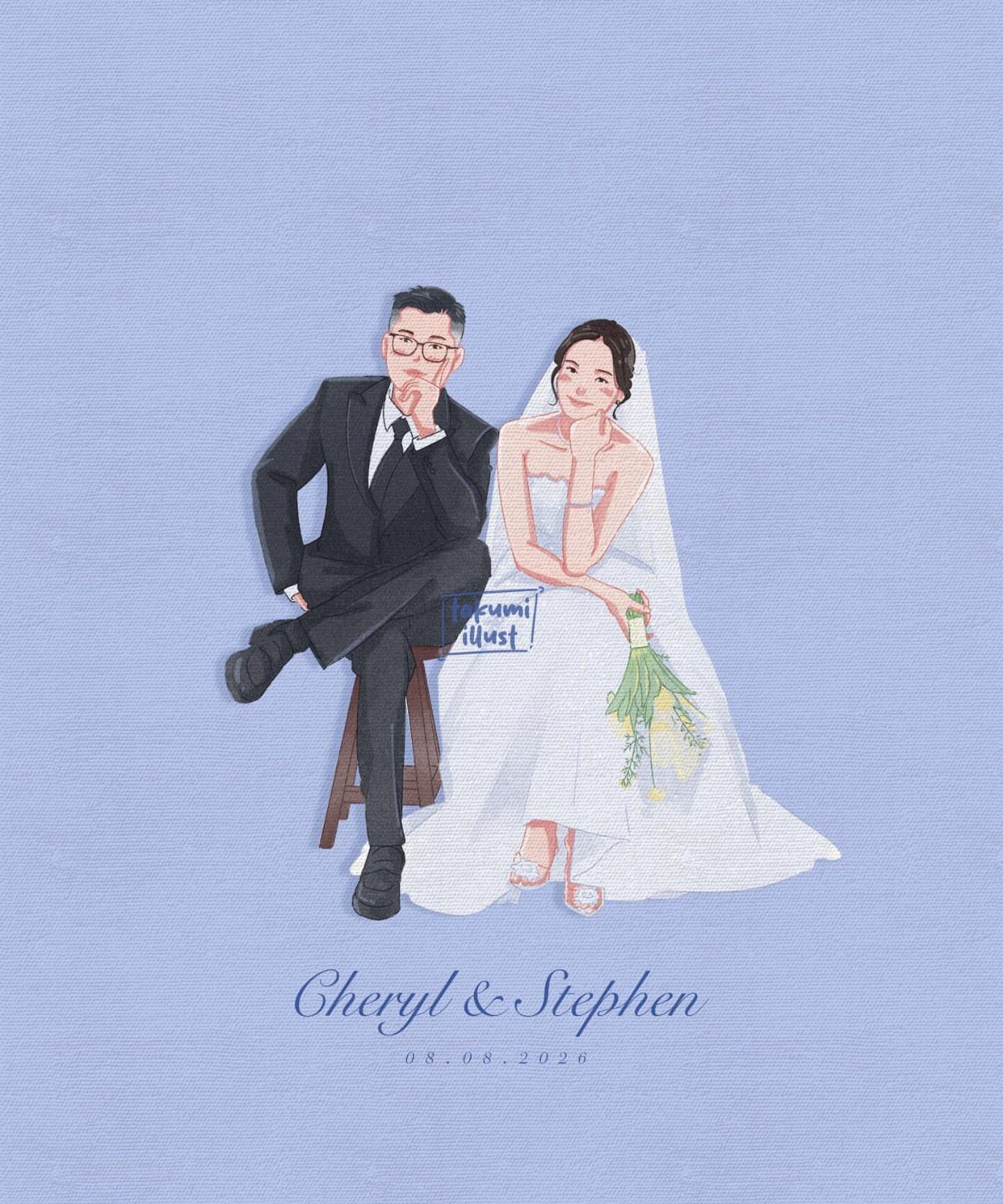
Small illustrated figures of the two of you, placed above your names and the wedding day, turn a standard invitation into something personal. A solid blue background keeps the artwork from competing with the text.
Send the artist a clear photo or a description of the attire, and ask to see a proof before printing. Check the date in the proof, because "08.08.2026" style numerals are easy to mistype.
Illustration costs extra, so I would use it on the invitation alone and keep the other pieces plain.
4. Gold Stamping, Letterpress, and Embossing
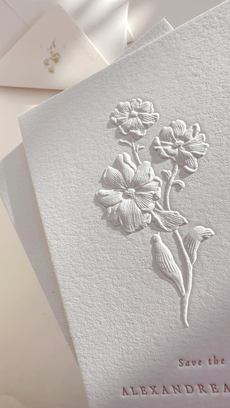
Embossing raises the paper without any ink, so a white-on-white floral pattern shows up only as texture and shadow. Printing a name in a reddish-brown beside it adds color without breaking the soft look.
Embossing raises a design out of the paper without any ink at all, while letterpress presses type into the card and foil stamping lays a thin metallic layer on top.
Each costs more than flat printing, and I would choose one finish rather than all three.
Ask for a thick, textured cotton-style stock so the impression has depth to hold.
5. Virgin Mary Illustration
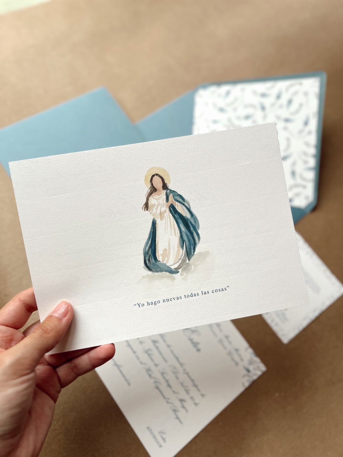
A watercolor Virgin Mary in blue robes with a gold halo gives the card a devotional focus. It suits couples who want faith to lead the design rather than sit in a corner.
A short line of scripture under the image, in your family’s language, makes it personal. Spanish works well here, and any language you choose should be proofread by a fluent reader.
Keep the rest of the card white and the wording brief so the painting stays the center.
6. Cross and Olive Branch Motif
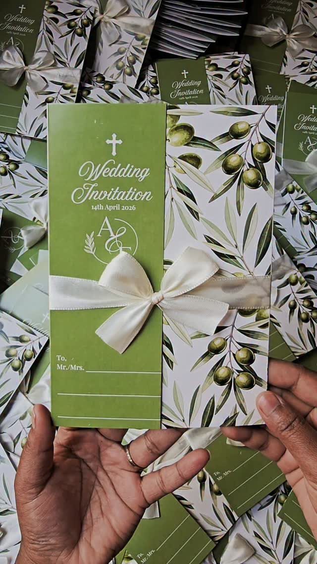
Olive branches around a cross say peace and faith without needing a single image of a saint. Green and white keeps the palette calm, and a white satin bow adds a tactile finish.
A bow means hand assembly, which can raise the price and the time. If money is short, I would ask for a printed bow and keep the real satin for the immediate family.
Leave the date on its own line so it stays easy to find.
7. Religious Icon Wax Seal
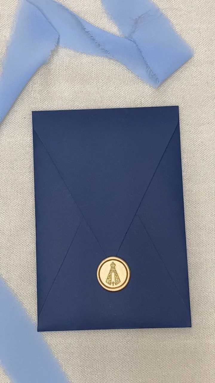
A wax seal turns the envelope into part of the design. Gold wax on dark blue stands out clearly, and a soft blue ribbon beside it keeps the look gentle, so the icon stamp feels devotional rather than flashy.
Order a custom brass stamp with the icon you want, or ask your printer for pre-sealed envelopes.
Hand sealing 100 or more envelopes takes real time, so I would seal only the ones going to close family and use a gold sticker seal for the rest.
Mail one test envelope first, since raised wax can get scuffed in sorting.
8. Monstrance Illustration on Handmade Paper
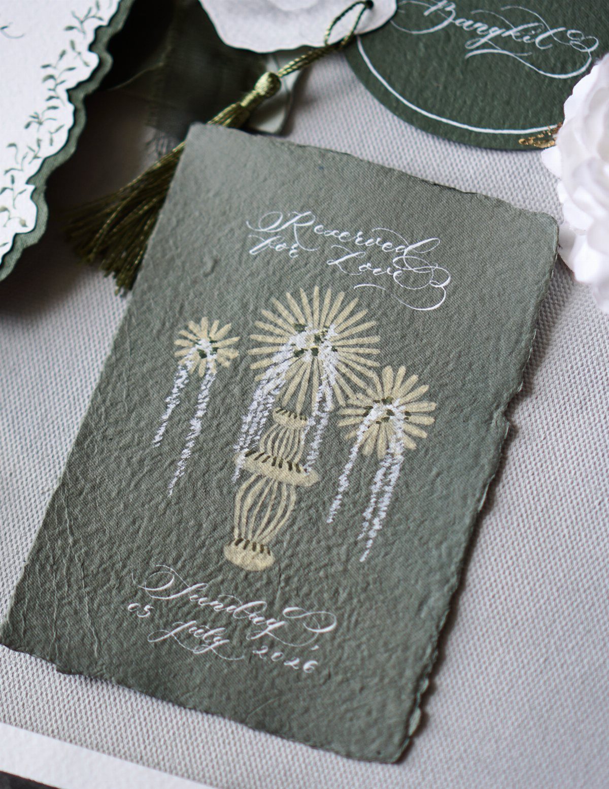
Sage green paper with a deckled edge feels handmade, and a gold monstrance gives it a clear Eucharistic focus.
White calligraphy stays readable on the green, so a line like "Reserved for Love" plus the wedding day can be the only text on the front.
Write the day out in full, weekday first, as the sample here does, and check the weekday against a calendar before approving the proof. Put the rest of the details on a separate card.
Handmade paper costs more than standard stock, so I would use it for the main invitation only.
9. Cross and Satin Ribbon Bow
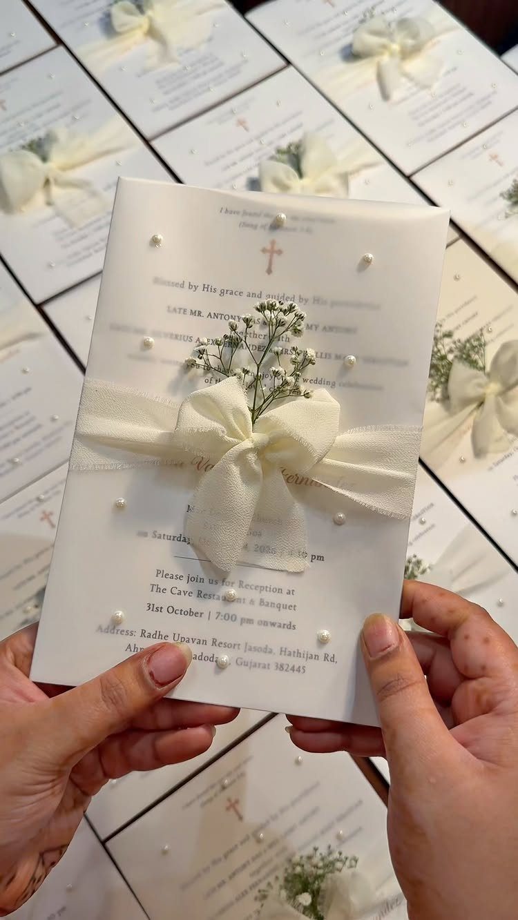
A cross, a satin bow and a few sprigs of baby’s breath make a white card look finished without adding a single extra color.
Hand tied bows cost more in labor, so ask for a quote per piece before ordering for a full guest list.
Tie the bow with the knot centered under the cross, and keep any venue and reception lines short so the front stays uncluttered.
If money is limited, I would put the real bow on the invitations for family and godparents and use a flat printed version for everyone else.
Shipping and Delivery
Mail invitations 8–12 weeks before the wedding.
That window gives guests time to book travel and gives you time to chase late replies. If many guests are flying in, aim for the earlier end.
Work backward from your mail date, because printing, assembly and addressing all take longer than they look. Order early enough that a typo found in the proof doesn’t push you past the window.
Free worldwide express shipping applies to orders over $350.
If your order lands just under that, check whether adding the envelope liners or a details card gets you over the line for less than the shipping would cost. Don’t pad an order with extras you won’t use.
Customer Reviews
Reviews of invitation providers tend to praise 3 things: paper quality, how easy the ordering process is, and responsive customer service.
Weight the service comments most heavily, since a problem with a proof or a delivery is when you will need a person to answer.
Look for reviews that mention a corrected proof or a fast reply, not just a pretty photo of the finished card. Order a sample if the shop offers one, so you can feel the paper yourself.
Customization Flexibility
Wording, design and materials can all be changed, so decide which of the 3 matters most to you and spend there first.
Paper is the easiest place to make a difference.
Pearlescent stock catches light with a faint shimmer that suits a formal Mass, and linen-textured paper feels softer and more rustic in the hand. Pick the one that fits the rest of your day.
Don’t overlook the envelope.
It can match the invitation, use textured paper, and carry a simple religious pattern or your initials. Adding a ribbon or wax seal makes opening it feel more ceremonial, though each addition adds cost, so choose one.





