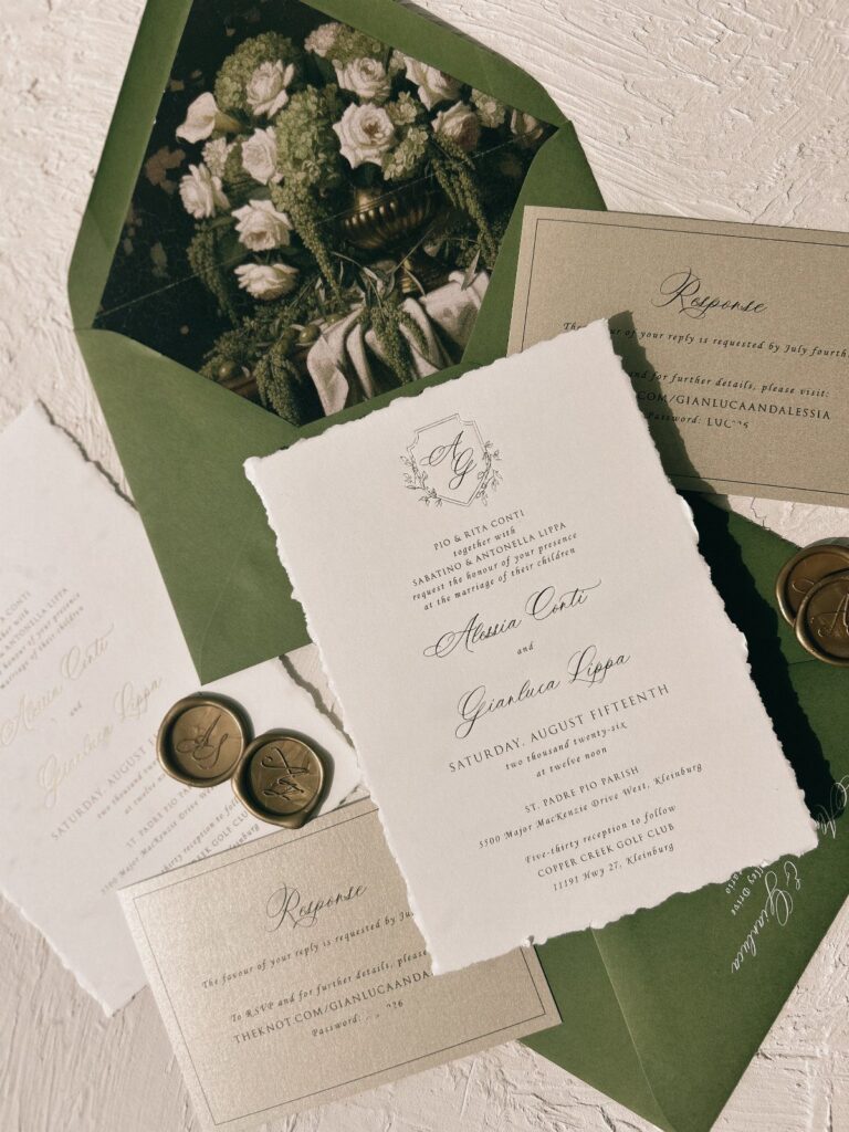
Italian wedding invitations range from a single terracotta urn in a card corner to a full suite with vellum wraps, wax seals and confetti packets tied in ribbon, and the effort climbs with every piece you add.
Your venue and guest list pick the idea: a named villa or church calls for a hand-painted illustration or gold foil, while a destination wedding also needs a timeline, with save the dates going out 9-12 months ahead.
Olive branches suit couples who would rather have Italy hinted at than announced; a single sprig of leaves does the work without a word of explanation.
1. Terracotta Urns
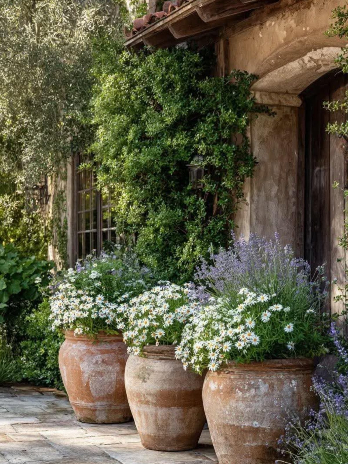
Terracotta urns work as a printed motif and as real decor at once.
Three of them, filled with white daisies and purple lavender, make a simple pairing to echo on an invitation, whether as a small illustration in a corner or a repeating border.
Keep the palette to those same 3 colors: terracotta, white and purple. Fewer shades on the card means the urns read clearly, and the flowers on the day can match the paper exactly.
2. Hand-painted Venue Illustrations
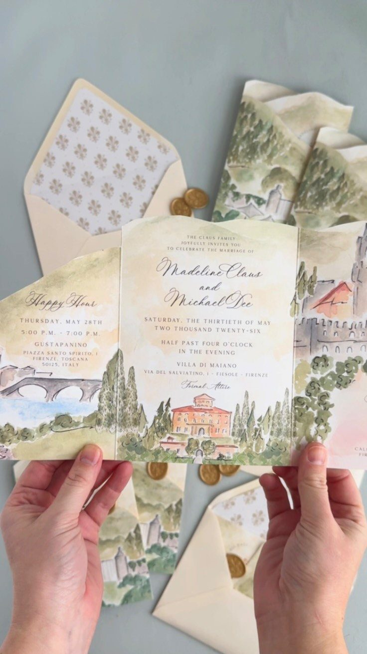
A watercolor of the actual venue turns an invitation into a keepsake. Here the villa and its landscape are painted by hand, and the names and the villa’s name sit in plain type beside the artwork.
Paint the building you are marrying in, not a generic Italian farmhouse; guests will recognize it, and it tells them where they are headed.
Send the artist clear photos of the villa, and ask whether the painting can be reused on envelopes or a welcome sign.
3. Wedding Stationery Design
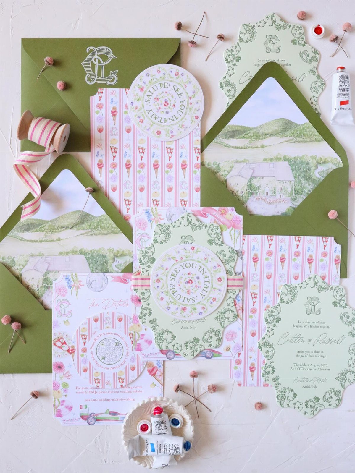
Stationery that begins on the invitation and carries through the weekend feels planned, not assembled.
A custom villa illustration, a green envelope and pink striped cards can all share one set of colors, so each piece looks like a relative of the others.
Reuse the same illustration on the details card, and pull the stripe pattern onto menus or programs.
My pick is one strong illustration repeated across the whole suite instead of many different designs. It costs less in design time and looks more confident.
4. Lemon and Citrus Designs
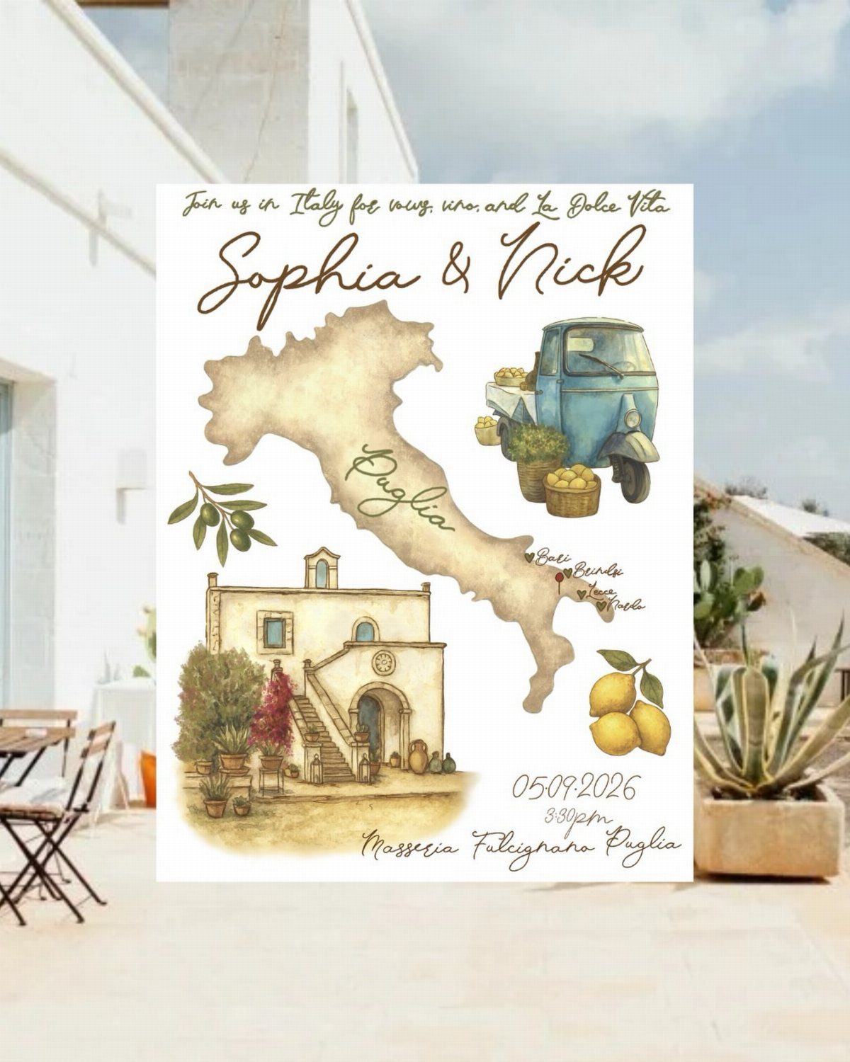
Lemons say Amalfi faster than any other symbol, and they pair easily with a map, a vintage vehicle and a stone building.
Puglia is the setting here, so the citrus sits alongside an olive branch and a hand-drawn route to the venue.
Keep the lemons as accents, not the whole design.
A map with a few bright yellow fruits stays legible, and the date and venue name still get the space they need. Yellow against blue is the combination I would choose.
5. Olive Branch Designs
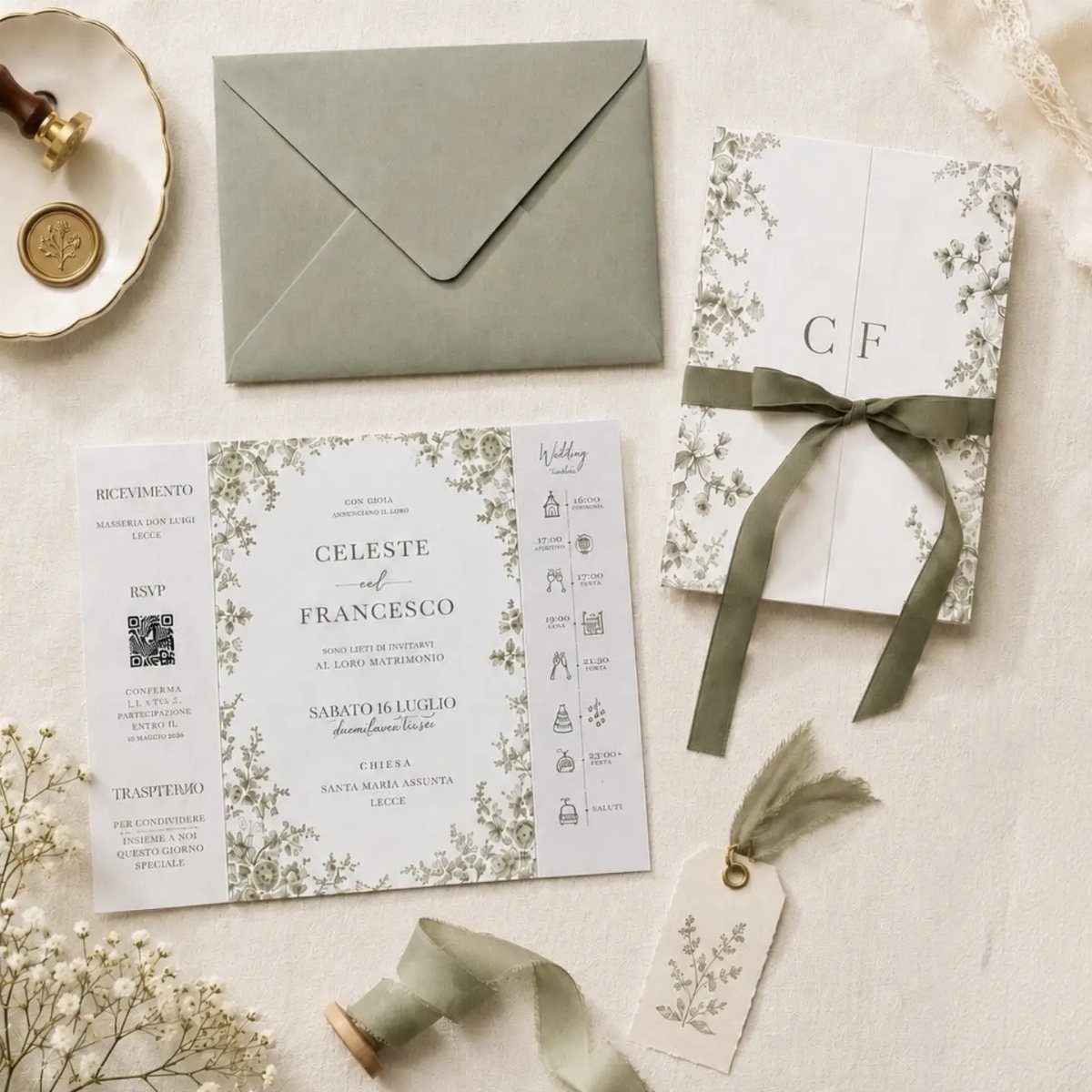
Olive branches are the quiet choice. Running them as a border around the text, on paper with a sage green envelope, gives an Italian feel without any loud imagery.
Because the motif is so restrained, it suits couples who want Italy to be felt more than announced. Pair it with Italian wording, such as a couple’s names joined by "e", to push the theme a little further.
6. Majolica and Tile Patterns
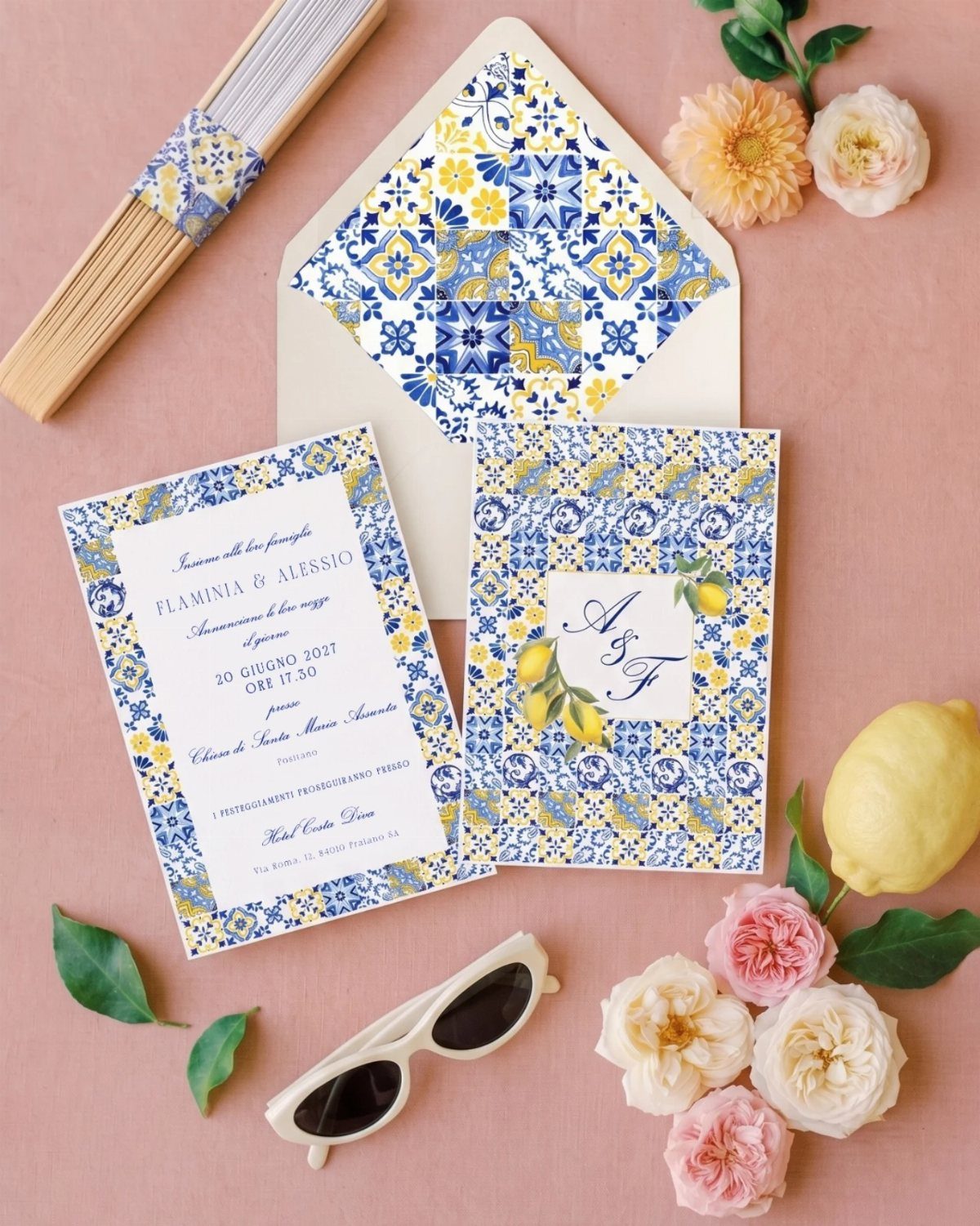
Majolica patterns bring bold geometry. Blue and yellow tiles, with a lemon motif tucked among them, give the paper the look of a painted ceramic plate.
Use the pattern in one place, like the envelope liner or a card border, and leave the main text on a plain field.
Dense tile designs fight with small type, and guests need to read the date. A pink background makes the blue and yellow stand out even more.
7. Wax Seals and Vellum Wraps
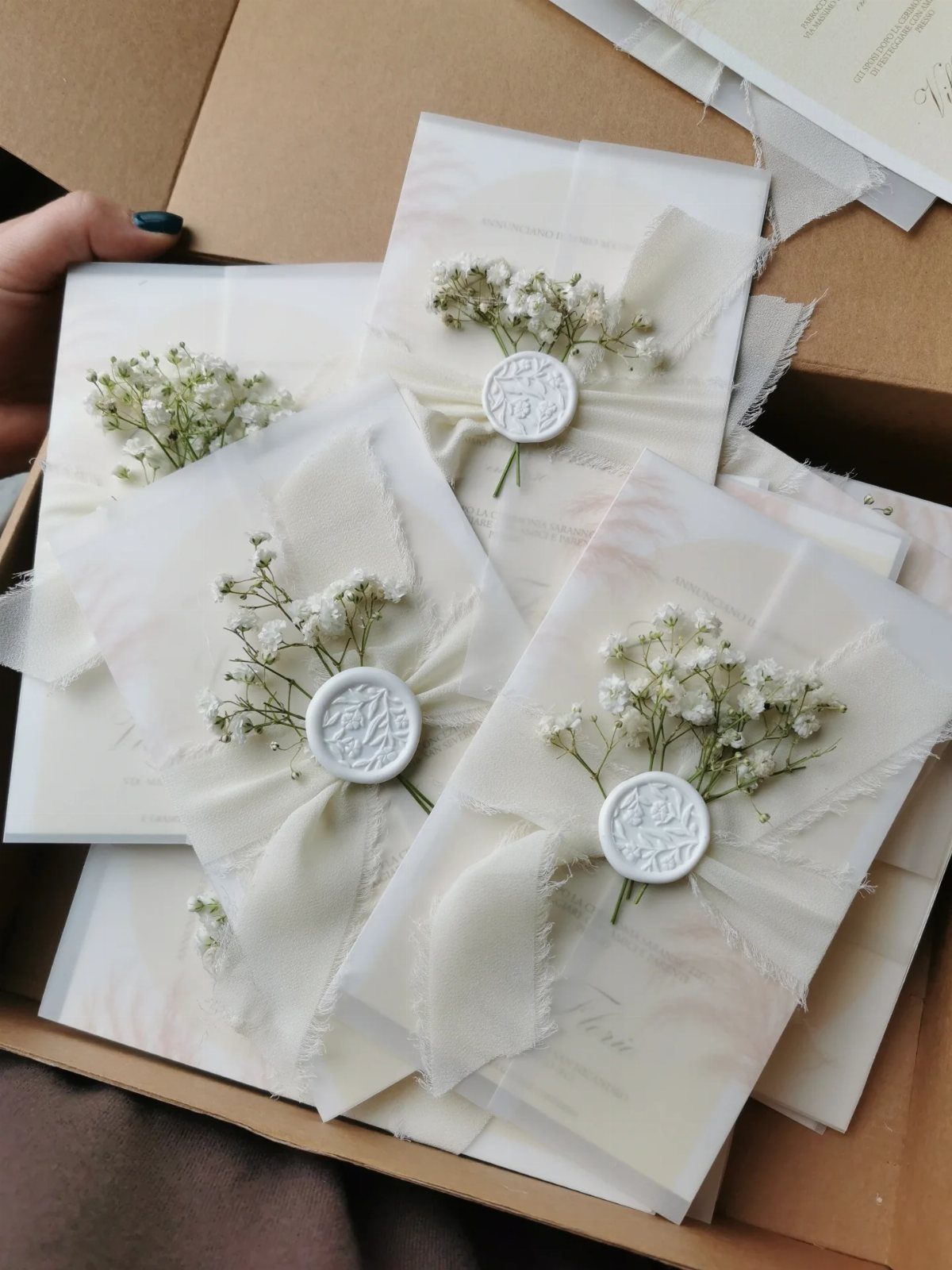
Vellum turns a stack of invitations into a small parcel. A translucent wrap, a white wax seal and a sprig of baby’s breath on top let guests see the card before they touch it, which builds a little anticipation.
Keep everything white or close to it, as the wrap, seal and flowers do here, so the card inside stays the focus.
Choose the seal and the dried or fresh sprig as the finishing touch, and expect to assemble each one by hand, which adds time to a large guest list.
8. Gold Foil and Tassel Invitation
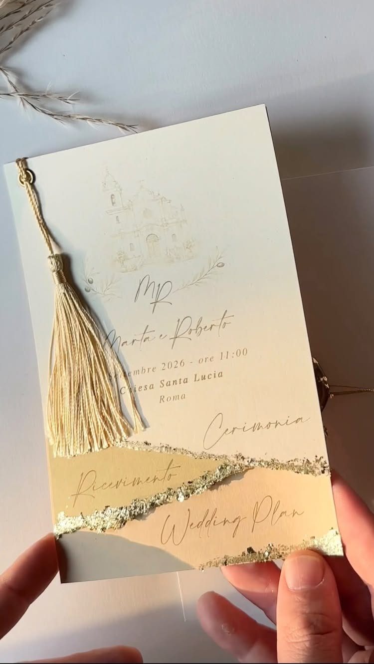
Gold foil and a tassel give a cream card the weight of a formal Roman invitation.
Foil is best saved for the names, "Marta e Roberto," and the church line, "Chiesa Santa Lucia," so the shine lands where eyes go first.
A small sketch of the building beside the text tells guests where they are headed without crowding the type.
I would stop at foil, sketch and tassel. Adding a fourth embellishment would crowd a card that looks best when it stays calm.
9. Playful Illustrated Caricature Invitation
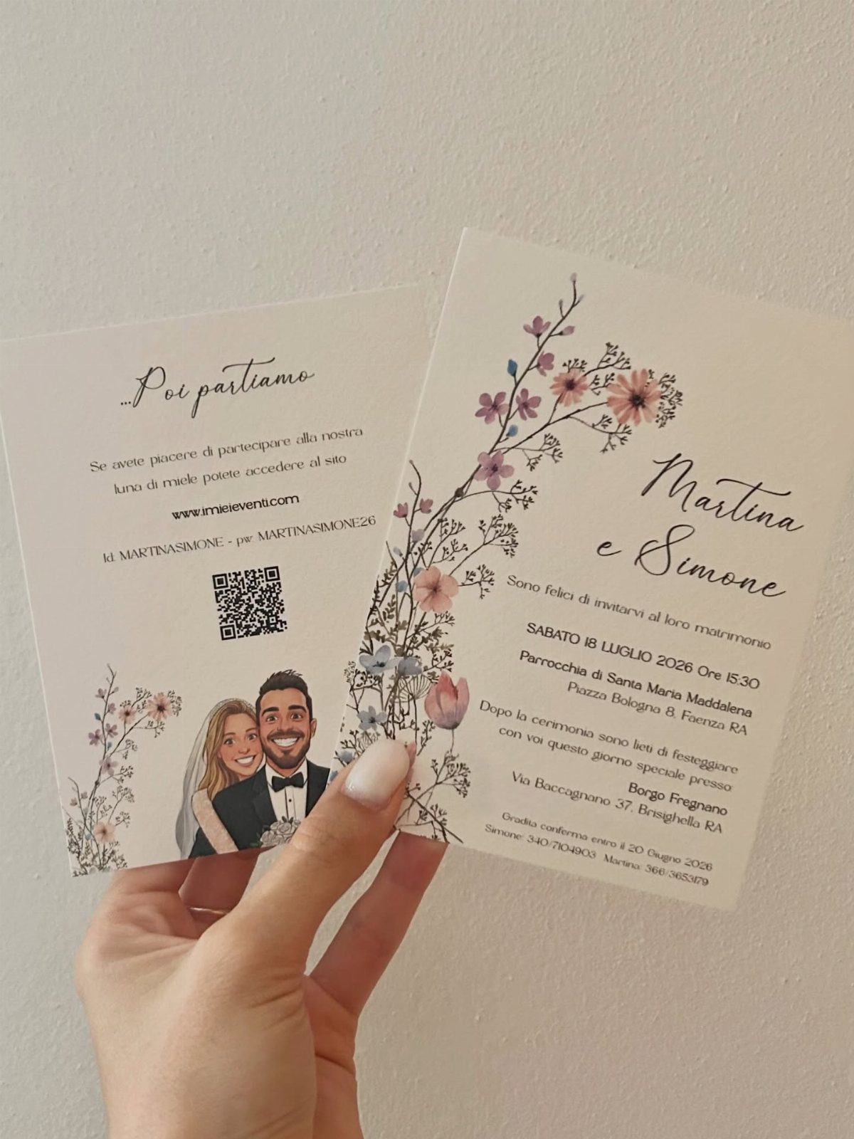
A cartoon couple tells guests the party will be relaxed before they read a word.
Pair the caricature with a light floral border, as on these cards, and keep the type simple so the Italian date line stays easy to read at a glance.
A QR code is a practical addition: it can lead to an RSVP page or a schedule, which saves printing extra inserts. Print it large enough to scan, and give it a plain white patch with no pattern behind it.
10. Confetti Packet and Ribbon Suite
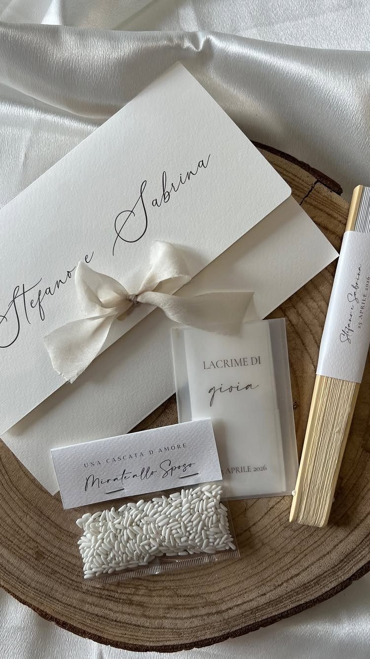
Confetti packets are a traditional Italian wedding touch, and tucking one beside the invitation makes the suite feel complete. A white packet labeled "LACRIME DI gioia" (tears of joy) sits well next to a white card tied with a ribbon.
Match the ribbon to the paper so the packet reads as part of the set, not an add-on.
Choose a label with Italian wording, since the phrase does the theme work for you. A small extra card can hold the practical details.
Destination Wedding Invitation Timeline
Timing matters more for a destination wedding than for a local one, because guests have to book flights before they can say yes. Send save the dates 9-12 months ahead, so international guests have the longest possible window to plan.
For the invitations themselves, I’d aim for 10–12 weeks before the wedding day. That is earlier than the 8 weeks usual for a domestic wedding, and the extra time gives people room to RSVP once their travel is settled.
Tuck 2 practical cards in with the invitation:
- Accommodation: hotel blocks, Airbnb clusters and local villa rental suggestions.
- Travel: nearest airports, transport options and driving distances.
Guests who see those details up front can book with confidence, and you answer fewer individual emails.
Save a welcome note or itinerary for later, 2-4 weeks before the wedding or on arrival.
Use it for your restaurant picks, the welcome dinner details and a rough schedule of the wedding day. I would keep it separate from the invitation, since the schedule may still shift while you are mailing the first pieces.





