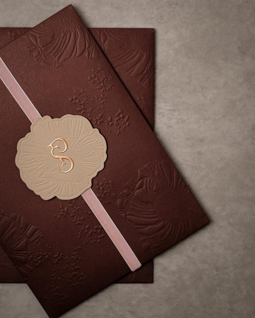
Fancy can mean anything from a lace cutout invitation to foil accents, a satin ribbon tied suite or a luxury designer set.
Costs climb with every hand-finished element, like ribbon ties, vellum wraps and foil, so my rule for picking a style is how much assembly time and money you have before the mailing date.
Mail 6–8 weeks ahead for a local wedding, and work backward from that deadline to decide how many wax seals, ribbons or vellum wraps you can handle.
1. Sample Invitations
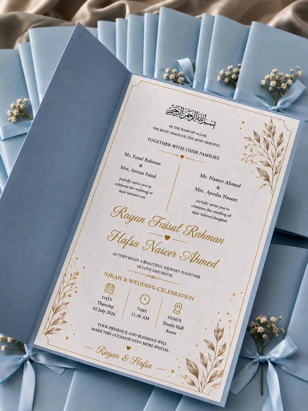
Get printed samples of your top designs first, since a final order is hard to undo.
Compare two or three designs side by side, and check the print against the paper.
Gold calligraphy on light blue is a delicate pairing, so hold the sample at arm’s length and read the date and both names aloud to see if the lettering holds up.
Samples cost little next to a full order of reprints, which makes them the cheapest insurance on the page. Request them early, since shipping eats into a tight timeline.
2. Matching Stationery Suite
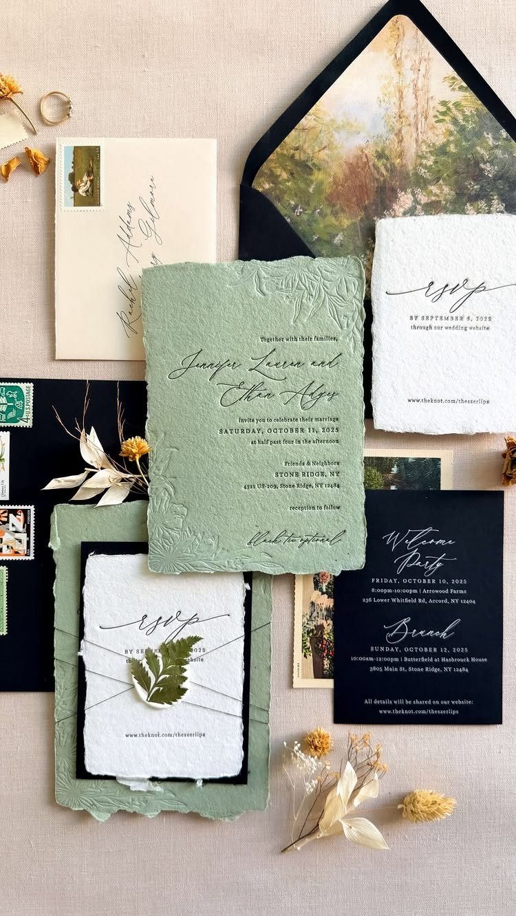
A matching suite means the invitation, RSVP card and details card share one palette and one typeface, so guests read them as a single piece. Sage green paired with black type keeps the set calm and legible at a glance.
I like it best when the pieces differ in size but not in style. Order everything from one designer at once, so the ink and paper stay consistent between cards.
For a fancier feel, the maker of this suite used letterpress on seeded handmade paper with a blind-debossed floral border. That’s an upgrade to price out, not a requirement.
3. Classic Wedding Invitations
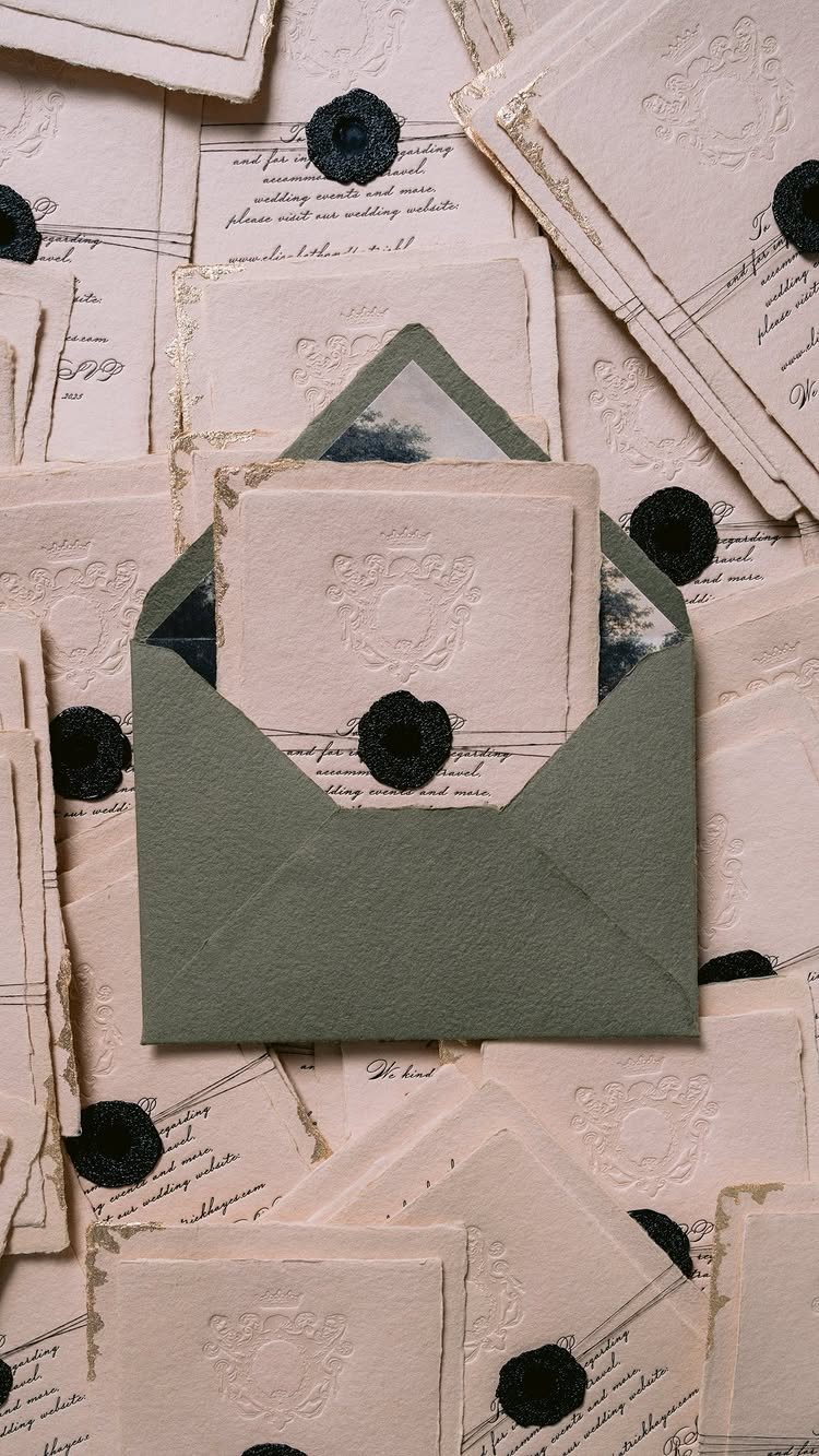
Cream paper with cursive type is a safe base, and the sage green envelope adds just enough color.
Formal phrasing and a simple layout work best here, because the crest and seal already do the decorating. Wax seals add hand time to assembly, so test one before buying 100.
I’d choose this over trendier styles if the invitations will end up in a keepsake box.
4. Envelope Addressing
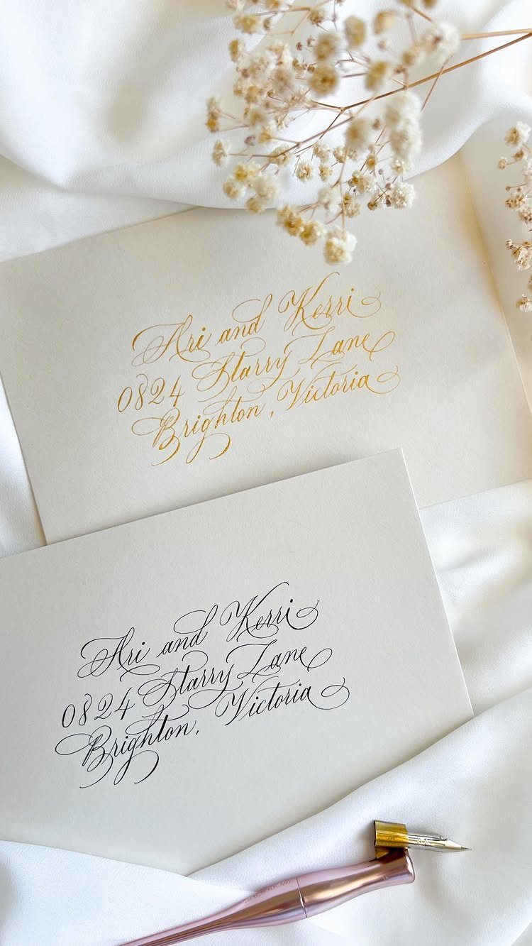
Calligraphy on the envelope is the first thing guests see, so it sets the tone before they open anything.
Free addressing, where a stationer offers it, saves real money, since hired calligraphers usually charge per envelope. Send a clean, final guest list with correct spellings and full addresses first.
Ask for a sample envelope before the whole batch is written. Corrections after the ink dries are costly.
5. Rustic Wedding Invitations
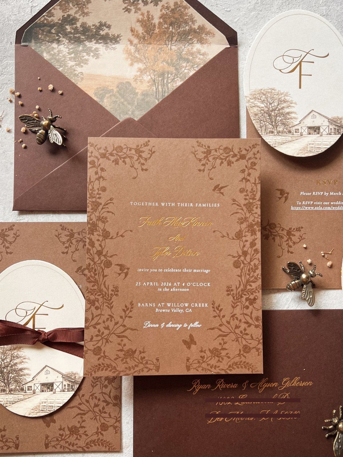
Rustic invitations lean on earthy browns, barn illustrations and gold calligraphy to suggest a farm or barn venue. Pairing the brown with cream keeps the text readable.
Small extras such as name tags and dried flowers add charm, but each one adds cost and assembly time. On a modest budget, I’d keep the barn illustration and skip the extras.
Match the style to the venue. A barn print on a ballroom wedding sends a mixed message.
6. Vellum Details and Belly Bands
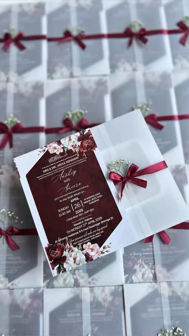
A vellum overlay turns a plain invitation into something layered, with the printed design softly visible beneath a translucent sheet. A burgundy ribbon belly band holds it together and picks up the red florals.
Use it when the invitation itself is simple, since the vellum and ribbon supply the drama. I’d pick a ribbon color already in the print so the set feels planned.
Both pieces need hand assembly, so budget time for wrapping each invitation, or pay the printer to do it.
7. Invitations with Foil Accents
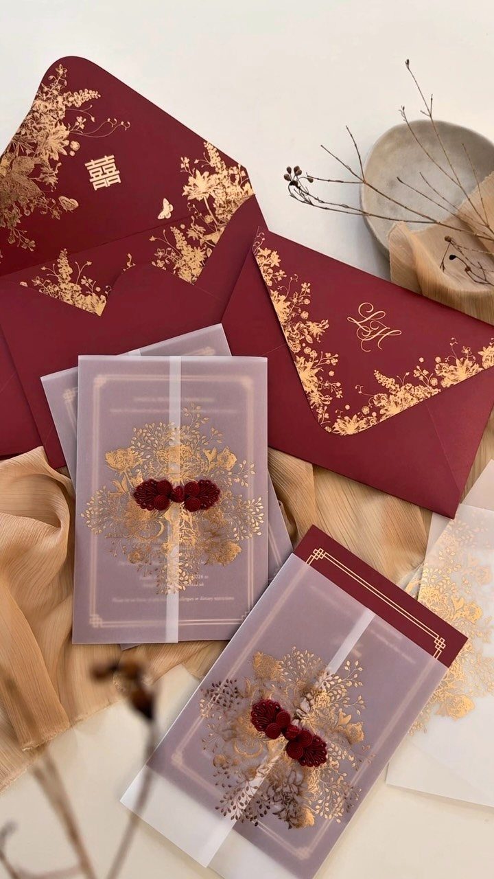
Gold foil on red and purple paper gives a floral pattern a raised, metallic shine that flat ink can’t copy. The red wax seals pick up the red in the paper, so the set looks planned.
Foil costs more than standard printing, so I’d limit it to one element, such as the florals, and print the wording in plain ink.
Keep the type dark and simple, because foil catches light and can make small text harder to read.
Ask for a printed sample before ordering, and tilt it under room lighting.
8. Luxury Designer Invitations
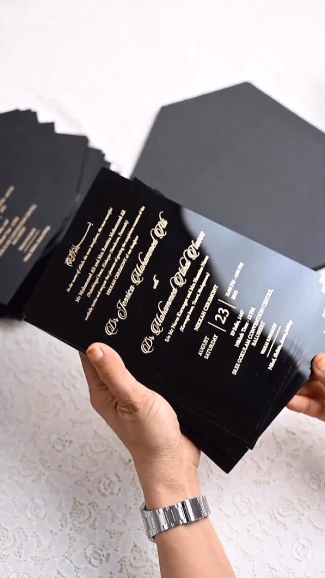
Gold on black reads crisply, so the names, title and date stay legible.
Bespoke means you choose the wording, layout and materials, and the price follows.
Since every detail is custom, proofread the names and titles twice before approving. A "Dr." line like the one here is the kind of detail to confirm in writing.
If money is limited, I’d save this style for the invitation itself and keep the other cards simple.
9. Lace Cutout Wedding Invitations
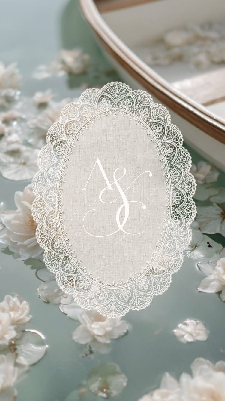
An oval invitation with a laser-cut lace border and a central monogram looks delicate without any extra trim. The cutwork is the decoration, so I’d keep the monogram small and the wording minimal.
The maker pitches this as an alternative to spending $500+ on paper invitations, which is worth weighing against quotes for letterpress or foil. Get quotes from at least 3 printers first, since laser-cut lace pricing varies a lot.
Oval shapes may need a custom envelope, so ask about that early. Order a sample to check the lace edges feel sturdy.
10. Satin Ribbon Tied Suites
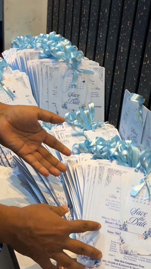
White cards with blue floral accents and a light blue satin ribbon make a quiet, cohesive set. The ribbon repeats the blue in the flowers, which is what ties the stack together.
Tying each bundle by hand takes time, so count your invitations and plan an evening or two for it, or ask the printer to assemble them. I’d choose satin over thin craft ribbon because it holds a clean bow.
Keep the knot flat so the envelopes mail without bulk.
How to Choose Styles
A modern clean-lined card suits a loft or gallery, and a classic one suits a formal or romantic ceremony. Whatever you choose, the invitation is the first hint guests get about how dressed up to be.
Paper is where "luxury" actually shows up: fine-art paper, cotton stock and premium envelopes are the materials to ask about. I’d spend on those before adding extra trims.
Classic designs hold up well because they never go out of style, and guests tend to keep them.
If you can’t decide between two looks, pick the one you expect to still like when the album comes out of the closet.
Planning Timeline
Count backward from the wedding date. Mail invitations 6–8 weeks before a local wedding, and closer to 6 weeks if nearly everyone lives nearby.
For a destination wedding, or when many guests need flights and hotels, mail them 8–12 weeks ahead. Travelers need that time to book.
A save the date should go out several months before the invitations. It matters most for a busy time of year or when guests are traveling, because it gets your date onto their calendars early.
Work out your mailing date first, then set the printing and assembly deadlines behind it. Anything hand-assembled needs extra days.
RSVP Importance
Include the RSVP card. It isn’t strictly required, but it gives you a firm headcount, and that number drives seating, catering and every other logistics decision.
It also makes replying easy. Guests don’t have to hunt for paper or an envelope, so more of them answer on time.
I’d treat it as the one card to skip last. If money runs short, cut a trim or an insert before you cut the RSVP.
Set a reply-by date you can live with, and leave yourself time to chase late answers before the final numbers are due.
Frequently Asked Questions
What is the average cost of wedding invitations?
Couples typically spend around $160 for 100 invitations, though design, paper, printing method and extras like inserts and RSVP cards can push that up or down.
Foil, letterpress and laser-cut lace cost more than standard printing. Price at least 3 printers against the same specs, and pay for a single printed sample so you can feel the paper before the whole order goes through.
How early should you send out wedding invitations?
Mail them 6–8 weeks before the wedding.
If nearly everyone lives nearby, closer to 6 weeks is fine. Guests who must book flights and rooms need extra lead time, so a destination wedding calls for mailing 8–12 weeks out.
Is an RSVP card necessary?
Technically you can skip it, though I’d drop almost anything else on the suite before this card. Including a response card with a pre-stamped return envelope also makes replying easy, so more guests answer on time.
Pick a reply-by date a few weeks before your caterer’s final count is due; that gap is where the phone calls to stragglers happen.





