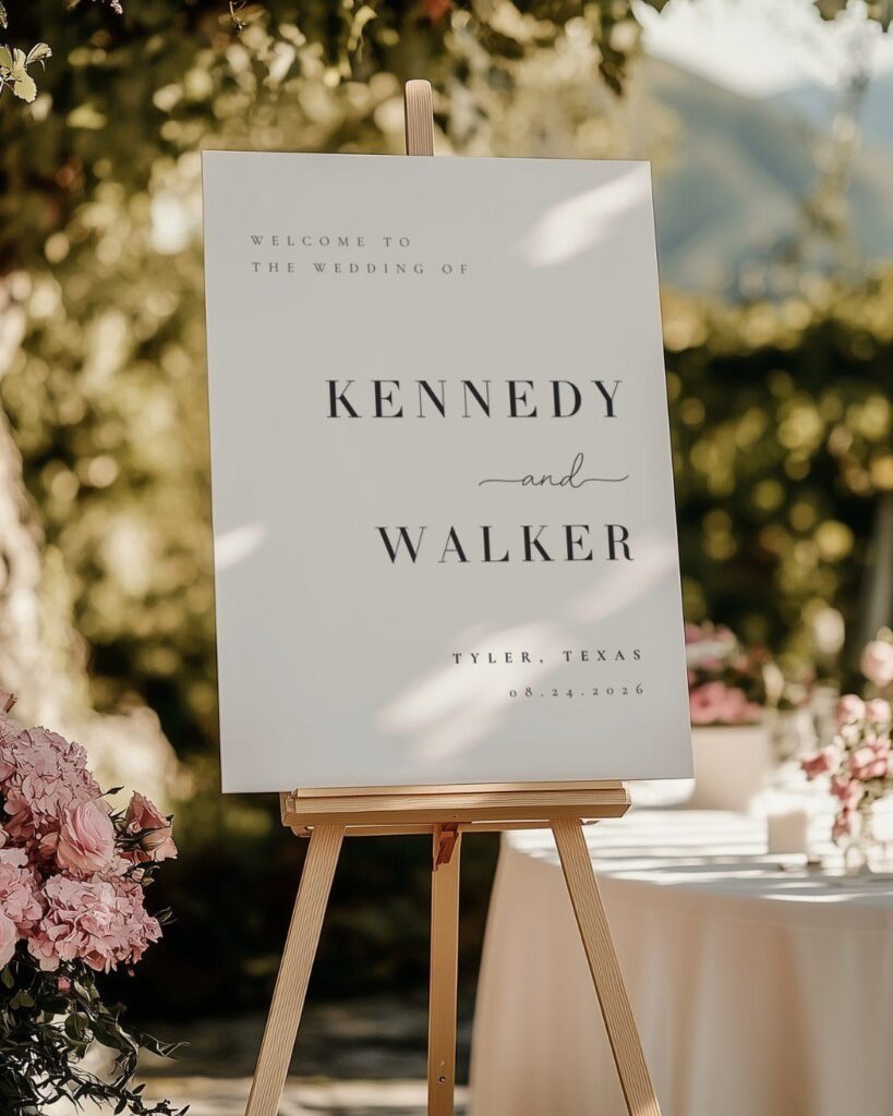
Your venue and guest count decide which signs you actually need, and the list runs from a welcome sign and table numbers to a memory sign or a timeline of the day’s start times.
Most weddings land at roughly 4 to 8 signs, so ask the venue what it already supplies before ordering any.
1. Welcome Sign
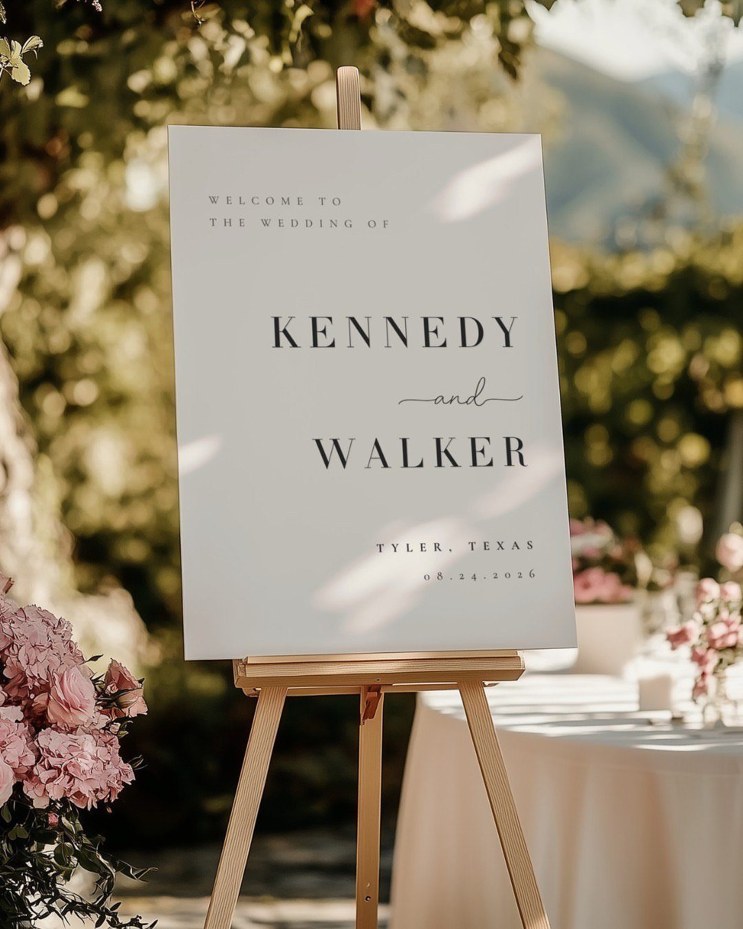
A welcome sign works hardest when guests can read it from the path, so a tall easel is a smart choice. The white board with names, city and date in plain lettering does the job without fuss.
Short wins on a welcome sign: both names, the place and the date, and nothing else. Anything more gets skipped by guests walking past with a drink in hand.
Set it where people pause, near the ceremony entrance rather than the parking lot.
2. Seating Chart
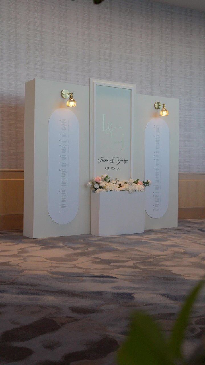
3 panels give a seating chart more room than a single board, and that matters once the guest list gets long. Splitting names across panels keeps the print larger and easier to read.
Printing the couple’s names and the date at the top ties it to the rest of your paper.
I would put it where guests can gather without blocking the door, since a line forms fast. Lighting helps too; a chart in shadow causes a pileup.
3. Table Numbers
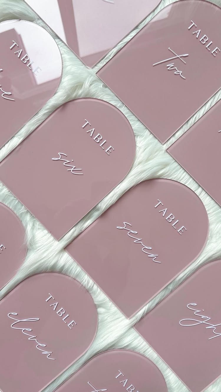
Acrylic table numbers in an arch shape are my pick when you want something that looks finished without much styling. Script numbers read as pretty, but spelling them out in words, like "six" or "eleven", keeps them clear.
Order one extra in case of a typo or a crack. Set them at the height of the centerpieces or slightly above, so a guest can spot their table from across the room.
4. Bar Sign
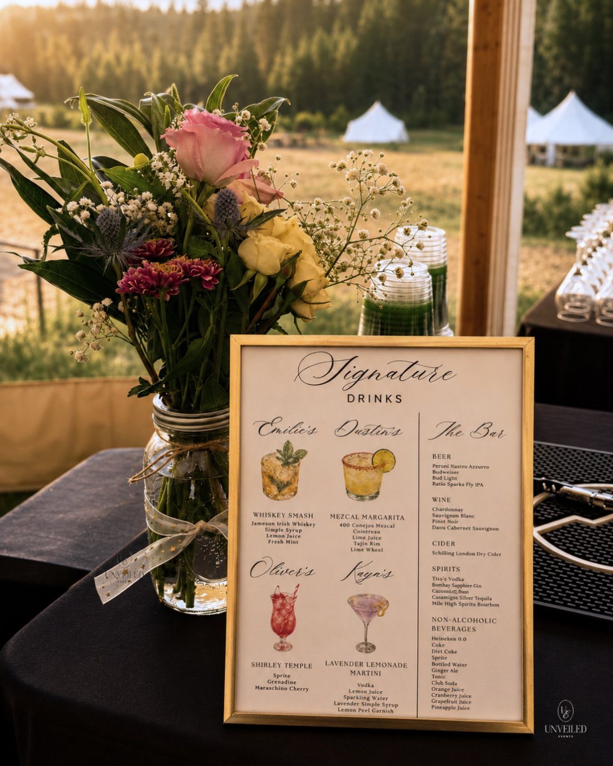
A framed "Signature Drinks" sign lets you name a cocktail for each of you, or for people close to you, and it gives the bar a personality that a menu card tucked away never will.
List the drinks with short descriptions, and keep beer, wine and spirits on the same sign so guests know every option at a glance.
A frame protects the print from spills and looks tidy. Keep it to a few drinks; more slows the line.
5. Guest Book Sign
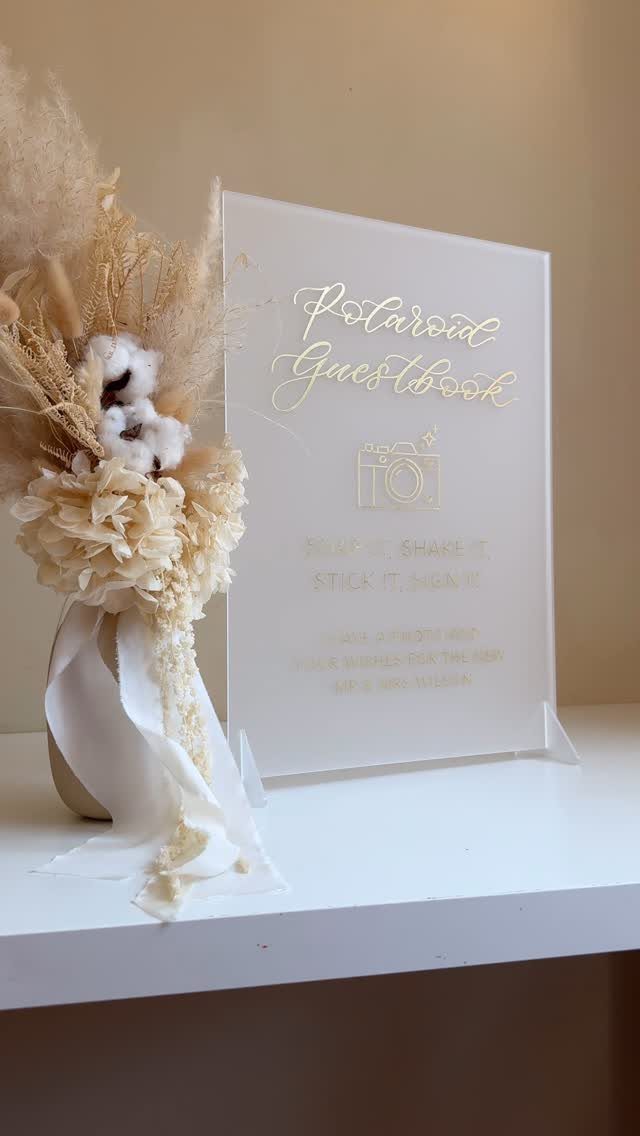
A Polaroid guestbook starts with the sign, and a clear one saves you from explaining it all night.
Place it beside the camera, the film and a pen so guests can write on the photo’s border.
A basket or album should sit in the same spot. Test the setup before the reception, since an empty film pack ends the idea early.
6. Interactive Guestbook Sign
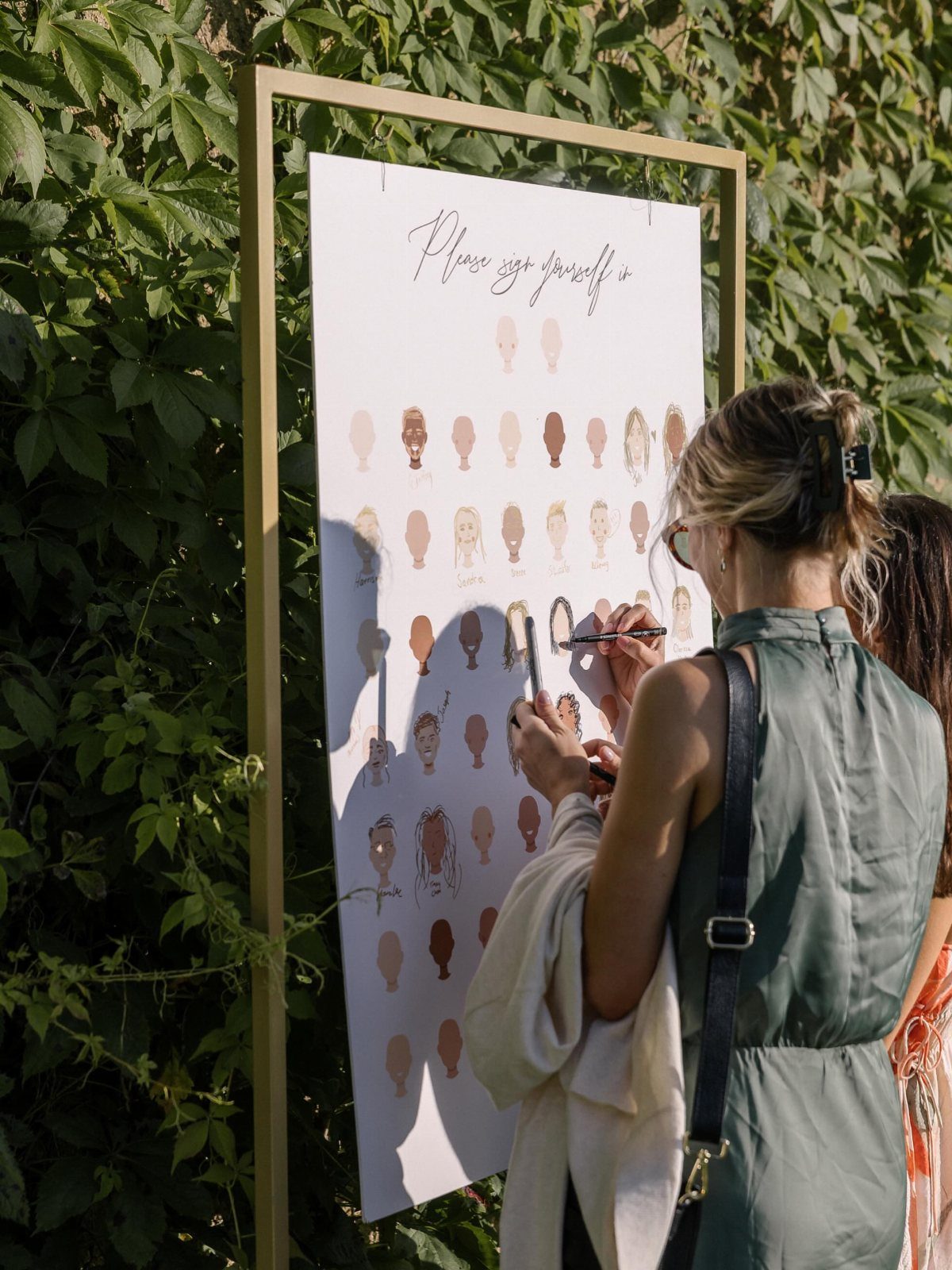
"Please sign yourself in" turns the guestbook into a small art project: guests color or draw on face outlines instead of writing a line they feel they must make clever.
I like this one for crowds who shy away from blank pages.
Put out markers in a few colors, and choose a sturdy frame that can sit upright without wobbling under a pen. Set it on a standing-height surface where guests walk in, so they find it early.
7. Gifts & Cards Sign
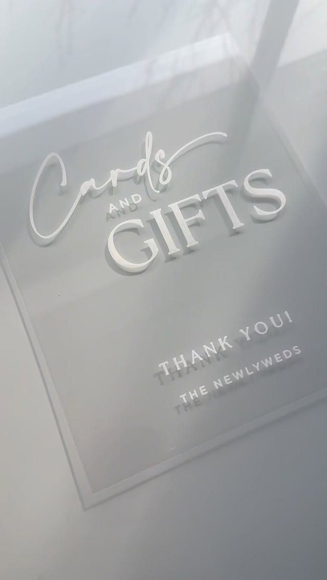
Clear acrylic with white 3D lettering reads cleanly against a light surface, and a sign that says "Cards and Gifts" saves guests from wondering where to put the envelope in their hand.
Set it directly on or beside the table, so the message and the spot are one thing.
Put the table on the reception’s main path or by the door, where guests pass early and can drop off a gift before they pick up a drink.
The thank-you line is a nice touch; it costs nothing extra and starts your gratitude before the thank-you notes do.
8. Unplugged Ceremony Sign
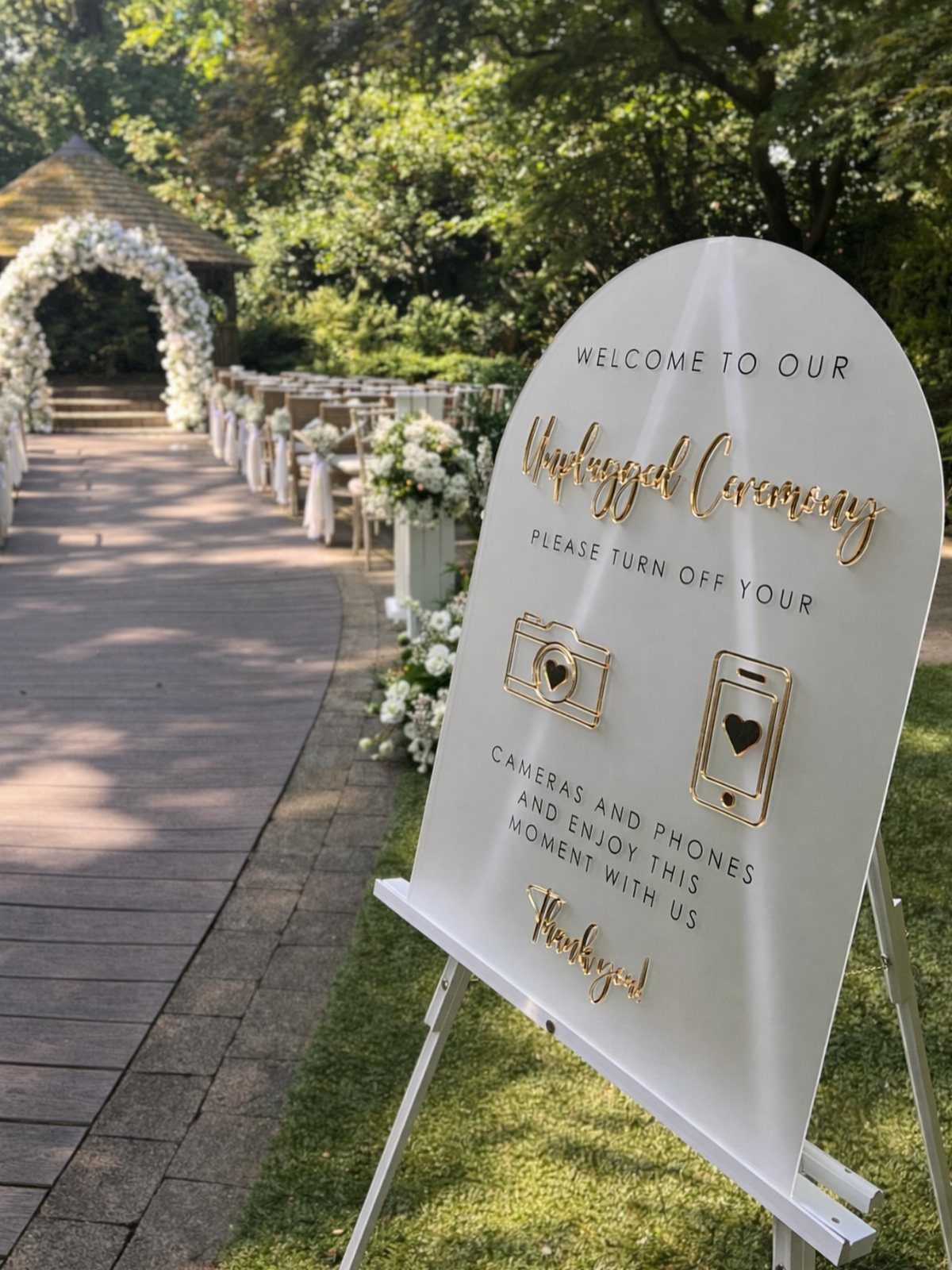
Phones raised in the aisle end up in every photo your photographer takes, and an unplugged sign asks guests to put them away before the ceremony starts.
A white arch with gold text and small camera and phone icons makes the request without a lecture.
Place it on an easel at the ceremony entrance, where guests read it on the way to their seats, not beside the altar where it arrives too late.
Ask your officiant to repeat the request aloud. A sign alone gets missed.
9. Memory Sign
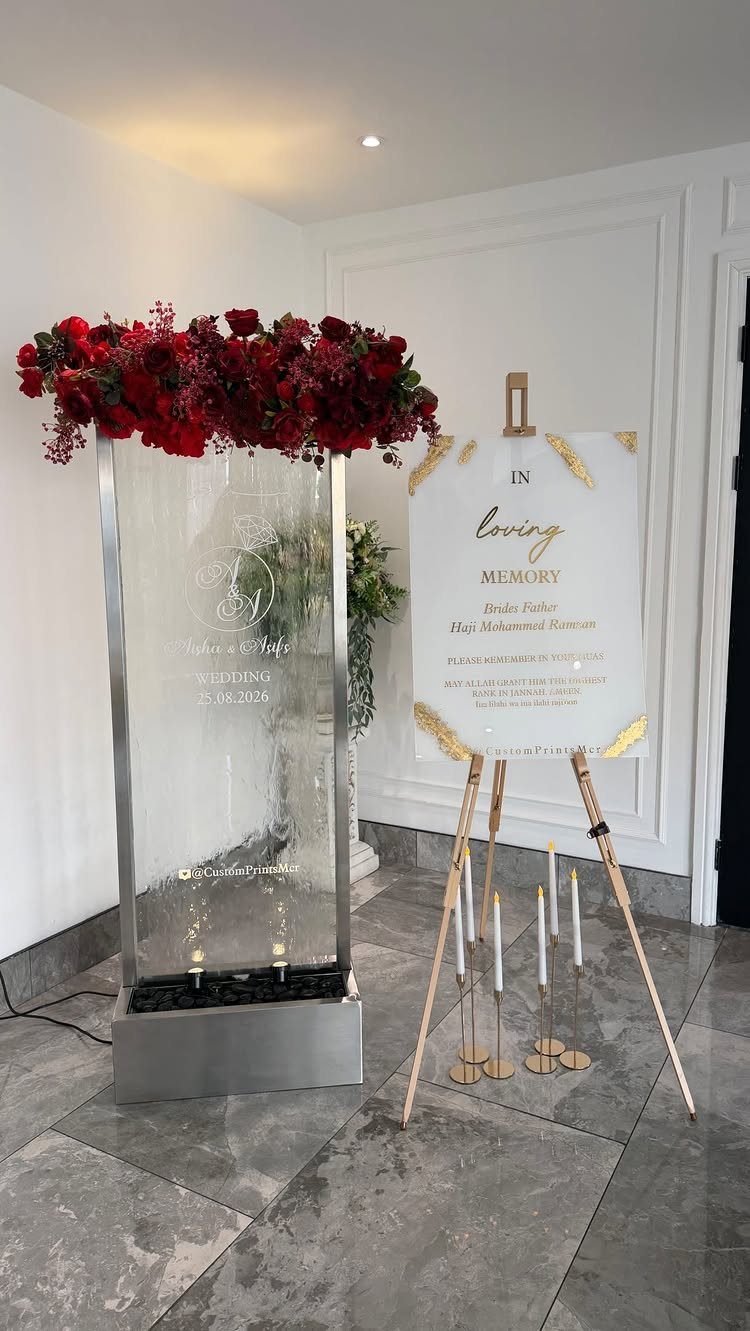
A memory sign gives a lost loved one a place at the wedding without needing a speech. "In Loving Memory" and the name are all the sign needs.
I like it paired with flowers and candles, since the sign then becomes a small corner of its own and not an afterthought. A wooden easel keeps it upright and at eye level.
Put it somewhere quiet near the ceremony space or the entrance, away from the bar line, so guests can pause for a moment.
A personalized plaque with your names is an option if you want the tribute tied to the day.
10. Timeline Sign
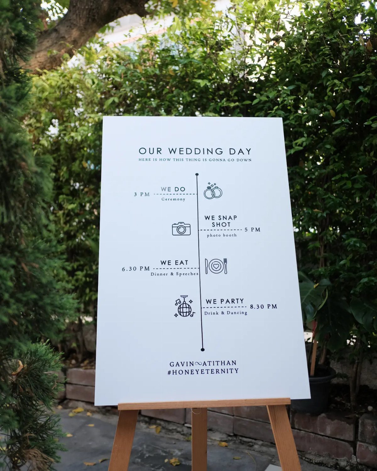
A short list is enough for a timeline sign: ceremony, photos, dinner, dancing, each with its start time. That is all this one carries, and it is the right amount.
Guests glance at it while holding a drink, so use light wording and large times. "We do," "we eat" and "we party" read faster than formal labels and suit a casual crowd.
Confirm the times with your venue and caterer before printing, because a sign with the wrong times is worse than none. An easel by the entrance is the usual spot for it.
11. Reserved Seating Signs
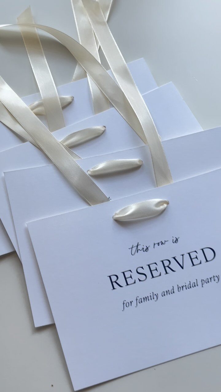
Small cardstock signs tied with satin ribbon are the cheap way to hold front rows for family and the bridal party.
This version reads "this row is RESERVED for family and bridal party," which names who the seats are for and ends the guesswork.
Tie one to the aisle end of each reserved row, or to each chair, so it is visible from the back.
I would print a spare or two in case one gets lost. Tell your ushers which rows are held, since signs alone are easy to sit past.
12. Pick a Seat, Not a Side Sign
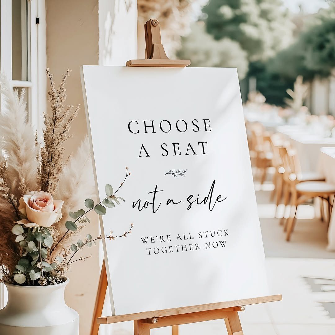
Open seating at the ceremony works only if guests know it is allowed, and "Choose a seat, not a side" says so with humor. The line "we’re all stuck together now" softens the request, so nobody feels scolded.
Put the sign on an easel at the head of the aisle, where guests see it before they pick a row.
It is the best choice when family lists are lopsided, and your ushers can repeat it kindly.
Importance of Wedding Signage
Signs do a job a person would otherwise do. They point guests to the right spot, share the schedule, and answer questions before anyone has to ask, which matters when no staff member is free to stand at the door.
They also count as decor. Matching fonts, colors and materials across your signs makes the whole day look planned, and the style can be rustic, romantic, boho or modern.
I treat signs as part of the design and not as an add-on. A sign that does its job and looks like it belongs gives you both at once.
How Many Signs to Include
Plan on roughly 4 to 8 signs for the whole day. Larger venues can push the count to 10 or so, mostly because they need extra signs to point guests from one space to the next.
Add more only if a gap shows up.
The number depends on your venue layout, whether seating is assigned, how many guest stations you plan, and how self-explanatory the setup already is.
Before you order anything, check with the venue about which signs it already supplies. Many venues handle a good share of guest direction, and I would hate to see you pay for signs that repeat it.
Materials and Styles
Acrylic is the traditional pick, but wood, mirror and foam board all work. Mixing two or three materials adds variety, as long as fonts and colors stay consistent.
A mirror sign is a fun alternative for a welcome sign. Write your greeting and wedding details on the glass, and guests will stop to take selfies in front of it.
Easels, crates and hanging frames give a sign some height and a finished look. Floral accents soften the edges of any material.
Read every sign twice before it goes to print, and place the order early so a typo can still be fixed. A misspelled name on acrylic or wood can’t be fixed, and a reprint eats time you may not have.
Frequently Asked Questions
How many signs do you need at a wedding?
For a typical wedding, 4 to 8 signs cover the day.
A large venue with several spaces to connect can stretch to about 10. Some venues already supply a good share of the directional signs, so get their list first and buy only what is missing.
What are some unique wedding sign ideas?
Try an interactive guest book sign. Guests color or draw on printed face outlines, which suits people who freeze at the thought of writing a clever line.
A Polaroid guestbook sign works too, telling guests to write on the photo’s border. A mirror welcome sign is another option, with the greeting and details written on the glass so guests stop for selfies.
What are the wedding sign trends for 2026?
Handwritten details and pared-down layouts are what I see couples choosing most for 2026. That fits the advice to keep each sign short, such as a welcome sign with just names, place and date.
Keep one set of fonts and colors across every sign; mixing two or 3 materials is fine as long as those two stay consistent. That sameness looks better than piling on extra signs.





