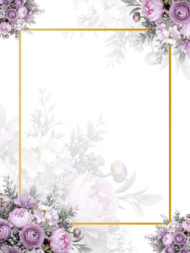
The backgrounds below range from a plain beige parchment to gold scrollwork, a purple watercolor wash, white roses with a eucalyptus border, cream damask, a peach arched panel and green watercolor leaves, and the ornate ones cost more in effort and in print extras.
Your own wedding picks the winner: choose the 2–3 colors in your flowers, linens and bridesmaid dresses, then keep only the backgrounds that already sit in that range.
1. Beige Parchment Wedding Invitation Background
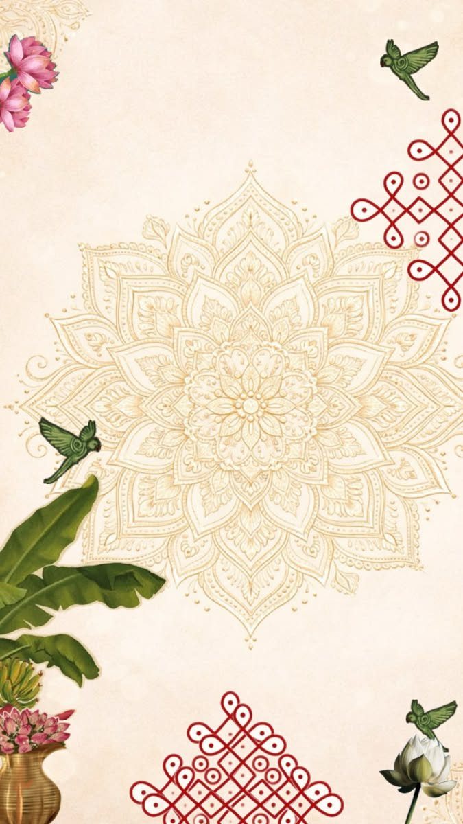
Parchment gives a mandala room to be the star. The beige ground stays quiet, so the gold-toned center, the red knots, the green birds and the pink lotus flowers can carry the color without the page feeling crowded.
For text, I would set names and details in one dark ink and leave the middle of the mandala clear.
On a parchment background with a central circle and knotwork, keep the lettering inside the circle’s edges or below it, because type running through the middle fights the ring, and red ink competes with the knots, so a deep brown or charcoal reads cleaner.
2. Gold Ornate Scrollwork
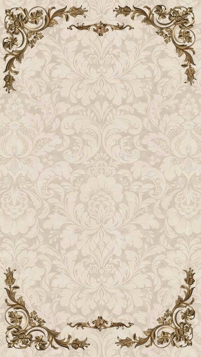
Corner flourishes are the cheapest way I know to make a page look formal. Gold scrollwork at the top and bottom of a cream damask leaves the center open for text, which keeps the layout simple.
Keep your wording inside the space between the corners. A single serif or script in dark brown or charcoal reads better against the damask than a second gold, which can blur into the pattern.
3. Purple Watercolor Wash
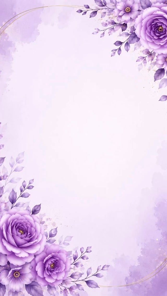
Purple roses tucked into 2 opposite corners, top right and bottom left, give a watercolor invitation its balance. The thin gold line adds polish without adding clutter.
Lavender and purple can look muddy under pale gray type, so I would choose white or deep plum text and test a printed copy first. Screens flatter watercolor more than paper does.
4. White Roses and Green Eucalyptus Border
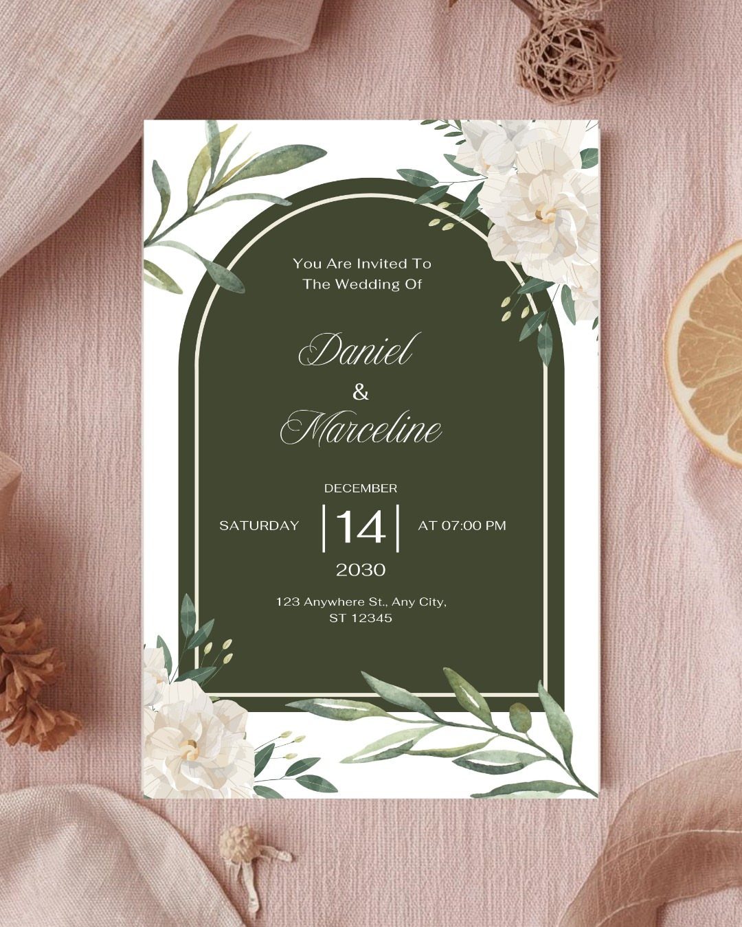
A dark green arch circled with white roses and eucalyptus makes a ready-made frame for the wedding details. Names, date and venue all sit inside it, so the florals never have to share space with the text.
The pink fabric behind it softens all that green. If you design your own, pick white lettering for the dark arch and check that it stays readable at a small size.
5. Cream Embossed Damask
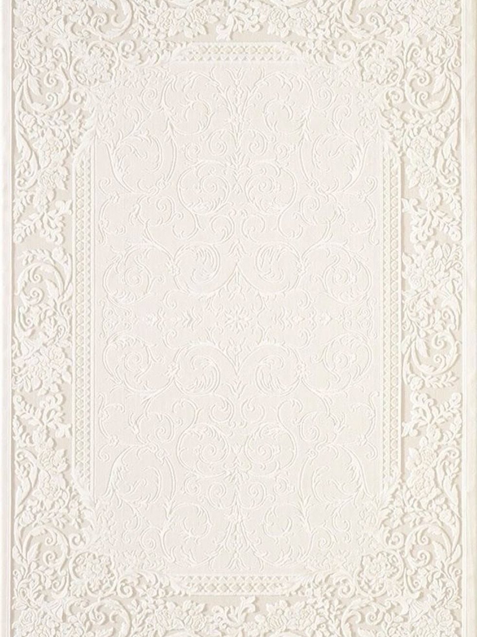
Embossing is a texture first and a pattern second, which is why a cream damask with a floral scroll and ornate border feels so rich. Printed flat, the same design loses much of that effect.
If you can’t afford true embossing, keep the tone-on-tone look in your digital file and choose a heavier paper. Ask any printer whether embossing is an add-on cost before you fall for it.
6. Peach Arched Panel
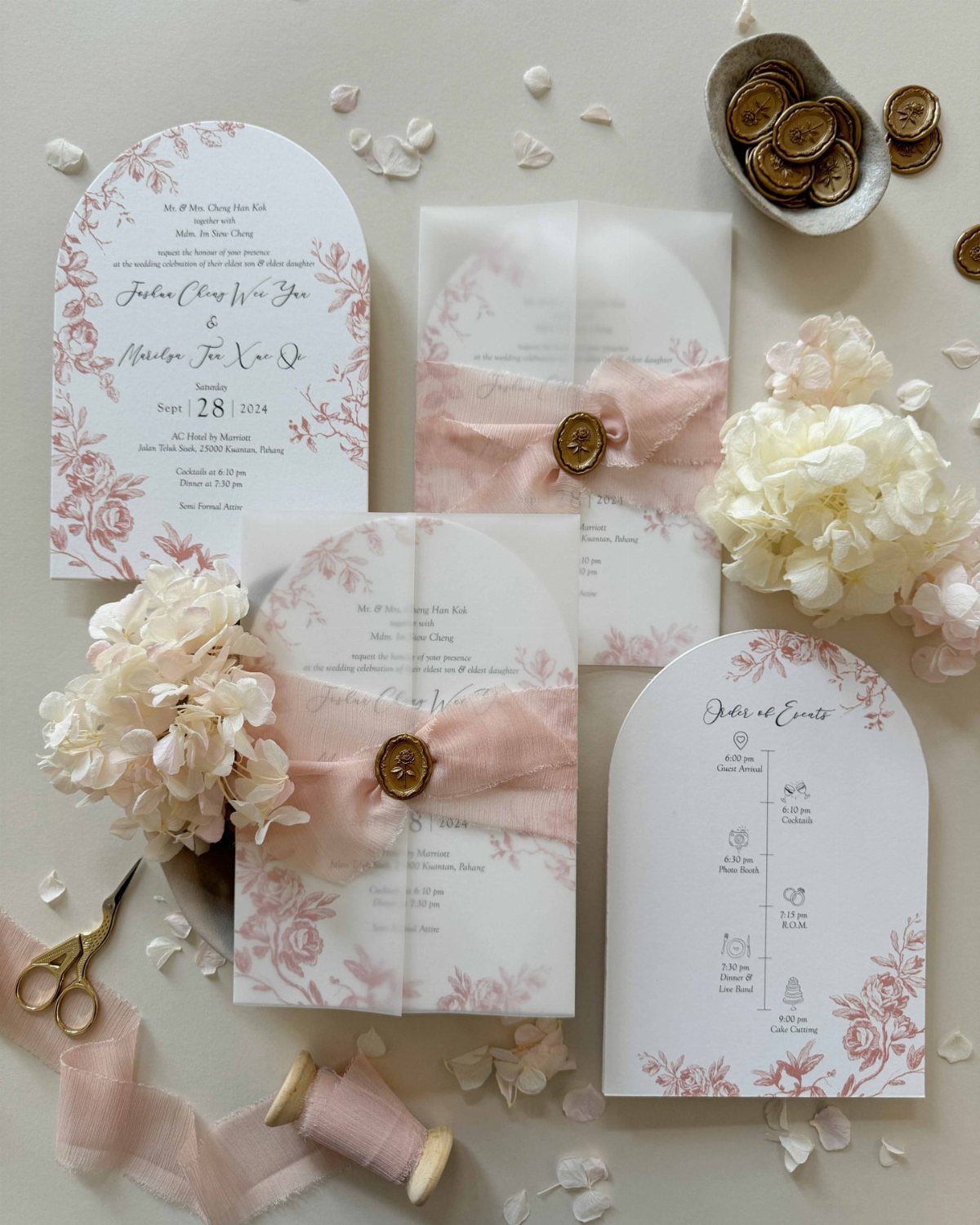
Arched cards in peach read as warm before anyone reads a word. Add a ribbon and a wax seal, and the invitation feels like a small gift.
For a modest budget, I would seal only the cards for close family and let the rest go out plain.
7. Gold Ornate Arch
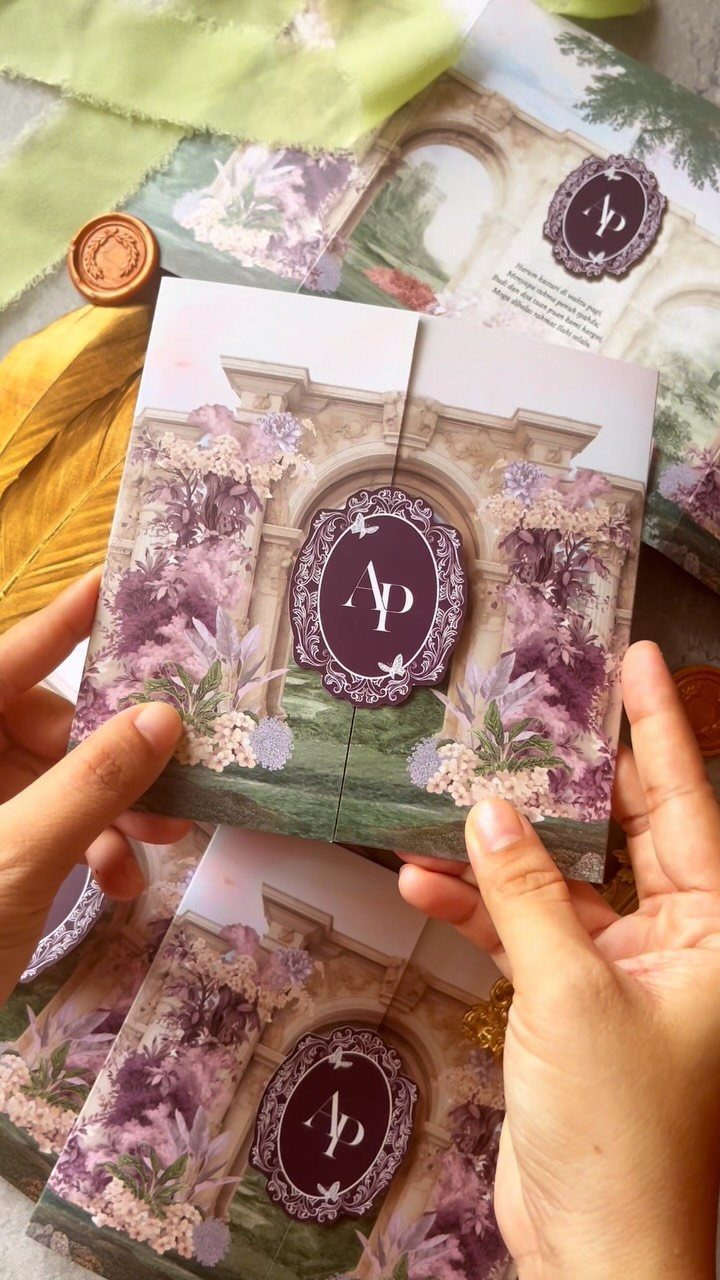
A stone archway with purple blooms and an "AP" monogram turns a flat card into a small scene. A monogram suits a design like this because it gives the couple’s initials a spot of their own, apart from the florals.
Let the arch frame the wording, and keep the monogram as the only place initials appear.
Dark ink on the lighter areas will read cleanly, though I would print one test copy before ordering the full run. Purple and gold both shift between screen and paper.
A wax seal on the envelope echoes the look without changing the card.
8. Green Watercolor Leaves
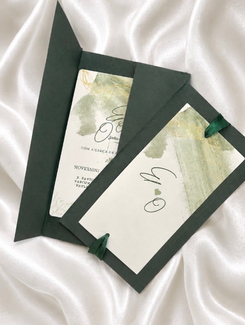
Green watercolor leaves feel modern because the paint is loose and the card around it stays plain. Dark green envelopes pick up the leaf color, so the set looks planned without extra embellishment.
Keep the leaves to the edges and set the text on the clear white area. Dark green or charcoal ink will match the leaves and stay readable.
If the guest list includes people who read another language, as the Portuguese wording here shows, the same layout works for a bilingual card. Just check that both versions fit the open space without crowding the leaves.
Choosing the Right Background
Start with the wedding itself, not the invitation. Pick the 2–3 colors in your flowers, linens and bridesmaid dresses, then look only at backgrounds that already live in that range.
A background that clashes with your decor is the easiest mistake to spot later, when the invitation sits next to the table settings in photos.
Match the formality too. A casual backyard party and a ballroom evening call for different paper, so let the venue and dress code set how ornate the ground can be.
Hold the background up to a fabric swatch or a printed color sample first, since screens rarely match what a press delivers. If the two look like strangers, move on.
Using Templates
Editable templates save the most time when you treat them as a starting point. Swap the colors to match your palette, replace the placeholder text, and change the fonts only if the original pairing doesn’t suit your wording.
Work through the whole file before ordering. Read every line of text and the spelling of each name, and check the day of the week against the calendar too, because a template will not catch your typos.
Keep the changes few.
Order one printed proof if the seller offers it. A template that looks right on a screen can still shift on paper.
Incorporating Personal Elements
Personal touches work best when there is one of them. A single photo or a custom illustration of a place that matters to you gives the card a focus, while several compete for the same space.
For photos, choose a sharp, well-lit image with plenty of plain area, since text needs somewhere calm to sit. A low-resolution picture will look soft in print, so use the original file.
A custom illustration, such as your venue or a pet, can sit as the background or as a small accent. Ask the artist for a high-resolution file, and confirm early that you may print it on your invitations.





