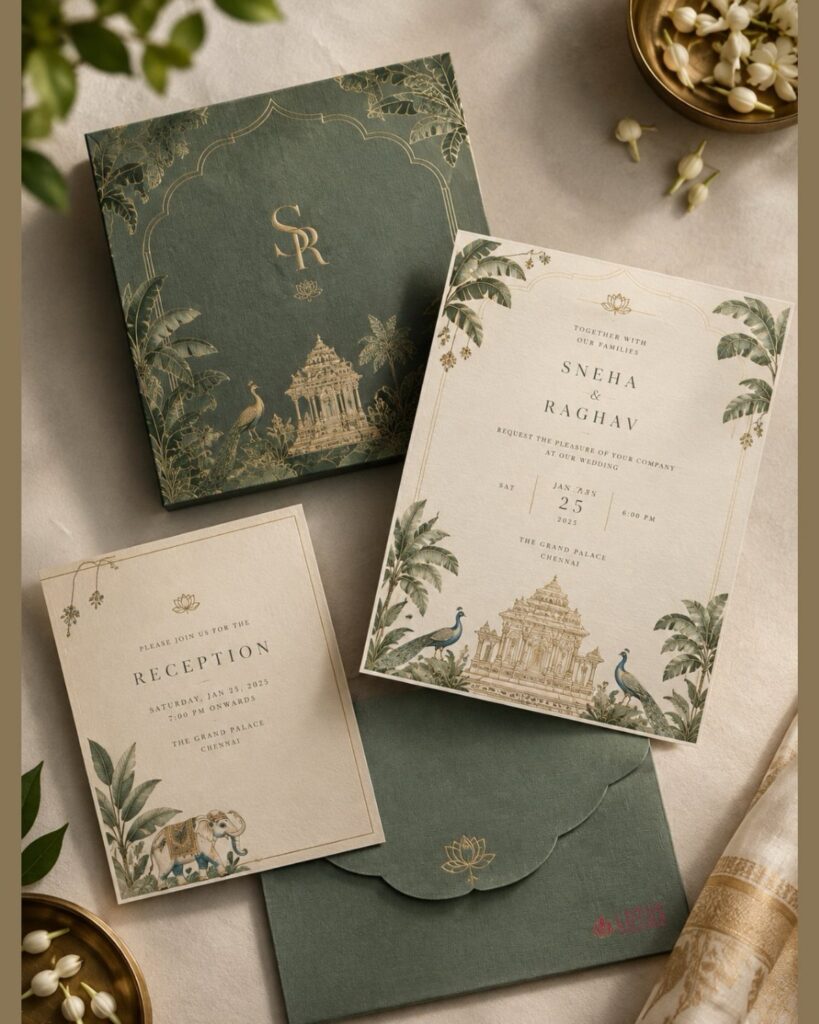
The ideas here run from one script-and-serif pairing to gold foil cursive lettering, and the cost climbs with every extra finish, so a plain all-serif menu will always sit at the low end of the quote.
Your printing budget decides which one fits, since a single ink color in a modern serif save-the-date costs the least, while gold foil lettering or a wavy border adds a line to the quote.
Whatever the finish, two typefaces will carry a whole suite, and the pairing of one script for names with one serif for details shows up in nearly every section below.
1. Script Headline with Serif Body Fonts
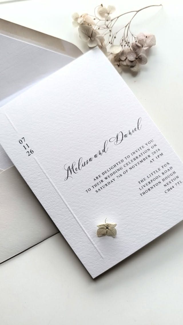
Names in script, everything else in a serif: this is the pairing I trust most for invitations. The script carries the romance in one place, and the serif keeps the date, time and venue easy to read.
Give the serif room. Set the details a size or two smaller than feels natural, with generous spacing between lines, so the names remain the one flourish on the page.
2. Stick to a Typeface Story
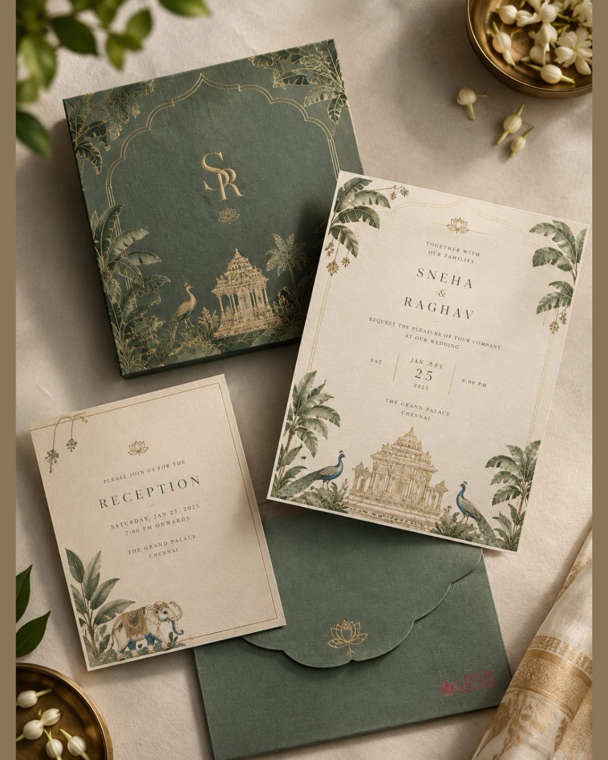
Two typefaces will carry a whole suite; three starts to look like a mistake. Choose one script for names and one serif or sans for details, then repeat them on every piece, from the box card to the reception card.
Repetition is what makes a set look designed, and it costs nothing extra. A tight type palette also keeps a budget printer’s proofing round short, since there are fewer decisions to correct.
3. Script Fonts for Names
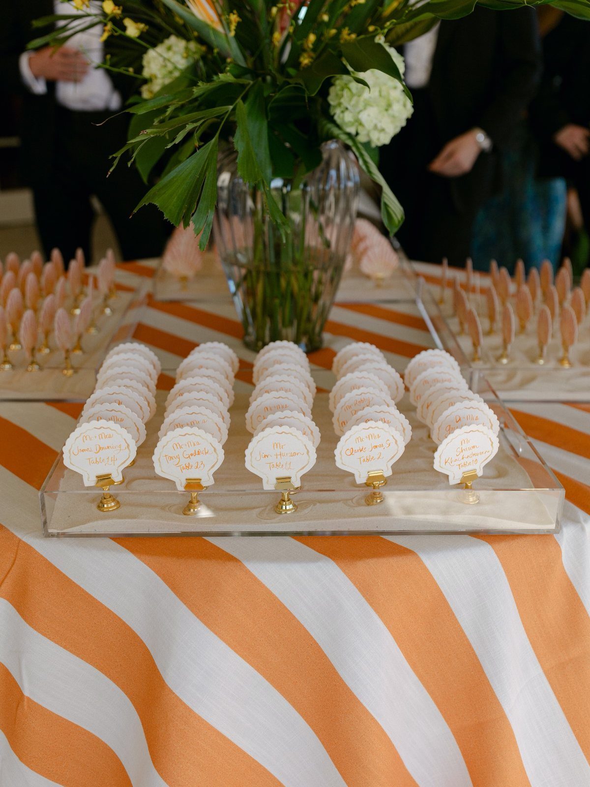
Reserve script for names, and a place card is the best use of it. Guests read a single line at a glance, so the flourish has room to work without slowing anyone down.
Keep the table number in a plain, upright face. Mixing a script name with a clear numeral means nobody squints at an ornate 11 and sits at the wrong table.
4. Choosing Fonts for Different Styles
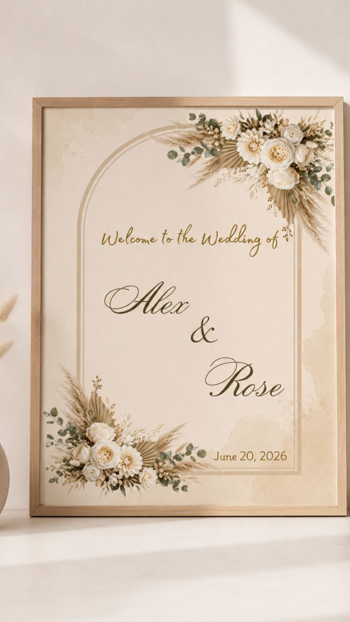
A font should agree with the wedding it announces. Loose script and soft florals suit a garden party; a crisp serif suits a formal evening; a clean sans suits something modern and spare.
Before you buy anything, pick the one word that describes your day, then test two or three fonts against it.
A welcome sign is a good place to try your choice at large size, since flaws in letter spacing show up quickly there.
Not all the best fonts to use for weddings are script or cursive.
5. All-Serif Typography for Menus
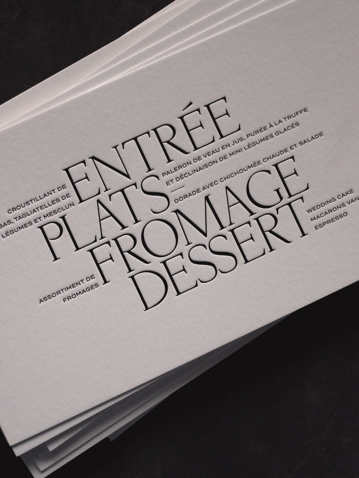
For menus, I would go all serif, headings and descriptions alike. Courses are lists, and a single classic family reads as calm and orderly where a mix would look busy.
Create hierarchy with size, capitals and spacing instead of a second font. Small caps or wide-tracked capitals for course names, regular lowercase for the dishes, and the page does its job.
6. Calligraphy Alphabet Sample
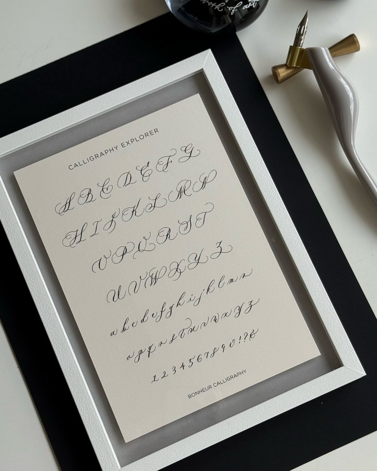
A framed alphabet sheet is a handy reference before you commit to a style. Seeing every capital, lowercase letter and numeral together shows you what a script does to the letters your own names contain.
Check the awkward ones: capital Q, G and S, and any numerals in your date. Some scripts look beautiful in a headline and fall apart in a phone number or an address line.
7. Gold Foil Cursive Lettering
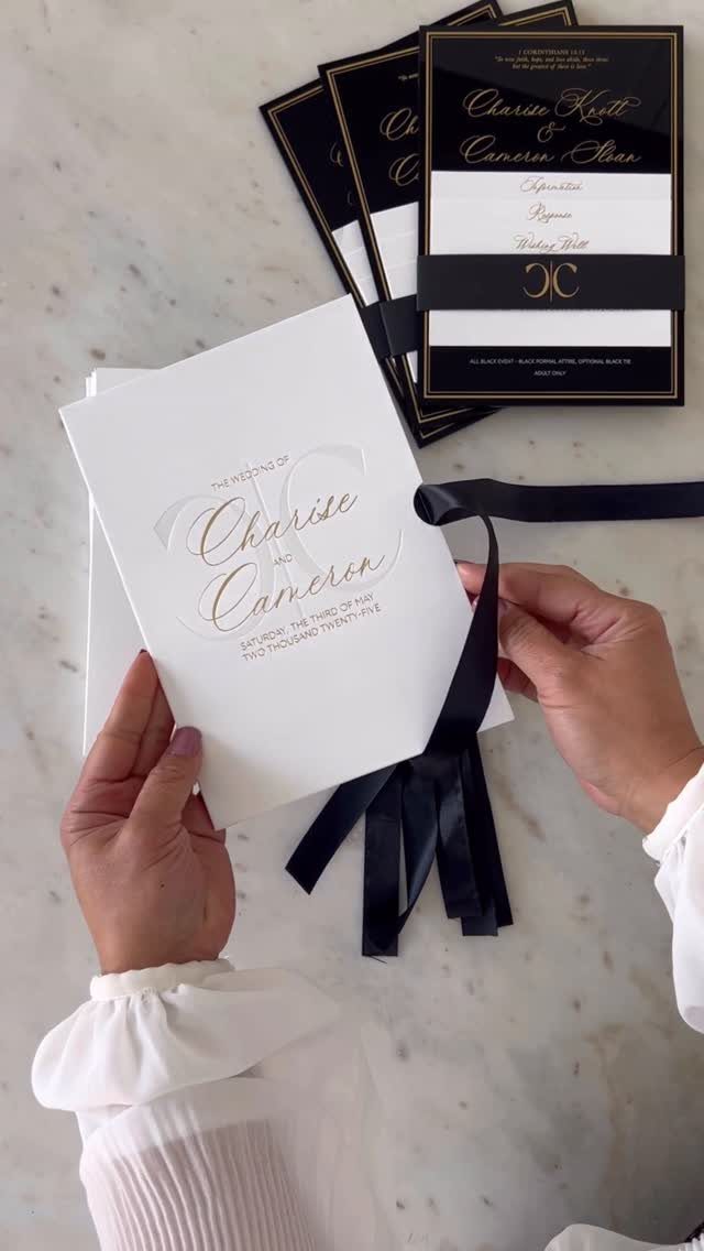
Gold cursive on white card reads as quiet luxury, and the same gold on black paper turns the contrast up. Either way, the metallic does the work of ornament, so the layout can stay plain.
Save the shimmer for the names. Set the details in a simple serif in the same gold or in a neutral ink, since a whole card of metallic script tires the eye.
Ribbon in a contrasting shade, black against white or the reverse, adds finish without another printing cost.
8. Blue Script Font Suite
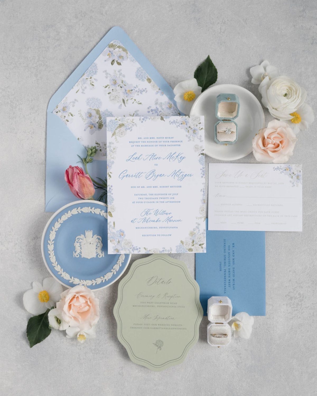
Soft blue script pulls a suite together when the other pieces borrow its color. Keep the invitation as the one blue script piece, then let the details card echo the shade in plainer lettering.
A floral envelope liner is a good place to add pattern, because it stays hidden until the guest opens the flap.
I like that over printing flowers on every card, which crowds the writing. Check that thin blue strokes stay legible against a pale green card before you order a full run.
9. Modern Serif Save-the-Date Cards
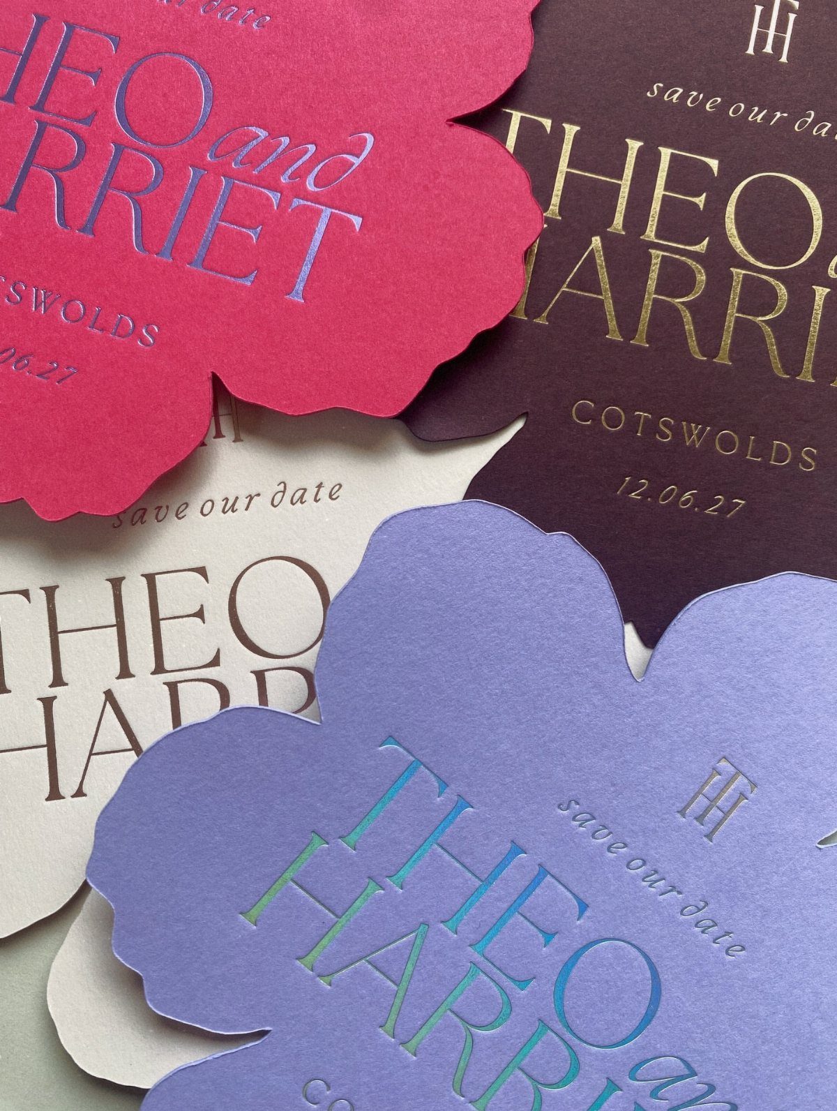
Serif capitals for the names and place, with the date in numerals, give a save-the-date all the information it needs. Foil accents on top mean the type can stay restrained.
Pick one typeface and vary the card color instead; a small set of shades works well when guests receive different ones.
Dates written in numerals, like 12.06.27, are compact, but US guests read month first, so confirm the order suits your audience before printing. A die-cut shape adds cost, so ask for a quote against a standard rectangle.
10. Typeface Pairing Specimen Card
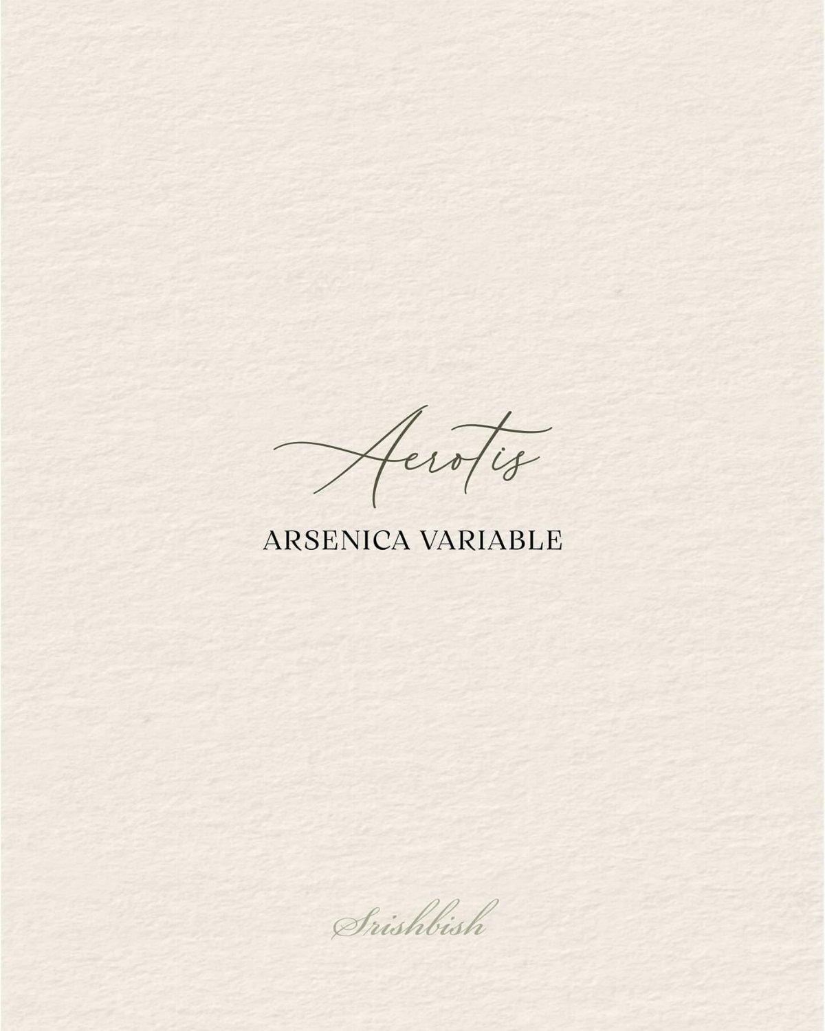
A flowing script works best as a single accent line, set above wide, all-caps serif lines that keep the card easy to read. Print your own names in the candidates before buying a full suite.
Scale matters most here. Let the script run large and the capitals stay small with generous letter spacing, so the two never compete.
Textured off-white stock softens the contrast, but proof it on the paper you will actually use, because texture can fill in fine hairlines. A sample card makes a cheap decision aid.
11. Wavy Border Script and Serif
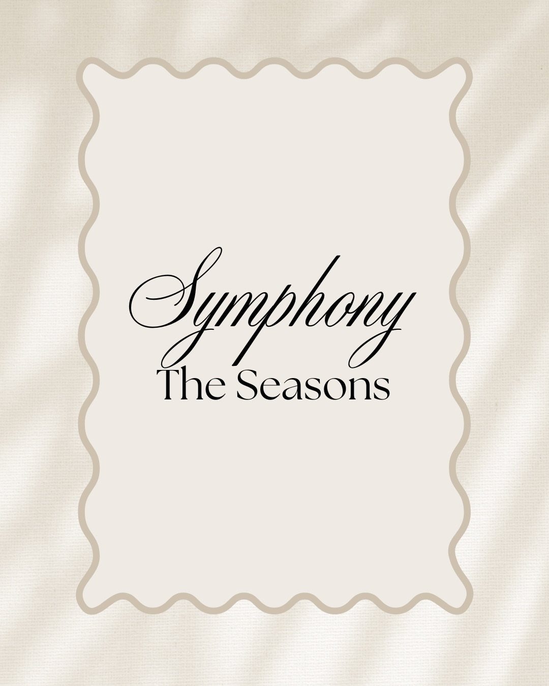
Black script paired with black serif on cream is a strict two-voice system: one flowing line, one structured. Using a single ink color lets the fonts carry the contrast.
A scalloped or wavy edge adds shape, so keep the layout sparse and centered.
I would use it for programs or a welcome card, where a short title and one line of detail fit. Die-cut edges raise the price, so confirm that cost before falling for the shape.
The Impact of Font Choice
Before choosing anything, decide how formal the day should feel.
Type signals that before a guest reads a single word: a delicate, looping face reads as intimate and romantic, a heavy capital face reads as solemn, and a rounded, casual one reads as playful.
Your fonts also speak for you. Guests who open an envelope have no other clue about the day yet, so the lettering stands in for your taste.
Run a quick check on your shortlist: set your own names and the date in each font, then ask whether the result sounds like the two of you.
If it feels like someone else’s wedding, drop it, however pretty it looks on a template.
The right font will pull attention to your names and carry the style of the day without extra decoration, which matters when a budget rules out add-ons.





