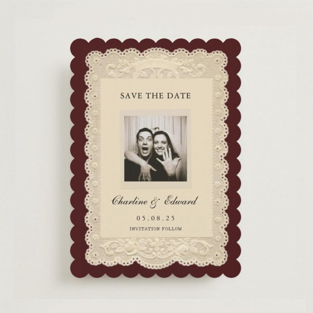
Vintage paper runs from an editable template you can print at home to lace-trimmed florals, with botanical and retro designs in between.
Headcount decides which end you can afford, because lace and botanical details are handwork or extras priced per guest, while a flat printed card or an editable template barely changes in cost.
A small guest list can carry the lace and the floral details; a large one is better off putting money into one thing, like a customization option, and letting an editable template handle the layout.
1. Vintage Floral Wedding Invitations
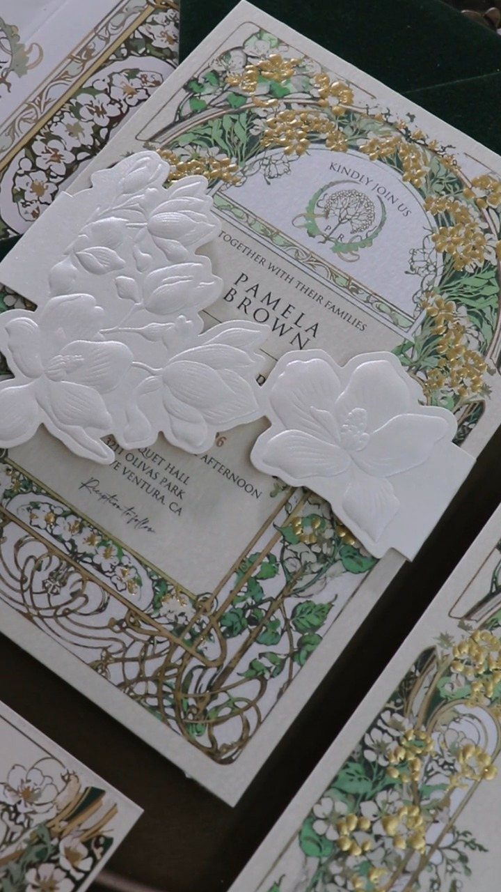
Gold foil borders next to white embossed flower cutouts give a floral invitation real depth, and that contrast is what I would copy.
The foil catches light while the cutouts add shadow, so the card reads as layered without any extra ink.
Both effects cost more than flat printing, so spend on them where guests will notice. I would pick one border treatment and one cutout motif, then keep the wording plain so the flowers carry the card.
2. Retro Wedding Invitations
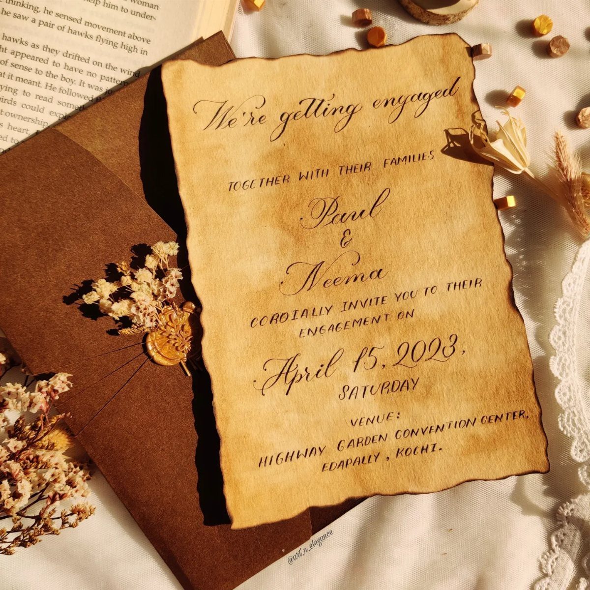
Scorched edges, a brown kraft envelope and a few pressed dried flowers tucked inside give an invitation the feel of a found letter, and you can do all three at home for pennies per card.
Parchment-style paper suits it best, and a wax seal on top finishes the aged look.
Wording should match.
Short, old-fashioned phrasing sits better on this paper than modern casual lines. Dried flowers can shed in the mail, so I would tuck them in loosely or add them only to a few hand-delivered copies.
3. Elegant Botanical Invitations
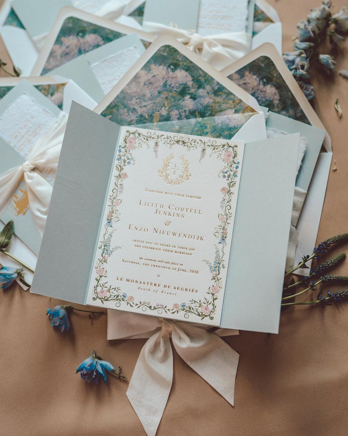
Botanical borders look natural and vintage at once, and a patterned envelope liner is where I would put extra money. Guests open the envelope before they read a word, so a floral liner sets the mood immediately.
Tying the invitation with a ribbon, white or a soft shade that matches the liner, adds a small gift-like touch. Keep the border illustrations fine and the text block centered so nothing crowds the names.
4. Vintage Lace Wedding Invitations
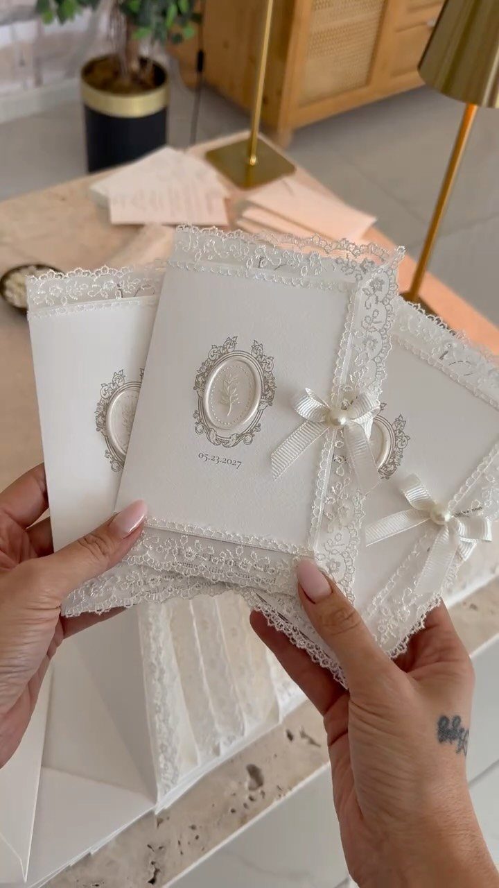
Wrapping a whole card in it gets bulky fast.
Each lace piece is handwork, so the cost climbs with the guest count.
For a modest budget, I would lace only the main invitation and print the rest of the suite flat. Put the date in clean numerals, like 05.23.2027, so the delicate trim never competes with the details.
5. Editable Vintage Wedding Invitation Templates
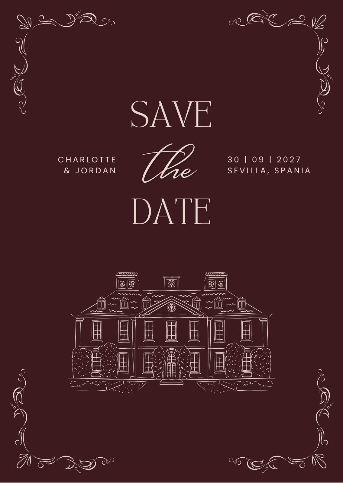
A template is the cheapest way into a vintage look, and a deep burgundy card with white lettering and a single line drawing proves how little design you need.
Pick a template with generous margins, since long names or addresses can break a tight layout. Proof the finished file twice before printing.
6. Simply Classic Wedding Invitations
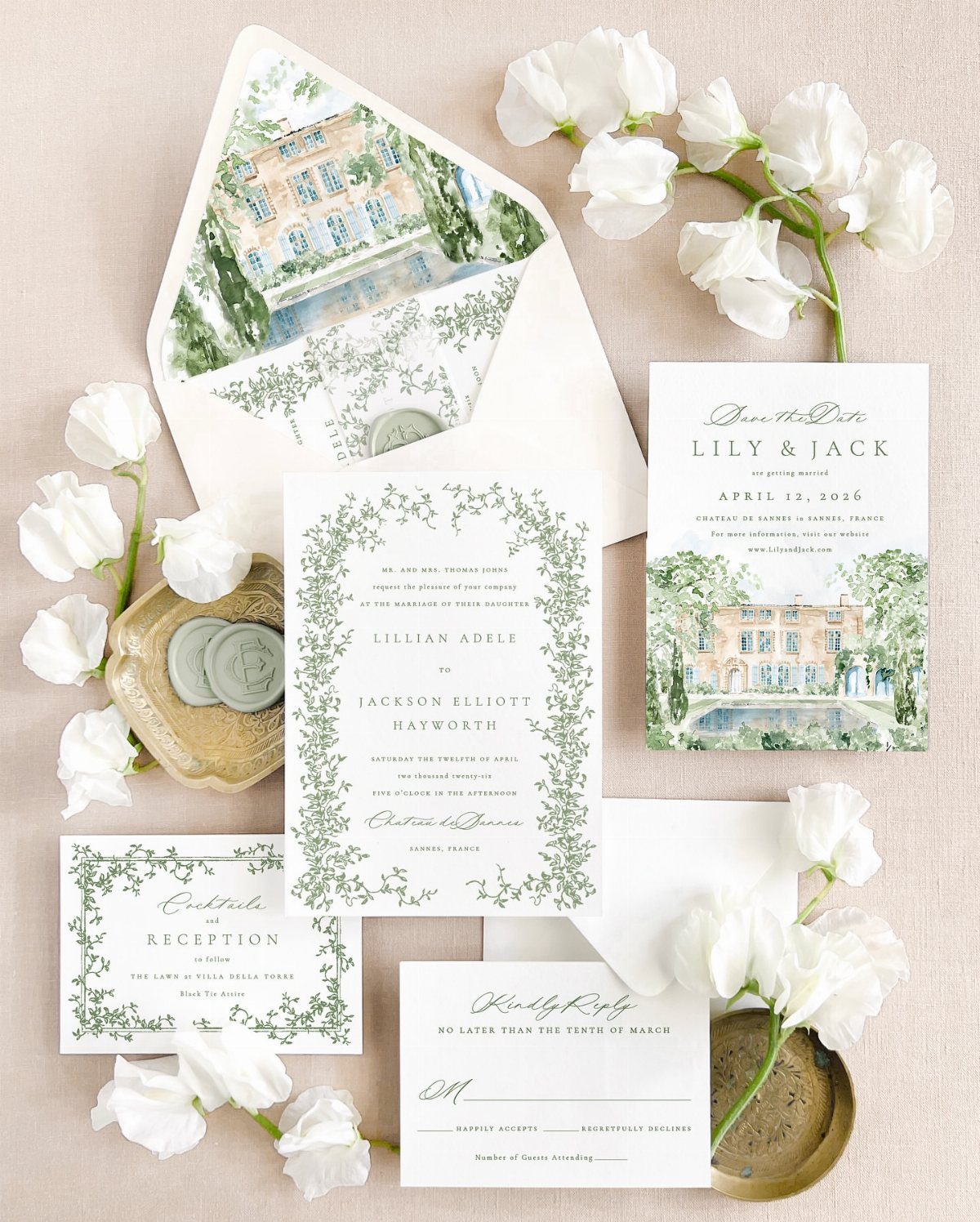
A matching suite, with save-the-date, invitation, RSVP card and reception card, is the most traditional route, and it is the one I would choose for a first-time planner.
Watercolor art repeated across every piece makes the set feel designed rather than assembled.
Each extra card adds printing and postage, so decide early whether the reception card can be folded into the invitation. White flowers and wax seals add polish without much clutter.
7. Matching Day-Of Stationery and Wedding Invitations
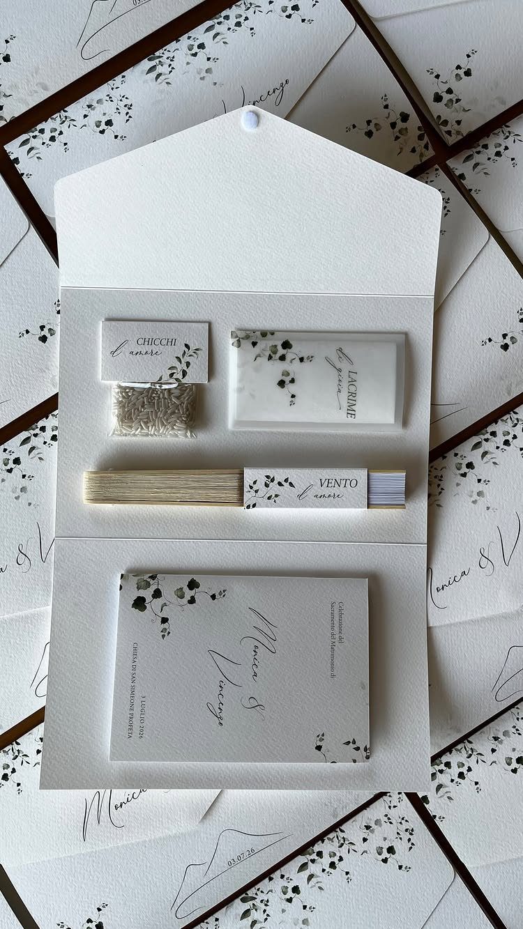
Repeating one botanical motif on every piece, from the invitation card to a small wooden fan and a packet of seeds, makes a suite read as a single design.
Since the names, the fan and the seeds all share the same flowers, guests connect them at a glance.
Pick one illustration and reuse it everywhere: card, envelope, fan, seed packet. That keeps design costs down, because you commission or buy one piece of art rather than four.
The fan and seeds are small gifts guests may actually keep, so I would add them before extra paper. Wooden fans and seed packets cost more per guest than a flat card, so price them against your headcount first.
Invitation Customization Options
Paper weight is the customization choice that shows most. Handmade cream cotton paper at 550 gsm feels thick and soft, and a deckle edge adds a torn-feather border without any printing at all.
Color and font come next.
Burgundy script on beige parchment reads warm and old-fashioned, while cursive calligraphy suits a formal card. Keep to one script and one plain companion font so names stay readable.
Envelopes are an easy place to personalize. A landscape-printed envelope gives the suite a second image before the card comes out.
Custom sets cost more than editable templates, so decide which pieces deserve the upgrade. I would spend on paper weight first, then on the envelope, and let the template handle the layout.
Cohesive Wedding Aesthetic
A muted palette of ivory, cream and blush, with plenty of greenery, gives vintage paper its soft, aged look, and it works best when the same few shades show up on the invitation, the menu and the signs.
If the invitation uses those colors, the flowers, ribbons and table linens can repeat them without extra design work.
Florals follow easily.
Roses, ranunculus and peonies suit this look, and calla lilies or orchids work too. Brass vases or trailing ribbons add a vintage touch for little money.
Formal weddings can borrow from the invitation itself. A monogram crest, a pastel flower or a blue script can reappear on signs and menus.
At the reception, soft candlelight and silverware on the tables cost less than chandeliers. On a tight budget, candles and a single antique-style mirror will do more for the room than any big rental.





