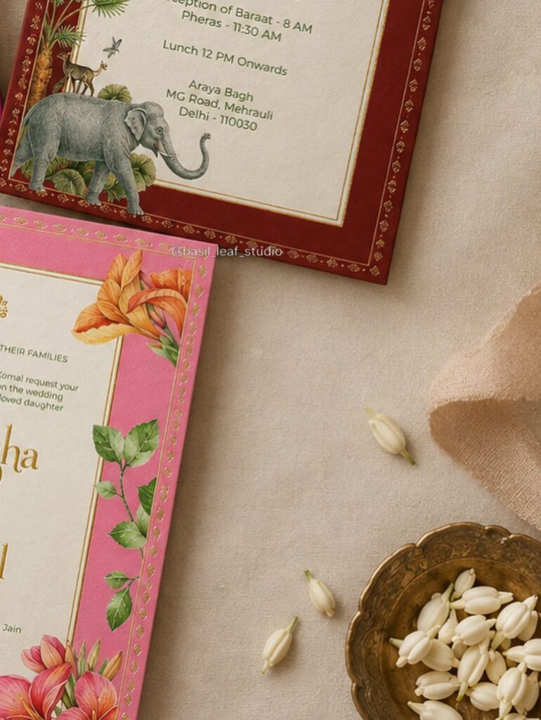
These 9 range from a flat Citrus Blossoms card to a Scroll Invitation with Soft Greenery that has to be rolled and tied by hand, and the labor climbs nearly as fast as the price.
Guest count decides which one is yours: the Layered Floral Patterns and Stripes and the Shaped Swan and Heart Suite need hands-on work for every single invitation, so a small list can afford them while a large one should stay flat, with Wildflowers Prairie or Autumn Leaves letting the color do the work.
A sage green envelope with printed guest addresses shows how far a single pale, simple choice can go.
1. Citrus Blossoms
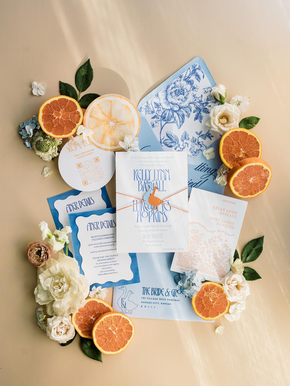
Blue on cream is the color story here, and it reads as fresh rather than loud.
For a lemon-grove or garden wedding, I would pick this over a full rainbow suite. Keep the envelopes patterned and the card itself quiet, so the names stay easy to read.
On a small budget, print the floral pattern on the envelopes only and keep the invitation itself plainer.
2. Wildflowers Prairie
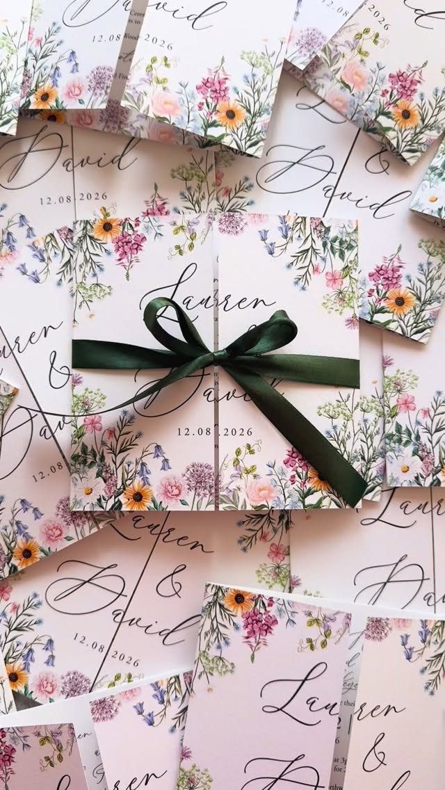
Wildflower watercolor is the easiest way I know to get many colors onto one card without it looking busy. The loose, painted edges soften the look, so a date like 12.08.2026 can sit in plain type below the art.
A dark green satin ribbon ties a wildflower palette together for very little money, usually a few dollars a spool. Choose a ribbon darker than the greenery in the art, because a lighter one fades into it.
I would keep the font simple and let the flowers do the talking.
3. Autumn Leaves
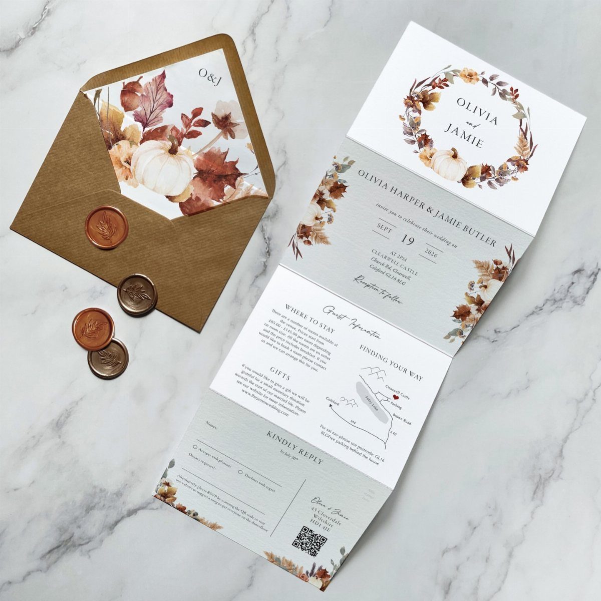
Pumpkins and fallen leaves in watercolor give a fall wedding its palette before a single flower arrives. Pair that art with an RSVP card and copper wax seals, and the suite feels finished.
Wax seals add a step to every envelope, so time a few seals first and multiply by your guest count before choosing them.
For a larger guest list, I would seal only the outer envelope and leave the inner pieces loose.
Marble or a pale surface photographs these warm tones best, if you plan to share a picture.
4. Envelopes with Printed Guest Addresses
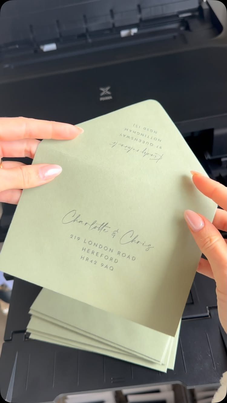
Printed guest addresses spare you from hand-writing every envelope, and a sage green envelope shows that the printing can look deliberate. Printing the guest’s name and full address in one pass keeps the result neat, even on the 100th envelope.
Ask whether your stationer offers addressing as a free add-on, since it saves real hours. If you print at home, test one on a spare envelope first, because dark green and heavy paper can smudge or jam.
Colored envelopes need a light ink-friendly shade, so choose pale tones.
5. Layered Floral Patterns and Stripes
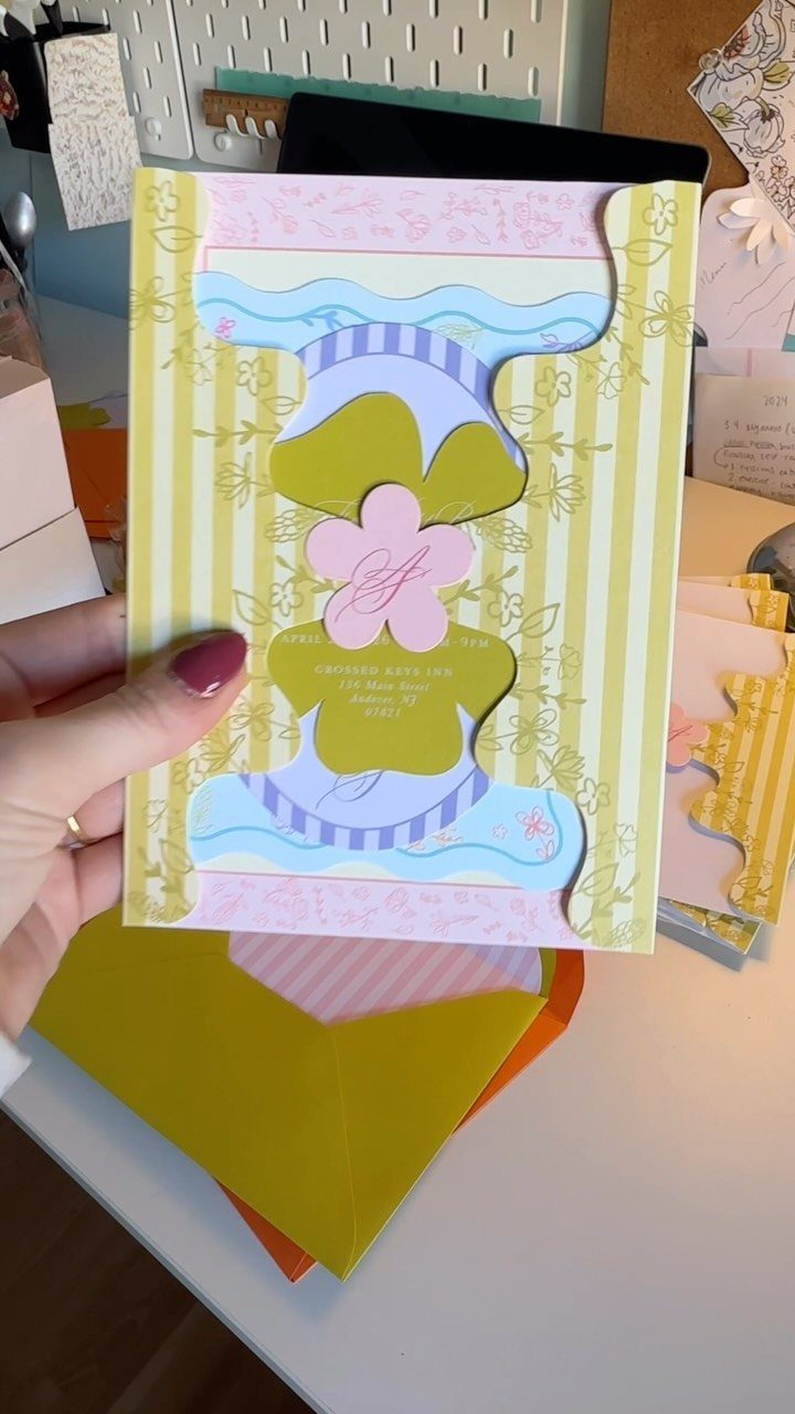
Layers do the work in this invitation: yellow stripes and pink floral cutouts stacked so each color gets its own space. A venue name such as Crossed Keys Inn can sit on the top layer, where it reads first.
Cutouts cost more than flat printing and take longer to assemble, so I would reserve this for a smaller guest list. If money is short, keep the stripes and drop the cutouts.
Choose colors that are bright but few, ideally three or four.
6. Traditional Indian Illustrated Card
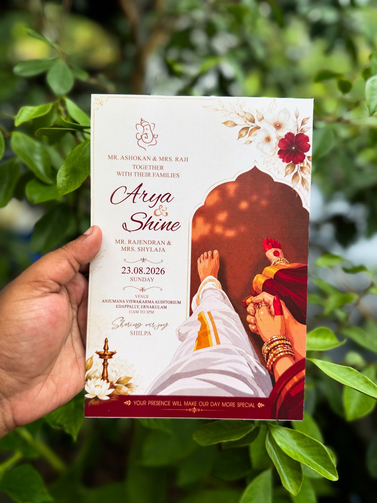
An illustrated couple in traditional Indian attire turns the invitation into a portrait, and the red, gold and floral borders carry the celebration before anyone reads a word. Names and a date such as 23.08.2026 fit neatly beneath the artwork.
Ask the illustrator to match the clothing colors to your actual outfits; that detail is what makes guests smile. I would keep the text area clean, since the art is already rich.
Allow extra time for custom drawing and revisions before printing.
7. Shaped Swan and Heart Suite
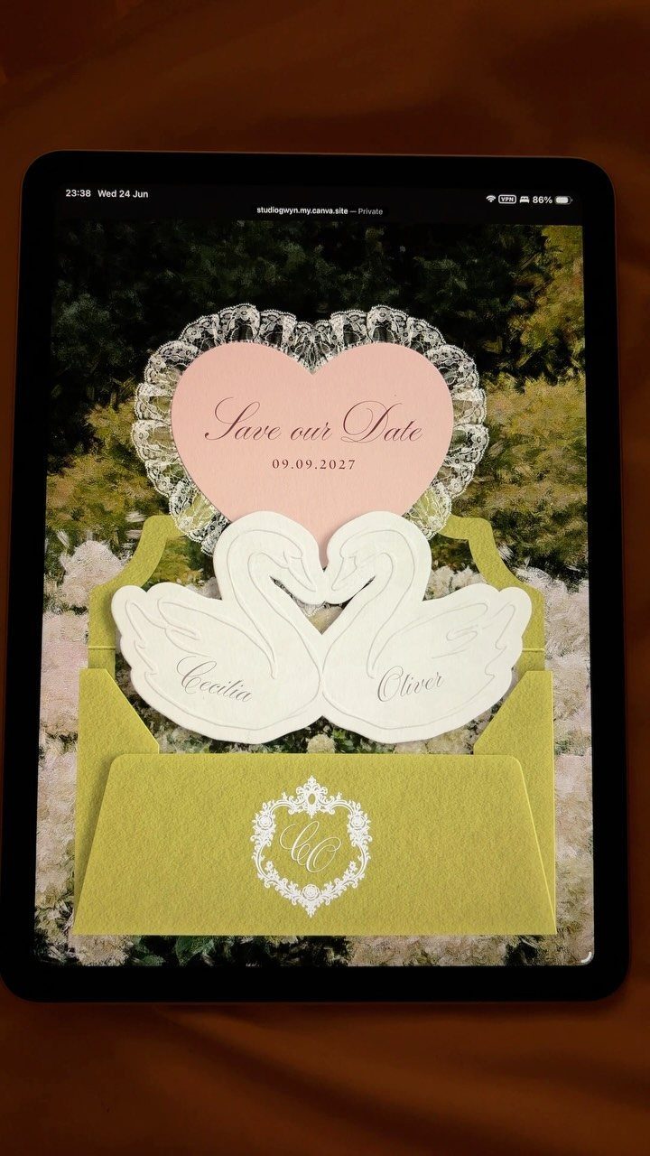
Die-cut swans and a heart make this a suite you hold rather than just read. The lime green envelope with a white monogram is the loudest piece, so a pink heart and white swans can stay simple beside it.
Shaped cards cost more than flat rectangles, since the cutting dies are extra. I would limit the shapes to one or two pieces and print the rest flat.
Put each name on its own swan, as Cecilia and Oliver do here, so the pair reads as a couple.
8. Watercolor Estate and Deep Burgundy
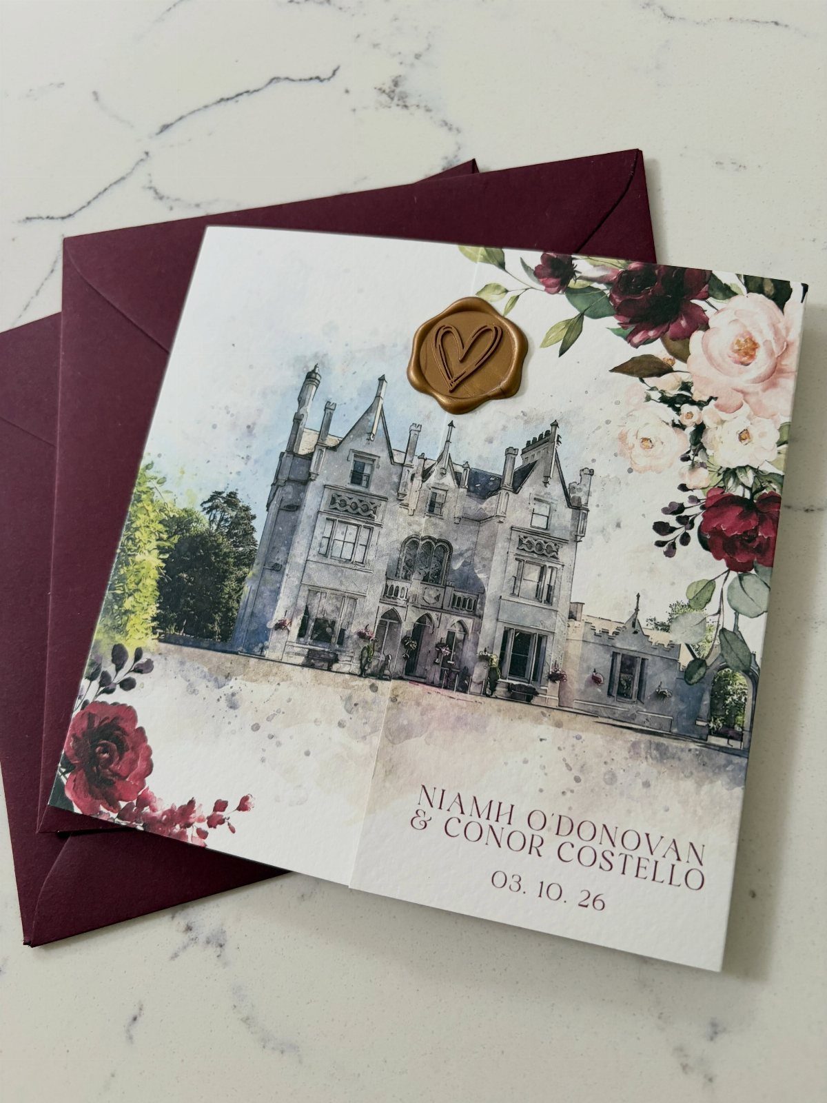
A watercolor drawing of your venue, framed by red roses, tells guests where they are going before they read the address. Here a castle sits above the names, and a date like 03.10.26 stays in small, plain type.
A deep burgundy envelope grounds the card, and a gold heart seal picks up the rose centers. I would choose one seal rather than several, so the art stays the focus.
Send the illustrator clear photos of the venue from a few angles.
9. Scroll Invitation with Soft Greenery
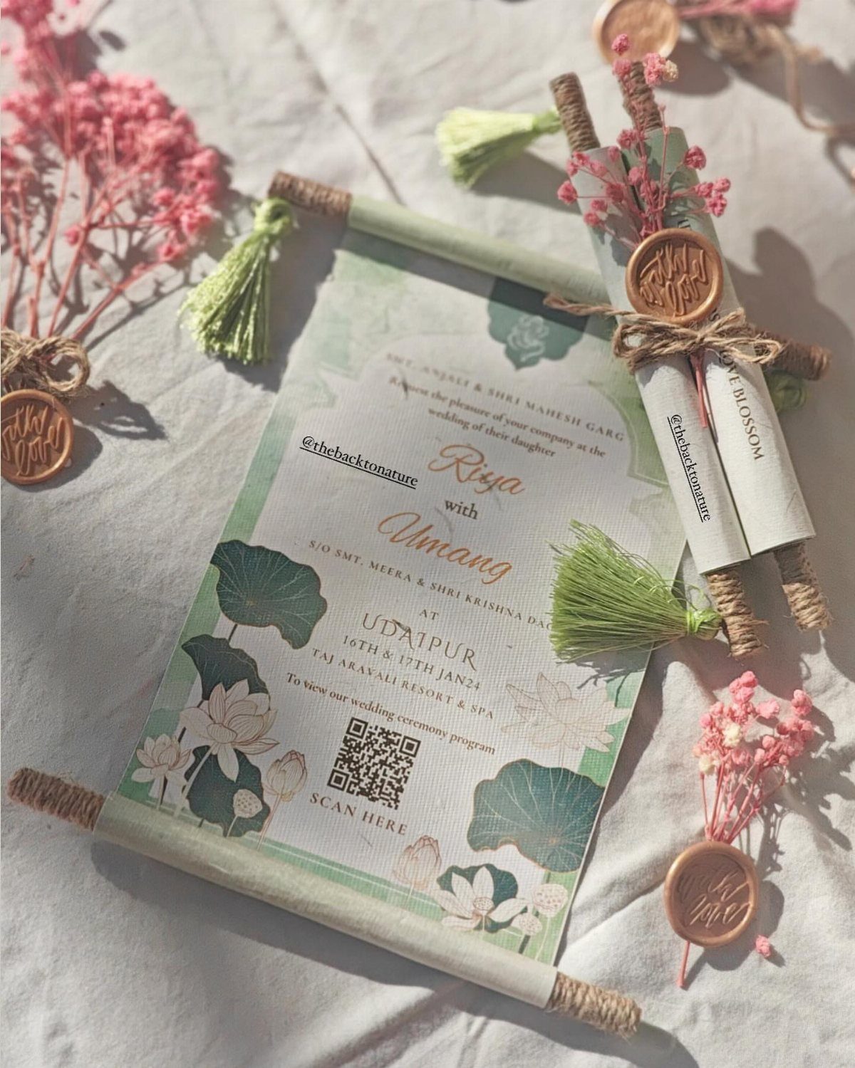
Rolled scrolls in soft green with lotus illustrations feel more like a keepsake than a mailer. Wax seals and tassels hold each roll closed, so guests get a small moment of unrolling.
Scrolls take more hands than flat cards: every one must be rolled, sealed and tied. Time one scroll from start to finish, then multiply by your guest count before you place the order.
On a small budget, I would scroll only the families’ copies and send flat cards to everyone else.
Frequently Asked Questions
What is the average cost of wedding invitations?
Budget around $160 for a run of 100 invitations; that is the typical figure couples report, though printing method and extras move it a lot.
Design, paper quality, printing method and extras like inserts, envelopes and RSVP cards can push that up or down.
Shaped cards, cutouts and wax seals all raise the price, while printing a pattern on the envelopes only keeps a small budget in check.
How early should you send out wedding invitations?
Mail them 6–8 weeks before the wedding. RSVPs, travel bookings and time off work all need lead time, so the send date has to leave room for each of them.
For a destination wedding or a crowd traveling far, move that up to 8–12 weeks. Handmade pieces like scrolls or wax-sealed envelopes take longer to assemble, so build that time in before the mailing date.
How many wedding invitations should I order?
Order 10–15% more than your household count.
Count households, not heads: a couple or family shares one invitation, and a single guest gets a card of their own. The extras cover addressing mistakes, late additions and keepsakes for you.
How can I make colorful wedding invitations without overspending?
Put the color where it costs least. Spend the color where it shows first.
A loud floral print on the envelope liner with a calmer card inside costs less than full-color everything. A spool of dark green satin ribbon runs a few dollars and pulls a wildflower palette together without adding printing costs.
How many colors should a colorful wedding invitation have?
Three or four bright colors is a good limit.
Each one then gets its own space and the card still reads clearly. Watercolor wildflowers are the exception: the loose, painted edges let many colors share one card without looking busy, as long as the type stays simple.





