Unique invitations run from a flat card with a foil line or a patterned envelope liner to scrolls, laser cut sleeves and acrylic panels, and the dividing line is assembly and weight.
Anything with a tie, a seal, a clear panel or a sweet treat costs more to make and more to mail, so the number of invitations you mail and the postage on each decide which idea is yours before taste does.
Take one finished suite, envelope and all, to the post office and have it weighed before committing to 100.
1. Foil Invitations
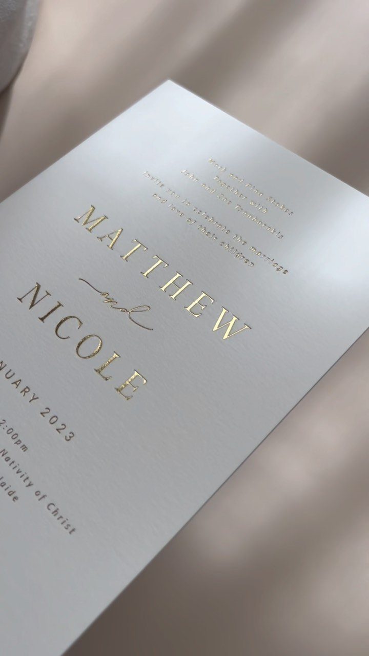
Gold foil on white is the quiet kind of luxury: the names catch light as the card tilts, plus whatever line carries the day you marry, and nothing else on the page has to work hard.
I like it best with a short text block, because foil reads cleanly in large capitals and gets muddy in small, dense lines.
Foil costs more than flat printing, so save it for the couple’s own lines at the top and print the details in plain ink. That keeps the shine where guests look first and the budget under control.
2. Craft Paper and Twine Invitations
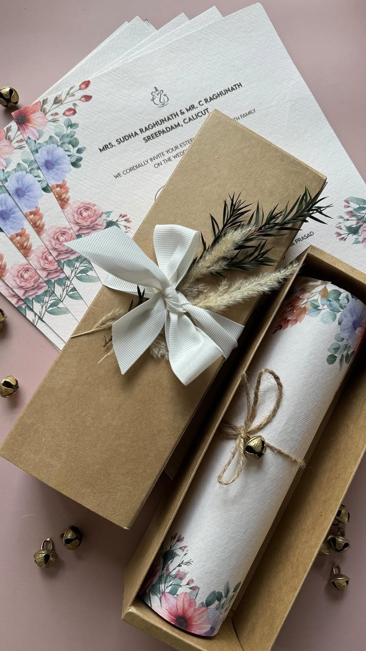
A rolled invitation tied with twine and a small bell feels handmade before anyone reads a word. The box does the heavy lifting here, so a craft paper box turns a simple floral print into something guests open slowly.
Rolled cards take more assembly than flat ones, and every one needs its own tie.
Do a test run with a small batch before ordering supplies for the whole guest list. If time is short, keep the flat version as your backup.
3. Custom Illustrations
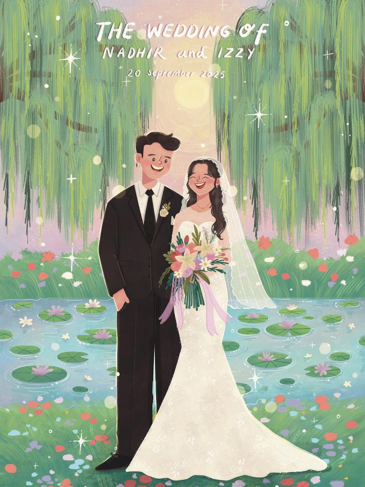
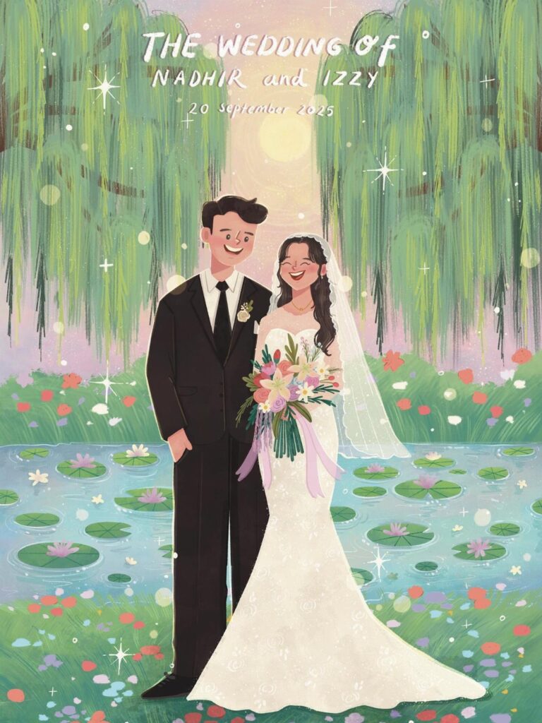
Commissioning an illustration of the two of you, standing in a place that matters to you, gives you artwork no template can match.
Ask the artist to include a setting with real meaning, like a garden or a pond, and let the text sit quietly around the scene.
I would pay for one strong custom piece and reuse it on the save the date, the program and the thank you card. Spread over several items, the fee looks far smaller.
4. Interactive Elements
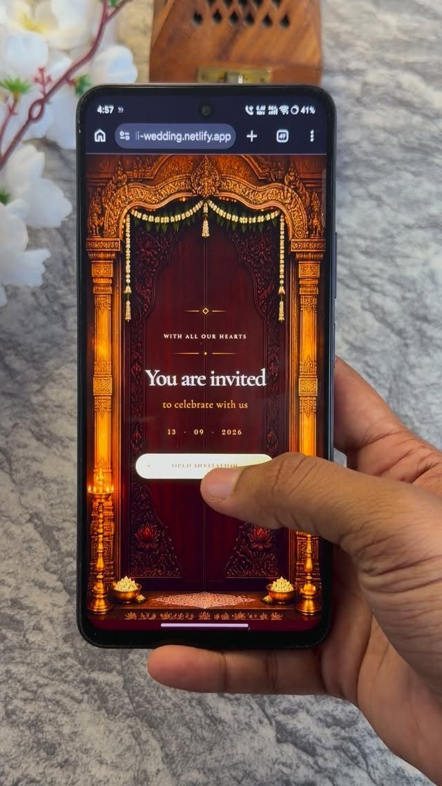
A digital invitation can open like a gate: the guest taps, and an ornate archway parts to reveal the details. That small moment of participation is something paper can’t do.
It also suits couples whose guests live far away, or who want to send updates without reprinting anything.
My own preference is a hybrid: send the animated version first, then mail a simple printed card to older relatives who may not enjoy tapping through a phone screen.
5. Letterpress Invitations
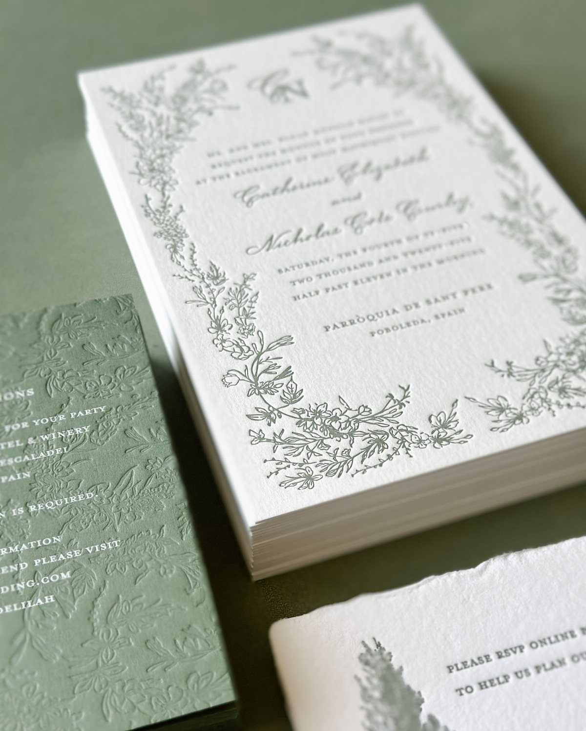
Letterpress presses the design into thick paper, so grey floral borders and cursive lettering can be felt as well as seen. Run a fingertip across the card and the impression is the whole appeal.
Choose a soft, matte paper and pick one ink color; a muted grey on white looks calm and expensive.
Pair it with a sage card or envelope for contrast. Expect letterpress to cost more than flat printing, so cut the extras like inserts before you cut the paper quality.
6. Classic & Elegant
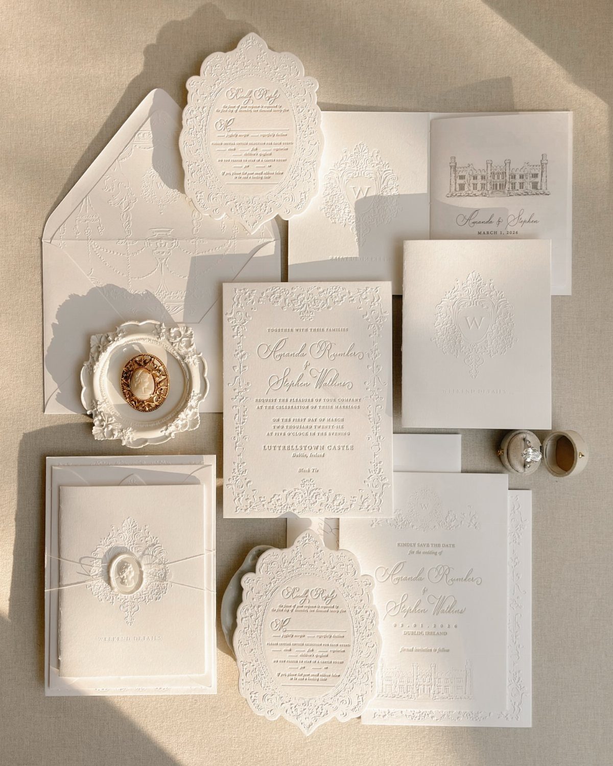
For a Regency, Bridgerton mood, start with the type: a flowing script for the names and a plain, timeless serif for the details.
Embossed floral patterns add that period feel without any extra color, and a wax seal on the envelope finishes it.
White on a neutral background keeps everything soft. I would limit the script to the names alone, since a full block of cursive gets hard to read fast.
7. Tropical Delight
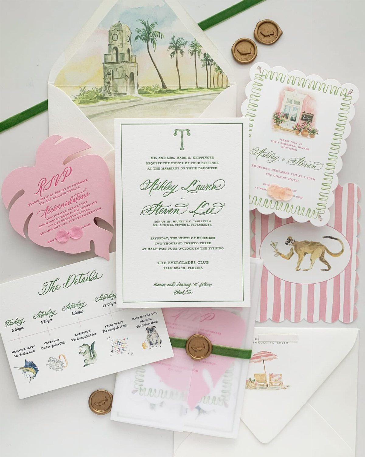
Palm fronds and a pink monstera leaf on the RSVP card tell guests to pack sunscreen before they read the venue line. For a destination wedding, that early signal does real work.
Keep the tropical print to one or two pieces, like the response card and the envelope liner, and let the main card stay quiet.
A watercolor skyline of the venue, as here, ties the place to the palms. Too much pattern on every piece starts to look like a vacation brochure.
8. Laser Cut Invitations
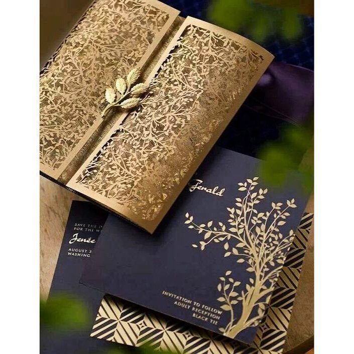
Laser cutting turns a sleeve into lace: gold florals pierced through the paper, with a navy card sliding underneath so the color shows through the gaps.
The contrast between the dark card and the metallic sleeve is what makes the cutwork read.
Intricate cutwork costs more than flat printing, so cut the sleeve only for the main invitation and print the rest of the suite plainly.
9. Pocket Invitations
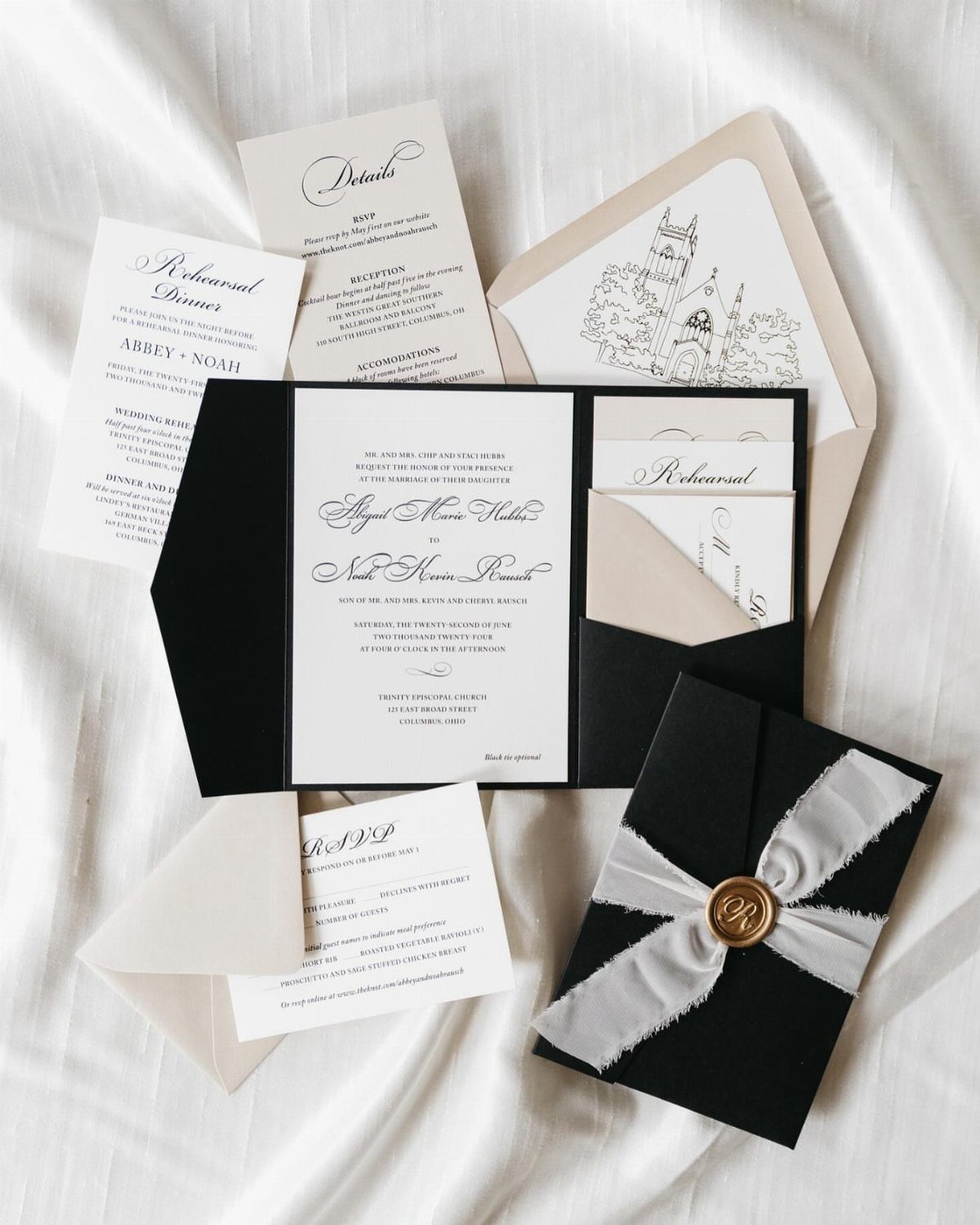
A pocket fold gives every piece a home: the main invite, RSVP, details and rehearsal dinner cards all slide into one folder, so nothing gets lost in the mail.
I would choose a pocket when the guest list needs several enclosures.
For a one-card invitation it only adds cost and weight, which can mean extra postage, so have one finished suite weighed at the post office prior to placing the order.
10. Travel-themed Invitations
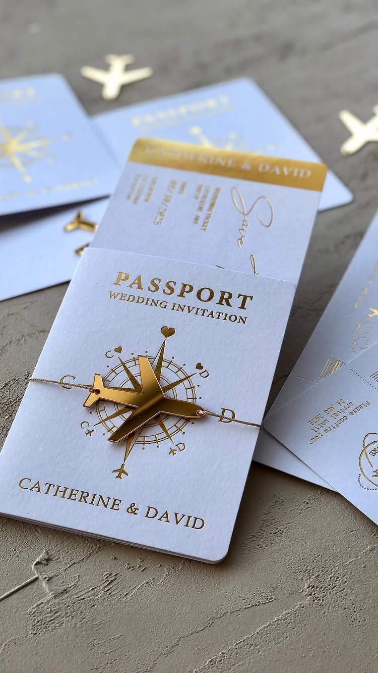
Passport-style invitations suit couples who met abroad or plan to marry somewhere far away.
Inside, use the pages the way a real passport does: one for the date and place, one for the schedule, one for the RSVP.
Charms add handling time and weight, so treat the airplane as a finishing touch and confirm postage before you buy 100 of them.
11. Clear Acrylic Boxed Invitations
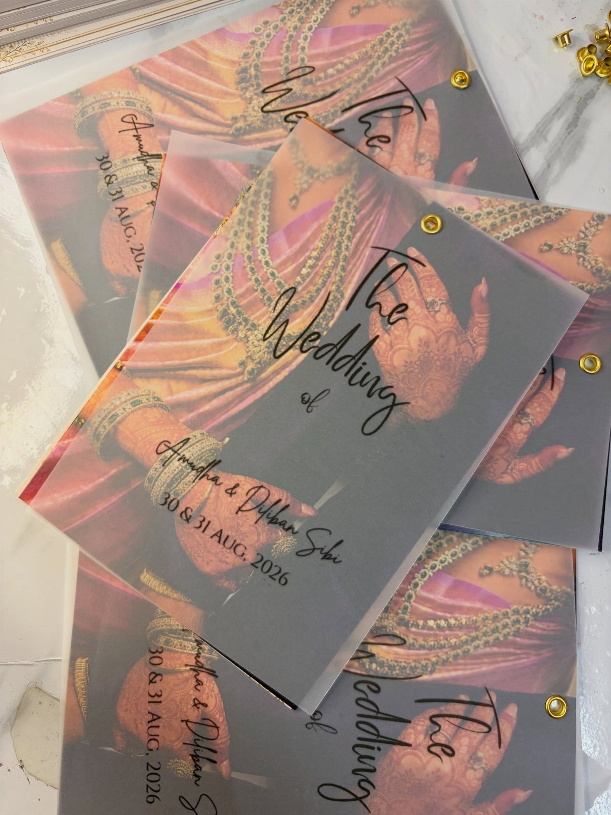
Clear acrylic makes the invitation an object guests keep. Printing a photo of henna-painted hands onto a translucent panel, then fastening the layers with gold rivets, gives the card depth that paper cannot copy.
Put the names and the dates on the front, and move the schedule to a separate paper insert, since text on a see-through surface is harder to read.
Acrylic is heavier and pricier than card stock, so order a sample first and check the postage.
12. Torn Deckle Edge Paper
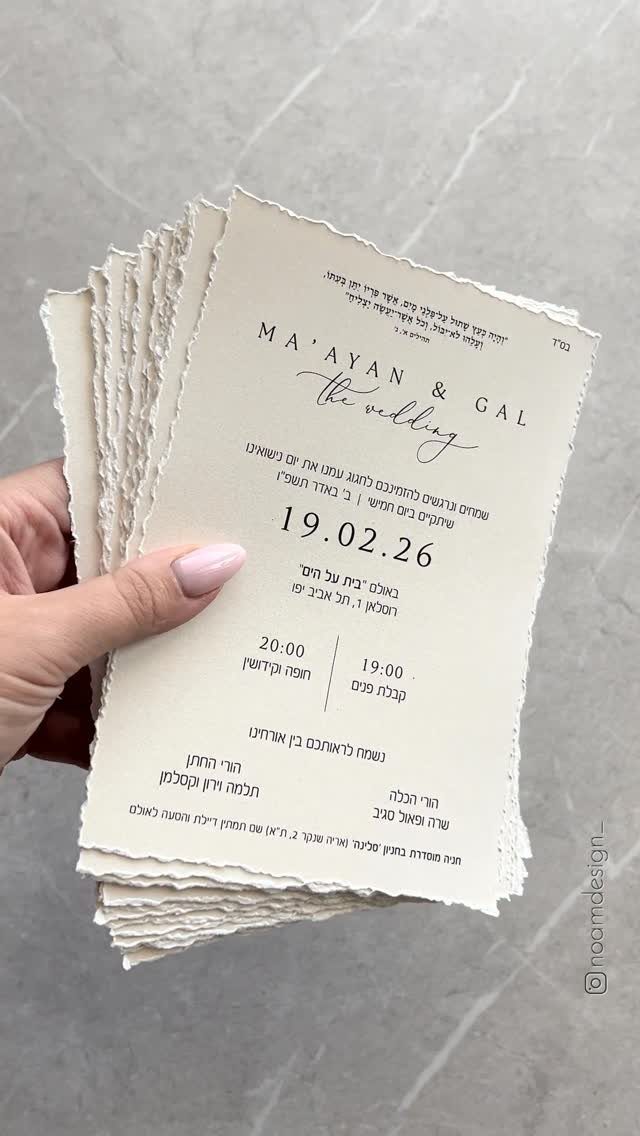
Raw, torn edges on cream stock make black type look deliberate and calm.
The maker of this suite tears each sheet by hand along a custom perspex guide, and that guide is the trick worth copying: it keeps the tear consistent from card to card.
Hand tearing is slow, so it fits a small guest list or a DIY weekend.
Pair it with one clean sans-serif and nothing else. For a larger list, ask a printer to supply deckled edges by machine.
13. Dark Envelopes with Wax Seals
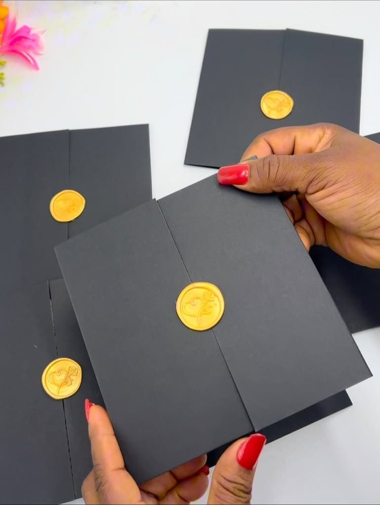
Matte black paper with a gold wax seal looks moody and formal at once, and the seal is the only shine the envelope needs.
Gold against black has the highest contrast you can get, so the seal reads from across a table.
Dark envelopes mean your return address and the guest’s name need light ink, so plan on gold or white.
Dark ink disappears. Order a test envelope first and check that the address stays readable.
14. Traditional Indian Motif Cards
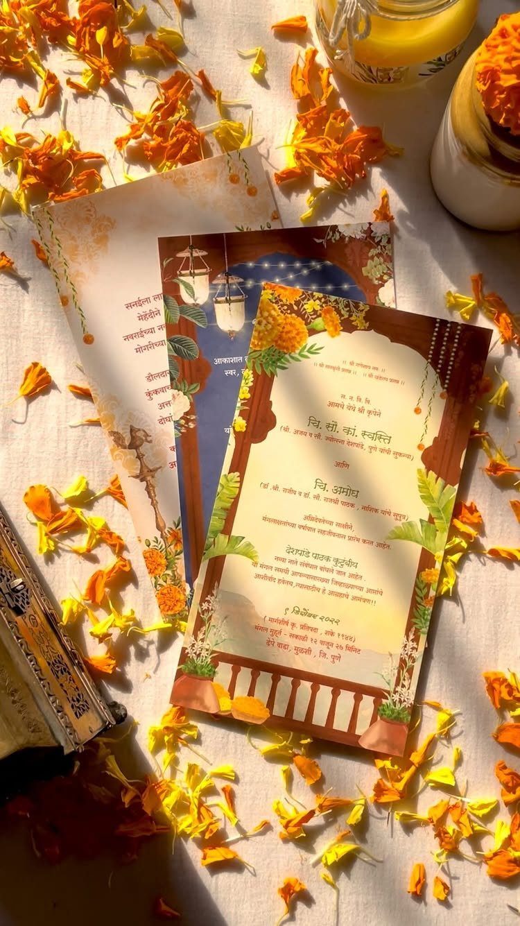
Orange and gold carry a card like this before anyone reads a line. Traditional motifs, paired with text in the language your families speak, make the invitation feel like it belongs to both sides.
I would let the motifs and color do the decorating and keep the wording in one clear layout.
If guests read different languages, ask a relative to proofread every line before printing, since a small error in a script you cannot read is easy to miss.
15. Patterned Envelope Liners
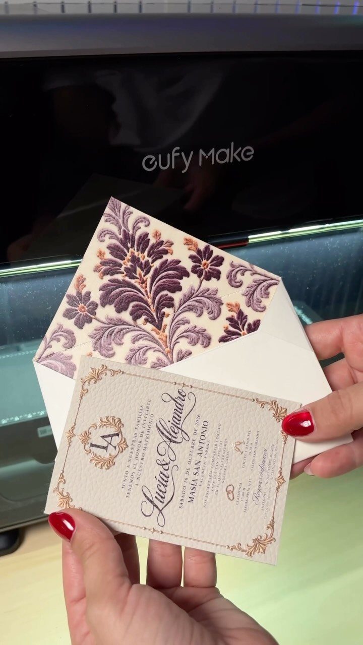
An envelope liner is the cheapest surprise in a suite: the guest slides the card out and a purple floral pattern is waiting inside. Against a cream card with gold borders, the print adds color without touching the invitation itself.
I would spend on the liner and keep the outer envelope plain. Choose a pattern that picks up one color from your palette, so the pieces match instead of compete.
16. Scroll Wedding Invitations
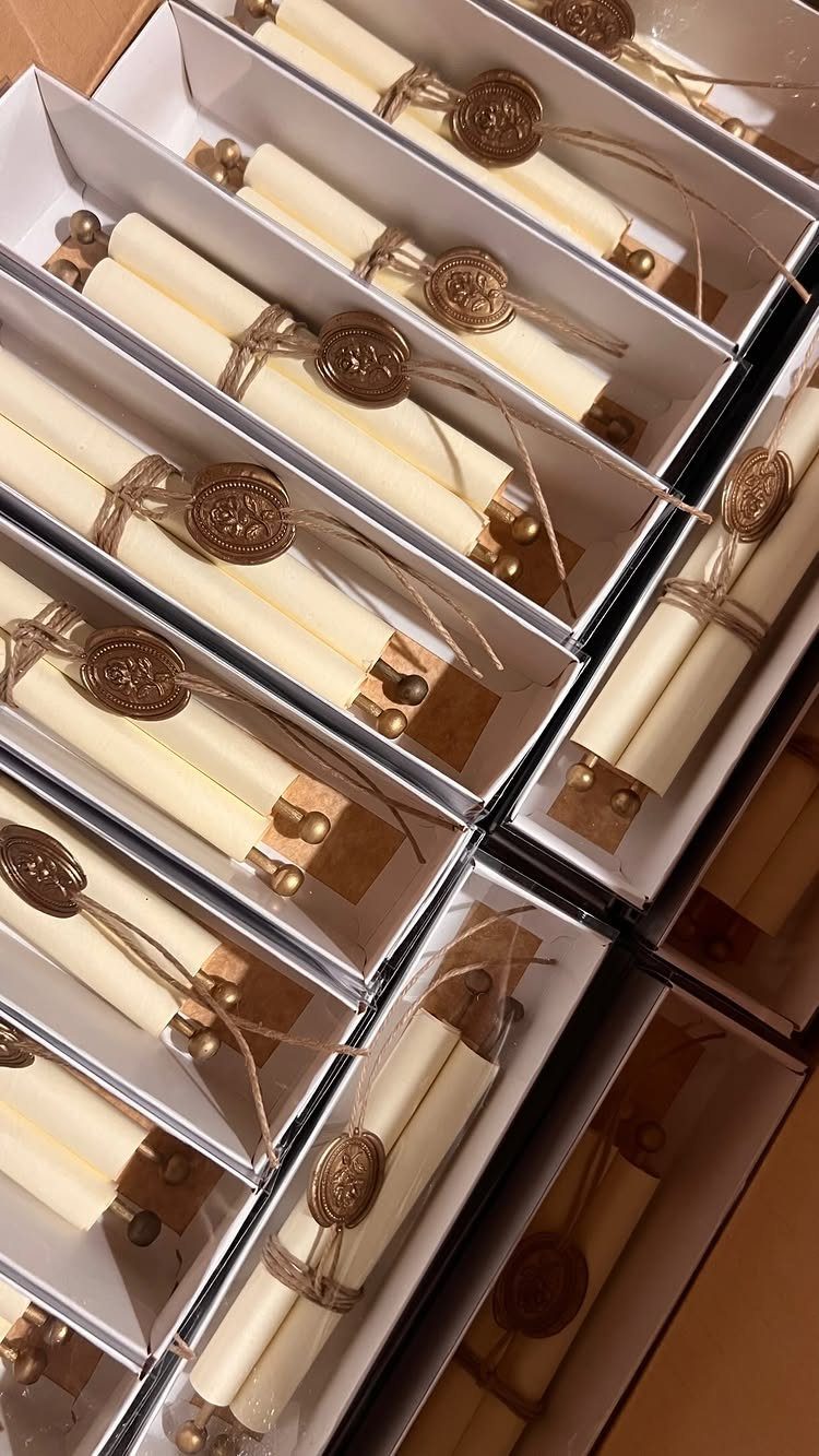
Rolled and tied with twine, a cream scroll gets opened slowly, which is half its charm. A wax seal holds the roll shut and doubles as the decoration.
Scrolls need hand assembly, so every one is rolled, tied and sealed separately.
Do a small batch first to learn how long each takes. Boxes keep them from crushing, though they add weight, so weigh a finished one before you mail 100.
17. Lace-Trimmed Invitations
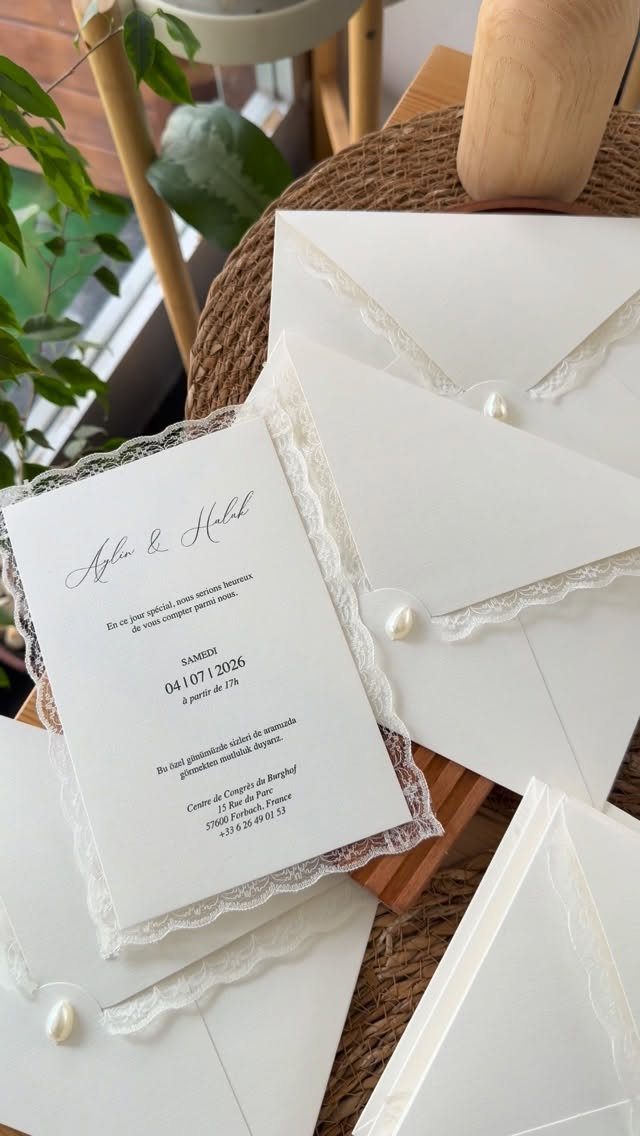
Lace trim and a pearl closure give a white card a bridal feel before anyone reads the names. Keep the printing simple, one ink and one typeface, so the texture stays the main event.
Trim and closures add hand work, and each card needs its own. Buy a sample of the lace before committing, and consider trimming only the main invitation while the rest of the suite stays flat.
18. Gold Acrylic Invitations
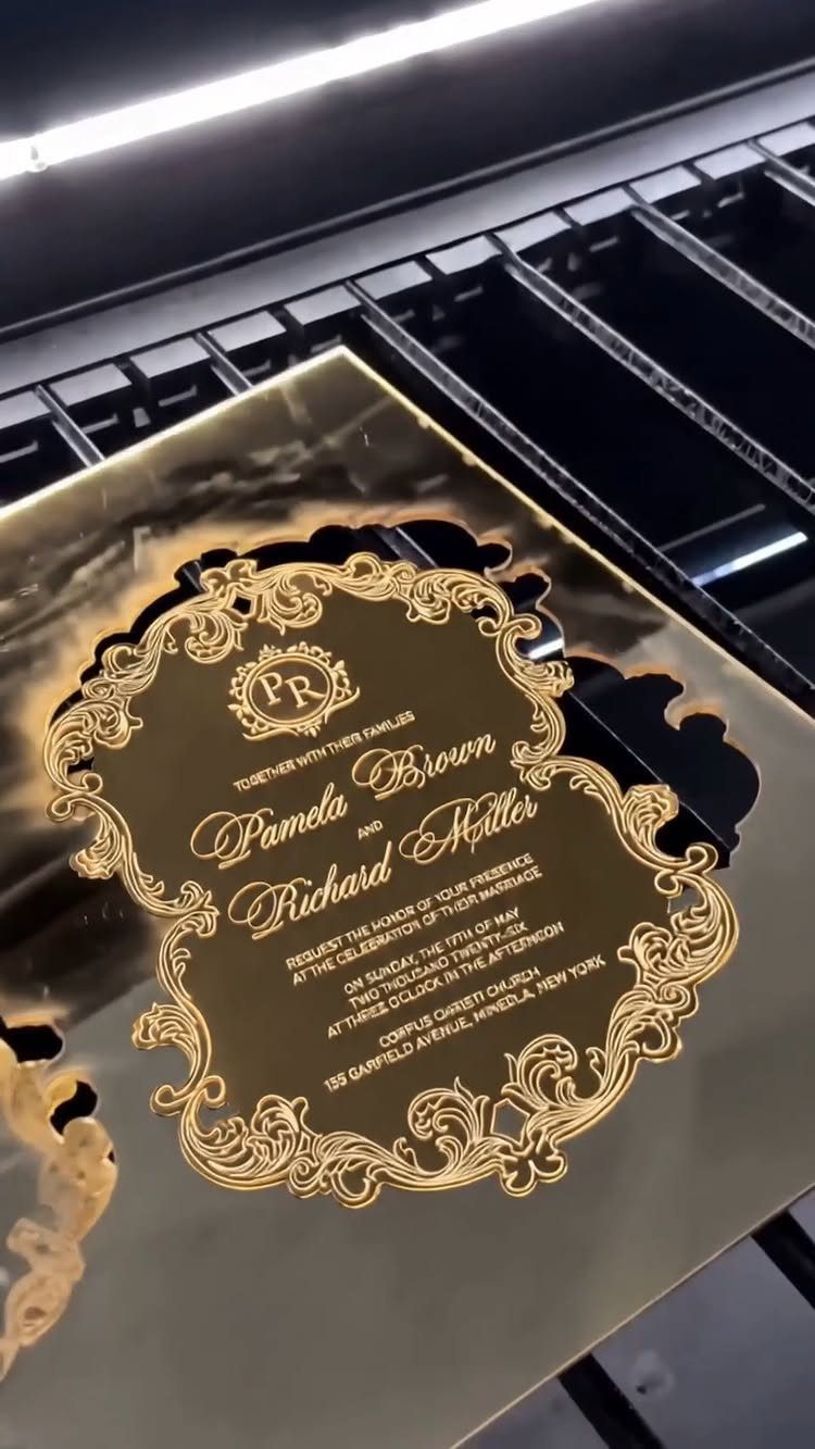
A gold mirror-finish acrylic card turns the invitation into something guests will want to keep. Ornate borders and cursive calligraphy suit it well, since fine line work holds up against the shine.
Reflective surfaces glare, so choose a calligraphy style with thick, steady strokes. Acrylic costs more than card stock and weighs more, so order one sample, test it for readability, and price the postage before you commit.
19. Embossed Arch Invitations
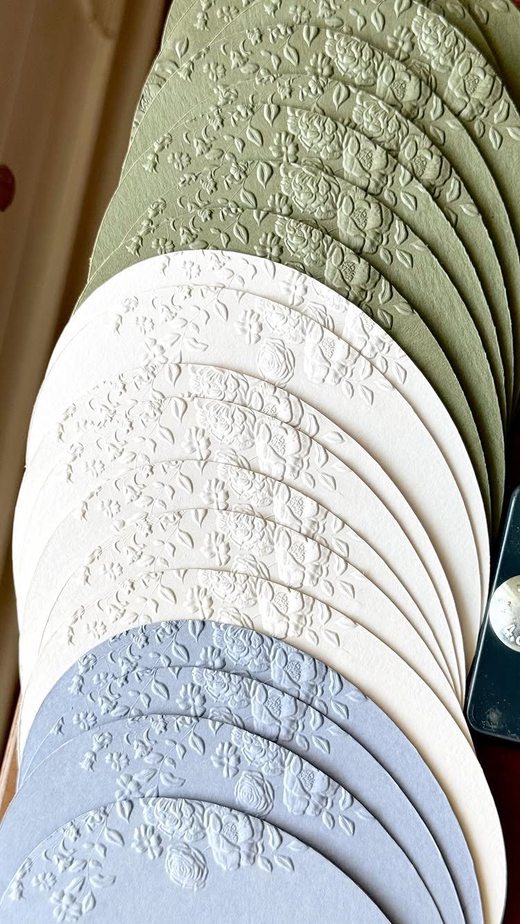
Raised florals on an arched card give the invitation a shape and a texture before any ink is read.
The sage, cream and dusty blue here are soft enough that the embossing does the decorating, so I would skip foil and extra patterns.
Pick one color for the whole suite, or let the three shades match your palette across the guest list.
Embossing and a custom arch cut both cost more than a flat rectangle, so order a sample first and feel how deep the impression is.
20. Sweet Treat 3D Invitations
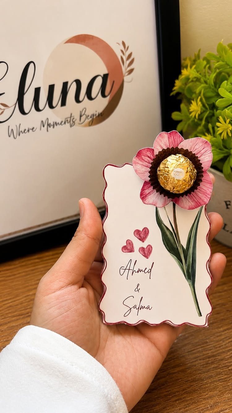
A wrapped chocolate attached to the card turns the invitation into a small gift. Here a dimensional paper flower sits at the center, with the gold-wrapped chocolate beside it, and the couple’s names stay simple.
Both pieces add thickness, so a flat envelope will not do. Weigh one finished card at the post office first, ahead of placing an order for 100, and ask whether the extra thickness changes the postage.
I would use this only for the main invitation. Keeping the rest of the suite flat holds the cost down and keeps the surprise special.
Personalization Options
Personal touches work best when they come from your own story rather than a template. If no premade design fits the picture in your head, you can upload your own artwork and have it professionally printed.
A few starting points: a timeline of your relationship from first meeting to proposal, a collage of personal photos, or a sketch or caricature of the two of you.
For a background, a map of the town where you met or grew up works well, and so does a night sky of constellations, whether they’re a random scatter or the 2 signs you were born under.
If you hire a graphic designer, ask for extras that echo your theme, such as greenery or a border.
Pick one personal idea and let it carry the card. Stacking a timeline, a map and a collage on one invitation leaves the wording hard to find.
Trends in Wedding Invitations
An envelope holds only so much, which is why a traditional invitation can feel flat. The fix is to change one thing, not everything.
Choose a single element that reflects your personality and let the rest stay conventional. A card that guests can still read in five seconds beats a clever one that hides the date.
Before you commit to any trend, ask whether it tells guests something true about the wedding. Style that sets the tone earns its place, and style added only because it looks current usually shows.
Budget Considerations
Shape is an affordable way to depart from the standard rectangle, and plenty of people never think of it.
Rounded corners soften a card, while a die-cut edge with a bracket shape gives it an outline that stays distinct from the rest of the mail on a doormat.
If you want texture instead, letterpress, foil stamping and embossing all add depth and a more luxurious feel. Using several techniques on one card gets attention, but each one raises the price.
My advice: pick one technique or one custom shape, not both, and keep the rest of the suite simple.
Ask your printer for quotes on both options at your exact quantity before you decide, since the gap between them can change which one fits.





